The Visual Wit of Designer Alan Fletcher Is Now Online
All work and no play infuses graphic design with a corporate dullness, but that was never the case with Alan Fletcher.

All work and no play infuses graphic design with a corporate dullness, but that was never the case with Alan Fletcher. The British graphic designer managed to merge both work and play in his logos, magazine and book covers, corporate identities, and other media work. Now you can take a trip through his extensive career with the recently launched Alan Fletcher Archive.

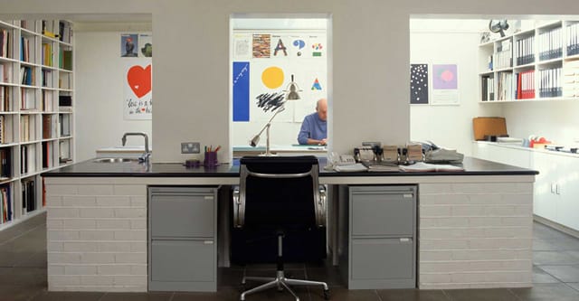
Born in Kenya in 1931, Fletcher grew up in London and later studied at the Royal College of Art, but was influenced as much his experience as a student at Yale studying under Josef Albers and Paul Rand. He got his big break by accident, or rather, by Soviet space intervention. He was showing his portfolio to the art director at Fortune on a Friday in 1958 when the Sputnik satellite launched and they needed a new cover by the following Monday. The structured, abstract cover with its typography forms would be the base for what came after, with both his working as a partner in Fletcher/Forbes/Gill in the 1960s and then Pentagram in 1970s. Tired of corporate design, he left Pentagram in 1991, but remained highly active as both a freelancer and an art director at Phaidon. He also published what’s perhaps his most popular work, at least with fellow graphic designers — his book The Art of Looking Sideways, an over a thousand page book where you are meant to flip anywhere to explore visual thinking.
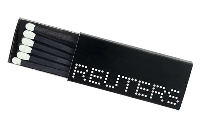
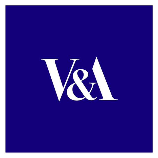
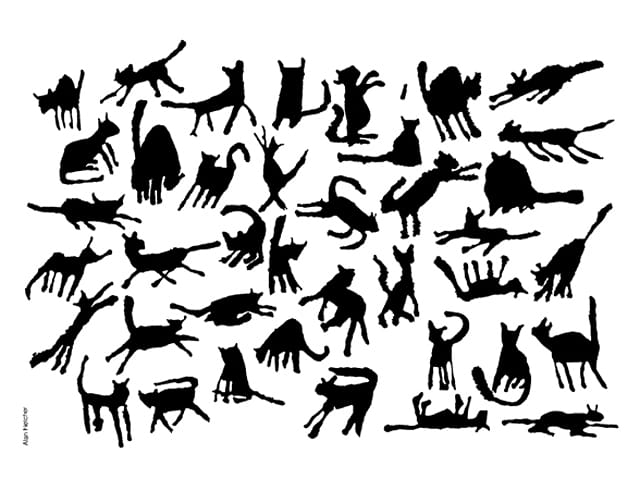
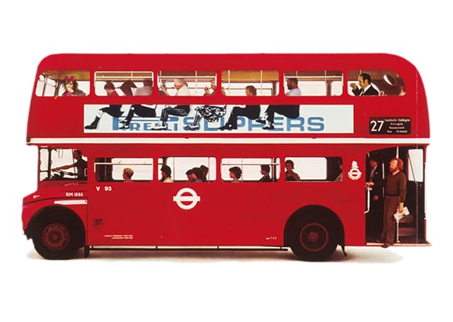
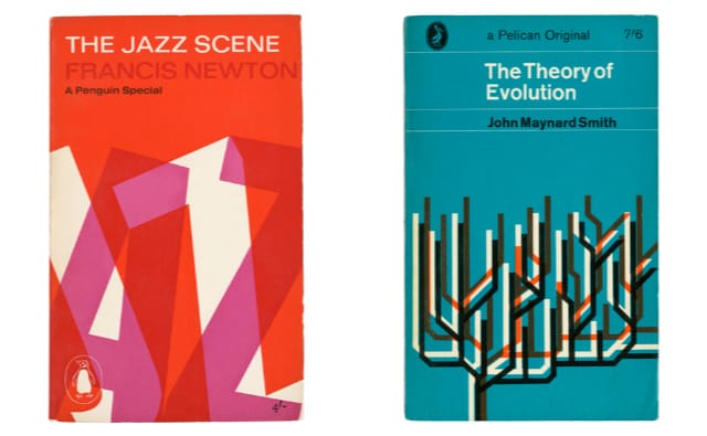
Fletcher passed away in 2006 at the age of 74, wearing a shirt on which was handwritten “I don’t know where I’m going, but I’m on my way,” according to his New York Times obituary. It was a fitting last statement by the witty designer, and the archive steps all the way back to his student years to see how that distinctive vision formed. The archive is part of the Fletcher Studio, which was established by his daughter Raffaella Fletcher in 2010, and you can sort through numerous projects by era (such as Pentagram or his student years), context (from ads to books and all media in between), genre (such as typography and collage), subject (like animals, people, or “quotes and aphorism”), and his numerous clients. Here there are his 1960s Penguin book covers he did under the direction of Germano Facetti, where his early experiments of modernist expressionism mix with a love for visual puzzles. There are his tributes to his wife Paola Biagi, the romance with whom was sparked over a dispute on whether pink and orange went together. There’s his logo for the Victoria and Albert Museum from 1990, where he used a two hundred year old font and sliced off one of the A’s legs to merge it into the ampersand almost invisibly, giving it a both classic and modern feel. And there’s his retired Reuters logo with its newsticker dots that was used from 1965 to 1992. Of course, the best work is being showcased, but even with Fletcher his lesser efforts had a cleverness to them all his own, even if that could sometimes dominate the subject with his strong identity.
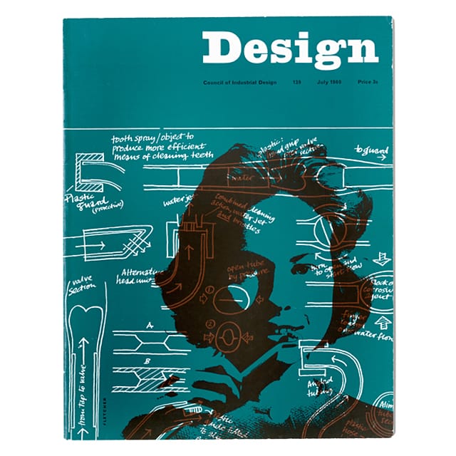
The archive also has articles and photographs about Fletcher, as well as a biography by Mike Dempsey told in fragments through the site. But what’s really interesting is to just look at the graphic design randomly, like another edition of The Art of Looking Sideways, and see the playful work of Fletcher emerge from different media in a collision of the 20th century European modernism and the era’s popular culture. Below are some more selections from the Alan Fletcher Archive:


View the whole Alan Fletcher Archive online.