The Unfashionably Late Modernism of Patrick Jones
DUBLIN — Patrick Jones, an English abstract artist now in his mid-60s, spent a considerable amount of time in America. After studying art in England, most notably at the Birmingham College of Art, he left to get his MFA at the Maryland Institute College of Art. This was in the 1970s. While in Americ

1.
DUBLIN — Patrick Jones, an English abstract artist now in his mid-60s, spent a considerable amount of time in America. After studying art in England, most notably at the Birmingham College of Art, he left to get his MFA at the Maryland Institute College of Art. This was in the 1970s. While in America — he did not return permanently to England until 1994 — Jones became preoccupied with process painting, particularly the way the Color Field painters, such as Helen Frankenthaler, Jules Olitski, and Larry Poons, practiced it.
Jones’ interest in American high modernist abstraction – an interest he shares with the older British abstract painters John Hoyland and William Tillyer — is part of a significant shift away from the figure in recent English art, a development that remains largely unknown in America. When compared to their figurative counterparts, ranging across generations from Frank Auerbach to Jenny Saville, British abstract artists are practically invisible in America. With few exceptions, almost no British abstract painter shows regularly here. And other than Paul Behnke, I can’t think offhand of an American painter who is strongly curious about the history of British abstraction.
This, I suspect, is also true in England. For them, as for us, David Bomberg is the teacher of Auerbach and Kossoff, rather than an original Vorticist whose works in the Inventing Abstraction show at MoMA were a revelation for this writer, at least.
2.
Although Jones’ current exhibition at Hillsboro Fine Art, Dublin, Ireland (June 6–July 6, 2013), is titled Survey, and includes an early work from 1976, all but three of the sixteen works were done in this century, many rather modestly scaled, tilting the show toward the present. This ended up whetting my curiosity more than satisfying it, especially as it became clear to me that the exhibition was not about to offer anything near a comprehensive view of Jones’ achievement, much less his recurring interests. But perhaps curiosity rather than satisfaction is — rather perversely — the best to take leave of any artist.
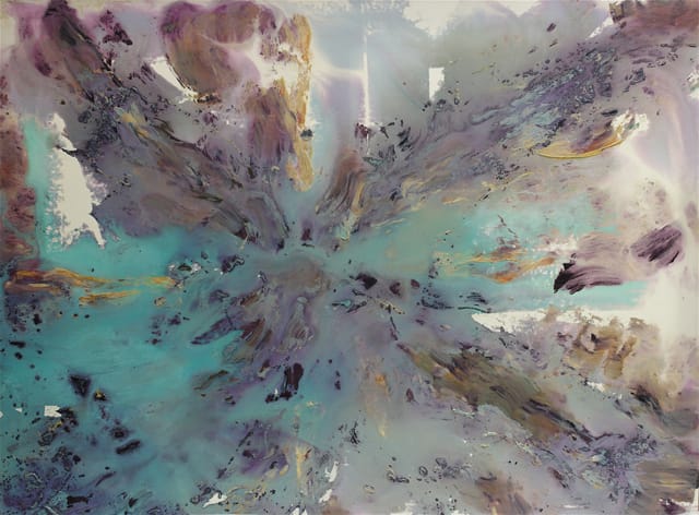
Nevertheless, I came away from the exhibition with what I am sure is a skewed understanding of Jones’ work. His mastery of the various process associated with Color Field and stain painting is apparent from this sampling of works, as is his command of the gesture and vocabulary we associate with the Abstract Expressionists, particularly Jackson Pollock’s drips and Adolph Gottlieb’s signs. A range of this kind would overwhelm many artists — and this certainly could be one reason why, in the face of such heavy precedents, parody and citation became the go-to modes of production.
Jones, however, never became ironic. He wanted to take all this history on and find a way to make something that is his own. In that sense, he is a modernist rather than a postmodernist. From what I can tell from the evidence provided by the exhibition at Hillsboro Fine Art, which was my first encounter with this artist’s work, Jones had accomplished this ambition by the early part of this century, at a time when the art world – convinced as it was of the death of painting – would not have noticed, certainly not at an institutional level. It is – of course – painters who keep painting alive (something also true of poets and poetry), rather than institutions (and I am thinking of just the ones in New York and how little they seem to know about current painting, much less exhibit it).
3.
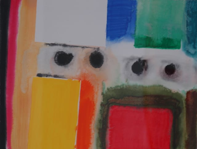
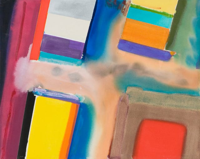
I want to call attention to two things in this exhibition — Jones’ longtime interest in odd formats, ranging from narrow vertical canvases to tondos, and his move away from the fluid paint and forms he used in the last century to the structuring of color in this one. In his No Pasaran series (2010) and other recent works in the exhibition, Jones works on a horizontal format. Two or more diagonally oriented rectangles are aligned along the top and bottom of the painting, cropped by the painting’s physical edge. We see only a glimpse of something larger and, most likely, non-repeating. While the rectangles are defined by bands of saturated, optical color, the ground is developed through multiple means, including staining, drips and dry brush.
I suppose my one quibble is that the ground can become too atmospheric and lose its function as a plane, but Jones’ orchestration of jarring colors, light and dark, and painterly effects generally overcome my hesitation in this regard. The paintings are a tug of war between structure and dissolution, with the cropped edges of the rectangles suggesting that chaos (or the unknown) will win out. We are literally and figuratively on the brink, sliding into pandemonium. Once Jones began to introduce metaphorical associations into his painting without resorting to symbols, which happened around the turn of this century, his work becomes all his own.
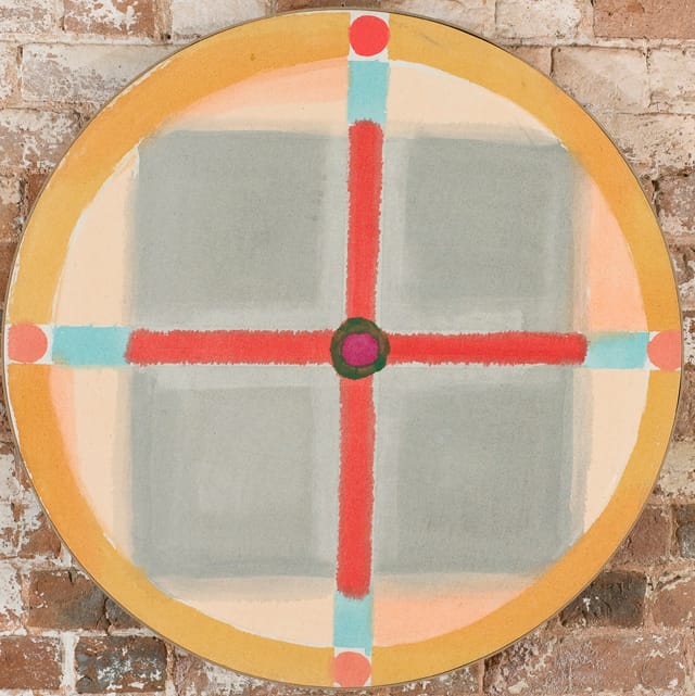
At the same time, almost in direct contradiction to what I have just written, another work caught my attention — a quiet knockout, as far as I am concerned — which featured one of the most loaded of symbols, a cross. Called “Tondo” (2003) — a round painting, as the title suggests — it superimposes a red cross over a pale gray rectangle within a pale peach circle framed by a darker, cantaloupe-colored band. When the cross’ four arms extend beyond the gray ground, they turn turquoise and terminate — as they reach the cantaloupe-colored band — in a red circle within a white square. At the center of the cross is a dark brown circular outline, with a red-violet interior. Because of the radical shift in color, this, rather than the cross, becomes the focal point.
Here the staining becomes delicate, a sign of tenderness. I was surprised and frankly delighted that Jones could paint a cross and not come across as being religious, largely because of the attention he paid throughout to the composition’s distinct geometry and changes in color. Here, the formal tamps down any overt symbolic associations, evoking instead the work of Kazimir Malevich and El Lissitsky. I wondered if “Tondo” was part of a series — which Jones tends to work in — or one of a number of anomalies. My interest now piqued, I will be sure to be on the lookout for more works by Mr. Patrick Jones.
Patrick Jones: Survey is at Hillsboro Fine Art (49 Parnell Square West, Dublin, Ireland) through July 16.