Art
Redesigning Death
For the amount of time that people have been dying, which is quite long really, our designs for death haven't changed as much as our designs for everything else.
Art
For the amount of time that people have been dying, which is quite long really, our designs for death haven't changed as much as our designs for everything else.
Art
LOS ANGELES — In a world where art seems to consist primarily of hyper-conceptual art school verbiage, it’s a relief to go to a museum show and actually have something to see. The California-Pacific Triennial, now on view at the Orange County Museum of Art in Newport Beach, Calif., definitely offers
Art
With fame and fortune you can do just about anything, but maybe you shouldn't. Yet that hasn't stopped celebrities from trying their hands at contemporary art
Art
When the Transportation Safety Administration (TSA) joined Instagram two weeks ago, the move prompted bemused and occasionally earnest reactions from the publications tasked with paying attention to these kinds of things.
Art
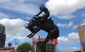
CALGARY — For ten days every July, a particular brand of cowboy hat-wearing, two-stepping, and beer-swilling mayhem descends upon the city of Calgary, Alberta. The Calgary Stampede, officially lauded as “The Greatest Outdoor Show on Earth” is ostensibly a rodeo, but its hallmarks include a thriving
Art
As a follow up to our investigation into the realm of obsolete pigments, here is a look at some of the surfaces that those pigments were applied to that have also fallen into obsolescence. This doesn't mean they have entirely disappeared, as even the most obscure material is likely still sought out
Art
The Brooklyn International Performance Art Festival (BIPAF) has begun and I will be blogging weekly photo essays of all the performances — a small fraction of the complete schedule — I attend each week.
Art
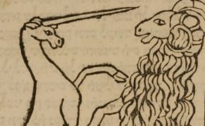
What a wondrous and rare creature is the unicorn — and of course sadly nonexistent. But that hasn't stopped the single-horned equine of myth to prance its way into centuries of art, acting as graceful spirit strutting through the forest or a captured creature representing everything from the entrapm
Art
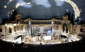
There's repurposed architecture all over New York City, from banks that have become grocery stores to a water tower becoming a speakeasy, but the most monumental transformations are definitely to be found among the city's old cinema palaces.
Art
Since painters of any stripe, be it abstract or figurative, no longer work around master narratives, trying to tackle one big issue, it’s common to see group shows of abstract painting arranged around particular interests or strategies a select group of artists may share.
Art
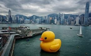
CHICAGO — A giant replica of the classic yellow rubber duckie drifted into Hong Kong's harbor last month. Sailing across the water, bobbing about as if in a giant, public bathtub, the Pop art-inspired duck, created by Dutch artist Florentijn Hofman in 2007, is essentially an enlarged version of the
Art
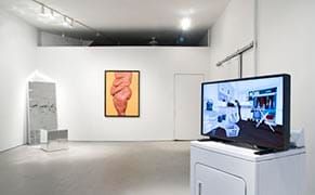
An exhilarating summer group show at Greenpoint's Rawson Projects mightily tackles this euphoria-craving aspect of the human condition. With the name Self Help, the viewer is invited to ponder the various ways we can help ourselves unlock that rush of good feelings within our own minds.