Designing the GOP's Presidential Contender
In 2008, not only did Obama and the Democrats win the US Presidential race but they hands down won the unofficial graphic design competition that vies for the hearts and minds of voters (even if on a subconscious level). As things are gearing up for 2012, the question is … did the GOP learn anything

In 2008, not only did Obama and the Democrats win the US Presidential race but they hands down won the unofficial graphic design competition that vies for the hearts and minds of voters (even if on a subconscious level). This battle of the graphic identities pitted Obama’s thrillingly modern design concept, termed O Design by design guru Stephen Heller, against John McCain’s stock logo that could muster as much excitement as, well, the candidate himself.
As things are gearing up for 2012, the question is … did the GOP learn anything about graphic design in the last few years? The answer appears to be no.
CNN has collected all the Republican Presidential candidate logos into one place and they asked some pundits to chime in about the visual brands.
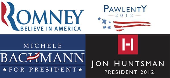
Surprisingly (or maybe unsuprisingly), there is little innovation in the images we see. The Mormon duo, Mitt Romney and Jon Huntsman, appear to have tried to differentiate themselves from the field but even they’re designs fall short. Huntsman’s almost sinister-seeming design looks far too corporate and doesn’t really tell us much about the candidate, while Romney’s has strange kerning issues and as a CNN commenter rightly asked about the design, “Is he running for President of France?” Yikes!
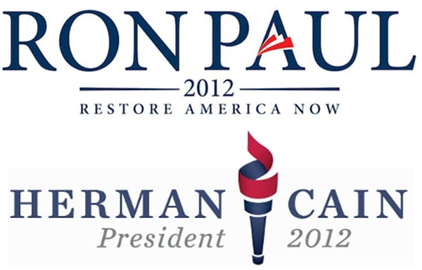
The CNN pundits think the Ron Paul’s logo is the clear winner but I disagree. Paul’s logo is clean and concise but lacks anything that differentiates it from any other political logo. I am particularly irked by those red streaks on an unimportant letter doesn’t do much for the branding.
I think Herman Cain’s logo is more elegant, though I admit it has its own shortcomings, particularly the feact that it could easily be part of the branding for a hospital or insurance company.
What is it about the Republican candidates that stops them from dipping their toes into the pool of innovative design?
Now, the big question is will Obama use his old branding or surprise us with something new? I’m guessing the former as the campaign has already announced that it will not be pursuing a 50 state strategy like in 2008 and some of the 2012 campaign materials are already using the 2008 logo.