Occupy Wall Street Gets a New Logo
In their quest for a unified logo, the Occupy Movement sifted through 8,319 submissions from 1,591 designers until they agreed upon a minimal design by maspoji™ — and no, we're not sure if the trademark symbol is ironic or not.

In their quest for a logo, Occupy.com, which is associated with the Occupy Movement, sifted through 8,319 submissions from 1,591 designers until they agreed upon a minimalistic design by maspoji™ — and no, we’re not sure if the trademark symbol is ironic or not.
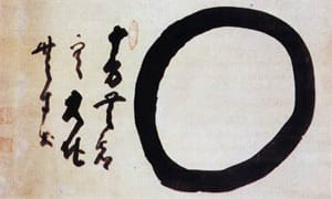
The winning logo has obvious similarities to many different images from various cultures and contexts, which is a good idea. My immediately reaction was that it somehow evoked the logo used by then US Presidential candidate Barack Obama in 2008 but without the sappy blue sky and rolling red fields. Perhaps a more appropriate association for the symbol is an ensō, which is a Japanese word that means “circle” and, according to Wikipedia, is “a sacred symbol in the Zen school of Buddhism, and is often used by Zen masters as a form of signature in their religious artwork.”
The beauty of the winning design is that it is universal. It also has a sense of power without veering towards the overly idyllic like the Obama logo.
The new logo will replace the more common OWS clenched fist symbol that has been with Occupy since the early days. This simple O evokes a new direction and simplicity that feels welcome, if not easy to define. Though part of me hoped for something more distinctive this doesn’t mean that the logo may not evolve just like the movement.
When Occupy put out their call for designs earlier this month this was their request:
We are challenging designers to think beyond the iconic Clenched Fist and create a new iconic symbol for resistance, solidarity and empowerment in the 21st century. It should appeal to a broad base and reflect the diversity of the 99%, while encompassing the values of the Occupy Movement — among them, integrity, justice, freedom, equality, compassion, community and true democracy.
According to a quote that occupier David Sauvage provided to SF Weekly:
“The creative energy of the contest naturally went towards the circle — It’s iconic, it’s endlessly reproducible, it’s infinitely inviting and inclusive and it symbolizes the connectedness of all of us.”
I’m curious what others think because even though I like the idea of this logo I can’t say that I find it particularly inspiring. Please vote or comment below.