Opinion
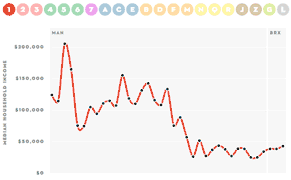
How Rich Is Your Subway Stop?
The New Yorker has taken the increasing economic segregation of our city and visualized it.
Opinion
The New Yorker has taken the increasing economic segregation of our city and visualized it.
Opinion
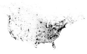
This is what we look like. You, me, and everybody else in North America: one dot each. 341, 817, 095 dots.

Opinion
There are now more than one billion people using Facebook every month, and there's no doubt that a huge number of them are sharing photos. To help illustrate what that means, the company teamed up with design studio Stamen to create animated visualizations of three different pictures going viral. Th

Opinion
James Leng's "Point Cloud" is a stunning kinetic sculpture with mesmerizing movement and a clean, digital-like aesthetic abstracted from weather data.
Opinion
I stumbled across two on the fabulous Medical State of Mind tumblelog, told from the perspective of third year med student.
Opinion
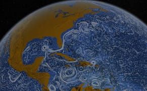
LOS ANGELES — These visualizations out of NASA's Scientific Visualization Studio, dubbed Perpetual Ocean, show the currents of the oceans.
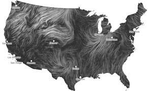
Opinion
LOS ANGELES — It's undeniable that the weather affects us, everyday. But understanding the patterns, the amazing global cause-and-effect, is difficult for anyone to wrap their head around.