
Opinion
Pantone’s Color of the Year Sounds About White
After the year we’ve had, going with Cloud Dancer can easily be interpreted as a piercing dog whistle.
Opinion
After the year we’ve had, going with Cloud Dancer can easily be interpreted as a piercing dog whistle.
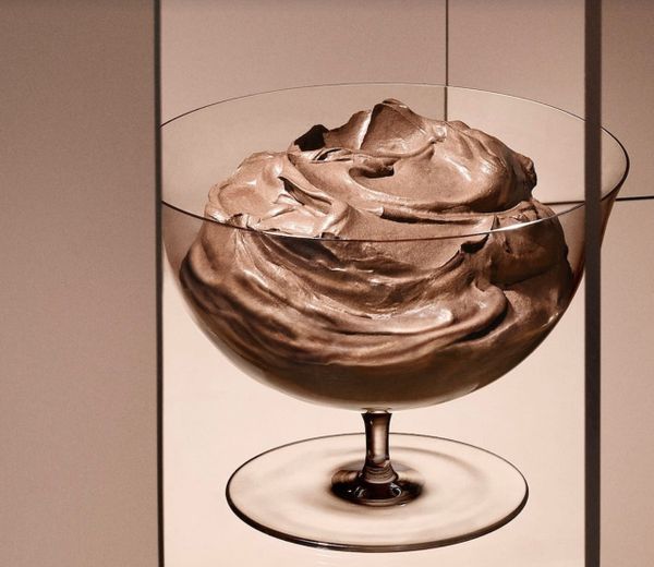
Opinion
I am always unfortunately attuned to the manner in which people respond to the color brown.
News
TikTok users are calling BS on the company in videos alleging that the chosen hues align with the interests of tech giants.

News
“How can we think that Period Red can universally represent our menstrual palettes?” asks Cromoactivismo, an Argentine group that mobilizes color in the service of social change.

Art
Pantone’s latest shade, “Period,” is perfect for smearing as a warning above the threshold to let visitors know — Old Testament-style — to pass this house over.
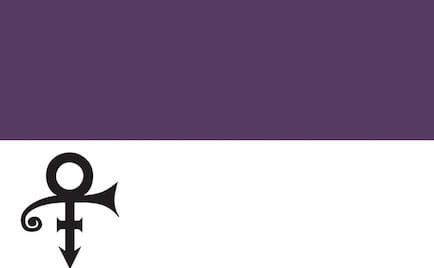
In Brief
Love Symbol #2 honors the late musician, who was known as the Purple One.
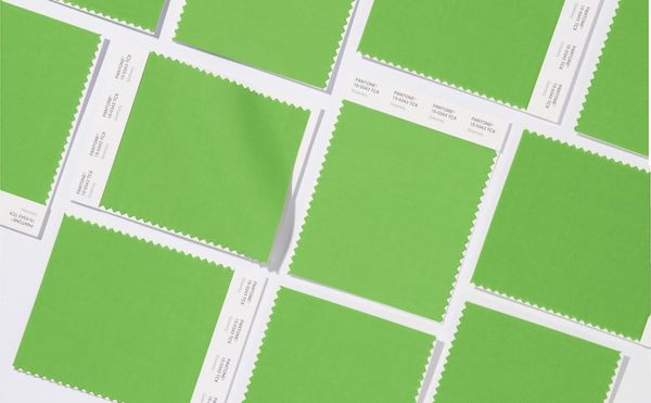
In Brief
The perennial paint purveyor is championing "a fresh and zesty yellow-green shade that evokes the first days of spring" as the defining tone of 2017.
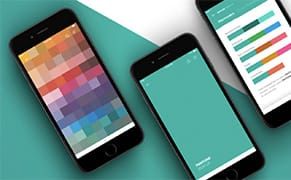
In Brief
Pantone has just released a new app, and using it feels a bit like an Easter Egg hunt for artists and designers.

Opinion
And the title of "World's Ugliest Color" goes to: Pantone 448C!
Opinion
Pantone's Color of the Year 2013 is… emerald! The company's famed color consultants have come up with the single hue that will define our coming year, and it's a deep, elegant version of green.