The Painted Book Cover Is Back
The recent shift toward figuration on book covers may reflect a broader desire for physical presence — proof of the artist’s hand in the digital age.

Walk into any bookstore in the United States lately, and the shelves and new-release tables resemble group exhibitions. Reproductions of oil and acrylic paintings, many immediately recognizable, fill the covers. Their colors are saturated, often primary. Figures abound, with inscrutable expressions and intimate gestures emphasized by tight cropping. Rather than stock photos or digital renderings, the covers foreground material marks made by artists ranging from early modernists like Hilma af Klint to contemporary realists like Nashville-based Shannon Cartier Lucy. In a market flooded with design templates and AI-generated imagery, the painted cover stands out as distinctly human.
The recent shift from color fields and geometric abstraction to gestural figuration on book covers may reflect a broader craving for embodiment and physical presence — proof, in other words, of the artist’s hand and subjectivity in the era of the internet. Just as painting implies time, so does the novel, demanding sustained attention to both write and to read. It’s a tension that undermines the forces driving creation and consumption in the service of ever-increasing profit margins, both in the art market and the publishing industry.
It’s also, of course, a matter of taste. To carry a novel framed by af Klint, the 20th-century mystic whose Guggenheim Museum retrospective remains the institution’s most visited, or by an emergent painter circulating the Tribeca gallery scene is to signal intellectual rigor, cultural capital, rarefied sensibilities, and a sense of irony. On the shelf, the painted cover seemingly aligns the book with an art-historical lineage rather than the curation of an algorithmic feed.
In an interview with Hyperallergic, LiteraryHub Managing Editor Emily Temple explained that “book covers occupy an odd aesthetic space because, on the one hand, they’re essentially advertisements doing double duty as packaging — but they also are, or can be, high art.” The best of these designs embraces that contradiction.
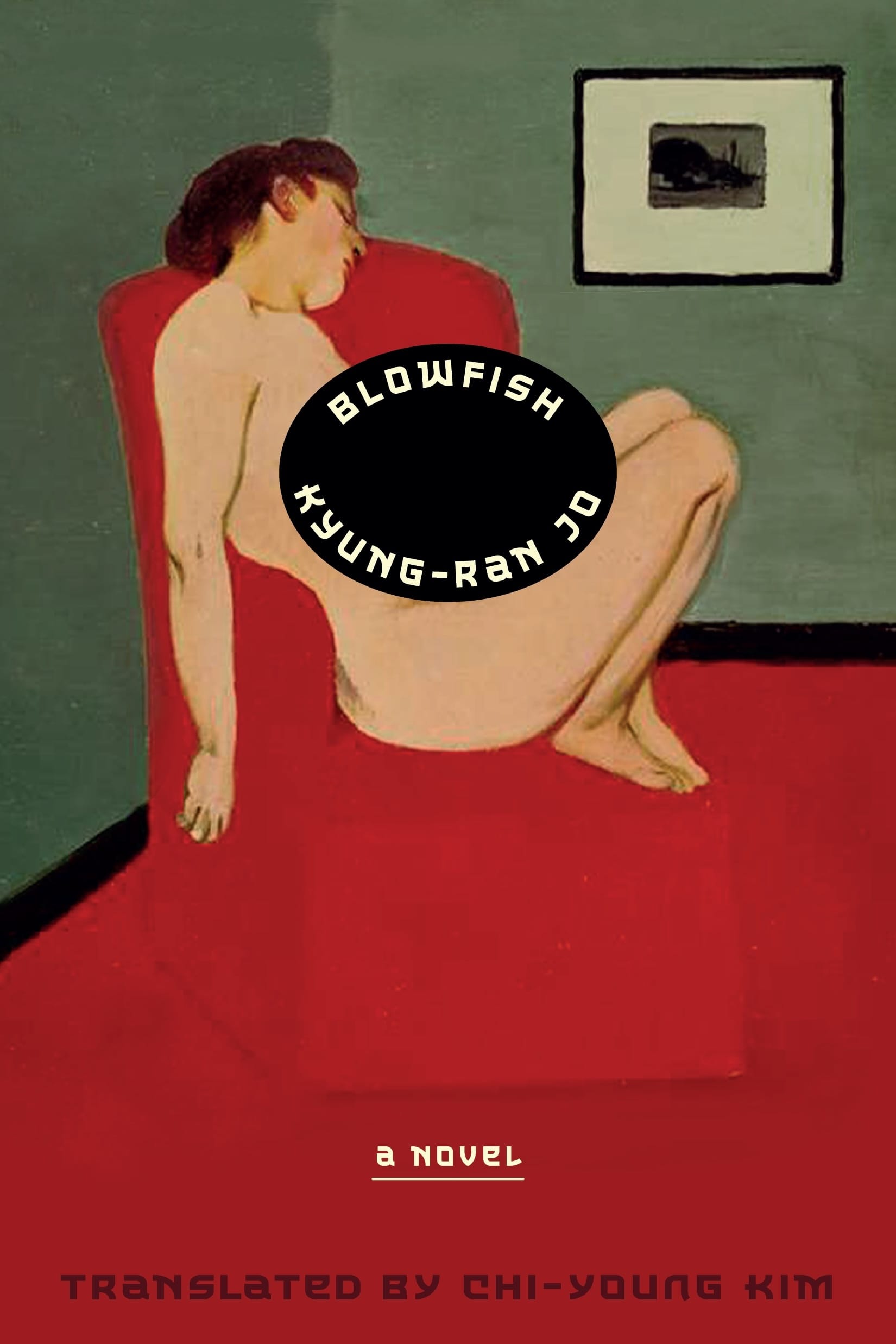
The trend plays out differently across publishers, but certain themes recur. Benjamin Schrank, publisher at Astra House, is a lifelong admirer of printmaker Félix Vallotton. When the time came to design the cover of Kyung-Ran Jo’s Blowfish (2025) — a novel of restrained, iterative melancholy and unconventional desire — he quickly secured the rights to Vallotton’s “Nude in Red Armchair” (1897), the same painting that appeared on the book’s original Korean edition.
“No one else is allowed to use his prints or paintings,” Schrank told Hyperallergic. While most paintings made before 1929 are in the public domain, photographic reproductions of them often require licensing either from the museum, archive, or photographers themselves.
Schrank, for his part, attributes the prominence of paintings on jackets to the broader revival of figuration in contemporary art, adding that representational imagery “creates historicity” and “sends cues” to the reader. Borrowing the cultural authority of paintings, he suggests, is both aesthetic and strategic, a way to confer gravitas and enrich narrative before the first sentence is read.
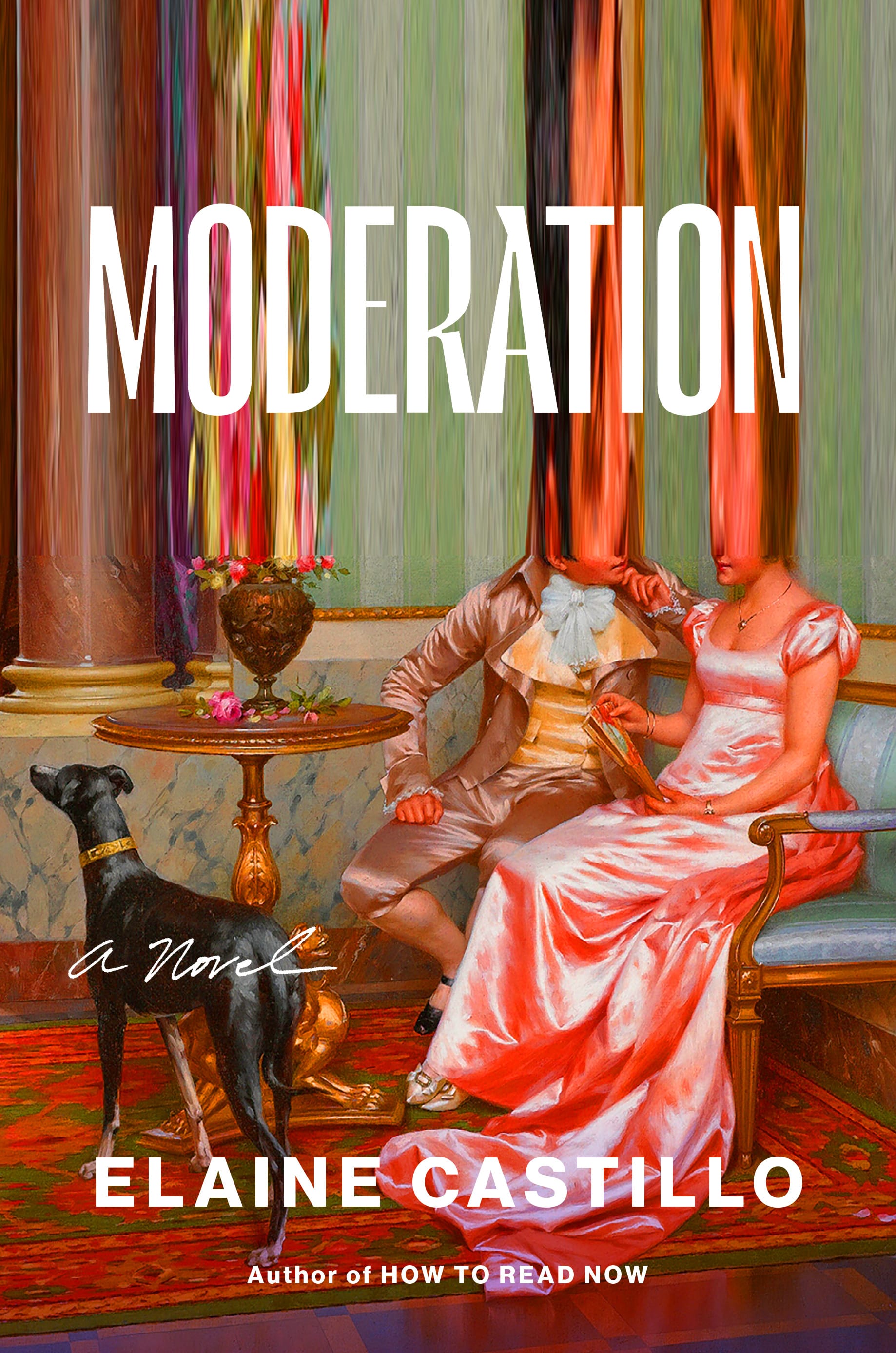
Not all designers borrow that authority as earnestly. Lynn Buckley’s design for Moderation (2025) by Elaine Castillo transforms Vittorio Reggianini’s undated painting “Admiration,” an opulent salon scene, by cropping, smearing, and overlaying it with sans-serif type — which Temple says is a familiar trope in contemporary book design. The cover reflects Castillo’s preoccupation with spectatorship and self-fashioning, while also revealing how publishers might adapt analog images for digital consumption, particularly those in the public domain. Clean type, super-saturation, and distortions preserve the idea of a painting even as they acknowledge its mediation.
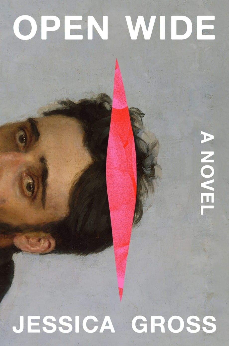
Portraits, in particular, have become a favorite among designers. Ruby Pucillo, an assistant editor at Abrams, connects portraiture to fiction’s fascination with psychologically complex, deeply flawed main characters. The novelist and the portrait artist, she told Hyperallergic, share an aim: to capture “something complex and essential with a finite series of gestures.” In Jessica Gross’s Open Wide (2025), Ilya Repin’s 1884 portrait of Russian writer Vsevolod Garshin serves as an object of obsession within the narrative and as the cover — a doubling Pucillo calls “a fantastic easter egg.” The protagonist’s fixation on the enigmatic face hanging in the Metropolitan Museum of Art parallels her infatuation with her boyfriend, whom she ultimately tries to inhabit, literally. Designer Eli Mock wrapped the painting so that Garshin’s nose aligns with the book’s spine, a sly nod to intrusion or sticking your nose where it might not belong.
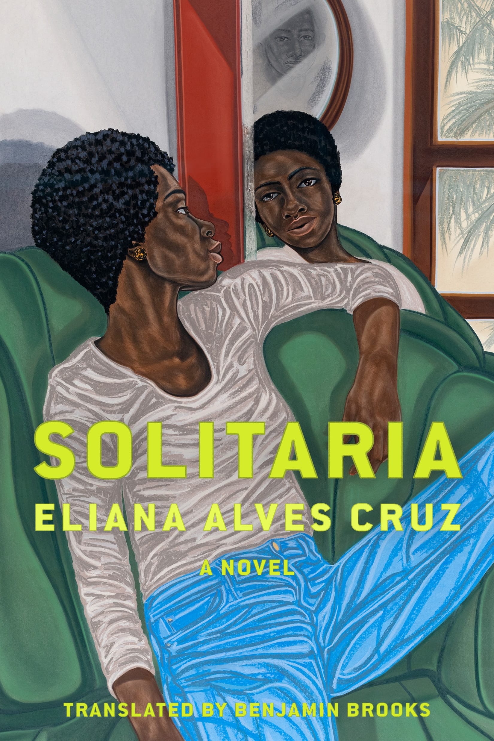
For the cover of Eliana Alves Cruz’s Solitaria (2025), translated from Portuguese by Benjamin Brooks, Astra House Associate Editor Maya Raiford Cohen selected Toyin Ojih Odutola’s vivid portrait “Projection Enclave” (2018). The image — which depicts a woman reclining on an emerald chair, framed by a mirror and a window — draws attention to the novel’s investigation into the pressures of confinement; the protagonists, a mother and daughter, share a single room in their employer’s home. Like Eliana Alves Cruz, Odutola is concerned with the ways identity, representation, and architecture shape narrative. On designer Frankie DiGiovanni’s cover, text and image seem to converge less as illustration than as interpretation.
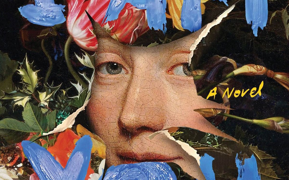
Other designers use paintings as a kind of education or excavation. Victoria Redel’s historical novel I Am You (2025), set in 17th-century Amsterdam, draws inspiration from Dutch still-life painter Maria van Oosterwijck. Fittingly, designer Jaya Micli layered Wallerant Vaillant’s 1671 portrait of van Oosterwijck with the artist’s own “Bouquet of Flowers in a Vase” (circa 1670). Van Oosterwijck’s face peers out from a tear in the tulip- and sunflower-strewn canvas, a metaphor for Redel’s recovery of the woman behind the work.
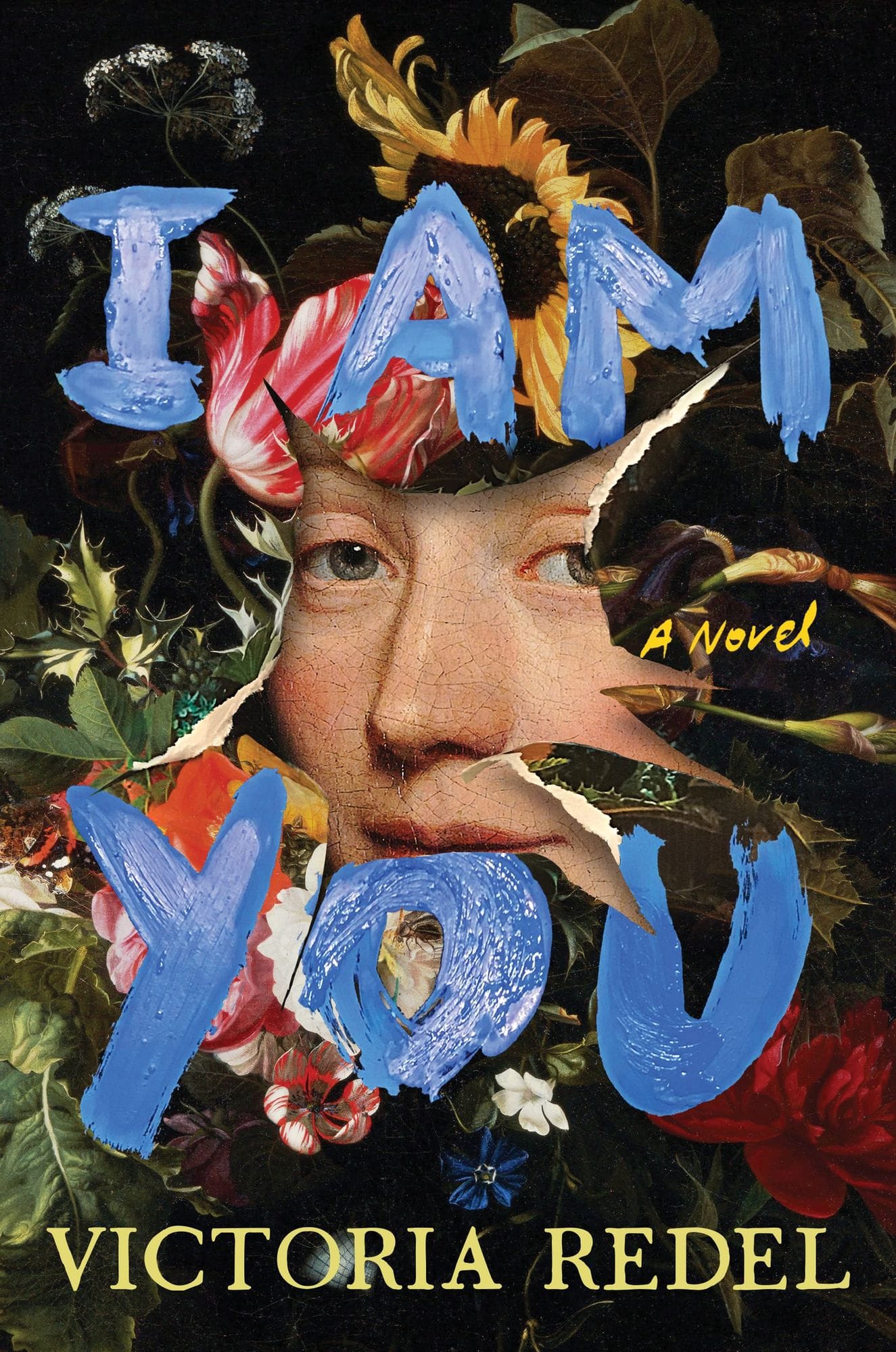
The color of the painted blue title, Miceli said, is an homage to the “hue that Oosterwijck’s assistant turned lover-turned-rival would prepare for her from lapis lazuli.” The tension between reverence and defacement foretells the two protagonists’ defiance of all manner of convention, from courtship to artistic authorship.
Mysticism offers another register. When Sarah Kellogg, a senior designer at HarperOne Group, finished reading Sonora Jha’s mythic novel Intemperance (2025), she knew the cover needed a swan. She found her match in af Klint’s 1915 painting “The Swan,” which she said “embodies [the word] ‘intemperance’ beautifully, with its air of defiance and fearlessness but also love.”
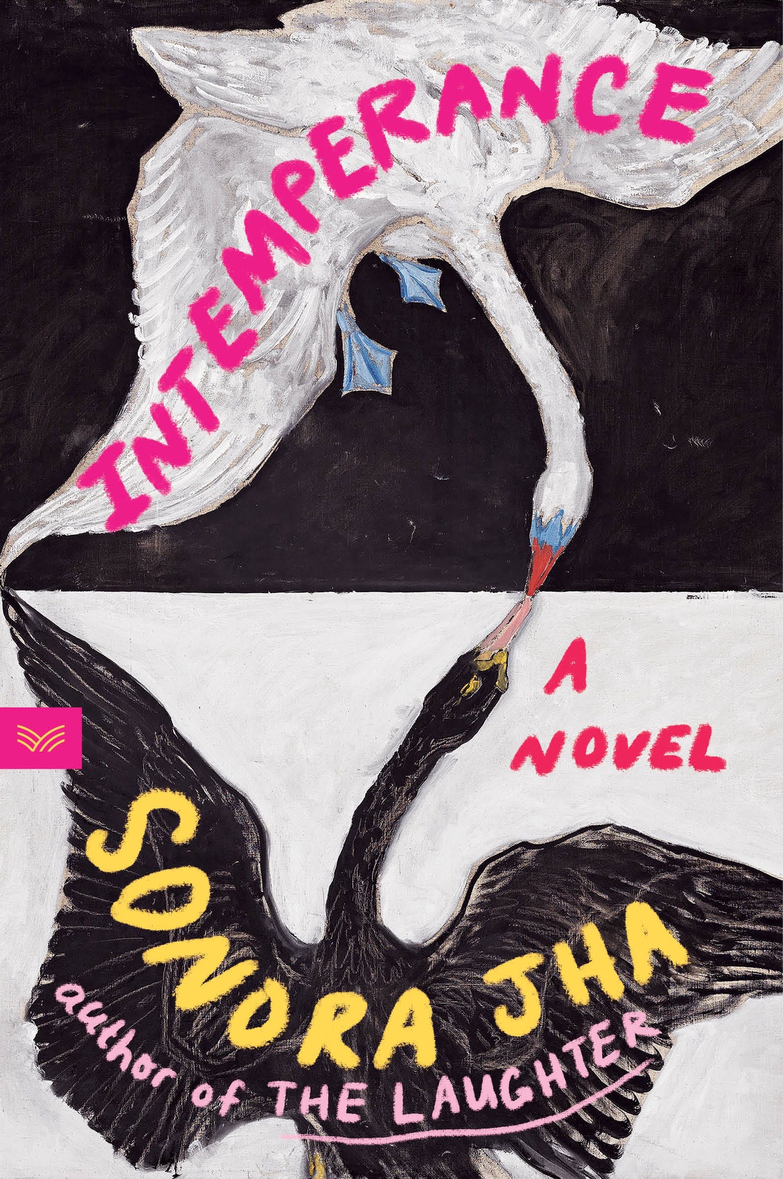
Af Klint’s mysticism aligns with the book’s fantastical elements, where feminist guides appear as goddesses and princesses before the protagonist. The brushy text treatment reflects what Kellogg describes as a return to “traditional and hand-made methods,” a sensibility at once reminiscent and resolute in a climate defined by relentless technological advancement.
Some paintings are more evasive, telegraphing a mood and a certain style rather than an argument or an illustration. Simon and Schuster’s longtime art director, Jackie Seow, points to Shannon Cartier Lucy’s gift for twisting the quotidian as the reason why her paintings lend themselves so well to covers. “Readers don’t want to be spoon-fed depictions,” Seow explains.

For Erin Somers’s The Ten Year Affair (2025), Lucy’s “Married Woman” (2023) — of two pairs of hands awkwardly touching — offered designer Emily Mahon an image of “intimacy and distance,” a dynamic that animates the novel’s central extramarital relationship. The saturated reds and powder-blues lend the cover a classic, almost nostalgic feel. Think 1970s-era Ralph Lauren or Ali MacGraw running around Harvard Yard in Love Story (1970). Perhaps a nod to the long history of infidelity stories.
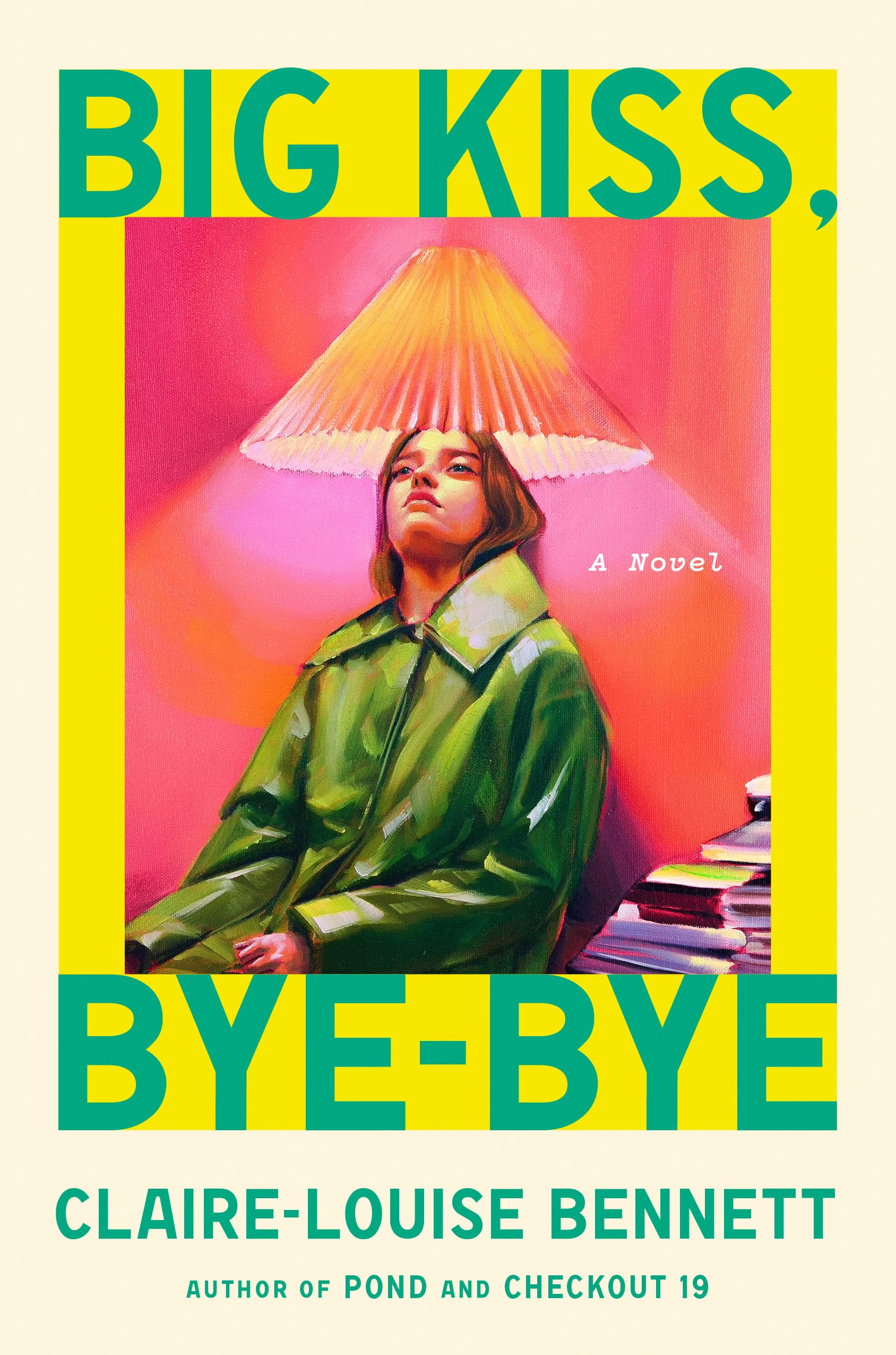
Claire-Louise Bennett’s Big Kiss, Bye-Bye (2025) catches the eye, whether as a thumbnail or in a window display. The fluorescent green, pink, and yellow palette of Maria Guimarães’s “Living” (2023), a portrait of a woman in a green coat, her head enveloped by a pleated lampshade, appears lit from within. The image literalizes the narrator’s extreme subjectivity, paradoxically turning illumination into self-erasure amid the glare.
For Guimarães, the publisher’s request to feature her painting on a book by a female writer similarly concerned with interior worlds was very welcome. “It felt like the work would travel somewhere new,” she said. “A kind of translation between art forms and cultures.”

The sense of translation — of meaning migrating between mediums — may be what unites these otherwise disparate covers. Estate (2025) is Cynthia Zarin’s third book to feature artwork by Alex Katz. Earlier covers, with their closely cropped faces and clean contours, minimized the materiality of the paint; here, with “Bather” (1959), the brushstrokes, uneven color, and wavering outline of a woman against a brilliant cerulean sky remain visible. The yellow font looks handwritten, scrawled on a postcard, echoing the novel’s epistolary conceit and stream-of-consciousness style. The emphasis on craft informs the protagonist’s own efforts to impose form on longing, to make, from painful memories, something meaningful. Like painters, writers wager that, against all odds, the lines made on a surface might outlast the moment of their inception.


