The Sticky Politics of Wall Texts
I never thought I would become an art critic who complains about exhibition didactics. And yet, after a visit to the 36th Bienal de São Paulo, here I am.

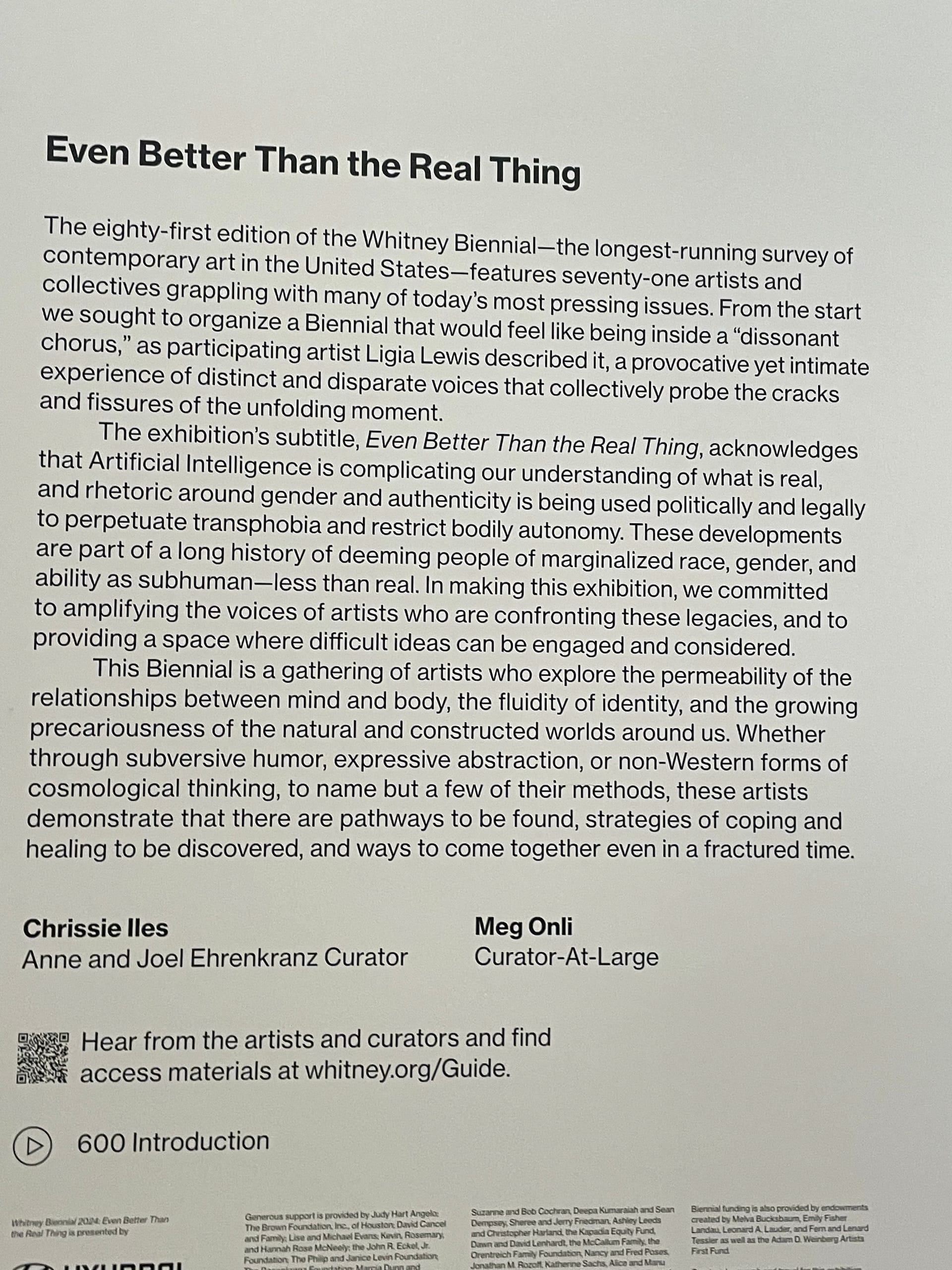
In 2024, I made a vow to never base my art criticism on wall labels. My decision came after reading reactions to that year’s Whitney Biennial. “If every label in ‘Even Better Than the Real Thing,’ the 81st installment of the Whitney Biennial, were peeled off the walls and tossed into the Hudson, what would happen?” asked Jackson Arn in the New Yorker. (He went on to suggest that the overall show would have been much better.) Travis Diehl, writing for the New York Times, noted that the labels, which attempted to “help viewers orient themselves according to the works’ intentions, or social causes,” felt “belittling.” In the Washington Post, Sebastian Smee, who proclaimed the show was the best in more than a decade, stated nonetheless that “you may come away less impressed by the art than alienated” by wall texts that he deemed “convoluted” and “brain-draining.”
These grumbles seemed to me inextricably tied to Jerry Saltz’s remarkably forthright statement that “the show isn’t for people like me” — i.e., for critics described by Emily Watlington as “various white men whose names happen to start with the letter J” (Jason, Jackson, and Jerry). After all, why fixate on the labels unless you have nothing else to say about the show? Couldn’t be me, I confidently declared.
And then I found myself at the 36th Bienal de São Paulo. The show, curated by a team led by Cameroon-born, Berlin-based Bonaventure Soh Bejeng Ndikung, brought together 125 artists and approximately 1,200 artworks installed in a building with 30,000 square meters of space — the size of five American football fields. There was a lot to commend about this thought-provoking exhibition. I’ve done that elsewhere; here I want to focus on the show’s didactics, which were — not to put too fine a point on it — pretty bad.
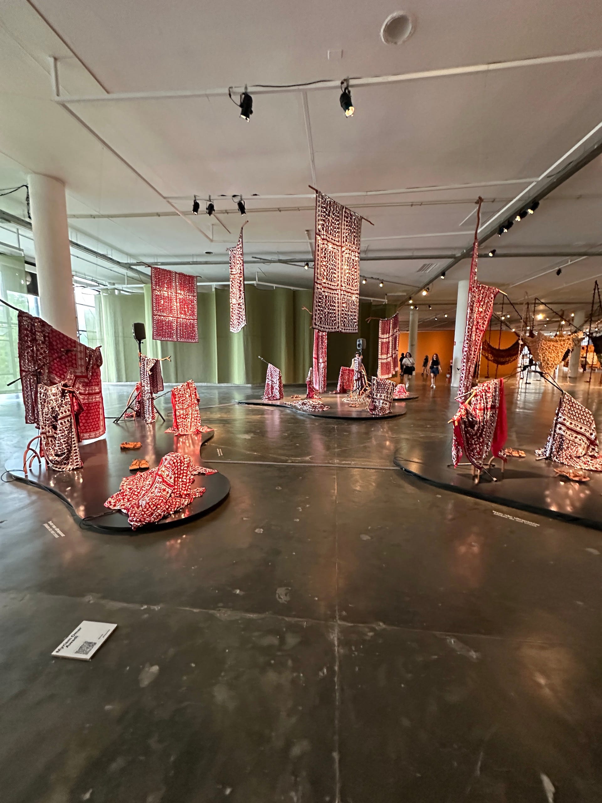
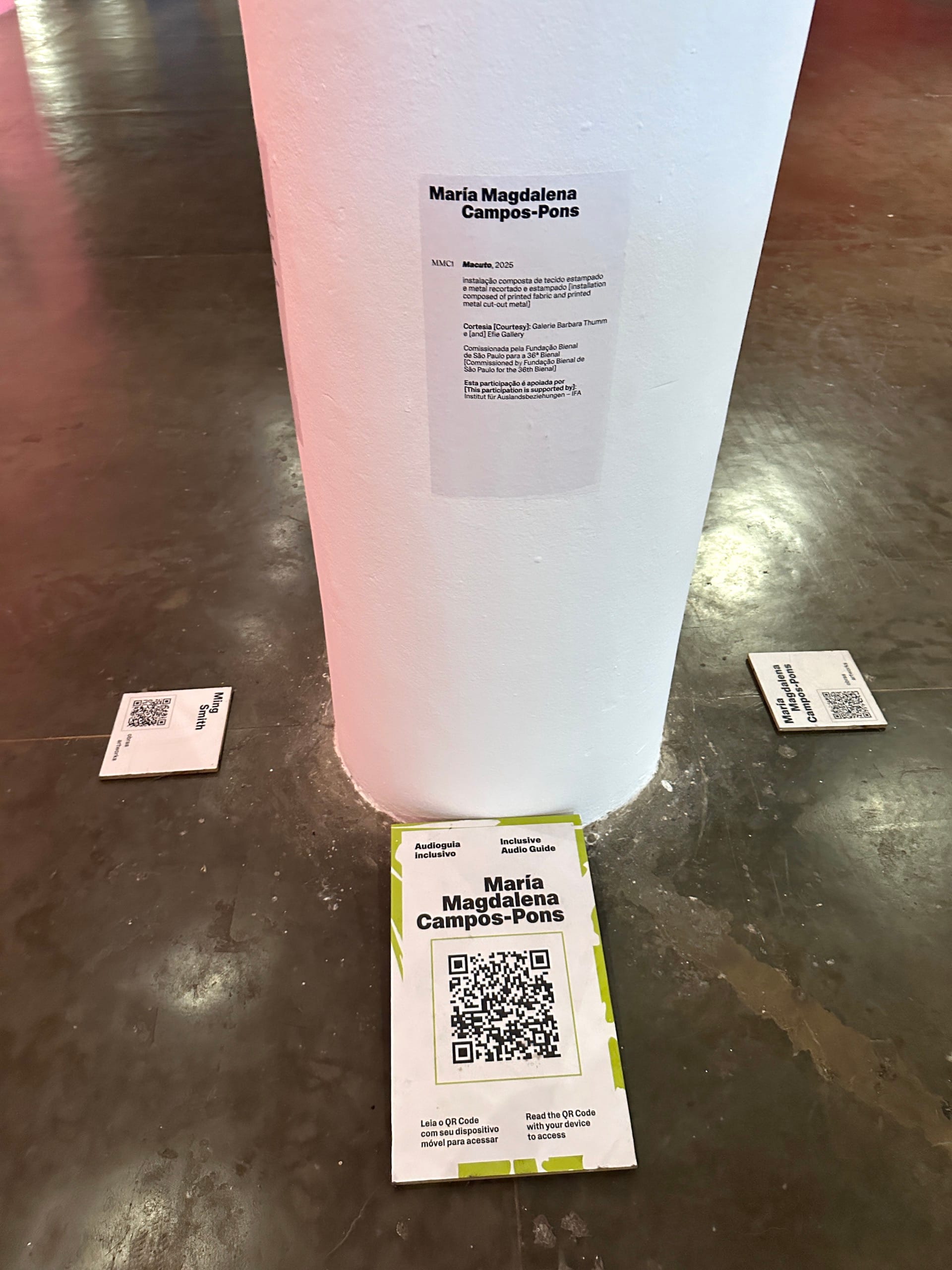
Placards with the artist’s name and a QR code were mounted on the floor. (I really hate QR codes and Bloomberg Connects, another digital tool used by museums to offer information about the art on their walls; they encourage me to stare at my phone when I should be staring at the art.) There were also labels listing the artist’s name, the work’s title and date, and granular information pertaining to medium — but more often than not, they were placed far from the corresponding artworks, or in hard-to-find locations, turning one’s experience of the exhibition into a scavenger hunt.
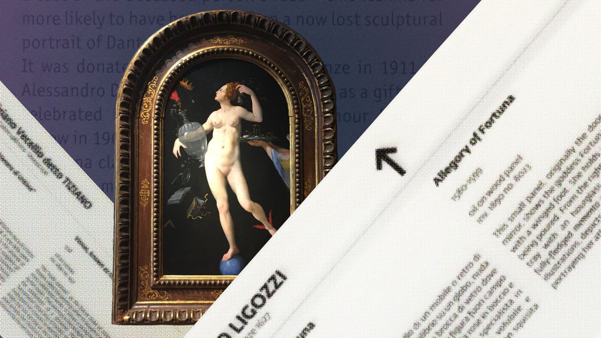
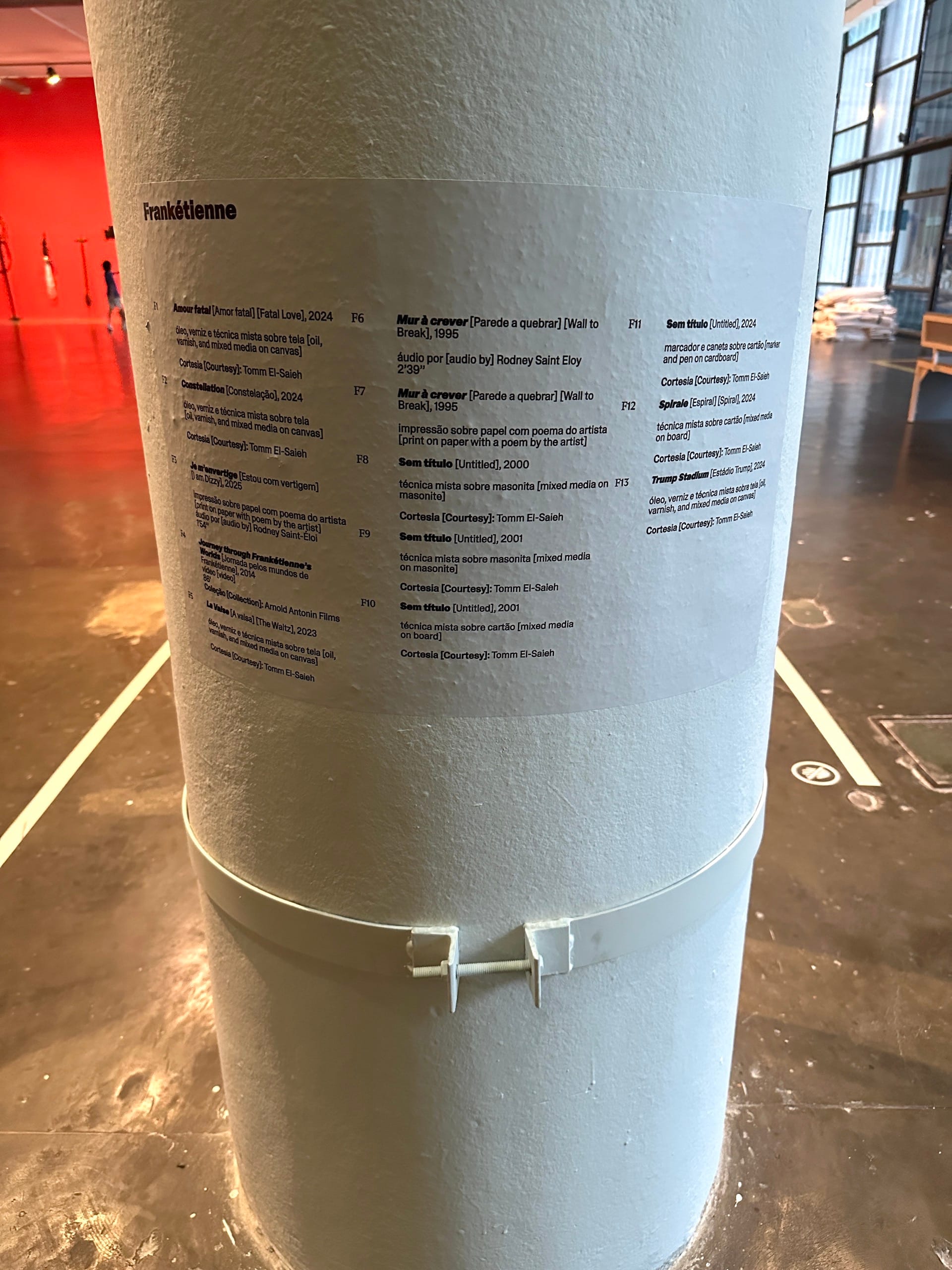
And then there were omnibus section texts for each of the show’s six “chapters,” pasted onto pillars or dividing walls, containing detailed information about every contribution — up to 500 words per artist. Times 125 artists, that’s 62,500 words — longer than my last two books combined. For comparison, museums typically limit “chats” (extended labels for individual artworks) to somewhere between 100 and 125 words, or even less, to avoid overwhelming visitors. Depending on the type of show, no more than 25–30% of the works on view will have these labels.
By making basic information hard to access while offering overlong section texts, the Bienal gave us both too little and too much. The organizers explained their strategy as a gambit to encourage a direct encounter between the viewer and the artwork — posing it as a democratic gesture that would deprioritize curatorial authority and acknowledge that many visitors, and some of the included artists, don’t read Portuguese or English — two colonial languages, in any case.
Examples of labels at the 36th Bienal de São Paulo (photo Aruna D'Souza/Hyperallergic)
Not everyone bought that argument. “The problem is that, in contemporary art, context is essential,” Fabio Cypriano wrote in Arte Brasileiros. “When curators withhold information about the works and the artists, they are reinforcing their own curatorial approach, which is a contradiction. Decontextualizing and dehistoricizing is practically a colonialist act.”
Not surprisingly, Cypriano’s charge that the curators — most of whom are African or Afro-Brazilian — were committing a “practically colonialist act” set off a heated debate in Brazil. Bruna de Jesus, a philosopher and museum educator, defended the decision, saying that “not everything needs to be written down, nor does everything need to be precisely stated; understanding and comprehension can happen in many ways, and estrangement is part of the process.” Fabrício Reiner followed up with his own split-the-difference assessment, sympathetic to the curators’ impulse but disappointed with its execution: “Far from fulfilling the curatorial intention, this estrangement acts in the space as communicative noise.”
For my part, I was struck by the many viewers who were not obviously art specialists — often parents who had wandered into the show with their kids from the park that houses the Bienal’s pavilion — who were examining paintings to make out the artist’s signature, presumably because this information was valuable to them. (One thing the Bienal gets very, very right is making the show free of charge and advertising that fact prominently on the pavilion’s exterior, resulting in a lot of casual visitors. By contrast, too many US museums that offer free admission bury this detail in the fine print.)
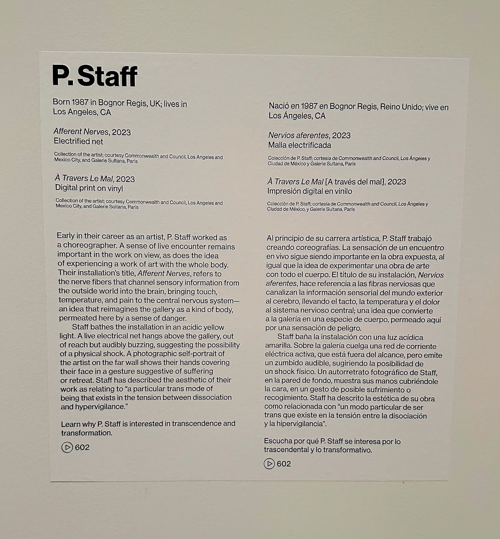
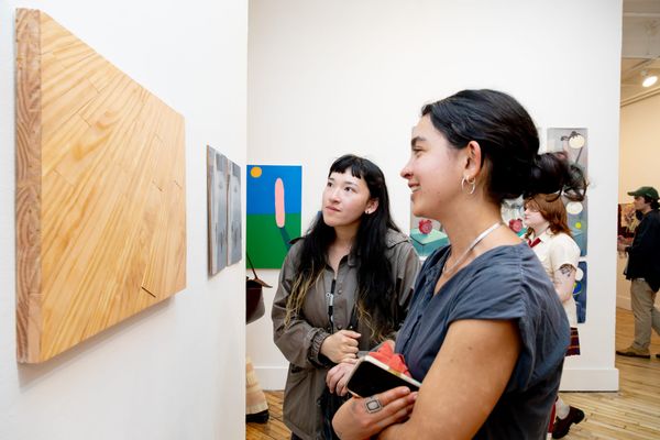
Left: Introductory text for the 2024 Whitney Biennial (photo Natalie Haddad/Hyperallergic); right: Whitney Biennial wall label for artist P. Staff (photo Aruna D'Souza/Hyperallergic)
I want to underline that what I am referring to here is not ideological content — an issue that is especially fraught in this political moment, as demonstrated by the White House’s March 27, 2025 Executive Order, “Restoring Truth and Sanity to American History,” which took umbrage at a number of exhibitions, including the Smithsonian American Art Museum's The Shape of Power: Stories of Race and American Sculpture. Notably, the EO didn’t describe any artworks at all; it focused solely on the content of the wall labels. Such issues of interpretation — and their political implications — have become all the more striking since Trump began his culture war, but they have always been sticky.
What I’m interested in is not so much interpretation as information — what’s helpful, what’s welcoming, what’s overwhelming, even what may be quote-unquote decolonizing when it comes to identifying and explaining art. Such debates are long-standing, and have developed as museum interpretation experts have honed their understanding of what visitors want and need to know about what they’re looking at, and have proposed best practices around those insights. And for me — someone who has written explanatory labels for museum exhibitions in the past, and who now very much relies on them as an art critic — the questions extend far beyond São Paulo or, indeed, any single show.
I spoke to Sara Bodinson, the director of Interpretation, Research, and Digital Learning at the Museum of Modern Art and an Association of Art Museum Interpretation board member, about what considerations go into developing exhibition labels.
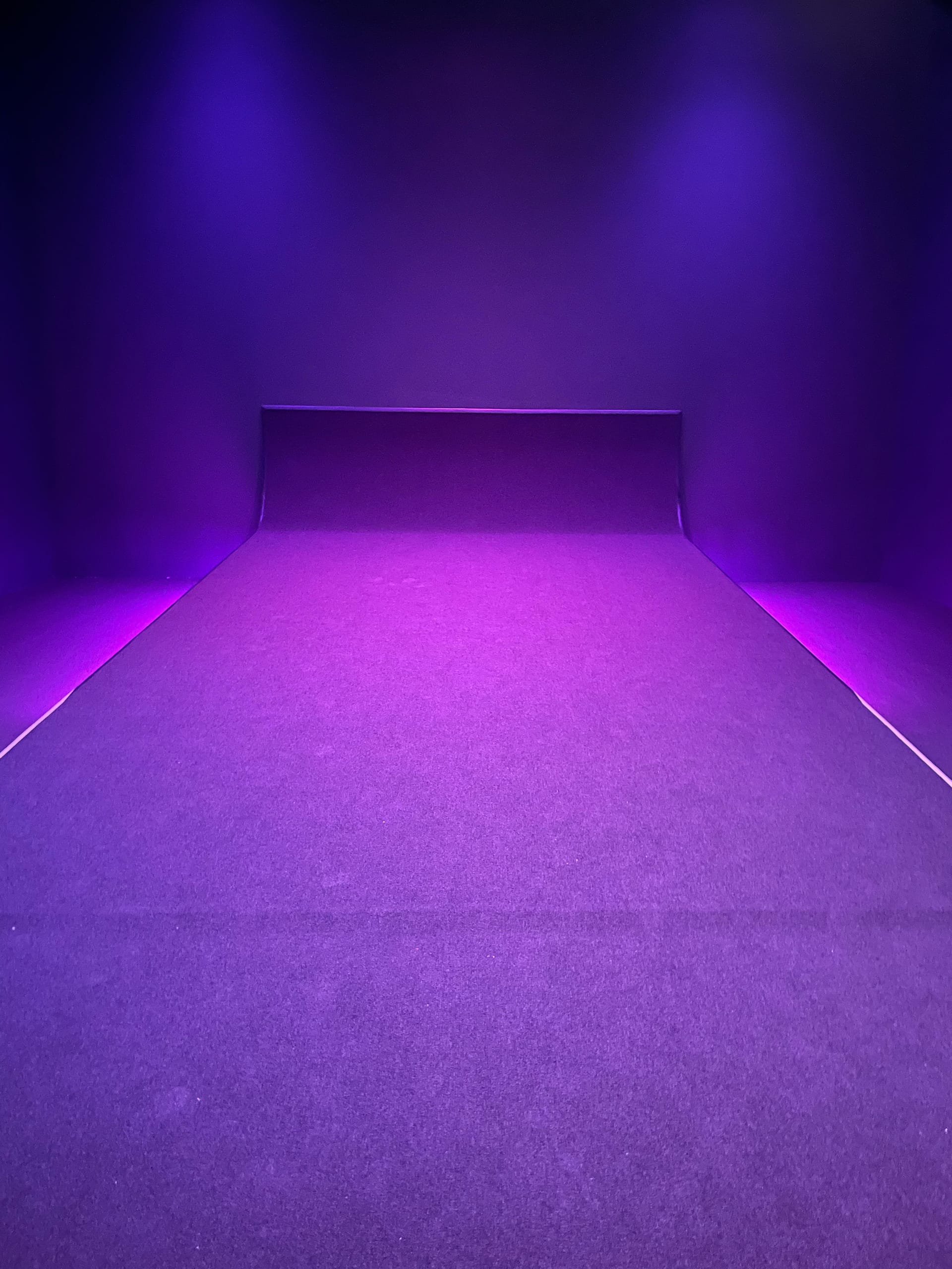
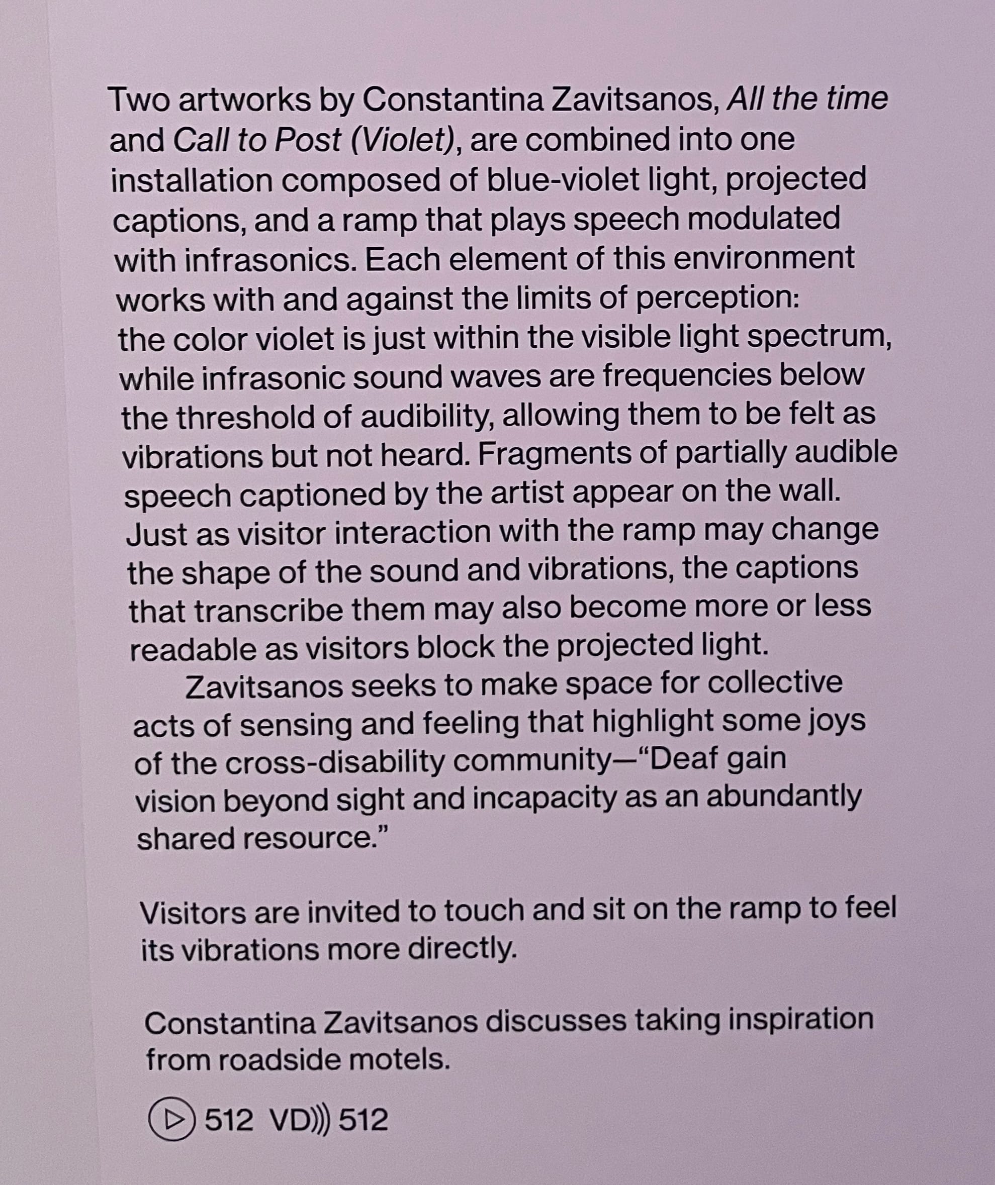
Installation view of Constantina Zavitsanos's "Call to Post (Violet) (2019/24) and "All the Time" (2019) in the 2024 Whitney Biennial, and accompanying wall label (photos Natalie Haddad/Hyperallergic)
At most institutions, wall texts are usually written by curators with the participation — to differing degrees, depending on the venue and type of exhibition — of visitor engagement specialists. MoMA, one of the best-resourced museums in the United States, has the advantage of employing a staff member dedicated to visitor research. “We literally interview people about what they want to know about works of art,” Bodinson told me. “It's been incredibly consistent over time: the top things are the artist’s inspiration and intention, materials and process, and social and historical context, in that order.”
Knowing, say, that MoMA’s museum-goers in general have little prior knowledge about modern and contemporary art, that 60–70% are visiting for the first time, that they are often coming from abroad with varying degrees of English fluency, and that the galleries are frequently crowded, has led the museum’s interpretation specialists to encourage curators to write short, snappy texts rather than long discursive ones. “You're telling one story,” she explained. “You're not writing five sentences that are all different.”
They also flag language that is too subjective. “Even though we're called 'interpretation,' we're really trying to create space for viewers,” explained Bodinson. “We shouldn't be saying anything that forecloses engagement. People want to find a way into the art through what the artists have said about their work — they don’t want someone telling them that this artwork is the best or that this is how you should feel about it.”
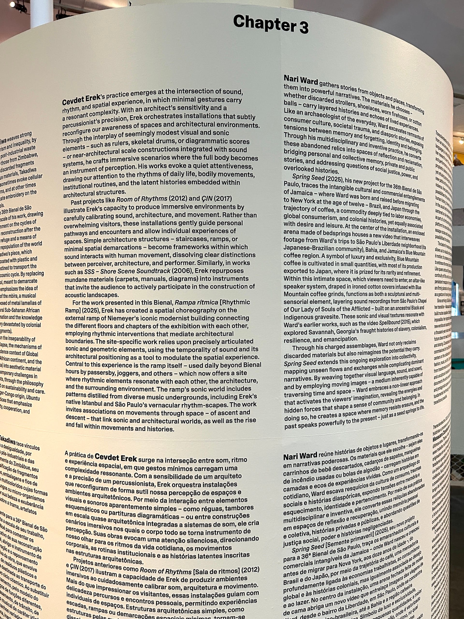
One of the detailed section texts at the 36th Bienal de São Paulo (photo Aruna D'Souza/Hyperallergic)
Many curators have long resisted the idea of tailoring their texts to viewers who are not well versed in art, or toning down theoretical language to make labels less intimidating, but perhaps also less rigorous; Ingrid Schaffner’s “Wall Text” was an important intervention into such debates in the early aughts, and offers a useful history of the genre. Yet the tide has shifted, said Bodinson. “I feel like we crossed the bridge of thinking that the use of accessible language is a form of dumbing down.”
Some museums have recently experimented with more radical and unique ways to modify their modes of address and the voices they want their didactics to highlight. For example, labels for a display called “Several Seats” in the Brooklyn Museum’s new installation of its American art holdings were co-written by drag and ballroom artists who were asked to “spill the T” on the elite subjects of 18th- and 19th-century portraits. (The goal, I think, was to make a room full of deadly boring images seem important enough to confront in the present — though I’m not sure any amount of sassiness could accomplish that.) MoMA and other institutions, including the Weatherspoon Museum at the University of North Carolina at Greensboro, are also experimenting with “community voices” — labels based on observations by the subjects of the artworks, or by people from outside the curatorial or education branches of the museum, including members of the public.
For biennials in particular — whether the Whitney or São Paulo — or other shows that include commissioned work, an added complication is that labels must often be written before a piece is created, and thus depend tremendously on how the artist describes it both visually and conceptually. What this all comes down to is not simply the question of who a museum imagines its audience to be: absolute neophytes; those educated, but not in art; art mavens; artists and art critics; people who come from different backgrounds and carry different experiences of the world. It’s also a matter of what the institution thinks it owes that audience. A stripped-down version of art that equates “accessibility” with providing the bare minimum of information, or even dispensing with labels completely, so as not to overwhelm? Or does it owe the audience the respect of challenging them, offering them the tools to speak the same language as the artists and curators, whether the show is on American modernism or ancient Chinese bronzes?
In the end, I like Ingrid Schaffner’s formulation: “As much as possible, the label should appeal to someone who knows more, less, and as much as you do” — in other words, it should speak clearly and cleanly, neither hovering over the heads of a newcomer nor below the feet of a pro. This is not an easy task, but it seems to me that it’s an urgent one. Wall texts are among the most direct ways that institutions speak to their visitors, and demonstrate hospitality toward them. I think that’s what bothered me so much about my experience at São Paulo: While a sense of utter generosity, both conceptual and practical, permeated the show, this often overlooked, but very important, mode of address was left out.