The Timeless Beauty of Ugly
Lost and hungry is not a good combination. Imagine driving in an unfamiliar place, stomach growling … many miles ago you’ve dropped all your pretenses about needing to eat all-organic food … the urgency of hunger is upon you … suddenly you see it, a huge billboard with the words: MCDONALD’S NEXT EXI
Lost and hungry is not a good combination. Imagine driving in an unfamiliar place, stomach growling, and not exactly sure how close or far away you are from any landmarks. Many miles ago you’ve dropped all your pretenses about needing to eat all-organic food and your concerns about maintaining your diet. Your diet has been compromised. The urgency of hunger is upon you. The onward-stretching road seems like a dim and unhappy place, and you’re starting to wonder if previously chewed gum still contains enough calories to sustain your energy.
Then suddenly you see it, a huge billboard with the words: MCDONALD’S NEXT EXIT. At that moment, you’re probably not thinking about the fact that it’s typeset in Arial without consideration for negative space, that it lacks attractive colors or that it’s just not a very nice-looking billboard. No, all you see, blazing from atop the trees and urban wasteland, is a glorious sign from God telling you all you need to know at that very moment.
Now, if said billboard had been dressed up with lovely graphics, scripty fonts, beautifully-lit interior photos, and text describing their new value menu in great specific detail, you may not have noticed it. You’d still be driving along, wondering how you’re going to find a place to eat. The ugly billboard has arrested your attention by screaming essential information to you as plainly as possible.
Sometimes, ugly design is really what we’re looking for.
While the definition of ugly is subjective to some point, there is a collective understanding of what is pretty to look at versus something that gets the job done. The kind of ugly we’re talking about here isn’t about what’s in or out of vogue. It’s a visual product demonstrating the essential purpose of design: to communicate and get a point across.
This is where we start to see the two different priorities in design. Form versus function. Form being “oh, this is lovely” and function being (as Larry Cable so eloquently puts it) “git er done.” Ugly falls into the category of function by default, while beauty is the form which builds upon it. For those who are dessert-lovers, let’s just say that “pretty” is icing on the “ugly” cake.
Function must proceed form. Design and creative briefs almost always begin with a statement of purpose and desired message. Not a checklist of color palettes, typographic choices or whatever. Those design elements are absolutely a part of it, but are subsequent to a higher priority.
I sell potatoes. My primary objective is to have you buy my potatoes, and I don’t care if you paint “POTATOES” (or “POTATOS” for that matter) on wood or metal or on your torso or just paint an image of a potato — I just want people to know I’ve got potatoes.
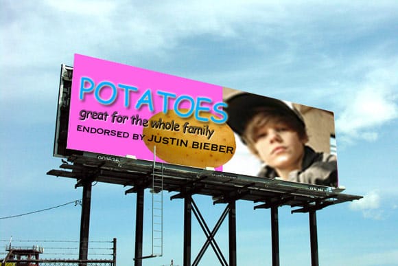
But suppose potatoes become endorsed by Justin Bieber for some weird reason, and they become the hottest ingredient in town. Kids and teenage girls go crazy over french fries (I know, it’s a stretch), hash browns, baked potatoes, perogies, potato chips, you name it. So I paint my sign in bright colors, slap some Comic Sans on there with a blown-up pixelated image of Bieber’s face that I found on Google Images.
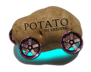
The potato fad gets picked up by Dolce & Gabbana, and potatoes become the new statement of the year. I drop the family-friendly look and hire someone to design an immaculately-kerned Potato Sans for my unique typeface, which will be etched onto pristine sheets of high-polished platinum.
By now, potatoes have risen in value to the point that they’ve flooded the stock market. What goes up must come down, so inevitably the potato market becomes ruined and no one wants them anymore. What else can a poor potato-seller do? So, I find the largest surface-area possible and paint in big red letters, POTATO LIQUIDATION SALE ALL SPUDS MUST GO 90% OFF ALL MERCHANDISE.
Bankruptcy ain’t pretty. Neither is my sign, but in the end, I just want people to know that I’ve got potatoes.
Obviously, this is a ridiculous analogy, but in design (signs or not), getting a message across is the ultimate goal. Graphic trends come and go; beautiful or in vogue styles are afterthoughts that eventually fade or are replaced by other fashions. Designs remaining steadfast for so many years are often the ones that are unashamedly base and cut out the frills. You can’t negate the worth of beauty for utility, but when you’re starving and lost, function always triumphs over form.

