Printing and Process: A Report from the NY Art Book Fair Conference
The New York Art Book Fair's seventh annual conference, a two-day event full of dialogues concerning the art book, is a distinguished gathering of bibliophiles looking to dissect each inch of paper at their disposal.

The New York Art Book Fair’s seventh annual conference, a two-day event full of dialogues concerning the art book, is a distinguished gathering of bibliophiles looking to dissect each inch of paper at their disposal. Tell them hunks of paper are worthless — they’ll prove you wrong! I attended the second day of the conference, eager to hear scholars discuss several of my favorite topics: livres d’artistes, photo books, analytical criticism of books, and the procedural musings that artists and writers encounter in the creation of said books. Below are my condensed and edited notes, breaking down the seven hours of intellectual overload as efficiently as possible.
* * *
The Re-Materialization of the Art Book: Contemporary Livres d’Artistes
Participants: Sheelagh Bevan (Morgan Library), Jenni Quilter (NYU), Maddy Rosenberg (Central Booking)
Background: Technically the livre d’artiste is a collaboration between a writer and an artist, often sold at high prices due to small, or even single, editions and traditional, laborious printing modes such as letterpress.
The Gist: The general consensus from this panel was that the components of an artist’s book should allow the mind to create associations. Time is money, and livres d’artistes often take an excruciating amount of time to create because of traditional (moveable type) printing and/or one-of-a-kind artwork. An understanding of process is helpful.
Highlights: Quilter linked reading children’s picture books to the thrill of artist’s books: one submits to “glancing, not reading,” moving at a rhythm that may differ each time and “invites the small revolution.” Quilter mentioned that these books often become “self-righteously precious,” but they can also consider controversial issues with an ambiguity or conceptualism that allows one to think outside the box. She discussed Kiki Smith and Leslie Scalapino’s collaboration The Animal Is in the World Like Water in Water, a handmade edition that draws attention to violence and the universality of primal urges. Smith contributed graphite drawings of a woman being gnawed and mangled by a beast that’s oddly self-aware, and Scalapino wrote propositional phrases of maddening repetition.
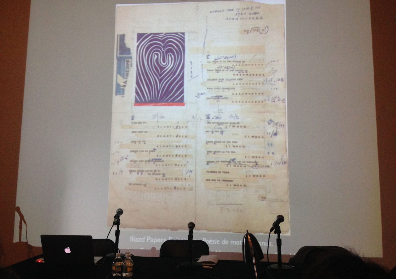
With high production values, a livre d’artiste can be a kind of magnum opus. Bevan spoke extensively about Poesie de mots inconnus, published between 1949 and 1951 in fewer than 200 editions by Iliazd, a Georgian artist, writer, and publisher. He was associated with the Russian Futurists and focused on altering text (both on paper and through performance) by publishing authors of zaum, a poetic language of grunts and sounds that fill the space between words. Iliazd moved to Paris in 1920, but when the Surrealists and Dadaists accused him of butchering language, he knew he had arrived to the scene too late. French Lettrism arrived in the 1940s, toying with many of his same ideas, and sparked a fire in Iliazd that rallied him to publish Poesie de mots inconnus. Featuring writing from by poets such as Arp, Artaud, and Schwitters and imagery from modern renegades including Giacometti, Chagall, Braque, and Matisse, this book was the ultimate flex. The hand-printed volume was a chrestomathy, meant to teach others the way of zaum and shut his protestors up. Each edition was transcribed by hand.
Rosenberg spoke about a recent exhibition she curated at the Center for Book Arts entitled Livre d’Artiste d’Aujourd’hui: Interdisciplinary Collaborations, which included transformations of the book form that take the shape of a ruler of micro-poetry and a wearable narrative, among others. A reminder that perhaps the most important characteristic of this genre is thinking outside the box.
Photo Meets Text
Participants: Russett Lederman (moderator, 10×10 Photobooks), Brad Zellar (writer), Nicholas Muellner (writer and photographer)
Background: This conversation was all about the relationship between photography and text, what Lederman called new narrative “mash-ups.” She saw no distinction between a primary and supporting role anymore: text is not an ancillary description, and images are not used to illustrate the text; rather, each contributes unique insights. She discussed “research as a part of storytelling” and allowing photography to provide a “factual account for fictional dreams.”
The Gist: Zellar went on an endearing rant about photographers who demean text in photography books. He argued that text provides a point of expansion and that many of the greatest photobooks have text in some capacity beyond captions. Despite being a slice of reality, a single photograph provides an opaque, perhaps guarded, insight. Even with image sequencing, tone is rarely transported completely from the photographer’s eye to the reader’s without mutation. Is it possible for a viewer to absorb a photograph neutrally, without her own bias? I think it’s nearly impossible. Perhaps writing is a way to force viewers to humor poetic, conceptual, or unrelated narratives and to debunk their presuppositions.
Highlights: Muehllner, who allowed the “persistent silence of photographs” to “stand in for what [he didn’t] want to say,” noted that words often add complexity without disarming the loaded layers of a photograph. In the cases where he both photographed and wrote fiction surrounding images, he compromised on both. Separately contributed writing and photography create suspense, an overlapping yet mysterious narrative — an invisible silk web supporting the creature that is the photobook.
Zellar, a bibliophile and photobook nerd since his teens, couldn’t imagine photographs without text — he admitted to acquiring blueprints for his writing, grounds for storytelling, through photography. In her introduction, Lederman mentioned The Americans by Robert Frank, first published in France in 1958. The original publication included contributions by several writers, among them Simone de Beauvoir and William Faulkner, as an introduction, providing a sociological platform for reading the photographs. The American version, published a year later in 1959, included more sensory prose by Jack Kerouac. Zellar’s current narrative strategies rely more on fictionalizing his surroundings, captured by Alec Soth in their collaborations through Little Brown Mushroom, a publishing house they started with several other artists in Minnesota.
Furthering the Critical Dialogue
Participants: Tony White (moderator, Maryland Institute College of Art), Leslie Atzmon (Eastern Michigan University), Cynthia Marsh (Austin Peay State University), Emily McVarish (California College of the Arts)
Background: Tony White noted in his introduction that this was the first year since 2008 that the Critical Dialogue session was dedicated not to a book but to an artist: Phil Zimmermann, an advocate for varied printing methods. Zimmermann was at the forefront of the modern artists’ books and their significant transformations in the 1970s. When technology sprinted toward more mechanical and affordable methods of printing and production, he was as visionary as he was efficient.
The Gist: The most successful artists’ books are three-dimensionally assaulting. They physically intervene in your experience of reading, encourage you to fumble through associations.
Zimmermann was not only on the frontier of artists’ books, but continues to approach the medium with an outlook that’s grounded in human experience. Many of his books, even those that are personal in nature, have a distinct tension — disorienting imagery and patterns, contradictions between text and images, and the multiplicity of ways the books can be handled and read in space (forward, backward, etc). He forces the reader to take time and to look/listen.
Highlights: Atzmon’s presentation on Nature Abhors stressed the palpable significance of Zimmermann’s structural understanding and the design mechanisms he used to connect narrative nodes. The book’s spine-like binding creates “physical sensations and mental impressions” that anthropomorphize the object. Atzmon compared the accordion-bound volume to a body writhing in pain from a lost love, finding distractions and relief only momentarily. She added that the desert appears as a recurring element of human suffering and struggle.
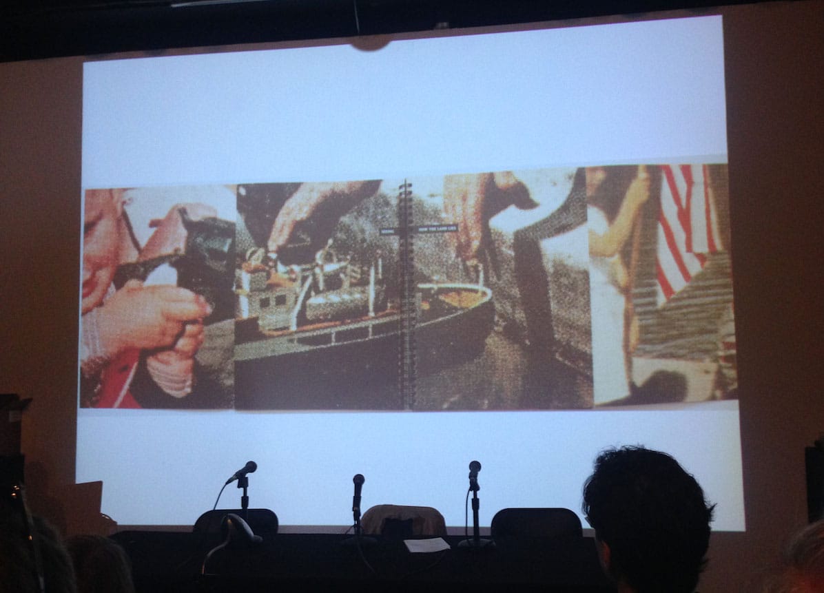
Marsh was a classmate of Zimmermann’s at the Visual Studies Workshop in Rochester, New York, in the mid 1970s. Zimmermann was obsessed with technology and how it factored into craft. She spoke of his printing manuals, self-published instructional bibles culling methods and techniques used by his fellow innovators at the workshop. She spoke about Long Story Short, a study of close-ups from LIFE and other 1950s publications of “the perfect life” rendered halftones. Unlike the traditional halftone, which illustrates a continuous tone with dots that reduce in size as color diminishes, Zimmermann’s halftone dots are all the exact same size. Marsh noted the “inverted truth” of the book — the dots may be technically imperfect, but the images they illustrate are faultless ideals. The seemingly guileless fantasy is much more complicated up-close.
McVarish dug deeper into Long Story Short, looking further at the “chains of association and narrative progression” that occur in Zimmerman’s positioning of clichéd gerund phrases atop the photographs. Every other page, words appear on the photographs, often near the gutter or edges of the page. Those pages open from the spine to reveal four additional photographs with additional words; “Beating/Around the bush” leads to “Beating/A dead Horse,” for example. Predictable phrases morph throughout the book, sometimes split between pages as well, forcing the viewer to consider the juxtapositions in the face of the ingrained clichés. The text, however, has no speaker and thus, McVarish noted, lacks perspective and intimacy. The reader must renegotiate the terms for herself.
Keynote: R.H. Quaytman and Susan Howe
Participants: May Castleberry (moderator), R.H. Quaytman (artist), and Susan Howe (poet)
Background: The MoMA Library Council has a publication program that pairs a writer and an artist for the creation of an artist’s book or edition at least every other year. This is the first time, according to Castleberry, they’ve formulated a team that shares genes — in this case, mother (Howe) and daughter (Quaytman). The pair’s book is called TOM TIT TOT.
The Gist: TOM TIT TOT is a hand-printed book of word collages and poems. About five different techniques were used in printing, while every word was cut from another source, including fairy tales, The Secret Languages of Ireland, and many others. They are “words as still life” according to Quaytman.
Howe also expressed an interest in artist Paul Thek’s extensive use of writing over painting on newspaper, and what the words underneath sound like as opposed to the ones above. She is working on a series of writings based on his retrospective at the Whitney Museum in 2010.
Highlights: Howe obsessed over fairy tales during a residency at the Gardner Museum, and the title of her collaborative book with Quaytman comes from an English fairy tale.
Howe read from TOM TIT TOT, and the effects were almost Lettristic: repetitive, abrasive, harsh. There was a notable increase in speed during more sound-oriented, syllabic passages but also an ethereal mystery to slower, more punctuated words.
Quaytman went through Paul Thek’s diaries for his retrospective at the Witte de With in 1995, so she too has a deep-seated connection to his layering. She mentioned that, in this project, she was “looking for things that were unknown, and open in their unknowing.”
Both Howe and Quaytman showed a noted interest in lost names, origin stories, and the mystery of structuring time. These were just some of the things they had in common, as well as their ability to recognize themselves in the other.
The 2014 New York Art Book Fair Conference took place September 26–27 at MoMA PS1 (22-25 Jackson Ave, Long Island City, Queens).


