Norway's Currency Goes Abstract
Ah, Norway. Land of universal health care, widespread wealth, true democracy, and excellent design. In keeping with that last one, the country's central bank unveiled plans this week for some of the coolest currency we've seen in a long time.

Ah, Norway. Land of universal health care, widespread wealth, true democracy, and excellent design. In keeping with that last one, the country’s central bank unveiled plans this week for some of the coolest currency we’ve seen in a long time.
Norges Bank announced on Tuesday the results of a competition launched in the spring to design new banknotes. “The purpose of the competition was to arrive at a proposal that can be the artistic basis of the new banknote series and communicate the theme ‘The Sea’ in an appropriate manner,” according to the release.
The technical winner of the competition is graphic designer Enzo Finger, who placed a series of seabirds on the fronts of the bills, which, in a twist, he turned vertical. Finger’s proposal “communicates the theme in a surprising way with considerable artistic flair,” the jury found.
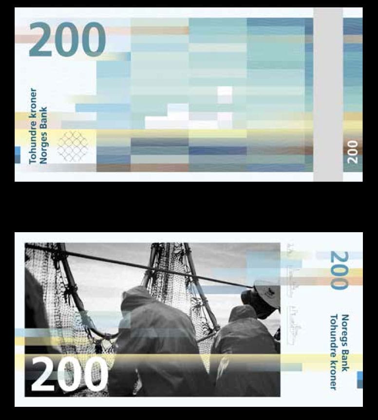
But that wasn’t enough to get him on the actual currency. For that, the jury selected two other designs: The Metric System and Terje Tønnessen’s “Norwegian Living Space” and Snøhetta’s “Beauty of Boundaries.”
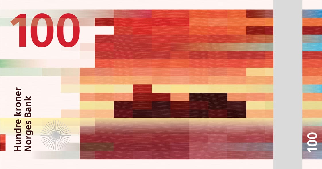
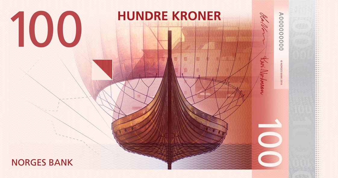
The Metric System will get the face of the new currency, on which they’ve placed symbols of the ocean and how the country uses it: a lighthouse, fish, boats, a cresting wave. It’s not, honestly, the most exciting, but it’s a nice break from stultified portraits of a given country’s leaders. Snøhetta, the firm responsible for such high-profile sites as the Library of Alexandria in Egypt, the National September 11 Memorial Museum Pavilion, and the Oslo Opera house, gets the back of the currency, on which it’s placed heavily pixelated images of the coastline. In its explanation of the design (translated roughly with the help of Google), Snøhetta writes that the images are based on the Beaufort scale for measuring wind, so lower monetary amounts mean weaker gusts and smaller, square pixels, which become long, rectangular blocks of color as the value of the notes increases. It’s a gorgeous design that manages to be notably different from most currency, seemingly timeless in its abstraction, and yet uniquely current, given the pixelation and affinity with computers and net art.
The final banknotes won’t be ready until 2017 at the earliest, but in the meantime Norges Bank is exhibiting all of the competition designs at Grafill in Oslo through October 26. You can also browse them in a document available online.


