Matisse’s Garden of Problems: The Cut-Outs at MoMA
The much-heralded exhibition of Matisse cut-outs currently at the Museum of Modern Art was previously at the Tate Modern, with a few less items than here, but it broke all attendance records and was open all night in its final days.
The much-heralded exhibition of Matisse cut-outs currently at the Museum of Modern Art was previously at the Tate Modern, with a few less items than here, but it broke all attendance records and was open all night in its final days.
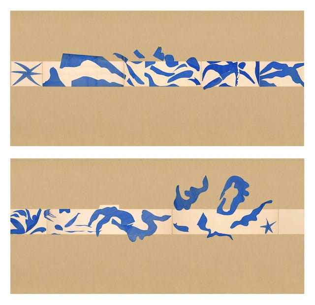
At MoMA, in the first rooms of the exhibition, where smaller works dominate, there is an attempt to arrange some of the compositions as they were situated by Matisse’s assistants, under his direction, in his apartments. This is followed by the extraordinary blue nudes, which this exhibition (here as well as at the Tate) collects together for the first time. One then proceeds to the refurbished “The Swimming Pool” (1952) that once wrapped around three walls and over the doorway of one of the artists’ rooms in the Hôtel Régina in Nice.
In this section, there are photographed illustrations of how the burlap backing that also functioned as a border was restored to its original color. As one enters the “Swimming Pool” room, reconstructed to the exact proportions of the apartment, one expects a bit of a color jolt from the cobalt of the swimmers against the ochre of the burlap, but the contrast seems a little off. The cut-paper figurative elements look faded mostly on the far right end as you enter the room (as laid out in the catalogue double-fold-out it’s on the far left).
The final rooms hold the largest works, transferred, after Matisse’s death in some cases, from the hotel walls to canvas. Here, glass panel protectors, not a problem earlier, are intrusive, distancing the viewer from the larger works. The final study, “Large Decoration with Masks,” from 1953, is particularly distorted by the large gap between it and the viewer as well as the impossible-to-ignore seams in the glass panels. This was unexpectedly dismaying because I remember first seeing it installed in its permanent home at the National Gallery a number of years ago and it took my breath away.
In Washington, as I remember it, the work was at the top of a stairway, hung high and open. I was able to have a visual and physical relationship with the slight changes of surface taking place between the pieces of cut paper, paper background and canvas mounting. In any case, it breathed.
The variations in color, shape and pattern shifted slowly, kinetically, as I took in the rock-solid construction of this monumental, ephemeral … thing. It is listed as a study for a ceramic wall but registers as a fully achieved mural-sized picture, realized at around the same time that mural-sized paintings were beginning to appear in Jackson Pollock’s studio in the US.
All the work is strange. Joy, as Peter Schjeldahl observed, was Matisse’s sole idiom. This remarkable simulation of it was produced by a driven, enormously intellectual sensibility that has willfully surrendered to the sensual. According to Marcelin Pleynet, Matisse “took as his point of departure the irrationality that he declared was constitutive of painting.”
No artist was more constantly aware that a painting is a surface of reflected light. Matisse was the master of tactile color as it intersects with airy light. As in his paintings, color is here transmitted via the brushy gouache surfaces of the paper cut-outs (assistants painted the paper in the later works) permitting light to come through.
Clement Greenberg characterized Matisse’s paint surfaces as “indifferent,” a blandness that undergirded his radical experiments with pictorial color, pattern, and representation. Matisse’s touch carried color carefully, varying saturation, speed and character. He stated that brush marks in painting could be considered a decorative element. Even when bare canvas was re-exposed through rubbings out, the light and texture of the support were of use to him. One hardly ever detects a demonstrative flourish. Matisse’s emotion was transmitted through his interpretation of what he was painting.
So there seems to be a logic to Matisse’s advancement to cut-paper. From his codification of the impersonal brushstroke mark to the introduction of a mediating tool like the scissors, his work comprises a further obliteration of the boundaries of color and drawing. Matisse’s use of scissors anticipates Pollock, Hans Hartung, Simon Hantaï, Helen Frankenthaler and Morris Louis, among others, in the use of an intermediary process (such as pouring paint or folding the canvas) in order to distance the artist’s hand and brush from the picture.
Greenberg also observed of Matisse, “Great artists are just as unaware of their strengths and weaknesses as the rest of us.” Interestingly, one of Matisse’s first forays into establishing the cut-outs as a viable form was a disappointment to him. Where previously he had used painted paper to work out his Barnes mural commission (1932-33) and a stage curtain design for the Ballet Russe production of Rouge et Noir (1939), and utilized it in designs for several book covers, his next project in colored cut paper, Jazz (1947), a book of stencil-printed pochoir plates, he deemed a failure.
The originating cutouts showed the working process: the pinholes; changes in color intensity due to uneven application of gouache onto sheets of paper. In the published book, all the slight alterations in the ground, which brought a “sensitivity” to the fore, were absent. The problem of how to interpret these colored paper compositions as works in themselves put Matisse in a position similar to where James Bishop found himself some years later. Bishop said he found that his works on paper were more complex than his paintings.
But Matisse continued, and not, I suspect, because his invalid state did not allow him to paint, but because the odd patches of perforated, brushed and cut papers were in fact the stuff of painting by other means. The works are filled with Mediterranean air and light, reflecting the place where he discovered his forms. In an interview published in 1943, he said to Louis Aragon, “An artist’s importance is measured by the number of new signs he has introduced into plastic language.”
The inventiveness and innovation on display at MoMA is astounding. Technically, it is also somewhat surprising that each cut-out is unique. Matisse really was painting with scissors. The longer one looks, the painterliness and Impressionist light arrives. The cuts do not follow the form; they surround mass and locate it in atmosphere. In the blue nudes there is fluidity between background and figure, buttressed by shards of inexplicable space. Here Matisse was continuing to merge traditional European oil painting with elements from other cultures, Islam being particularly in evidence.
Incidentally, from this perspective, moments in this show simply look racist. Four pages of the accompanying catalog are devoted to studio shots of a cut-out figure of Josephine Baker semi-abstracted into an oversized “Amazonian,” as the catalog refers to it. These images as well as such compositions as the carefree, grass-skirted “Creole Dancer” (1950) make one cringe.
And of course his Orientalism is everywhere, originating in his enormous debt to Delacroix’s “Women of Algiers” (1834). Matisse’s entire career was spent unpacking this painting. The lassitude, the availability of the women of the seraglio, the African servant, the patterned draperies and garments, the textures of flesh against fabric, shining metal and Mediterranean light appear throughout his career, finally synthesizing into a concept of the picture as a piece of decorative cloth. When that decorative cloth seems about ready to drift off its stretchers, the cut-outs take over.
As is always the case with Matisse, serious study yields ample rewards. But for all of Matisse’s subsequent influence, one wonders at the same time what exactly is the legacy of these late cut-outs.
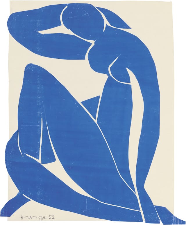
The scuffing on the surface of some of the cut papers, as in “Blue Nude II” from 1952, for example, makes the piece look as contemporary as a Wade Guyton. The circulation of the book Jazz informed later work by the New York School of graphic designers such as Paul Rand and Ivan Chermayoff, as well as the film titles of Saul Bass. It’s a safe bet that Barnett Newman looked closely at these collages when they were first shown at Pierre Matisse gallery in 1949. The clean edges and clear jumps from one color field to the next in these works were found nowhere else at this time.
The Côte d’Azur-based Supports/Surfaces group of artists benefitted most directly from the legacy of the late works. Active largely in the south of France, they saw them earlier than Paris-based painters. Also, Matisse’s final act — applying the efficacies of fifty years of painting at the highest level to a social project like the Vence Chapel(1951) — set an important precedent for the political and social engagement of the young group. In addition, Matisse’s work with cloth, tapestry, vestments all pointed toward the beginnings of the deconstruction of the painting object. Jean Fournier, the most artistically influential postwar French gallerist, who handled some members of this group, is said to have remarked after seeing some of Matisse’s cut paper shapes pinned to a cloth background that they were an awakening to his understanding of where painting could venture.
Closer to home, the two artists most credited as being influenced by Matisse’s late work are Ellsworth Kelly and Richard Tuttle. It seems somewhat ironic that this most painterly of painters would be interpreted by artists who are both essentially polychrome sculptors.
Tuttle’s work, for all of its beauty, is made up of a collection of details, and no composition by him has ever approached the generality of emphasis that unifies the pictorial-ness of each of Matisse’s later cutouts. But both of these artists are post-utopians, problematizing the unity of these pretty patches of cut color. Tuttle realized an art of sequences, fragments, openness and contradiction, utilizing the lessons of Matisse when it suited him, almost like an apprentice chef with his own ideas.
With Kelly, whom this writer has long admired, this show seems to have forced a referendum on the porousness of the surface that so distressed Matisse upon discovering that it had gone missing in the plates of Jazz. In contrast, Kelly’s paintings, reliefs and freestanding sculptures take Matisse’s disjunctive color cuts into a realm of solids. As Harold Bloom observed, the artist must misread the great work that preceded him in order to move on. Bloom called this a “correction.”
Kelly, as demonstrated by recent exhibitions of his collage-studies, is aware of the immediacy and expressiveness of this methodology, but chooses to recast them in grander mediums. One of the many interesting things about Matisse was how very little of his production involved changes in scale, projects, and translations from one medium to another, the chapel being the biggest exception. His general avoidance of this activity points to his attention to how paintings and drawings speak to the sense of touch through the eye.
In both Tuttle and Kelly this frontality, this direct engagement with the individual beholder that remained of such importance to Matisse has been discarded. Tuttle’s work is performative: every element is present in a non-relational way. Composition is not his concern, only presentness. Kelly on the other hand, while seeming to adhere so closely to the cut-outs, returned them to painting with mixed results. While there seems to be a complete experience when looking at a Tuttle, with Kelly there appears to be something lacking, especially as the work moves closer to the present. The reliefs, perhaps unique to Kelly as a genre, seem to transmit an idea about the pictorial without embodying it. They appear derived from a cut paper fragment, perhaps derived from an organic form.
Kelly chose to make these works on subtly shaped canvases or steel with uninflected opaque color. If Chermayoff and Co. translated the simplified forms of Jazz and other works into a corporate typography, Kelly appears to be making emblems that convey a nostalgia for the Matisse of the cut-outs. Once again, thinking of Kelly, one realizes that there is very little of Matisse that relies on sheer elegance, but with Kelly it’s a mainstay.
It took Blinky Palermo to ‘correct’ Kelly’s Matisse-collage color bands into his Stoffbilder (Cloth Pictures), which are so influential to current painting. If you’re looking for the great, great grandfather of the so-called provisional painting movement, with its interest in materiality, spareness and unity, his works are hanging on the walls of the Modern right now.
Henri Matisse: The Cut-Outs continues at the Museum of Modern Art (11 West 53rd Street, Midtown, Manhattan) through February 8, 2015.


