The Centennial of Centaur, a Modern Typeface that Revived a Classic Design
The Grolier Club celebrates a century of Bruce Rogers's Centaur type, the "noblest Roman of them all."

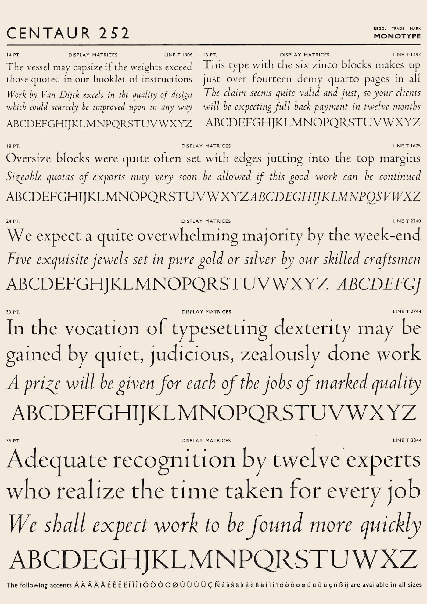
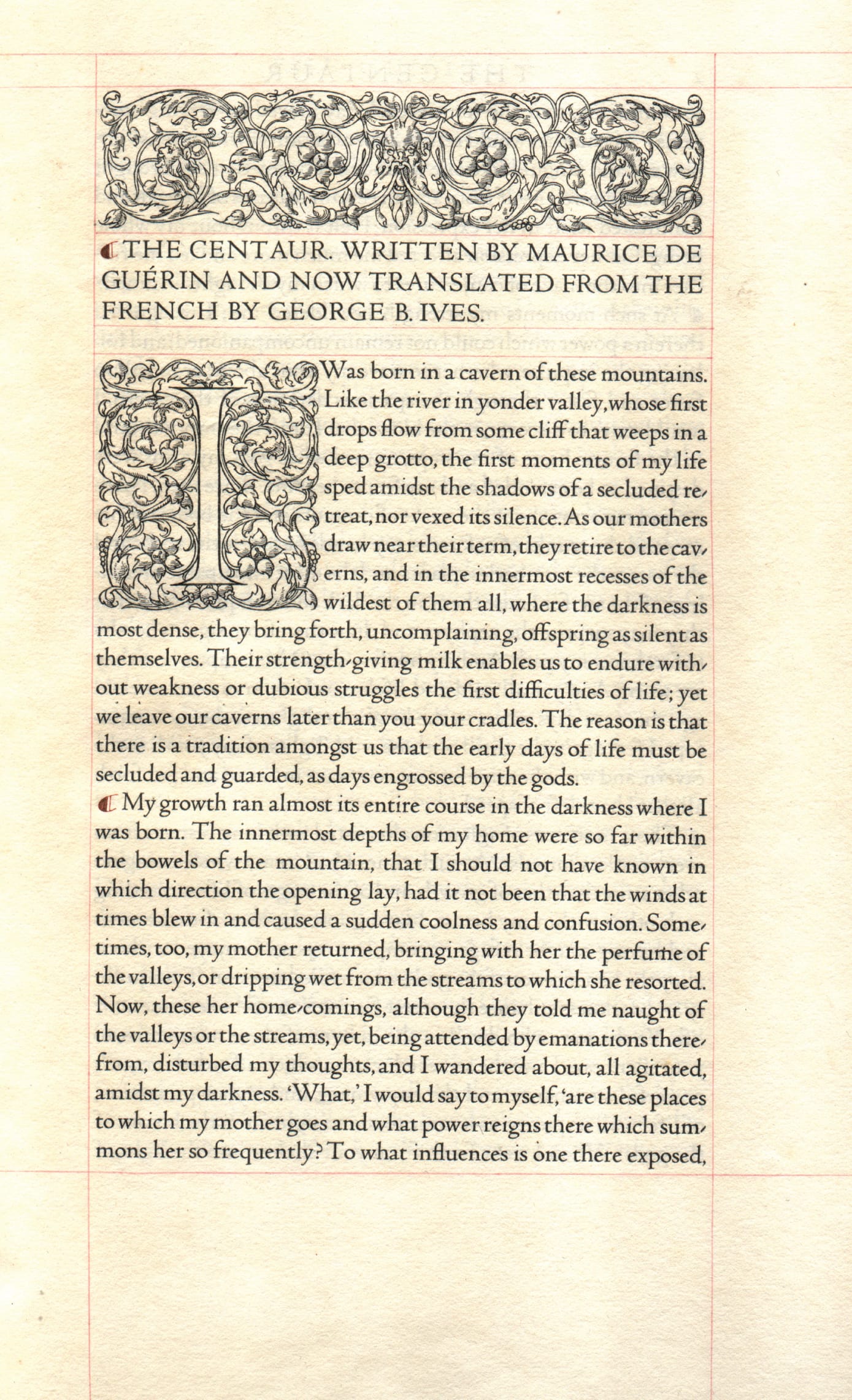
The Metropolitan Museum of Art was among the first institutions to acquire a type for its exclusive use, thereby creating a consistent identity across all its publications. The Centaur typeface by Bruce Rogers was first set in 1915, in an edition of The Centaur by Maurice de Guérin, thus attaching the half-man, half-horse creature to the Roman letters. Based on Nicolas Jenson’s 15th-century Venetian letters, Centaur balanced the classical and the modern, a perfect fit for the ambitious New York museum, which used it in the Metropolitan Museum Press for decades of publications.
The Centaur Turns One Hundred: A Century of Bruce Rogers’ Centaur Type, From the Collection of Jerry Kelly at the Grolier Club in Manhattan chronicles the “noblest Roman of them all,” as printer Robert Grabhorn declared the type in 1948.
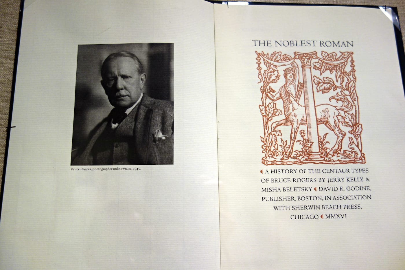
Book designer Jerry Kelly, who is loaning much of the material, also co-authored The Noblest Roman: A History of the Centaur Types of Bruce Rogers with Mish Beletsky, art director at Abbeville Press. The publication was released this fall by the Book Club of California. It includes rare drawings that show Centaur’s progression from cast type into digital typeface, and is itself set in Kelly’s new rendering of Centaur, based on the original foundry casts.
At the beginning of the 20th century, several typefaces were inspired by Jenson’s old Venetian serifs, such as the Doves Press type that was just recently retrieved after its disappearance into River Thames in London. Rogers is certainly not forgotten among typography enthusiasts, especially with his prominent 20th-century legacy of book designs, yet the Centaur exhibition emphasizes how prolific he was, even in some overlooked ways. For instance, the “M” logo, which the Met only recently replaced as part of its questionable rebranding, is widely known as being adapted from a 16th-century book by Luca de Pacioli. The curators note that it may “have been Rogers’ idea, since it was included in the retrospective show of Rogers’ work at The Grolier Club in 1939.”
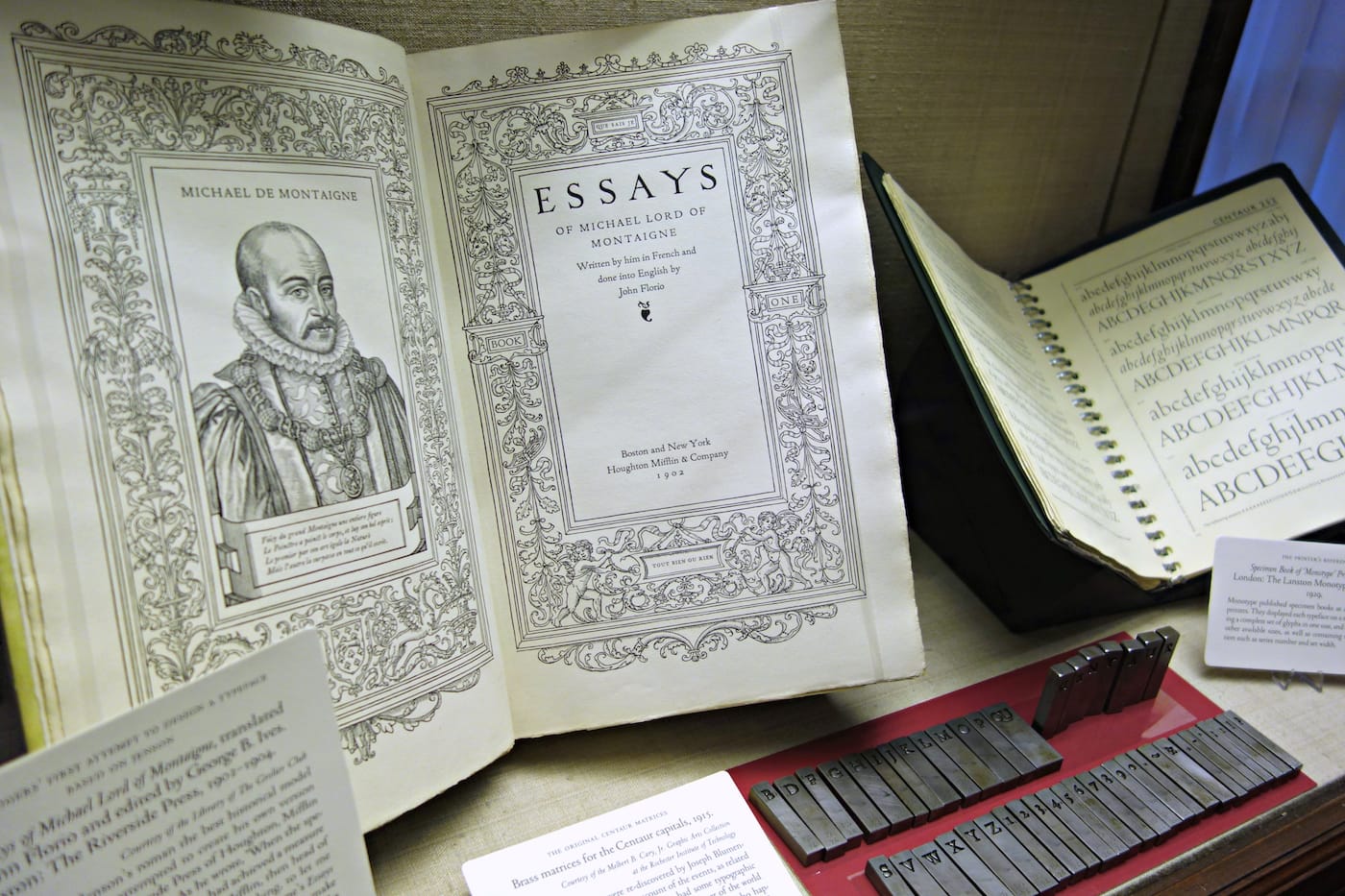
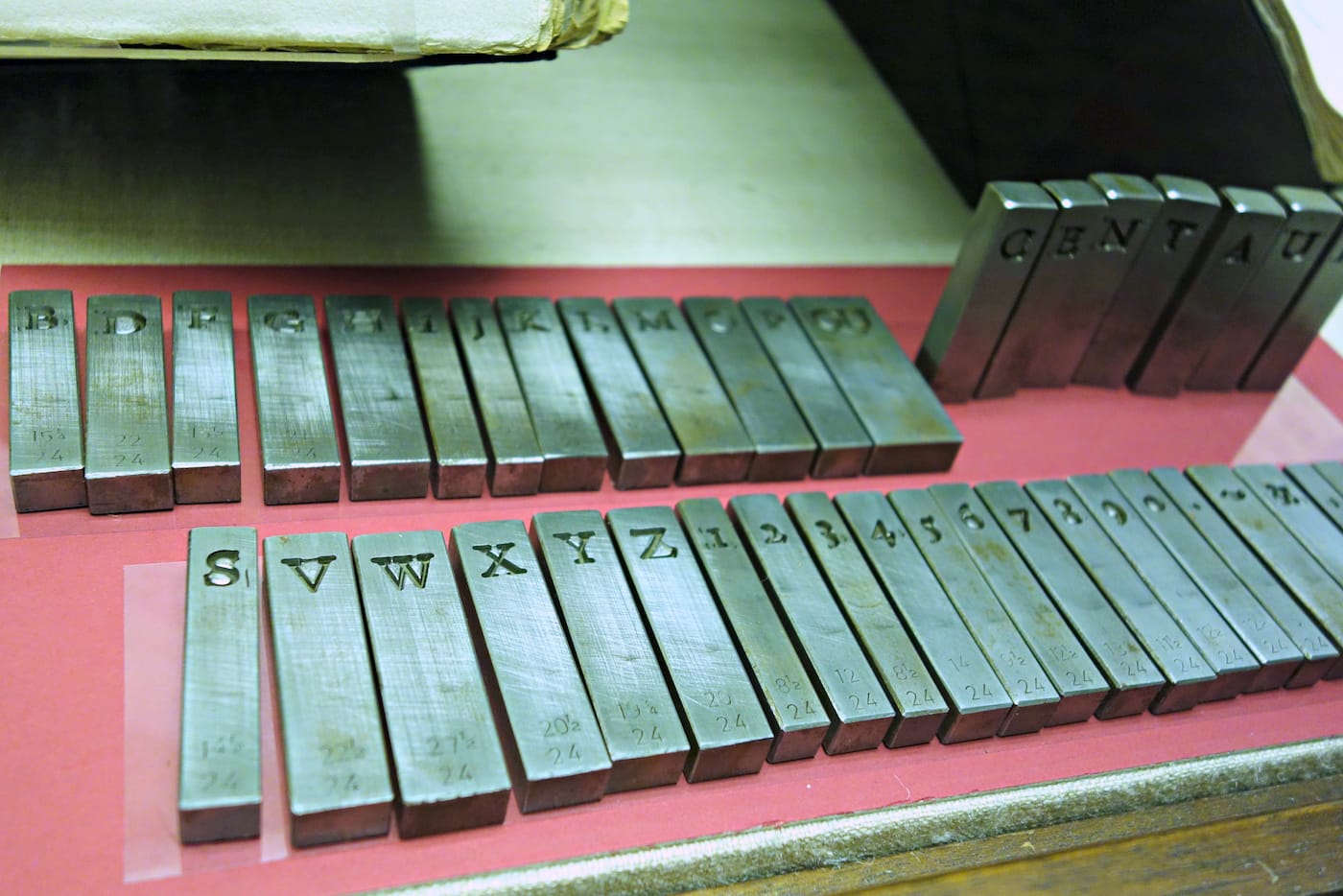
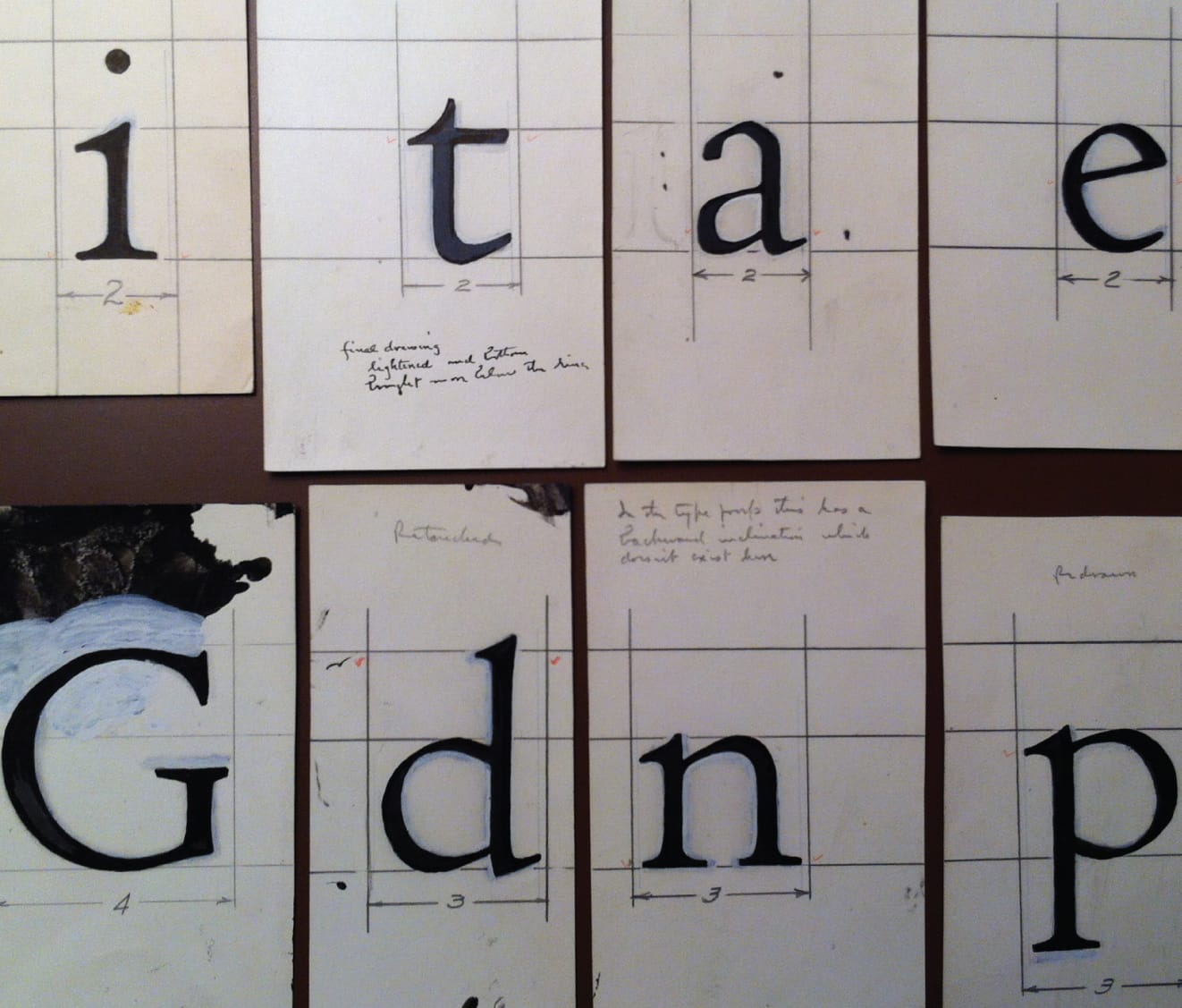
While that’s a detail that isn’t pinned down, the rest of the exhibition has many examples of the elegant Centaur in print, including its 1948 modification for the typewriter, all the way up to Rogers’s 1955 take on Dante’s The Divine Comedy, his last Centaur design in his lifetime. He died a couple of years later, in 1957. In one of the cases of the exhibition are a few of the 1915 brass matrices for the Centaur capitals, rediscovered in an attic in the 1980s. The metal letters still have a precision and orderliness that reflects Rogers’s thorough examination of classical sources to create a modern type. As Hermann Zapf wrote in 1982, upon the 25th anniversary of Rogers’s death: “The proportions and elegance of the Centaur design are still a highpoint in contemporary type design.”
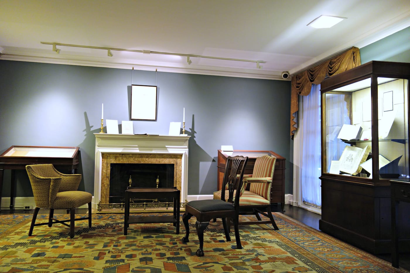
The Centaur Turns One Hundred: A Century of Bruce Rogers’ Centaur Type, From the Collection of Jerry Kelly continues through November 5 at the Grolier Club (47 East 60th Street, Upper East Side, Manhattan).


