“Neither Flesh nor Fleshless”
What’s great about Rothko’s paintings is their refutation of language, the way they push back against conclusions.

The line, “Neither flesh nor fleshless,” is from T.S. Eliot’s poem “Burnt Norton.” It is something that I remember for a moment, but it is soon gone. In fact, lots of words and phrases are buzzing in my head when I walk into the gallery: tragedic, universal, melancholic, essential, meditative. One by one, these clichés leave until finally, sitting on one of the padded benches the gallery thoughtfully provided, I find myself staring at “Untitled (1955), trying to figure out where the middle rectangle in the painting ends and the ground begins. I can make out the top and bottom rectangle but not the middle one. The middle rectangle is there and then it isn’t. It becomes an emptiness you feel as much as you see, like staring into a cave unable to make out anything in the darkness. I am frustrated but also strangely comforted. This is why the words I had in my head left me — they were too definitive.
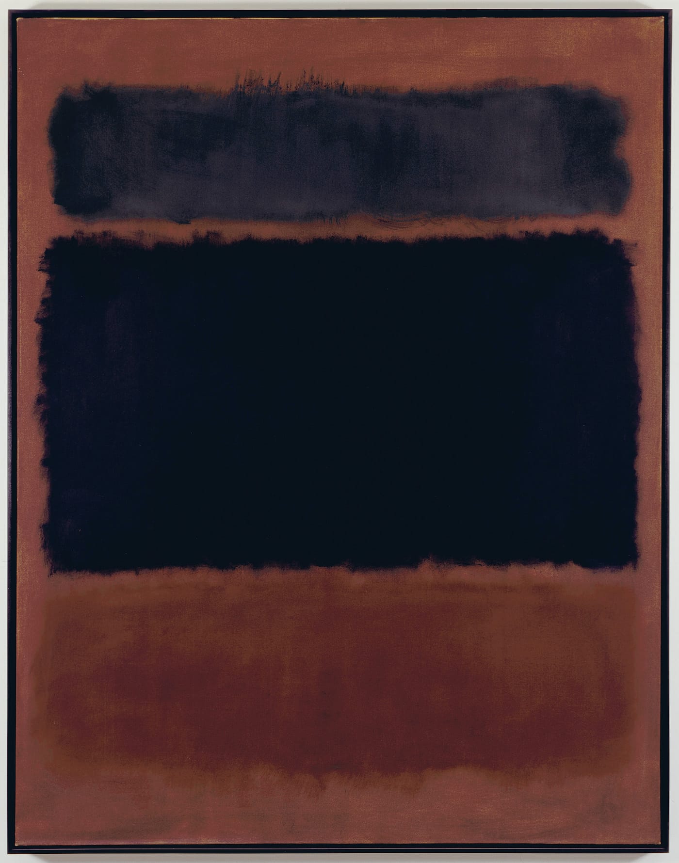
The painting, “Untitled” (1955) is included in the exhibition, Mark Rothko: Dark Palette at Pace (November 4, 2016 – January 7, 2017). It has three rectangles, with the top and bottom ones vaporous and the middle one even less substantial. The top rectangle is a muted violet with most of the top ever so slightly darker than the interior, while the one at the bottom is a muted dark blue, with the left half of the top edge slightly brighter than the rest. Over time I become increasingly sensitive to the minute transitions and shifts of tone and color within the painting without ever feeling quite satisfied with what I know. And yet, as I suggested earlier, I don’t feel dissatisfied either. Is it because I sympathize with Rothko’s refusal to be definitive in this painting? Is it because he immersed himself in murky color sensations much more than I am able to? I can’t say. Rather, like the hovering vaporous planes in many of his paintings, I feel between being moored and unmoored.
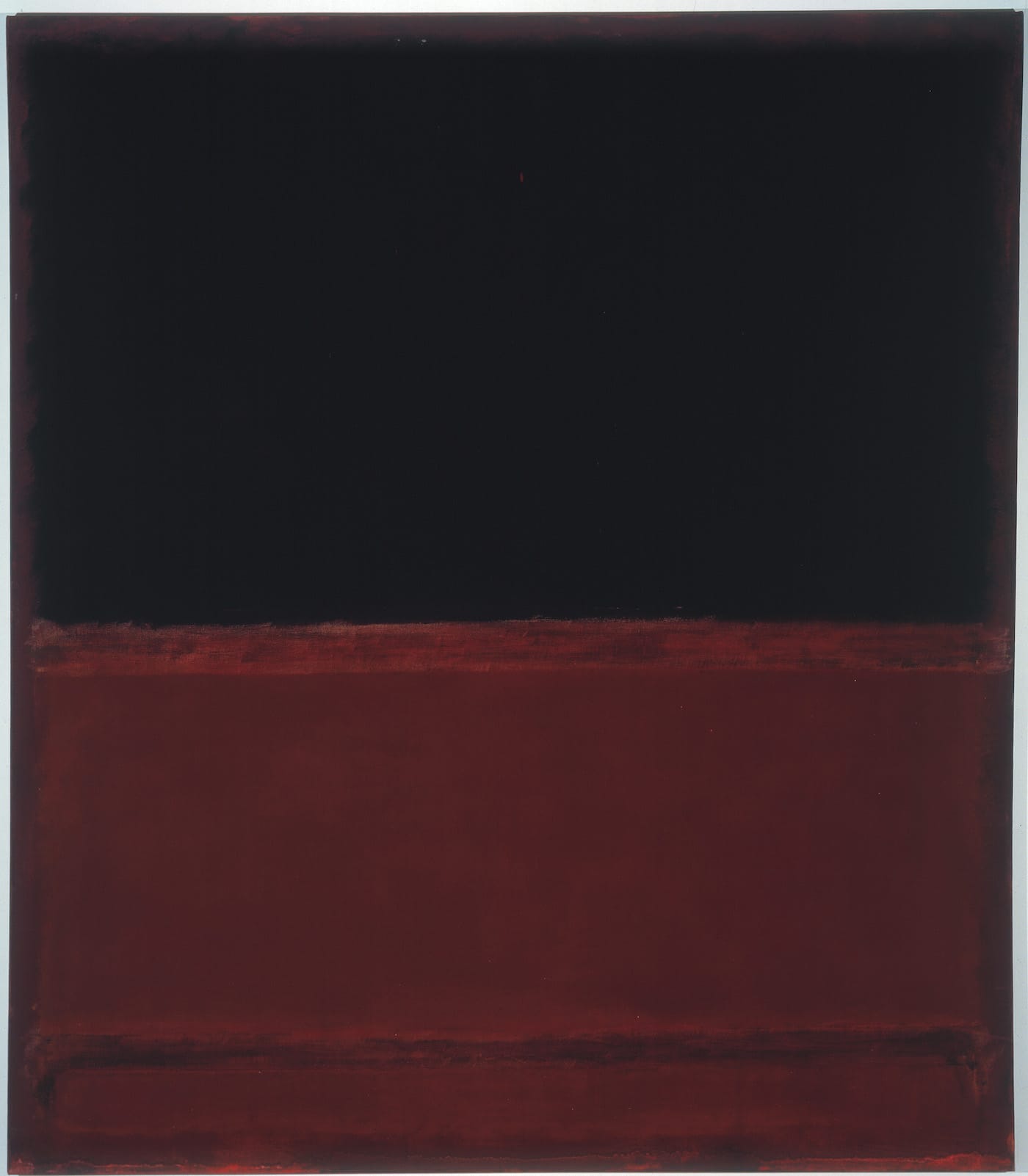
I get up and walk around, wishing there was no one else in the gallery on this rainy afternoon. Rust browns, red browns, blue blacks, and dark plum reds — these are some of the crepuscular colors Rothko used. Some of his rectangles, edged with an aura, seem almost never to come into focus, while others feel almost crisp. Looking at “Untitled (Dark Gray on Maroon)” (1963), which is in the collection of the National Gallery of Art in Washington DC, I feel as if I am losing the ability to distinguish, to see the three rectangles hovering inside the painting’s rectangle, which is over 11 feet high by six feet wide. Each one is different enough from the others that I find myself registering the increments separating evanescence and density. The edges of the middle, squarish shape are darker than the interior. At times the maroon ground seems to have bled through the skin of the darker color that Rothko has laid over it. There is something disconcerting about the experience, even as you are flooded with an odd tranquility.
In fact, I find it a relief that a painting such as “Untitled (Plum and Brown)” (1964), was occupied by a single large, vertical rectangle hovering close to the top of a canvas measuring nearly seven feet tall by slightly less than seven feet wide. At the same time, the more I look at the paintings in this stunning exhibition, the more I find myself drawn to the ones percolating with a feeling of instability. In these paintings, where the two or three rectangles ranged across the surface differ from the others in substantiality or, perhaps more accurately, insubstantiality, I feel that Rothko has gotten to a state of unparalleled vulnerability in his work. But I also sense the degree to which he counteracted that perception, infusing his colors with the solidity of a shadow.
It’s as if, through the act of rubbing the thinned colors into the canvas, he was rubbing the skin of the painting until it turned the color of dried blood, or a blue or violet bruise. And yet, once again, I have become too definitive. This is not to suggest there is something vague about the paintings. There is nothing uncertain about how subtle and exquisite the colors are, or about how the light seems to have been suddenly snuffed out, with everything settling into darkness. These descriptions are dramatic in a theatrical way. Rothko’s paintings are dramatic without being theatrical, which isn’t to say that they are hushed or muffled. Despite the limits he imposed upon his practice, the paintings are as different as faces in a crowd: you need only look. Philip Guston may have gotten sick of purity, but I don’t think that Rothko was the least bit interested in purity. There is something dirty about his blacks and rust reds — they reek of the earth even as they try to shed their materiality.
What’s great about Rothko’s paintings is their refutation of language, the way they push back against conclusions. They imagine a domain in which materiality has surrendered to the tenebrous. There are planes with feathery edges, or with edges where a faint aura glows. Sometimes both are in the same painting. Between the planes a strip of orange rust cuts across, like the slashed throat of a setting sun. The color breathes in these works — some of them brimming with suppressed agitation, or what Rothko called “curbed desire.”
Rothko wanted to make a naked painting, which I take to mean he wanted to merge seeing and feeling with nothing to protect him. My eyes and my mood keep adjusting because there is something apprehensive about these paintings — the joy of making mixed with the sorrow of seeing. I am reminded of something that Pierre Bonnard wrote, “There is always color, it has yet to become light,” though in Rothko’s case, I hear him say, “it has yet to become darkness.” And then in an email from Thomas Nozkowsi, I read the line: “Henry James says we paint picture because there are things we cannot say.”
Mark Rothko: Dark Palette continues at Pace (510 West 25th Street, Chelsea, Manhattan) through January 7, 2017.


