Graphic Design as Political Practice: A Conversation With Metahaven [Part 1]
Metahaven is an Amsterdam-based design studio made up of its two members and founders, Vinca Kruk and Daniel van der Velden. Yet to describe them simply as a design studio seems misleading. The pair uses graphic design, identity branding, and product development as weapons, harnessing the power of t

Metahaven is an Amsterdam-based design studio made up of its two members and founders, Vinca Kruk and Daniel van der Velden. Yet to describe them simply as a design studio seems misleading. The pair uses graphic design, identity branding, and product development as weapons, harnessing the power of the image in the internet age to design concepts that both signal label and propel political and social change.
Following their fascination with strange political gambits, obscure corners of the internet, and the power of the cloud, Kruk and van der Velden have written essays for e-flux, rebranded the micronation of Sealand, and created salable products for Wikileaks as the organization was just hitting the global scene. On the occasion of their current exhibition at MoMA PS1, I sat down with Metahaven to discuss their history as a studio, the process of working with Julian Assange, and the aesthetics of the dot-com boom. The second part of the interview will be published tomorrow.
Kyle Chayka: How did Metahaven first get started?
Vinca Kruk: We started to collaborate on the Sealand Identity Project, which was to conceive a national identity for the Principality of Sealand, which is a self-proclaimed nation on a former war platform near the coast of the UK. We didn’t stop working on that project, but wanted to keep going with it. That’s what our practice emerged out of. Quite naturally, it wasn’t a formal decision.
Daniel van der Velden: I agree.
KC: How did you first hear about Sealand or start thinking about it?
DV: Towards the end of the dot-com boom at the time I was co-designing a magazine called Archis, which is now called Volume, an architecture journal, and we had a special issue about islands. Sealand emerged in an editorial meeting as an example and then actually the idea came about to think about an identity for this kind of really weird place that no one can actually visit, that’s only accessible through the internet.
Sealand was trying to have its own dot-com business model at the time. So it was really a combination of this idea of sovereignty, self-proclaimed nationhood, in combination with this flawed entrepreneurial dream of starting an offshore business onboard Sealand. I think we were both interested in working on a lyrical aspect of visual identity, something that had to do a lot with heraldry, opulence — something not so minimal. Sealand was a really good launch platform for that. We also had an interest in theory, so it was also a great projection screen for all kinds of theoretical notions of identity and state.
VK: Explorations of theory, nationhood, and statehood, the combination of anarchy and monarchy, and all the contradictions that you find in Sealand as a kind of self-proclaimed state. There’s a strange, almost totalitarian thinking behind it, but it is so lo-fi. People hanging out with beer on a platform like “playing state” in their backyard.
DV: It’s interesting because Roy Bates, the founder of Sealand, recently passed away. The whole idea of Sealand was basically a gift to his wife. So it was his wife Joan, and he was obviously very much in love with her. He gave her this title “princess.” Which is a super-poetic and at the same time totally meaningless title. She doesn’t get any special perks from that other than some sort of fame. It’s interesting that it was done in a pre-internet age so obviously he wouldn’t have done it for, like, followers.
It was an inherently genuine act. That’s what’s great about Sealand.
KC: Can you describe what kind of identity you made for Sealand? How did it evolve visually and what was the end product?
VK: What we found interesting about Sealand that it had all the very traditional objects of statehood, like stamps and passports, to prove that Sealand was very legitimate and real. There were also fake Sealand passports circulating. We were interested in creating coins of stamps that wouldn’t really materialize, but would exist virtually. An endless flow of heraldic images that keep going and keep adding to them.
DV: There are the old fixed icons like coins and stamps, but they are charged with stuff that’s actually really unstable, like everything that you find through Google Images. Everything you find about Sealand through Google would be legit to use in the identity for that reason.
So, for example, the landlord of the murderer of Gianni Versace had a fake Sealand passport. So that’s a little chain of events, and because of that link we could use the Versace iconography in the brand. If you Google “Sealand” now, you also get results for “Seal and Heidi Klum,” because Google has changed its algorithms accordingly. So you get lots of images of Seal and Heidi Klum together. Had that had been around at the time, we would have certainly used that.
KC: What’s the current state of Sealand?
VK: There was a fire on Sealand a few years ago, so it’s in a bad shape.
DV: People also know that their idea of turning Sealand into a data haven is not working. The P2P file sharing platform,the Pirate Bay, tried to buy Sealand a couple of years back because it still is this kind of internet anarchy symbol. But it’s not working, and I think we predicted that in our essay ‘The Network Ruin.”
KC: Totally, the ruins of the failed utopia are a visual archetype. Through Metahaven, you’re taking on projects that are niche but remain very relevant. How did you develop and run the studio practice.
DV: We are interested in ideas and concepts that require not just visualization but also research. I think that when we decided to we wanted to collaborate further on these things we also were struggling with how to set up a studio. I gave up another practice that I had at the time, which had many clients, in order to completely focus on Metahaven, so we started form scratch — we had nothing. We also had to find clients to sustain this practice. You can’t run your practice on something like Sealand alone. So the first few years were spent on getting that model together, of having commissioned work, combined with longer and shorter term research projects.
VK: I think working on Sealand as a topic was very important because there were so many themes in there that we have continued working on since, in different projects. We started to write much more, we organized conferences. We started working issues like the use of totalitarian architecture in Europe, and how such buildings were re-appropriated as symbols in capitalism. Still architecture, and identity were things we were working on.
KC: It’s interesting that on one hand, there is the commercial need to survive and take on projects and clients, but you also have a split between client work and research projects. How do you guys feel about Metahaven as kind of a business entity?
VK: We don’t really separate it — it’s not like we work on a commission for a client and the next day we do a research project. It very much overlaps, and also the way we talk with clients about commissions is very much how we talk in the studio about how to continue a research project.
DV: I think the notion of proactivity is really important, the notion that you can initiate stuff yourself. It can actually be a project that involves a client. There is the old notion of “pro-bono” work, which is the supposedly ethical counterpart to commercial practice, but in our case you could say that we dedicate a certain amount of research and resources to a potential client or partner that we feel could benefit from that.
That’s how we approached WikiLeaks, for example. Just before their global notoriety, so they were actually still approachable at that time.
KC: Wikileaks blew up pretty quickly in terms of global notoriety. Do you mean working on topics that have more real-world impact?
DV: Nobody could have foreseen what happened to WikiLeaks, and the events that unfolded. Of course, it’s impossible for an identity to keep track of all this, so that’s also why we had to change the central question of the project, moving into something that was much more about products, merchandising — because what they needed most was money. Then of course we solved that in a completely non-straightforward way. We did stuff that obviously was very different form what they had in mind originally.
KC: What kind of things did Wikileaks have in mind for themselves?
DV: The sort of stuff you see in their official merchandising store.
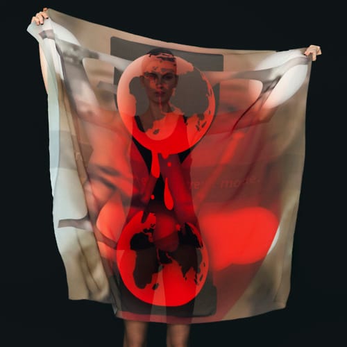
KC: Instead, you made some more upscale items for them, like a Chanel-style scarf. What’s the story behind that?
DV: The notion of the scarf talks about opacity and transparency, which is exactly what they are about.
VK: Something that’s kind of glamorous, and you could wear it both as a luxury item, but also use it to cover your face.
DV: There’s also the cheapness of glamour. There is something about WikiLeaks that echoes cheap, fake imports—like a revolt of the means of production over the brand image. That’s why we had that Louis Vuitton play with the “WL” logo in one of the earlier scarves. WikiLeaks is about a notion of democratic access to value. This is something that we wanted to bring out a little bit.
KC: How difficult was it to actually communicate with Wikileaks, given their secrecy? Did you have any contact with Julian Assange himself?
VK: It basically started with us sending them an email in mid-2010 saying, “Hey, we would like to work on your identity, would you be up for it?” We got a reply back two hours later. The email said, “Great, we have a shortage of such things.” The e-mail was signed with “JA.” So that was enough for us to get started because they opened up the possibility to do something.
Then they started releasing the cables, and communication became very difficult. It took some time to get back touch with them, which eventually happened. We met with them and showed what we had done.
DV: Then, in that meeting, what we had been doing was sort of brushed aside, which was completely predictable. Some of the stuff we did which was brushed aside is in the show.
KC: Which parts?
DV: The identity part basically. Then we decided that pursuing tee shirts and mugs was really the way to go. We had a dialogue over the specific designs later on that was very productive.
VK: What we really understood during that meeting was that they have a problem surviving financially because of a blockade by MasterCard, VISA and PayPal. Selling merchandising is an important way for WikiLeaks to raise money, so basically that was the only thing they felt they needed designed.
DV: There’s a lot of criticism about this. They seem so focused on money sometimes that you feel it’s actually not benefiting the people who care for Wikileaks. These are not necessarily people who have lots of money. So if you force someone to support an organization by buying a mug you’re basically molding that person into a consumer role.
We found that the leaks are to WikiLeaks what tour dates are to a band, so basically our t-shirts present different important leaks, one per t-shirt.
Part two of Hyperallergic’s interview with Metahaven was published on Friday, February 15, 2013, “Graphic Design as Political Practice: A Conversation with Metahaven [Part 2].”
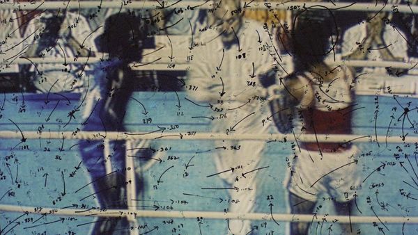
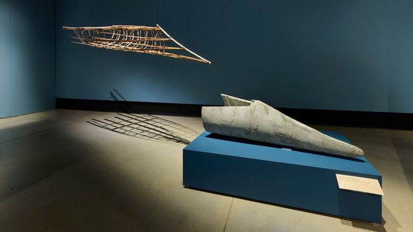
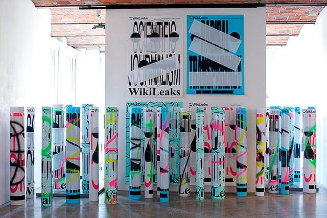
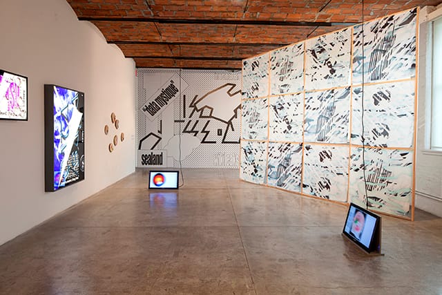
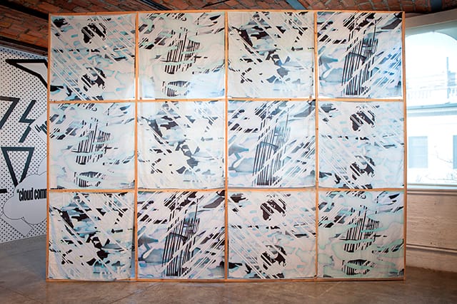
Metahaven: Islands in the Cloud runs at MoMA PS1 (22-25 Jackson Ave, Long Island City) through April 1.