Failing Better: Erroneous Art at Lisa Cooley
There’s a bit of curatorial sleight-of-hand in I Dropped the Lemon Tart, the summer show at Lisa Cooley on the Lower East Side. The title refers to a real-life mishap in a restaurant kitchen where imminent culinary fiasco turned into a triumph of pluck and invention.

There’s a bit of curatorial sleight-of-hand in I Dropped the Lemon Tart, the summer show at Lisa Cooley on the Lower East Side. The title refers to a real-life mishap in a restaurant kitchen where imminent culinary fiasco turned into a triumph of pluck and invention. The artwork in the exhibition, however, seems to go more right than wrong, which really isn’t anything to complain about.
The “now-storied incident” of the lemon tart, as recounted in the gallery’s press release, took place in Massimo Bottura’s Osteria Francescana in Modena, Italy, where “Bottura’s trusted sous-chef,” Takahiko Kondo, dropped one of two lemon tarts as he was preparing to plate them:
Bottura describes the color draining from Kondo’s complexion as he realizes what has just happened; Kondo himself laconically admits he wished to commit hara-kiri. But Bottura grabs his shaken assistant by the shoulders and frames his hands around the destroyed dessert. Looking through his hands and seeing the artfully splattered tart, Bottura is struck by a moment of aesthetic inspiration.
Bottura and Kondo start “flinging lemon filling across plates and shattering pastry shells,” ending up with a lemon-flavored Jackson Pollock, which ultimately becomes “one of Bottura’s signature dishes.”
Nothing about the artwork on display approaches this level of drama: there are no heart-stopping disasters, no happy accidents or seat-of-the-pants improvisations, unless we’re talking about the wall color. Two of the main gallery’s walls are painted the most godawful shade of Naugahyde® brown you can imagine, but somehow the artworks hung on them, which largely skew toward cool colors, look spectacular against it.
These include, on the long east-west wall, Mernet Larsen’s “Smog” (2005), in acrylic and tracing paper on canvas, which at first glance resembles a blank Art Deco store sign, but on second glance turns into a jokily Cubistic head; Leon Benn’s Fauvist-inflected “Cop Commander” (2015), depicting a police officer aiming his pistol; Jenny Holzer’s bronze plaque from her Survival Series, “IF YOU AREN’T POLITICAL YOUR PERSONAL LIFE SHOULD BE EXEMPLARY” (1998); and three black-and-white photographs by the 81-year-old Viennese artist Josef Bauer of a woman struggling inside an enormous sack.
There’s little if anything about these pieces that have to do with failure, other than the inability of the woman in Bauer’s photographs to extract herself from that sack — images that convey Beckettian futility via an old-time Eastern European vibe. Or we might view, in light of recent events, Benn’s cop as failing both civil society and his oath to uphold the law as he unholsters and points his weapon.
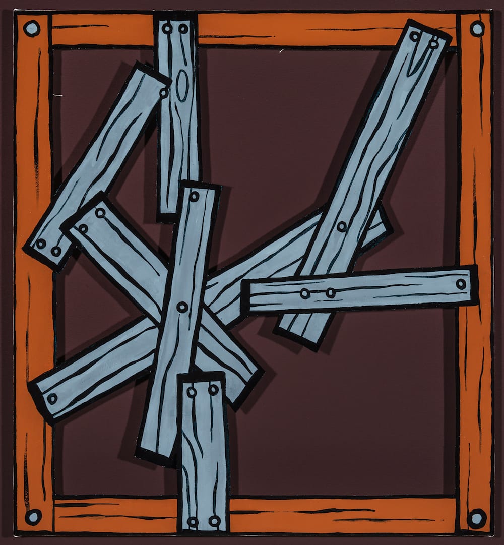
The second brown wall, at the rear of the gallery, holds seven pieces by a single artist, Todd Bourret’s infectious series of works bearing the collective title “Boarded Up” (2015), all of which are rudely cartoonish depictions, hand-painted in silkscreen ink, of wooden frames that suggest a painting’s stretcher bars, but with planks of varying dimensions nailed across them (leaving them “boarded up” and inaccessible).
With this gesture, the artist seems to be sending up the deconstructivist tendencies prevalent in some contemporary painting, such as the works of Dianna Molzan that were recently featured in The Forever Now: Contemporary Painting in an Atemporal World at the Museum of Modern Art, for which the exposure of the stretchers seems key to the aesthetic.
There are a number of curious inversions here: the use of silkscreen ink rather than paint to create a painting of a painting; the focus on the verso of the canvas, which turns the back into the front and the front into the back; and, most engagingly, the decision to cut out the negative shapes between the boards, leaving empty spaces in the surface.
This last reversal revels in exposing the artifice of the work: we can’t deny that the boards and stretcher bars are anything other than canvas (although the real stretchers are visible in a couple of the pieces).
The holes in the surface also reveal that there is nothing where the supposed face of the painting ought to be; the empty spaces open up on the Naugahyde®-toned wall, the color of which, it should be noted, blends beautifully with the burnt orange of the ersatz stretchers and the slate gray of the planks, while providing deep shadows for the cutout holes. This three-dimensional interaction effectively positions these works as bas-reliefs.
It’s hard to discern where exactly failure fits into Bourret’s contributions, unless we go metaphysical and think of the boarded-up canvases as a sign of the failure of contemporary painting, if it is concerned only with an artwork’s inner mechanics, to engage with the concerns of the real world. But that might be a stretch.
On the other two walls of the main gallery, which are painted a customary white, there is an oil painting of blue balls on a white field, “Bloobs” (2014) by Mathew Cerletty; a loopy, oddly affecting drawing, “Untitled (shit)” (2011) by David Shrigley, of concentric circles emanating from the word “shit”; Vern Blosum’s “Off The Hook” (2015), a larger-than-life-size graphite drawing of a vintage payphone with its receiver dangling, appropriately, off the hook; and Emily Mae Smith’s “The Studio (Science Fiction)” (2015), which depicts the split halves of an eggshell hovering above a flying saucer/fried egg, the edge of its white perimeter forming the words “THE STUDIO” against the starry blackness of outer space.
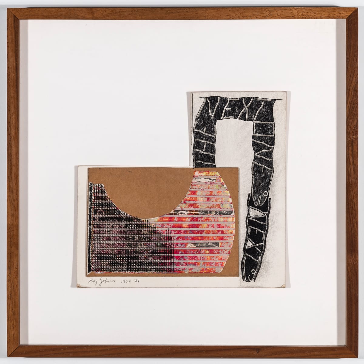
There is also a knockout collage by Ray Johnson, “Untitled (The Next One Next)” (1958-81), which makes dazzling use of the humblest of materials: paper and board pasted into a J-shape, with the words “THE NEXT ONE NEXT” written in white on two black snakes slithering across the top and sides of the vertical component to the right. Equally memorable, and inadvertently topical, is Sean Landers’ “To Whom it May Concern” (1991), a four-page letter, hilariously earnest and egregiously misspelled, in which the artist seeks to reassure his creditors that he intends to repay his defaulted student loan of $23,648.80 “ONCE I AQUIRE [sic] THE NESSESSARY [sic] RESOURCES.”
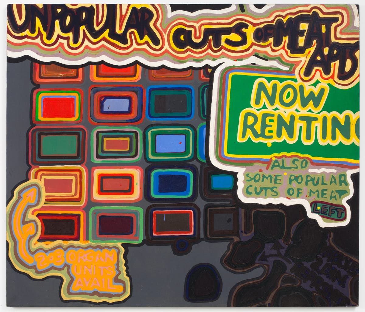
This exhibition includes a real find in “Unpopular Cuts of Meat,” an acrylic painting from 1969 by Gene Beery. With its twisted sense of humor — the “unpopular cuts of meat” are apartments for rent — and its jarring mix of Pop-influenced lettering and abstracted, boxlike shapes arranged in a quasi-grid, it could have been painted yesterday, Stanley-Whitney-meets-Loren-Munk. Beery was born in 1937 and has recently been shown at the invaluable Algus Greenspon Gallery, but if you haven’t yet come across his strikingly forward-looking work, this is the perfect opportunity.
Again, not that many signifiers of failure leap out at you, although gelitin’s “Latte Macchiato” (2012), a precarious tower of crudely made wooden boxes piled on a white pedestal and topped by a mannequin head (pierced, for good measure, with a kitchen knife), reportedly collapsed during the exhibition’s opening. But this was something it was designed to do, triggered by a foot pedal, which qualifies it as a sort of failure aforethought. A collective of four artists from Vienna, gelitin is also responsible for “2D 3D” (2012), a length of rope outlining the shape of a chair — a contour sketch convincingly rendered in three-dimensions. The third piece of sculpture in the show is a tiger-striped A-frame ladder called “Skeleton, no. 4 (Asian tigers +)” (2013) by Amy Yao.
In the gallery’s narrow entrance passage, two artists display not failure but a sophisticated mastery of technique. Ben Vida is represented by two works, “Hand Torn Seconds (Blue)” (2015), composed of vertical strips of rag paper gradated from blue to white and arranged in uneven rows, and “Approx. 26,000 hand made seconds” (2015), a four-channel audio piece in which discreetly ambient sounds are emitted from four speakers atop four narrow pedestals. Meanwhile, near the street door, Yonatan Vinitsky’s “SoFtSkIlLsSsSsSs” (2014), a virtuosic design made by angling a very long strip of elastic through a route demarcated by hundreds of nails, runs overhead across the width of a wall.
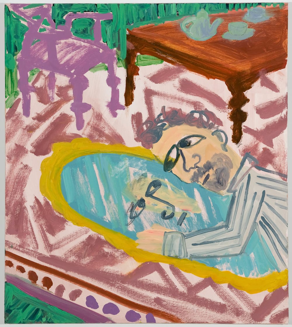
The last work in the show (if you head toward the rear wall and then loop around) is Scott Reeder’s “Man with Mirror” (2011). Like Benn’s “Cop Commander,” it’s a faux-Fauvist painting, but this one depicts a haute-bourgeois living room and a bearded man in a striped shirt (or pajamas), who could very well be Henri Matisse, embracing his reflection, Narcissus-like, in a gilt-framed, oval mirror resting on a carpet.
It’s a straightforward but puzzling image. Is Reeder satirizing the self-absorption of the affluent, which would be an easy target, or — as Bourret’s “Boarded Up” series might suggest — is he instead asking pointed questions about the ego-driven ethos of modern art, which served to shake up tired forms and free up an artist’s means of expression, but also engendered an insularity and elitism that have isolated much visual art from the cultural mainstream? Or is that another stretch?
I Dropped the Lemon Tart continues at Lisa Cooley (107 Norfolk Street, Lower East Side, Manhattan) through August 21.


