The Genre That Wasn’t There: A Wide-Ranging Examination of Postwar Ceramics
NEW HAVEN, Conn. — Leave it to a former professional studio potter to organize a wide-ranging exhibition of postwar ceramics that’s relatively free of hangups about form and function.

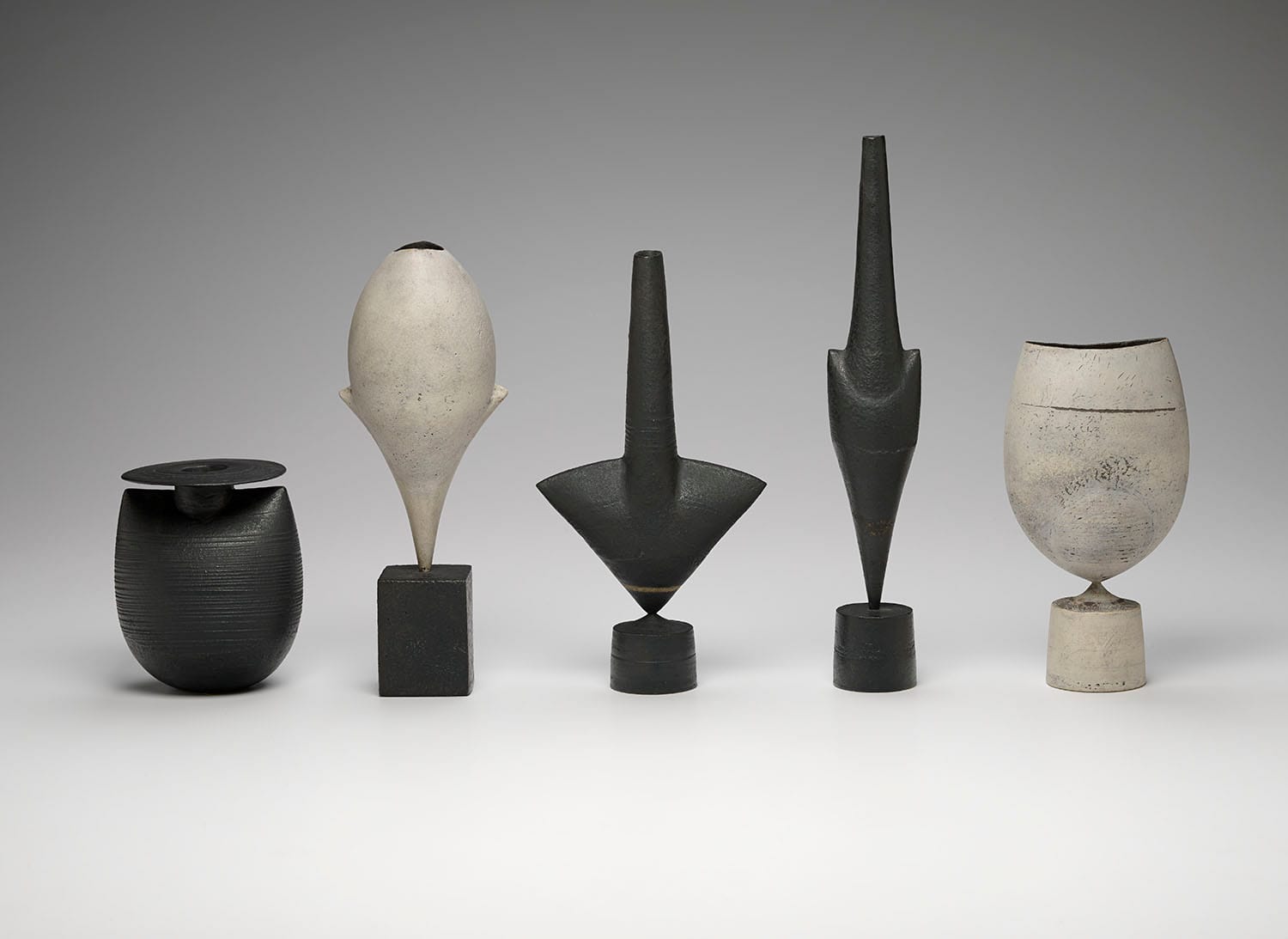
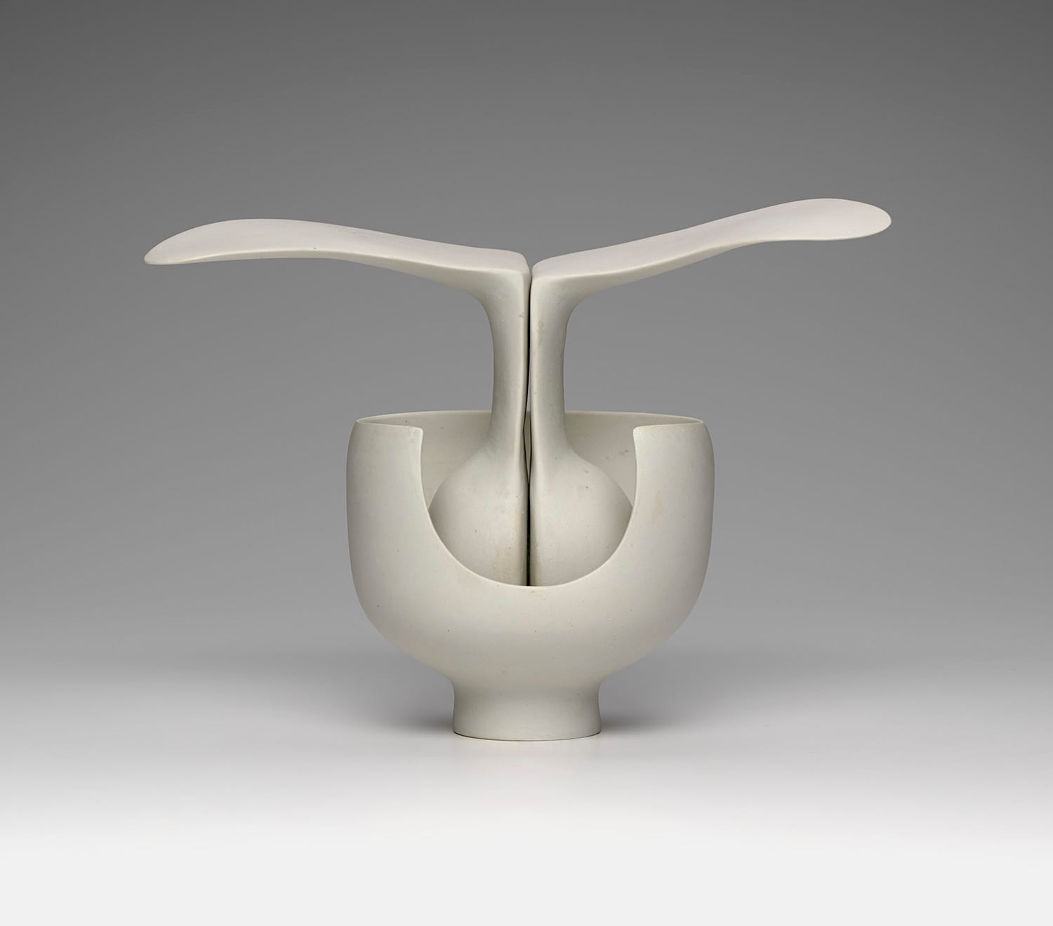
NEW HAVEN, Conn. — Leave it to a former professional studio potter to organize a wide-ranging exhibition of postwar ceramics that’s relatively free of hangups about form and function. The Ceramic Presence in Modern Art: Selections from the Linda Leonard Schlenger Collection, currently on view at the Yale University Art Gallery, demonstrates connections of various sorts between works in clay and paintings, drawings, and other forms of sculpture from the period. The exhibition’s core material, and its initial inspiration, is the collection of Linda Leonard Schlenger, one of the world’s foremost collectors of post–World War II American ceramics. Works from the Schlenger collection are juxtaposed with paintings, sculpture, and other ceramics from Yale’s own collection. For the most part, pottery in its most traditional form plays the role of the genre that wasn’t there, while sculptural works explore volume and the vessel form in various media. The exhibition was curated by Jock Reynolds, the Henry J. Heinz II director of the gallery, and Sequoia Miller, a doctoral candidate in art history at Yale. Before returning to graduate school, Miller was a full-time studio potter — a pedigree that gives him rich material insight into the subject at hand. The exhibition comprises 233 objects, ranging from small, exquisite ceramic vessels by George Ohr to a towering bronze by Martin Puryear. It occupies two floors in Yale’s elegant galleries (housed, appropriately enough, in a 1953 Brutalist building by Louis Kahn, who taught in the Architecture school) and offers visitors an unpretentious banquet for the eyes.
The title of the exhibition is a scholarly nod to “The New Ceramic Presence,” a genre-defining essay by Rose Slivka that appeared in Craft Horizons (now American Craft Magazine) in 1961. Slivka’s essay is an oft-cited lightning rod that sharply divided the ceramics world when it was published. In it, she argued for an embrace of the “new ceramics,” which included the rugged, slash-and-stack works of Peter Voulkos, and her point of view offended many traditional potters to their core. Slivka described an American visual culture that was thoroughly evocative of her time — a masculine, mechanized world of progress and high capacity — and she drew an analogy between this aesthetic milieu and the aggressive forms emerging from post-WWII ceramics studios: “Our environment, our temperament, our creative tensions do not seem to encourage the making of beauty as such, but rather the act of beauty as creative adventure — energy at work — tools and materials finding each other — machines in movement — power and speed — always incomplete, always in process.” Regular readers across the country were aghast. Minnesota potter Warren Mackenzie wrote an angry letter, and Bauhaus-trained Marguerite Wildenhain, who fled Europe during the war and eventually settled in California, has twice since refused nominations to the American Craft Council College of Fellows, still unable to forgive the Council for its “horrible magazine.”
So if some of the works on view in Ceramic Presence seem like traditional Ab-Ex fare, particularly the Voulkos pieces and the idiosyncratic early John Masons, it’s important to remember that this material was artistically orphaned in its own time. Baffling to traditional ceramists and often ignored by the contemporary art world by dint of its association with crafts, these works deserve something like aesthetic shared custody today. The essential form of the pot, though it may be hard to discern in many cases, is fundamentally part of who they are. With that in mind, it’s hard to organize a show like this (or, indeed, to visit one) without a tired, familiar chestnut lurching into the room, unbidden: the revisionist theme of “elevating” ceramics into a more prestigious-seeming context of 20th-century sculpture. Fortunately, this exhibition largely sidesteps the obsession with hierarchy via-à-vis ceramic’s relationship with other artforms in order to tackle three more engaging and more finely articulated concerns: shared theoretical approaches, personal connections between the artists across media, and formal characteristics that unite some of the works visually.
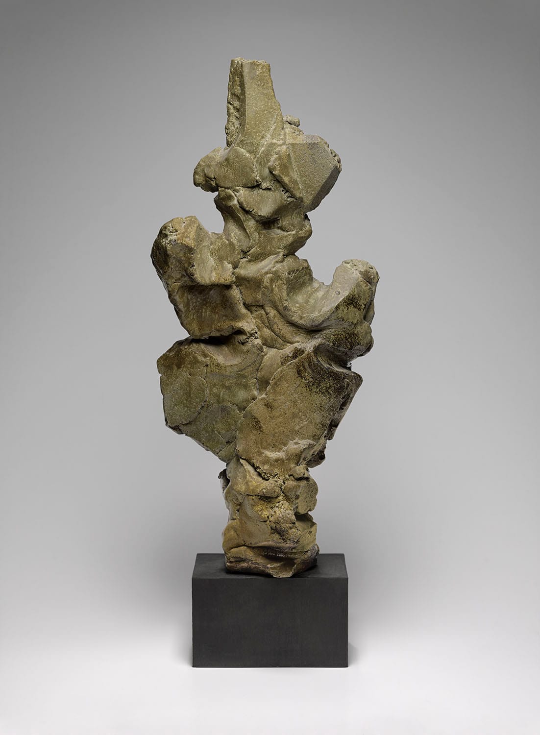
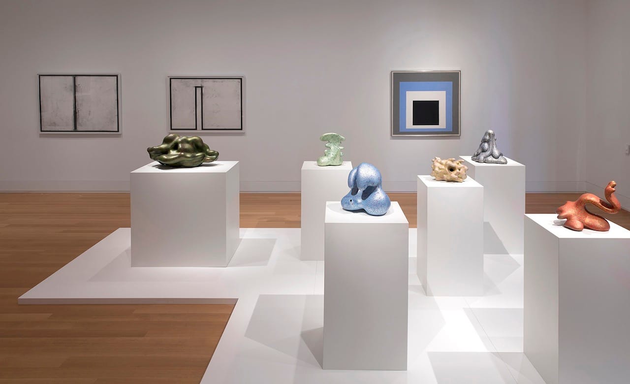
Many of the vignettes are very strong, and some, like Toshiko Takaezu with Mark Rothko, or Ken Price with Josef Albers, are sublime and bracingly original. In almost every case, the works seem to attend to one another, as though they were drawn into their groupings by a mutual awareness of like form, color, style, or provenance. The most explicitly Ab-Ex section pairs works by Voulkos and Mason with paintings by Hans Hoffman. The two Masons, “Untitled, Vertical Sculpture” (1961) and “Untitled” (1958), both from the Schlenger collection, are strikingly different from the modular, fiercely geometric works from later in his career and for which he is better known. These early pieces are dynamic and full of energy, with their own kind of eccentric precision, and they pair excellently with the vibrant Hoffman painting Fortissimo (1956).
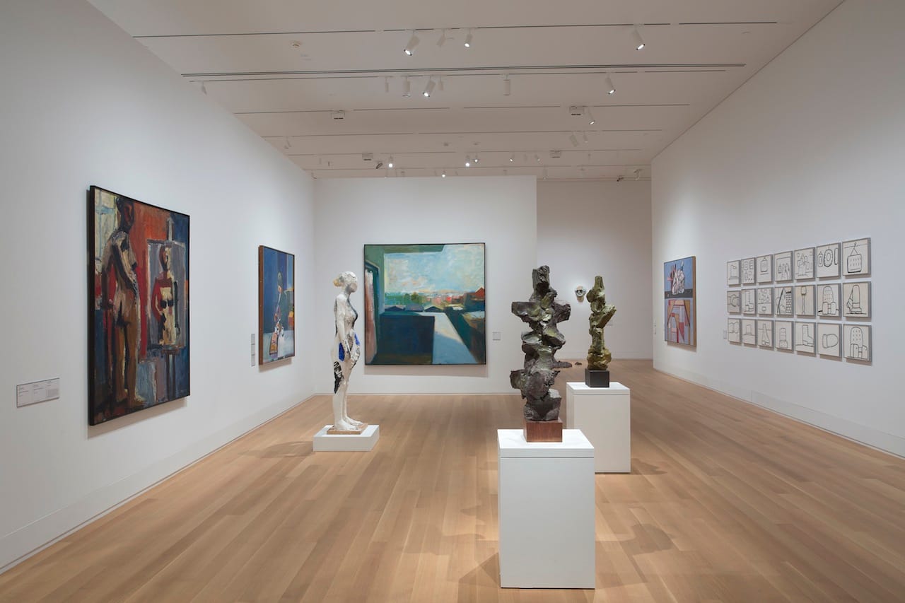
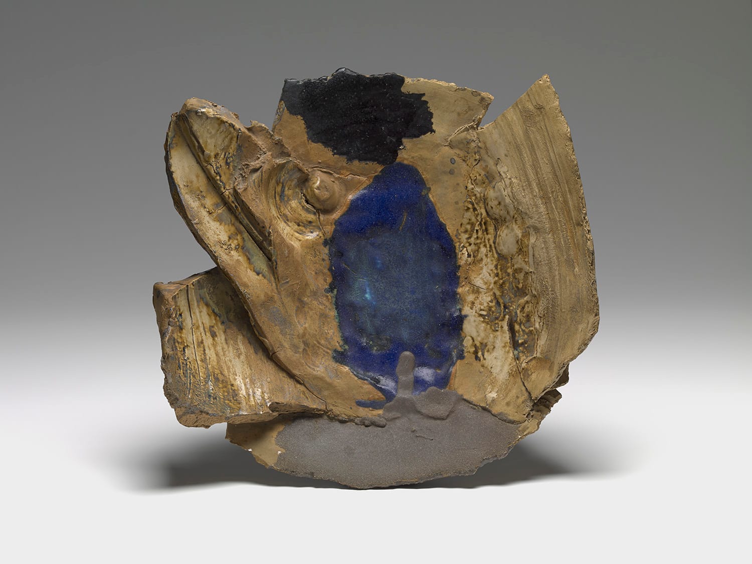
Voulkos’s “Big Jupiter” (1994), a later work created very much in the spirit of the earlier sculptures, stands toe-to-toe with a jagged-edged David Smith bronze. These two artists had a personal and creative bond, Miller tells Hyperallergic: from early in Voulkos’s career, Smith was a hero and mentor to him, as they both explored the interplay of negative and positive forms. One uncanny “separated at birth” moment comes from the pairing of a blue-glazed stoneware Voulkos plate from 1963 with a small John Chamberlain sculpture entitled “Hawthorne” from 1959. The two blues, one from a junked car, the other straight from the glaze bucket, and the pieces’ shared dynamism, are a lovely example of the kind of formal similarities this exhibition is aiming to place at center stage. In both cases, it’s worth noting that both juxtapositions place Voulkos with works made from metal, underscoring Slivka’s early observation that he was working in a decidedly American, machine-inspired manner. Nearby, an Anthony Caro bronze from 1978–79 called “Table Bronze Manifold” appears to barely contain three cylindrical forms on their sides, resembling something like a broken-down vehicle that somehow traveled back in time to the ancient world, acquiring a nice patina along the way.
The “Biographical Connection” grouping is the only area in which the organizing principle goes off the rails a bit. A large area devoted to the always impressive but usually unlikable Robert Arneson is designed to signal the importance of California Funk and the related artistic activity at UC-Davis, where co-curator Jock Reynolds was a student in the late 1960s and early 1970s. This moment is certainly a crucial one in America ceramics history, but many of the works installed here are not from the Schlenger collection, and this waters down the impact of seeing the fruits of her collecting career in a cohesive installation — a shame, since she has been one of the field’s most influential patrons.
In a separate gallery, three London ceramists, Lucie Rie, Hans Coper, and Ruth Duckworth, are paired with several works by Martin Puryear, Isamu Noguchi, Sol Lewitt, and Agnes Martin. Martin’s set of 30 screenprints, “On a Clear Day” (1973), face a row of Copers whose color palette complements the ultra-subtle Martins, both in different ways about “sensitivity of line,” as Miller says. Yet there is something contextually puzzling about this juxtaposition, according to Garth Clark, former director of the Garth Clark Gallery. (Clark and partner Mark Del Vecchio sold works to Linda Schlenger over the years, and they run the digital magazine c-File, devoted to ceramics in a variety of disciplines.) Coper left his sculptural practice behind to make pots, Clark argues; it wasn’t that he was a sculpture wannabe making pots for lack of a better option. For the installation of his work to not be “pot-centric” misses an opportunity to investigate Coper’s peerless mastery of the vessel form.
One of the most compelling aspects of the installation is that many of the smaller works are displayed without vitrines or stanchions. This gives visitors a rare chance to get a really good look at some of the 20th century’s most inspired and masterful examples of glazing, particularly in the case of works like Lucie Rie’s tea bowls, which are ringed with coppery glaze so subtle, they don’t truly dazzle until you’re eye-to-eye with them. The same can be said of Toshiko Takaezu’s orbs and Ken Price’s undulating forms, which were created by coating surfaces in layer upon layer of acrylic, then firing them as many as 20 times each. He would work away at the surface with wet sandpaper or rubbing alcohol, then add new layers of vibrant color with a Q-tip, so that they resemble layers through which different hues would emerge, Gobstopper-style. Just over the Price area’s shoulder hangs “Homage to the Square: Unconditioned” (1952–54) by Josef Albers, which exhibits a parallel phenomenon in two dimensions, as though one were looking straight into a squared-off pot with layer upon layer of color. A tip of the hat to a thoughtful juxtaposition at Brooke Alexander Gallery in 2010, it’s one of the show’s moments of real curatorial brilliance.
The exceptions to the no-stanchions rule include the contents of a small vitrine containing works by Price, Ron Nagle, and Richard Shaw, and in another gallery, a group of pots by George Ohr. It’s a shame that the Ohr pots are encased up against a wall; the catalog essay by John Stuart Gordon, the Benjamin Attmore Hewitt Associate Curator of American Decorative Arts at the Yale University Art Gallery, makes a persuasive case that Ohr can be understood as an abstract expressionist before his time, but the display reads more like an open-storage decorative-arts study collection that prevents viewers from seeing them in the round. This approach, Miller tells Hyperallergic, was adopted for valid safety concerns due to the rarity and preciousness of the Ohr pots, and these concerns are entirely understandable. Still, as such exceptional examples of Ohr’s work, they cry out for a more sculptural style of installation.
This oddness, in a way, perfectly captures something about the complexity of the curatorial endeavor that created Ceramic Presence: sculptural ceramics is an art form that exemplifies the English expression to have “fallen between two stools,” which is what happens when plans A and B have both failed. It’s more precise to say that postwar ceramics are not exactly classifiable, since the works are so clearly not functional pottery, but the essential form of the vessel is something that clay can’t seem to shake, even today. It fits into no standard museum category, which might be why many of the exhibitions celebrating it have either been solo shows, like the recent Ken Price Sculpture: A Retrospective in 2012–13 (which traveled to the Metropolitan Museum of Art), or media-specific group exhibitions, like Clay’s Tectonic Shift: John Mason, Ken Price, and Peter Voulkos, 1956–1968 at Scripps College in 2012.
Ceramic Presence does make a few small missteps, but the thoughtfulness and ingenuity of its approach is a valuable contribution to the field and a vivid aesthetic experience for the viewer. It also provides an intriguing template for multidisciplinary exhibitions to come, not just for ceramics, but for other traditionally craft-affiliated media. True to its title, this is a show best experienced in person. Its inspired vignettes and luminous surfaces reward the physical presence of visitors — modern or otherwise.
The Ceramic Presence in Modern Art: Selections from the Linda Leonard Schlenger Collection continues at the Yale University Art Gallery (1111 Chapel Street, New Haven) through January 3, 2016.
Correction: This piece originally misstated the year of a blue-glazed stoneware Voulkos plate as 1996, rather than 1963. It has been fixed.