Paint as Language, Language as Paint: Paul D’Agostino’s Chromatic Alphabet
The fluency of concept and form in Paul D’Agostino’s new, bifurcated show at Life on Mars marks a further consolidation of his rigorous attention to language and the infinity of ways it can be parsed, subverted, and remade.

The fluency of concept and form in Scriptive Formalities, Paul D’Agostino’s new, bifurcated show at Life on Mars in Bushwick, marks a further consolidation of his rigorous attention to language and the infinity of ways it can be parsed, subverted, and remade.
Artist, writer (poetry, fiction, nonfiction, criticism), curator, linguist, translator, scholar, teacher, art editor of L Magazine and Brooklyn Magazine, blogger at After Vasari, and director of the apartment salon Centotto — D’Agostino is arguably Bushwick’s most formidable hyphenate in a community brimming with them. (D’Agostino has featured my work at Centotto on several occasions.) Language provides a consistency of purpose among these roles while avoiding a uniformity of approach: the formal distinctions of each discipline are understood, respected, and turned on their head.
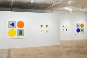
At Life on Mars, the main gallery features D’Agostino’s ongoing Chromatic Alphabet series, which he started in 2013. Hanging on the wall beside the entranceway, and visible from anywhere in the room, is the key work, “Chromatic Alphabet” (2013-15), a long, horizontal grouping of twenty-six paintings, each embodying a visual correlative of a letter in the standard English alphabet.
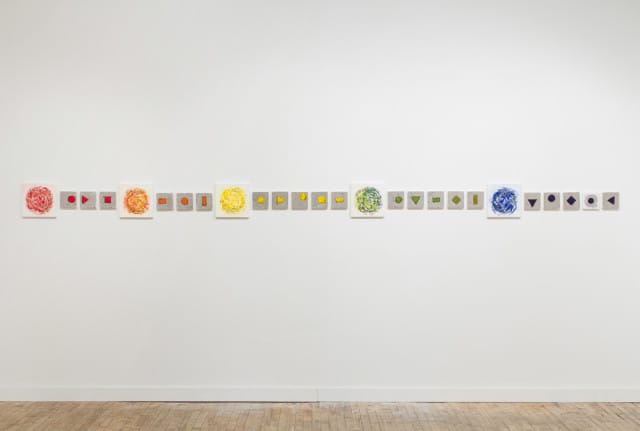
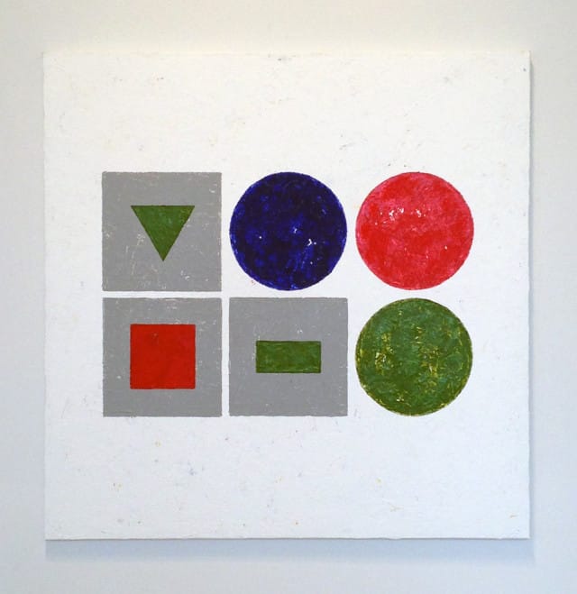
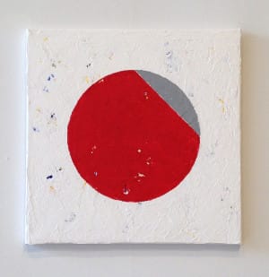
Each painting is on a square panel, with those representing consonants measuring 5 x 5 inches, while the five vowels are twice as large, at 10 x 10. The consonants are interpreted as red, orange, yellow, green, or blue geometric shapes (squares, rectangles, triangles, diamonds, or circles) against a vibrant field of gray, which is a mixture of the three primary colors. The vowels, painted as simple circles against a white ground, also follow the color chart: red (A), orange (E), yellow (I), green (O), and blue (U).
In a statement, the artist explained that the difference in the panel’s size, as well as the choice of white or gray for the field, relates to the “open” sounds communicated by the vowels and the “closed” sounds of the consonants. This system creates a conflict at Y, which is sometimes used as a vowel and sometimes as a consonant. D’Agostino’s solution was a 5 x 5-inch panel containing a blue circle inside a gray circle against a white field.
At this point, you’re probably thinking of semaphore code, and you wouldn’t be half-wrong, but you wouldn’t be right either. D’Agostino’s panels might appear to be reinventions of semaphore flags, with their square format and two-toned color scheme, but the similarity ends there.
A very different logic informs the two systems. Semaphore is sequential: the flags, held with arms extended by a member of a ship’s crew, click along from position A through position Z like the hands of a clock. Not so with D’Agostino’s chromatic alphabet, which is simultaneously visual and aural; the colors, shapes and compositions are designed to evoke the sounds that create the letters, which are then strung together like an abstract rebus to create words.
But the program doesn’t stop there: a further intricacy of D’Agostino’s alphabet is that the consonants take on the color of the vowels they follow, so that if A is red, so are B, C, and D, and if E is orange, so are F, G, and H, etc. Looking at the twenty-six paintings stretched across the wall reveals the alphabet’s striking symmetry, starting off with two groups of three consonants and finishing up with three groups of five.
If this seems to be getting too much into the weeds of D’Agostino’s project, rest assured that there’s more (e.g., the position of the geometric shape on the gray field indicates, as the artist wrote in the same statement, the “hard or soft, labial or sibilant, voiced or voiceless” sounds we make when we pronounce the letter, as well as the area of the mouth where the sounds’ “frication” takes place).
Rather than lean on his linguistic program, however, D’Agostino is intent on making these works, first and foremost, formal and material objects. The buildup of layer upon layer of gesso, in which tiny fissures expose previous coats of colorful paint, establishes a glistening, jagged, rocklike surface that offers a pointed contrast to the hard-edged geometric motifs.
The red, orange, yellow, green, blue, and gray shapes are painted freehand, with no assists from tape or stencils. Tellingly, D’Agostino uses a palette knife to lay down his colors, which more reliably retains the body, vibrancy, and translucence of oil paint than the flattening tendencies of a brush; it is also more difficult to control in the making of such precise shapes. The resulting image is exacting and handmade, playful and stark, weighty and free-floating.
The introduction of diacritical marks — umlauts, circumflexes, grave and acute accents, etc. (again, the weeds are abundant if you care to wade into them), which are expressed as gray slices across the tops of the vowel-circles — offers yet another set of formal variations for the artist to play with. And then there are the canvases featuring painted words, which spell out art-related terms in a variety of languages: “Zeit,” “quadro,” “olio,” “couleurs,” and so forth.
D’Agostino is setting up a code of sorts, but one that distills speech into a conflation of sight and sound, visualized vocalizations that are as musical as they are linguistic.
In an article by Natalie Angier in this week’s New York Times about newly discovered “neural pathways that react almost exclusively to the sound of music,” a researcher is quoted as saying, “There are theories that music is older than speech or language […] Some even argue that speech evolved from music.” With his Chromatic Alphabet, D’Agostino is using abstract painting to convey elemental sounds — the building blocks of both music and speech — in a visual/aural end run around the evolution of written language.
Such psycholinguistic factors provide an added dimension to the artist’s project, but the fecundity of imagination represented by this show suggests that the letters of the alphabet are to D’Agostino as trees were to Piet Mondrian and wallpaper was to Édouard Vuillard: real-world templates to frame investigations into the interactions of color, shape, line and texture.
In the gallery’s project space, D’Agostino has installed a selection of his Floor Translations, a series of drawings in which he copies a splat on his studio floor and unspools a narrative from it across several sheets of paper. The story itself, written out in longhand, is tucked inside shapes silhouetted against a dense field of charcoal and ink. In her New York Times review of Twilit Ensembles, the artist’s 2013 solo at Pocket Utopia, Roberta Smith praised these works as uniting “Mr. D’Agostino’s several talents into something wonderful […] that is very much his own.”
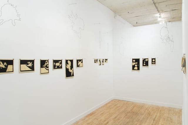
I referred to the current show as “bifurcated” because the Floor Translations couldn’t be more different from the Chromatic Alphabet. The latter, for one, is initiated through deliberation and planning, while the Floor Translations — which include a hanging wire sculpture in the shape of the story’s protagonist above each set of drawings (an arrangement that makes for a stunning overall installation) — rely entirely on chance. (In a book published by the gallery in conjunction with the show, photographs of the actual floor stains accompany the absurd tales spun from them.)
It’s unusual, to say the least, for an artist to display such startlingly different bodies of work in the same show, but the two are opposite sides of the same coin: both possess language as its spine, with one engaged in ideal forms (the circle, triangle, rectangle, square), and the other indulging in the whimsical and grotesque.
Is there a hierarchy, or caste system, at work? The Chromatic Alphabet, which proceeds from the head (eye, mouth, and brain), is not only abstract and geometric, but also brightly arrayed in three primary and two secondary colors. The Floor Translations originate beneath our feet, and their irregular forms are rendered in stark black and white (actually, black and buff, given the warm ivory tone of the paper).
It could be a measure of D’Agostino’s humanism that the distance between heaven and hell — the Platonic shapes of the Alphabet vis-à-vis the crustaceous bottom feeders of the Translations — is the length of the human body. It is also worth noting that the realm of the ideal, represented as simple geometric shapes, is readily within our grasp, while hell is no more ominous than a curious dream.
The simultaneous presentation the Chromatic Alphabet and Floor Translations is indicative of the both-and, rather than either-or, nature of language as a metaphor of human interconnection: a fluid state where every utterance is a flawed translation of emotion to thought, thought to speech; and truth lies only within the nimbleness of the transformation.
Paul D’Agostino: Scriptive Formalities continues at Life on Mars Gallery (56 Bogart Street, Bushwick, Brooklyn) through March 6.


