Flesh and Bones: Philip Guston’s “Thingness”
The idea of an abrupt transition between the abstract work and the late figuration has become so ingrained in the narrative of Guston’s career that a view suggesting a more gradual evolution might meet with resistance.

My first reaction to the exhibition Philip Guston: Painter, 1957-1967 at Hauser & Wirth’s enormous Chelsea space was that it was all too much — thirty-six paintings, many measuring more than seven feet across, and forty-eight drawings in a 3 x 16 grid spanning the width of the gallery. Too much gray, black, and salmon-pink; too many lush, fleshy strokes of a two-inch-wide, paint-laden filbert brush.
But then the rhythms of the installation began to sink in, and the paintings took on a life and logic that looked backward and forward at the career of an artist whose influence can’t be overstated.
The exhibition’s curator, Paul Schimmel, in his remarks at the press preview, dismissed the idea that these paintings, which have been little seen in the half-century since they were made, are transitional, a ten-year interregnum between the warmly glowing “Abstract Impressionist” paintings (a term Guston hated) of the early- to mid-1950s, which brought him international attention, and the earthy candor of his late figurative works, which made him a postmodernist icon.
Schimmel made the point that ten years of painting is much too substantial a period of time to regard as transitional. In fact, the canvases in this show, which are dominated by gruff, aggressive swaths and patches of black, span twice as many years as his earlier abstractions. And by the evidence presented here, Guston’s contemporaries, who were scandalized by the figurative funkiness of his final decade, should have known what was coming.
I actually saw one of the large paintings featured in the current show, “Traveler III” (1959-60), in December at Art Basel Miami Beach, and it was startling. At the time, I described it as displaying “a spirit more closely aligned with [Guston’s late-period] nasty-funny images,” even though it was made ten years before the shift to figuration, “than with the twilit lyricism of his non-objective work: the color is harsher and darker, and a red-and-black tree-like form dominating the right half of the picture could be a precursor to the innumerable clouds of cigarette smoke he painted later on.”
The idea of an abrupt transition between the abstract work and the late figuration has become so ingrained in the narrative of Guston’s career that a view suggesting a more gradual evolution might meet with resistance, since it implies a diminishment of the Promethean inspiration that carried him from one mode of expression to another.
But the constellation of images brought together by the exhibition squeezes his drive toward graphic simplicity and natural inclination toward graspable form (as opposed to the loosely affiliated brushstrokes of the early ‘50s) into the ball that would soon burst into the universe of the late paintings.
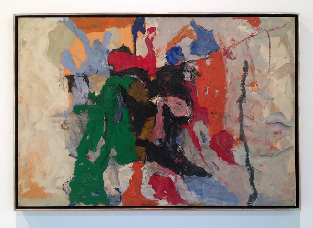
A piece like “Fable II” (1957), one of the earliest works in the show, done in oil on illustration board, represents a solidification of the formerly shimmering paint strokes of the artist’s previous abstractions. Craggy, organic forms in green, red, orange, pink, black, and brown converge on the center of the canvas, where they are compressed like fault lines between two off-white tectonic plates on the right and left.
In subsequent paintings, the compaction of these forms, which recall Clyfford Still in their ruggedness, quickly gives way to permeable fields of improvised, mostly gray brushstrokes. Edges open up as swatches of canvas are left undisturbed by Guston’s outward-working of the image, a marked departure from the all-over sensibility of most of his Abstract Expressionist peers.
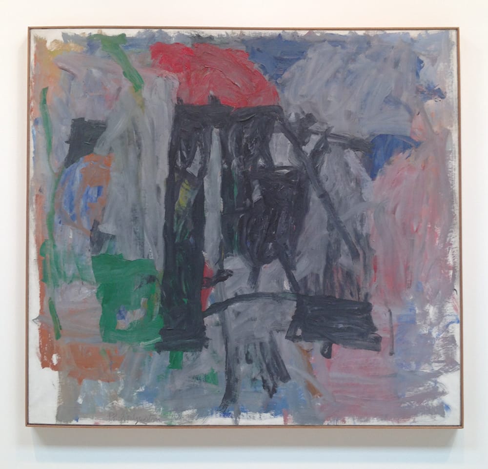
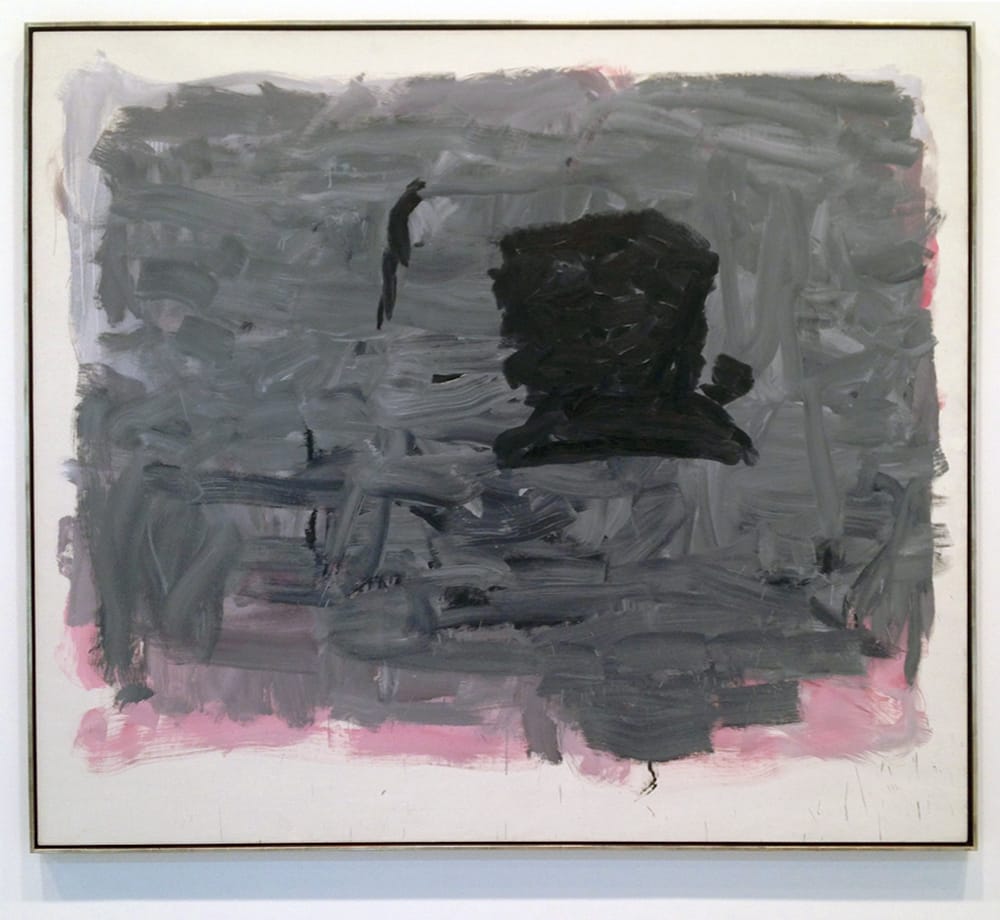
A large work from 1959 — 65 x 69 inches — is dominated by two vertical shafts in the center of the canvas, which resemble black scaffolding or buttresses topped by a reddish-gray blob. Its title, however, is “Painter,” and suddenly what could have been read as an abstracted industrial landscape is now imbued with a figurative dimension. Are we looking at Guston’s idea of a painter’s essence (not an uncommon line of inquiry for the time) or is the image a caricature of a long-legged artist in black pants and a red shirt (or, more satirically, a smock)? Is that his arm shooting off to the left, near the top of the canvas?
And if it is, what’s happened to his head? There isn’t even an indication that he has one. Could this odd little detail be a sendup of the 19th-century French phrase, famously skewered by Marcel Duchamp, “bête comme un peintre” (“as stupid as a painter”)? If the answer to any of the last four questions is yes, is it safe to say we are looking at a figurative painting (and a very funny one at that) rather than an abstraction? The answer here, apparently, is maybe. As Robert Storr writes of this period in his 1986 monograph on the artist, “Neither figurative nor fully abstract, the content of these images is the elusiveness of their being.”
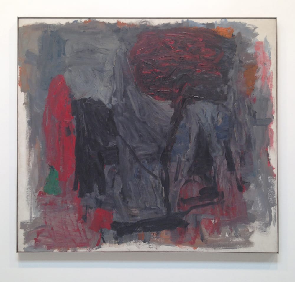
Moving from the late-‘50s to the 1960s, Guston’s titles become more tied to representational motifs: instead of “Fable II,” mentioned above, or “Rite” (1957), or simply “Untitled” (1958, 1962, and 1963), we find allusions to the landscape — “Path II” (1960); “Garden of M” (1960); “Slope II (1961) — or to the figure: along with “Painter” and “Traveler III,” there is “Alchemist” (1960), “Stranger” (1964), “The Inhabiter” (1965), and “Portrait I” (1965). Storr notes that Guston’s titles from this time “reflected the growing ‘thingness’ of his images, suggesting a wide variety of specific subjects, moods, and art historical references.”
Guston was among the most literate of artists, as well as one who continually stared death in the face, and so it would be tempting to think of “Stranger” as a reference to everyone’s Existentialist fave, Albert Camus’ novel L’Étranger (1942), except that it wasn’t published in English under that title until 1989 (previous translations bore the name The Outsider). Nevertheless, it is worth noting that around the time he painted it, he also made a cluster of works evoking states of being and the passage of time: “Looking” (1964); “Position I” (1965); “Afternoon” (1964); “The Year” (1964); “May Sixty-Five” (1965).
In all of these paintings, one or more black, blocky forms, suggestive of human heads, hover above a field of agitated gray or gray-over-pink brushstrokes. (The explosion of velvety gray paint to the left of the central black coffee-cup-shape in “Stranger” is a miracle of sensual materiality.) This is the part of the exhibition that initially felt overhung with similar canvases. However, after giving it a little more time, I began to see the subtle but lively interactions among the paintings’ formal elements, especially in the trio comprised of “Portrait I,” “Stranger” and “Reverse” (1965), mounted across a single wall.
Grouped together, the three paintings seem to form a single line of thought, as the black shapes, one per canvas and located pretty much in the same spot, bob and weave from one image to the next. The effect is almost like reading a comic strip, such as George Herriman’s Krazy Kat cartoons (another prefiguring of things to come), in which the action often takes place in a single, unchanging setting.
In “Reverse,” which sports the most abstract title of the later semi-abstractions, the black form looks for all the world like a silhouette of one of the cigarette-puffing heads from the artist’s last decade (I’m thinking specifically of his portrait of Morton Feldman, “Friend—to M.F.,” 1978, but the shape also feels as if it could be a self-portrait). The jump to full figuration feels immanent.
As the ‘60s wore on, with its escalating political violence and foreign entanglements, accompanied by the Minimalist’s ascendant formal pragmatism, Guston continued to pare down his methods until he was left with two colors, gray and black, and ultimately black lines on white paper.
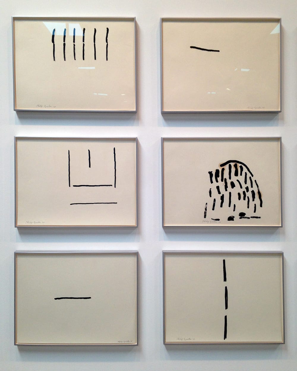
The subtitle of the show is Painter, 1957-1967, but that’s a bit of a misnomer, because the latest painting in the show is dated 1965. Guston stopped painting for two years after his 1966 Jewish Museum retrospective and turned exclusively to charcoal and ink. The exhibition’s wall of untitled drawings, made between 1967 and 1969, amounts to a magnificent coda to the paintings — an extreme distillation of Guston’s search for spontaneous form.
Each of these high-contrast works holds the expanse of paper with an authority that is both light-filled and vibrantly inventive. And yet, even in their elemental state, which would have turned into an endgame for anyone else, they are restless, moving somewhere, anywhere, as if to ask, in the words of T.S. Eliot, one of Guston’s favorite poets, “Shall these bones live?”
Philip Guston: Painter, 1957 – 1967 continues at Hauser & Wirth (511 West 18th Street, Chelsea, Manhattan) through July 29.


