Another Hidden Chapter of ’70s Abstraction
The nine artists in 1970’s: 9 Women and Abstraction infuse their art with an unexpected warmth, humanity, and quirkiness that feel all the more invigorating when compared with the cerebral objectification prized by their male Minimalist counterparts.

The exhibition 1970’s: 9 Women and Abstraction at Zürcher Gallery on Bleecker Street, curated by Barbara Stehle, is as matter-of-factly titled as you can get — the decade, the artists, the genre — which is entirely appropriate for the materials-based, understated, and uncompromising art on display. Even a whiff of embellishment would have been too much.
But the minimalist aesthetic indicated by the title shouldn’t suggest that the works are dry or ascetic: to the contrary, the nine artists included here — Lula Blocton, Regina Bogat, Samia Halaby, Hermine Ford, June Leaf, Lizbeth Marano, Kazuko Miyamoto, Lynn Umlauf, and Merrill Wagner — infuse their efforts with an unexpected warmth, humanity, and quirkiness that feel all the more invigorating when compared with the cerebral objectification prized by their male Minimalist counterparts.
Unlike the Post-Minimalism of Eva Hesse or Jackie Winsor, whose sculpture branched out into impurely geometric and organic forms, these artists (with the notable exceptions of June Leaf and Lynn Umlauf) remain by and large tied to the grid; where and how they depart from it become the most telling aspects of their work.
In her highly informative essay on the exhibition’s website, curator Stehle takes issue with an essentialist agenda that would split aesthetic inclinations between male and female: “For the 9 women in the show, the point was never to make a distinction between the genders. The point was to design their lives and create a place for their work.” It would therefore be more fitting to approach this show not as an argument between formal or gendered dichotomies, but as a glimpse into explorations of Minimalist abstraction that remain largely outside the received narratives of the period.
Even works as apparently straightforward as these, however, can be fraught with ambiguity between their execution and intent, a friction manifested most strongly in Hermine Ford’s untitled painting in oil, graphite, and gesso on cotton duck from 1975.
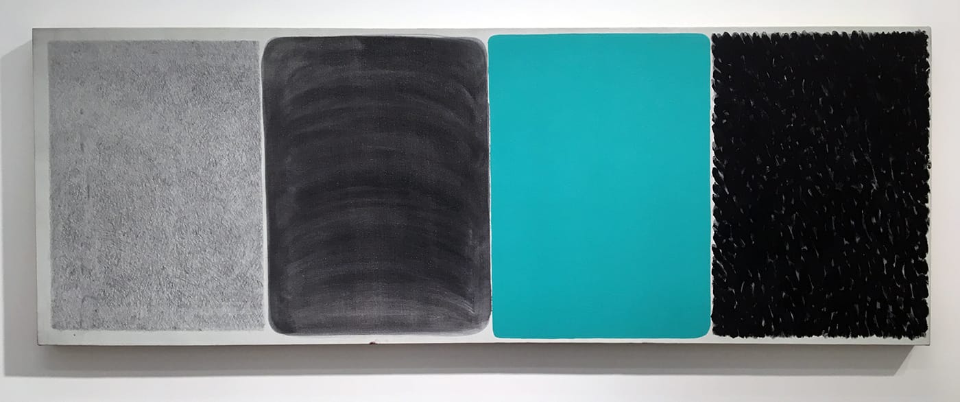
The painting, a narrow, horizontal rectangle (23 ½ by 66 inches), is divided into four discrete sections, each covered in a different color and texture: massed graphite lines; swipes of gray wash; flatly applied green monochrome; and a swarm of dense, black brushstrokes, which could just as well be thumbprints, with flecks of the white ground peeking through.
My initial impression was that Ford had extracted a row of four cells from the formalist grid and permeated them (more precisely, three out of the four) with the nuanced and defiantly anti-formalist factor of the artist’s touch. And, yes, I did view this gesture in gendered terms. But when I later read Stehle’s essay, I learned that Ford’s “fields of marks […] were derived from the grass growing on the dunes” of Provincetown on Cape Cod:
Those small marks could be varied forever. The next panel would be an acidy copper green, which was the color painted on the window trim of the gray, unpainted dune shack we use to stay in. The dune shack itself was this “natural”, weathered gray, but the window frames were painted in what I always considered to be very artificial, oxidized copper green color. (This passage is quoted from an interview with the artist in Stephanie Buhmann’s book, New York Studio Conversations – Seventeen Women Talk about Art, published by The Green Box, 2016.)
And so I stood corrected. But art is one part what the artist puts into it, one part what the viewer brings to it, and one part context as determined by the presiding culture. Even after learning its origins, I still can’t see the painting in terms of a landscape, which only underscores its material authority and substance as an abstraction.
The show is full of such indirections, sleights of hand, and double-takes: Merrill Wagner, whose handsome, four-decade mini-retrospective is currently running at the gallery of the New York Studio School, contributes quasi-geometric works in tape on Plexiglas, completed between 1975 and ’77. In some, the tape is applied straight, with its color (red, yellow, gray, or beige) determining the color of the piece, an early indication of the artist’s preoccupation with the subtle distinctions of monochrome, which led her to make paintings comparing different brands of the same color. In other tape works, Wagner included a coating of charcoal, resulting in sooty, gritty textures, or imprinted the pigment of the red Conté crayon covering the surface of one drawing (“Sanguine Five, B,” 1975), composed of vertical bands of gaffer’s tape, onto another, which was made up of horizontal strips of the same material (“Sanguine Five, A,” 1975).
These blunt, muscular statements, which delve into the expressive potential of household items, link up with Wagner’s later time-based works (exposed to and eroded by the elements) in their contemplation of transience and stability. The transfer of pigment from one piece to another, as in the “Sanguine” drawings, sits on an opposite pole from the resolute materiality of a Donald Judd or Frank Stella. There is a grace and fragility to these works that reveal an unexpected depth of emotion and paradoxically underscore the power of their presence.
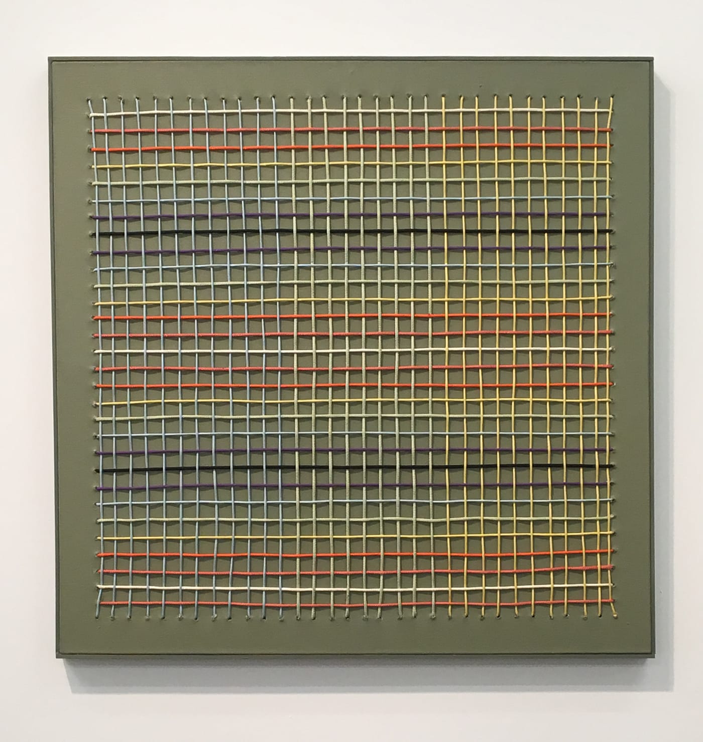
A similar formal contradiction, or parallel track, occurs in Regina Bogat’s “Woven Painting 1” (1973), in which horizontal cords in eight colors (representing the three primaries, the three secondaries, and white and black) define the rows of a grid, while blue, green, and yellow verticals (moving from left to right, with 12 blue, nine green, and 11 yellow) create the columns. The cords are woven into a 35-by-35-inch canvas, painted moss green, in which the empty space around the edges provides a frame-like border for the grid.
The systematic color scheme is undercut, however, by the inherent wobbliness of the main material. The woven grid is de facto imperfect due to its process, which pulls some cords tighter than others, resulting in a lilting pattern of slightly varied cell sizes and slightly off-kilter intersections of vertical and horizontal cords. It is as if Bogat has turned geometric abstraction’s foundation on its head by re-siting the grid in what, at the time, would have been considered the realm of craft, while emphasizing the exquisite fallibility of the human hand.
Lynn Umlauf, in contrast, pays the grid no attention whatsoever, creating shaped, biomorphic canvases overlaid with configurations of cutout paper, which are painted a single, juicy color while the canvas remains raw. The effect is both painterly and sculptural, with an aggressive tactility that resonates into the surrounding space. It is hard to look at these works without considering their interaction with the floor, wall, and ceiling.
June Leaf, on the other hand, pays no attention whatsoever to the era’s dominant conversation about abstraction, going her own way to paint scribbly faces in gouache on paper, superimposed with tiny landscapes and figures, including two who could be Huck and Jim on their raft, inside of swirls reminiscent of the rings of Saturn.
Lizbeth Marano is represented by six large photographs documenting two early Land Art pieces (three photos each, stacked almost floor to ceiling). “Three Squares on a Hill” (1971) depicts squares made of string cordoning off sections of an undulating landscape, and “A Line as Long as a Bag of Lime” (1970) tracks the progress of a white trail of lime that the artist poured from a bag as she walked across a barren field.
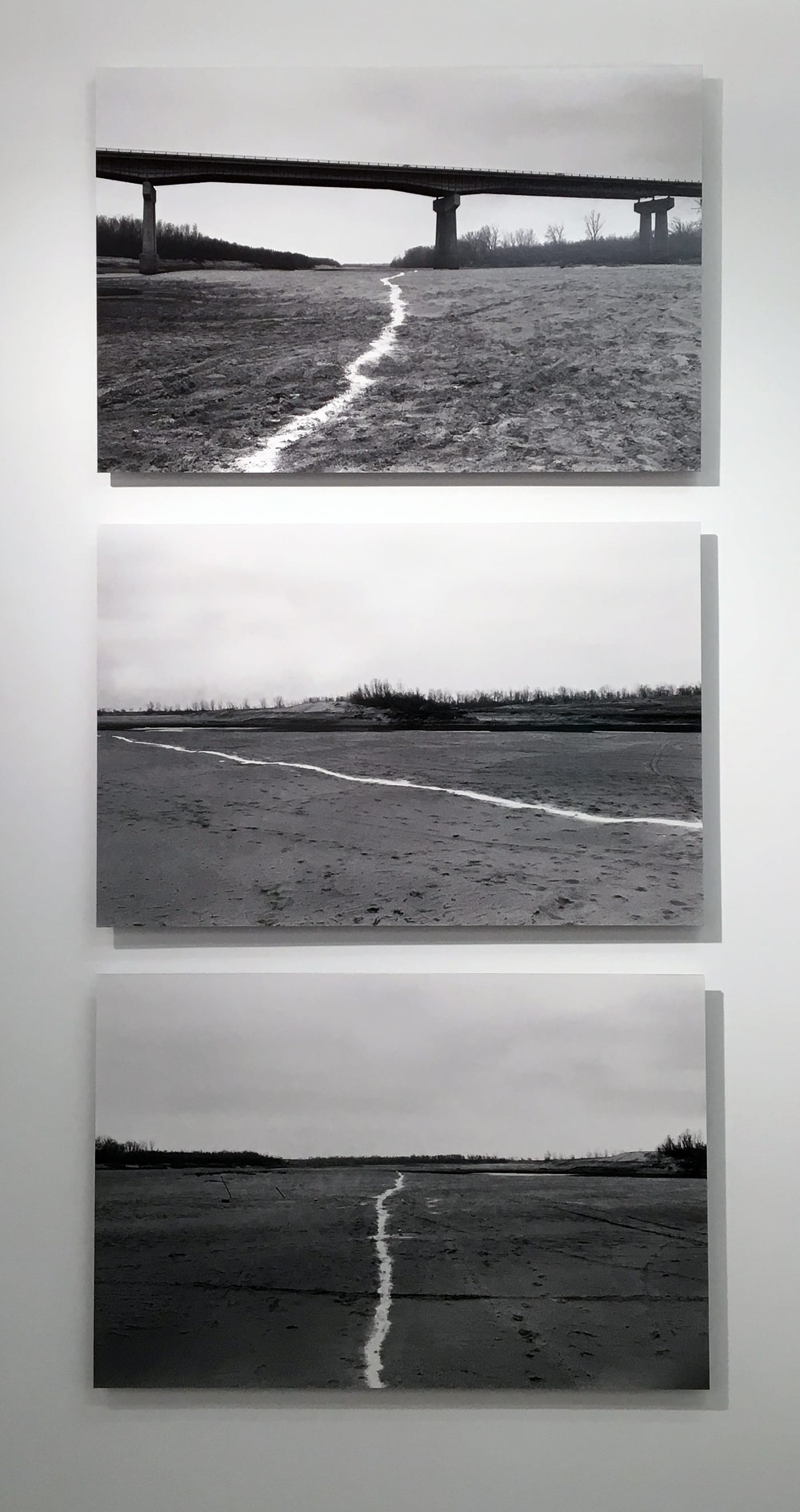
“A Line as Long as a Bag of Lime” is oddly prescient of a performance piece by Francis Alÿs, “The Green Line” (2004), in which he poked a hole in a can of green paint and walked, according to the artist’s website, along “a line following the portion of the ‘Green Line’ that runs through the municipality of Jerusalem. 58 liters of green paint were used to trace 24 km. Shortly after, a filmed documentation of the walk was presented to a number of people whom I invited to react spontaneously to the action and the circumstances within which it was performed.”
Marano’s piece was done on a deserted field in an unidentified location, without the cachet of a camera crew trailing behind her. It lacked the self-aggrandizement implicit in calling out an unsolvable political and cultural divide that’s self-evident to everyone living on either side of it. She didn’t use paint, which would disfigure the landscape, but lime, which would eventually blend into the soil and disappear. The avoidance of paint as a primary medium can be seen, in the work of Wagner and Bogat, as a sign of both skepticism and humility; in Marano’s case, it’s an acknowledgment of mortality and oblivion.
Swinging back to yet another set of aesthetic concerns (and it’s remarkable how well a show so disparate in media and scale hangs together), Lula Blocton and Samia Halaby present paintings (two by Blocton in oil on linen) and drawings (three by Halaby in wax crayon and colored pencil on paper); within the context of a group, the use of such traditional means as oil paint or pencil on an unviolated rectangular support would seem out of place if not for the artists’ individualistic takes on convention.
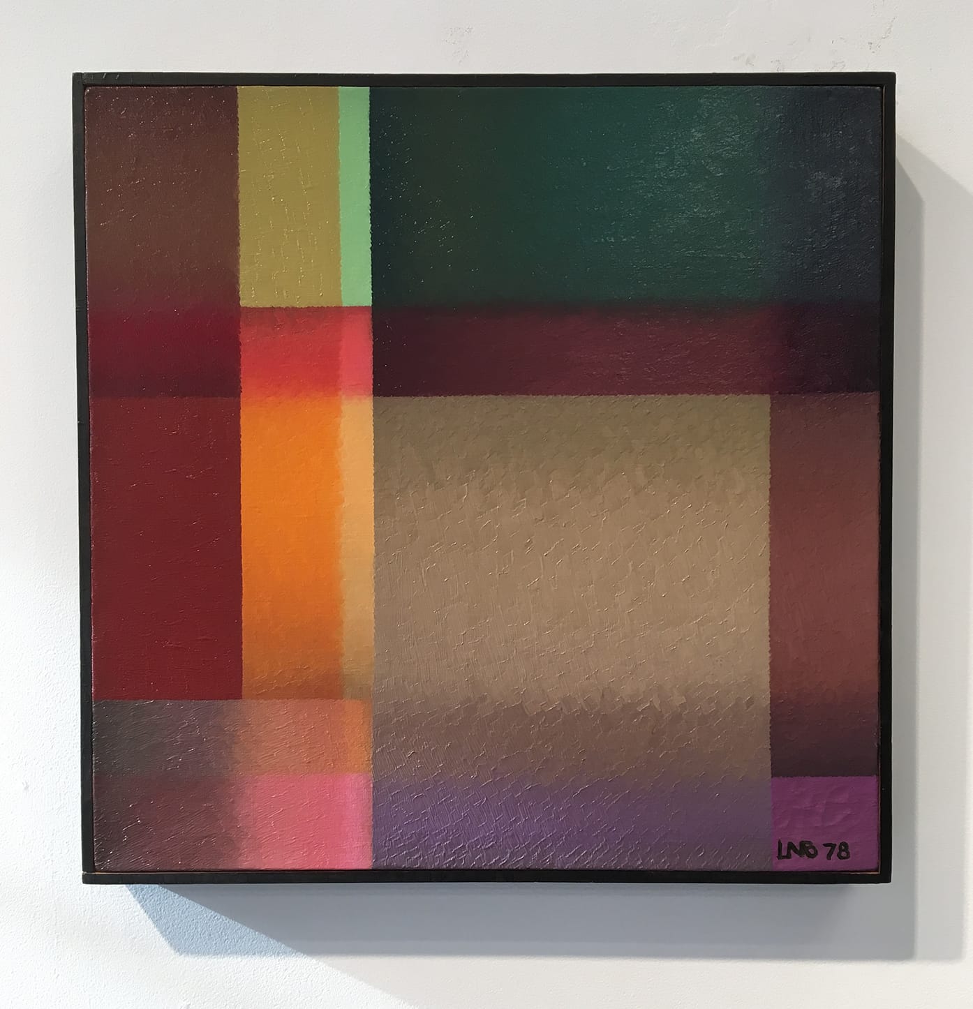
Blocton paints grid-based abstractions, but her treatment of the surface seems expressly designed to send Clement Greenberg, the preeminent postwar critical voice and iron-fisted arbiter of formalism and flatness, howling into the night. Her two modestly scaled (16 by 16 inches), cooly luminous untitled canvases from 1978 are less like paintings than patterns of light. Their overlapping squares and rectangles contain the depth and translucency of stained glass; we seem to look through rather than at them. They are abstract illusions without the cheap schtick of Abstract Illusionism. You may not agree with the approach, but it is difficult to deny their disorienting beauty.
Stehle writes in her essay that Samia Halaby “is an abstract painter. Yet, she has kept up a figurative drawing practice. Her figurative work is infused with her sentiments as a Palestinian refugee. This practice is a window into her emotional and political identity, but she has not let it define her artistic path. Her quest as an artist resides in the field of abstraction. She has written extensively about her commitment to ‘Reflecting reality in abstract picturing.’” (The quotation is the title of an essay that the artist wrote for the journal Leonardo in 1987.)
In this regard, Halaby’s pursuit is uncannily parallel to that of Thomas Nozkowski during the same time period, when he rejected formalism and attempted to imbue his abstract paintings with his personal passions and experiences. Halaby’s precisely rendered diagonal bars and planes couldn’t be farther from Nozkowski’s freewheeling improvisations, but they do discharge a sense of dislocation and the tragic in the predominance of black in two of the images, and the lack of a vertical or horizontal anchor in all three — a compositional slippery slope that threatens to cast us into an emotional free fall.
The two sculptures on display by Kazuko Miyamoto are titled as matter-of-factly as the exhibition itself, and they are just as deceptively simple. “Nails and String Wall Piece” (1978) is a shimmering array of white strings forming a 10-foot-high curved plane that stretches from the wall to the floor. The surface feels so organic — despite its overall sensation of Platonic order — that it is a surprise to discover that the nails attaching it to the wall create, if not a perfect grid, then a strictly regimented series of rows that start near the floor and climb to the top of the piece.
The combination of materials unavoidably recalls the work of Fred Sandback, but where a Sandback sculpture, delineated in yarn or elastic and attached via invisible anchors to the floor and ceiling, is one step away from an immaterial idea, Miyamoto’s work exalts in the sheer physicality of driving nails into a surface and tying the string-ends around their heads. Even so, the piece is no less ethereal for the time and work that went into it.
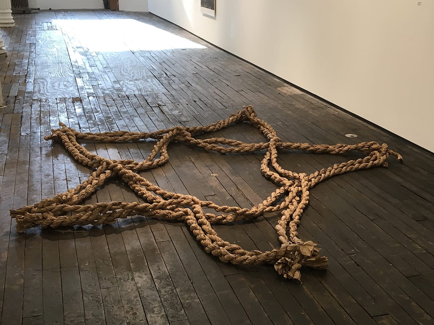
Miyamoto’s other sculpture, “Star Piece” (1979), is a five-pointed star, nine feet in either direction, composed of tightly coiled brown industrial paper, lying on the floor like a spread-eagled body. I immediately, and inexplicably, thought of the death of Ana Mendieta, who, six years after the sculpture was made, fell from the 34th-floor window of her Mercer Street apartment, a half-mile away — a tragedy for which Mendieta’s husband, Carl Andre, was tried and acquitted.
Later, I read in Stehle’s essay that Miyamoto had befriended Mendieta in 1978, and together they organized Dialectics of Isolation: An Exhibition of Third World Women Artists in the United States for the Feminist collective gallery A.I.R. Perhaps the piece reminded me of Mendieta’s funereal Silueta performances (1973–77), or perhaps it possessed a spirit of the time shared by both artists that Miyamoto had, consciously or not, endowed in the work, or perhaps it was something else. But, as disquieting as it was, the connection was there.
1970’s: 9 Women and Abstraction continues at Zürcher Gallery (33 Bleecker Street, Bowery, Manhattan) through January 15, 2017.


