Jet-Age Dreams in the Vintage Posters of Pan Am Airlines
Pan Am: History, Design & Identity, a new book by Matthias C. Hühne, retraces the distinct design history of the defunct Pan Am airlines.

Pan Am hasn’t existed as an airline since 1991, but its blue globe logo endures as a familiar icon of the Jet Age. Pan Am: History, Design & Identity by Matthias C. Hühne, recently released by Callisto Publishers, examines in its over 400 pages the company’s attention to its visual identity, from vivid posters of distant destinations, to modernist architecture for its terminals.
Hühne authored last year’s equally colossal Airline Visual Identity: 1945–1975, which explored post-World War II graphic design in the airline industry. The planes were newly accessible in peacetime, and airlines like Pan Am promoted their own contributions to the war while encouraging customers to take advantage of the advanced technology in aircrafts helped by the military.
“Pan Am’s story also illustrates how publicity experts and commercial artists coped with this new mode of travel as it evolved from its early stages, when passenger flight was very prestigious and exclusive as well as still somewhat dangerous, to become the safest, most conventional and most important means of long distance travel,” Hühne writes in an introduction.
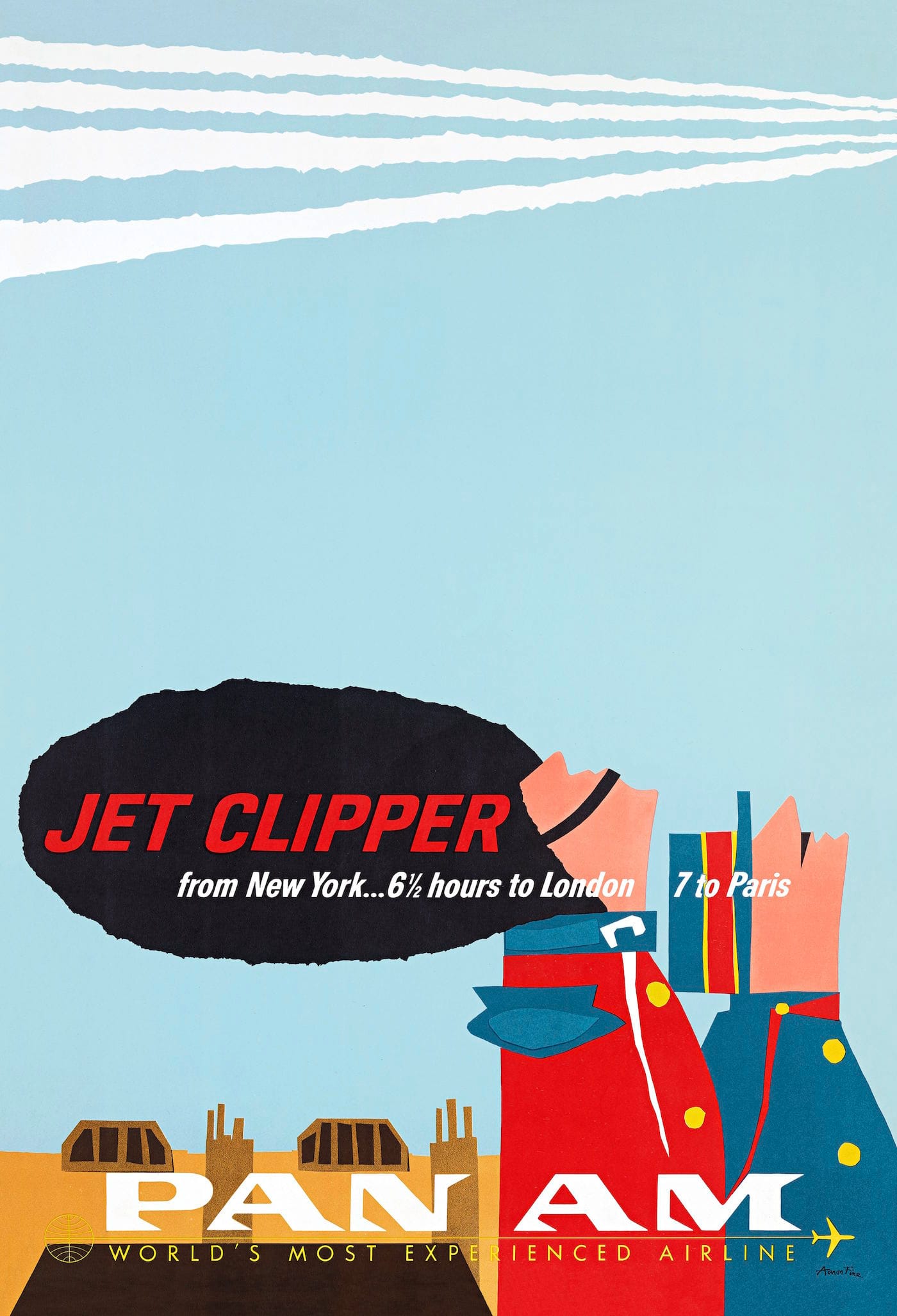
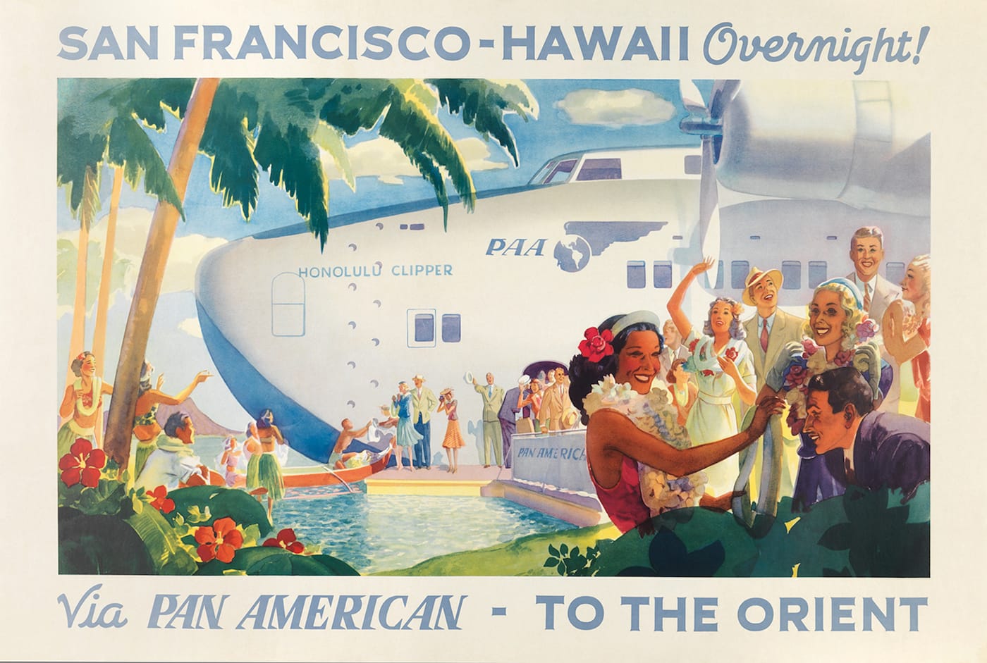
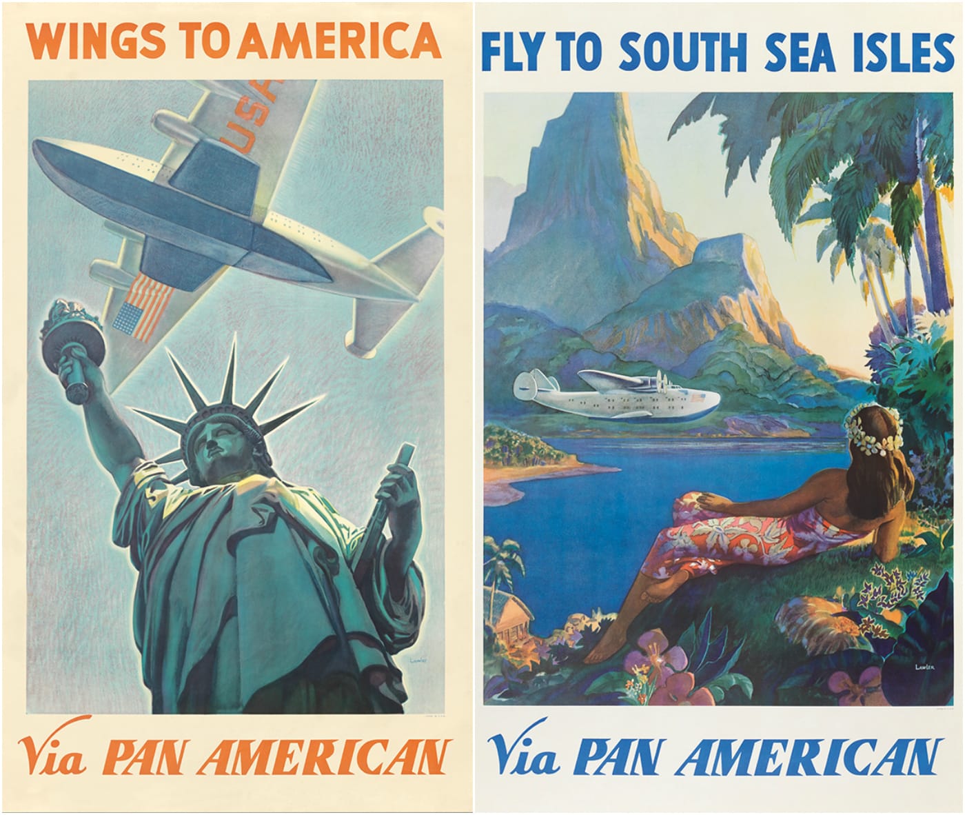
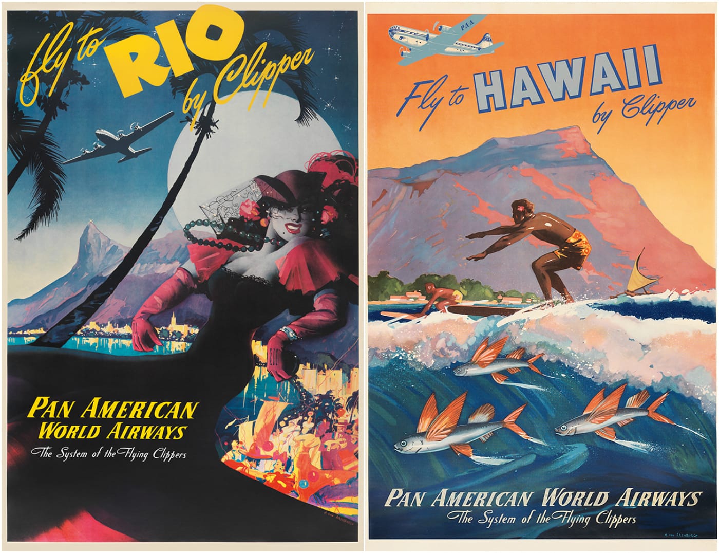
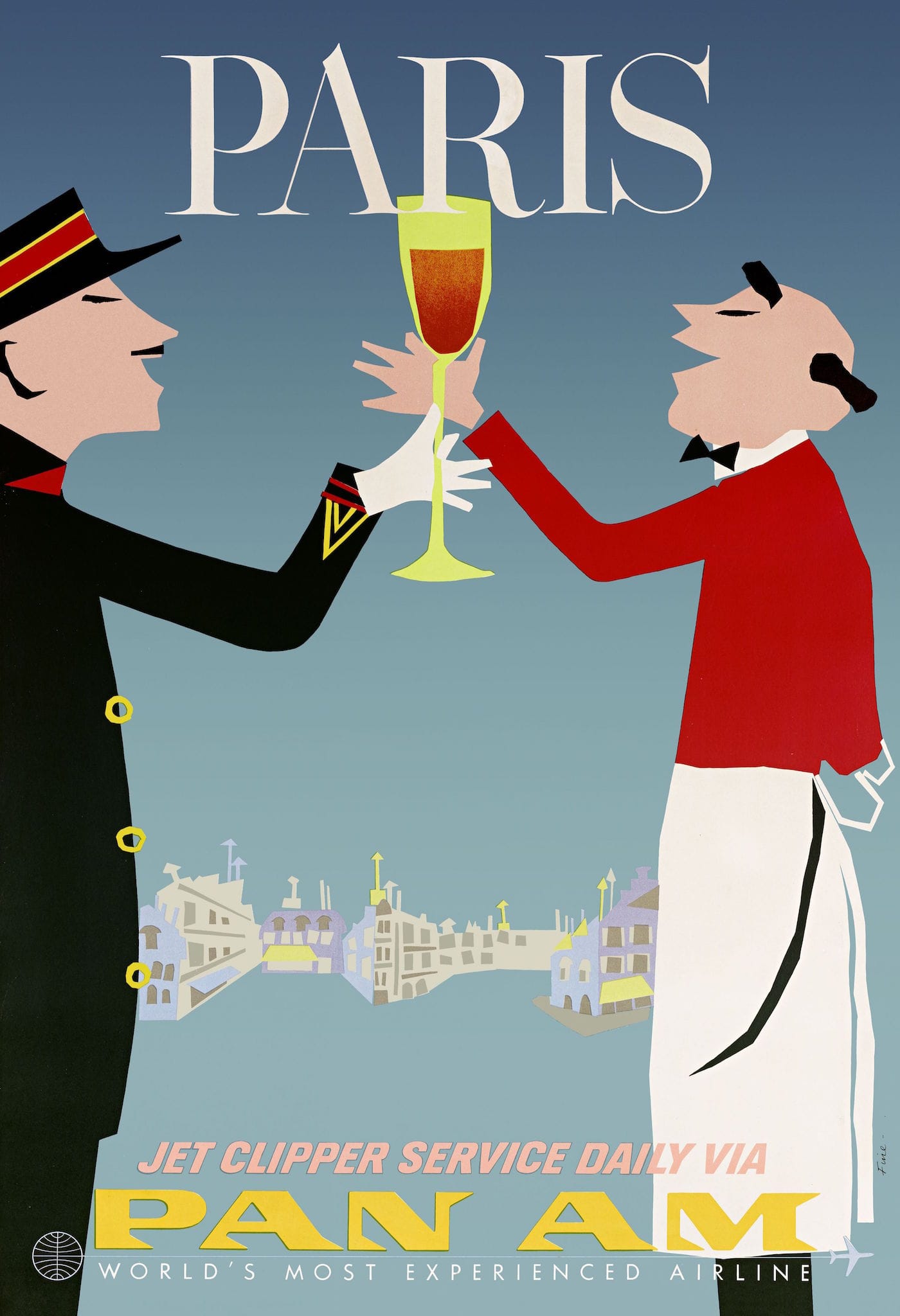
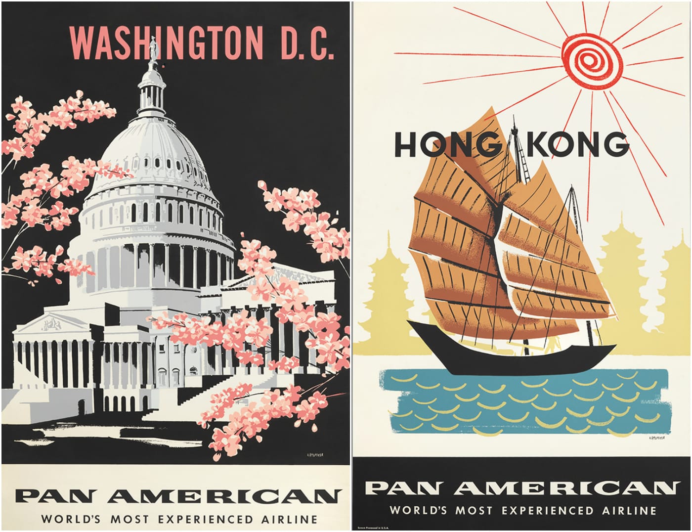
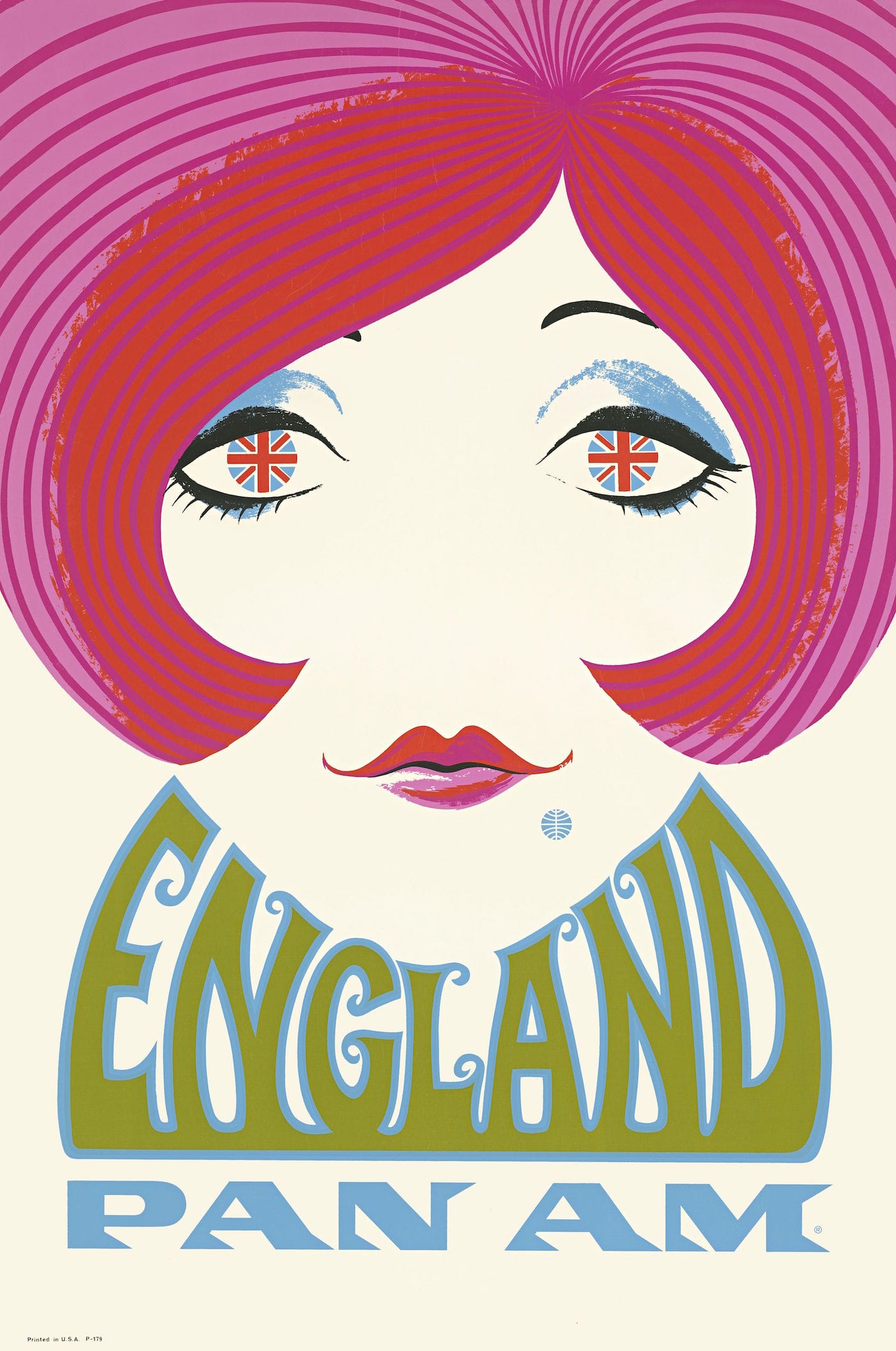
Pan Am started in 1927, founded by Juan Trippe, who was committed to making airline travel affordable for the larger public, and the consistent brand visuals reinforced that goal. Late 1930s and early 1940s illustrations by Frank McIntosh and Paul George Lawler portray exotic locales in muted, inviting hues, and in the late 1950s, Aaron Fine echoed this friendliness in his more vibrant and cartoonish posters that marked the debut of Pan Am’s commercial jet services. In one, a member of the British Queen’s Guard is craning his tall hat backwards to look at the trails left by the plane soaring through the sky.
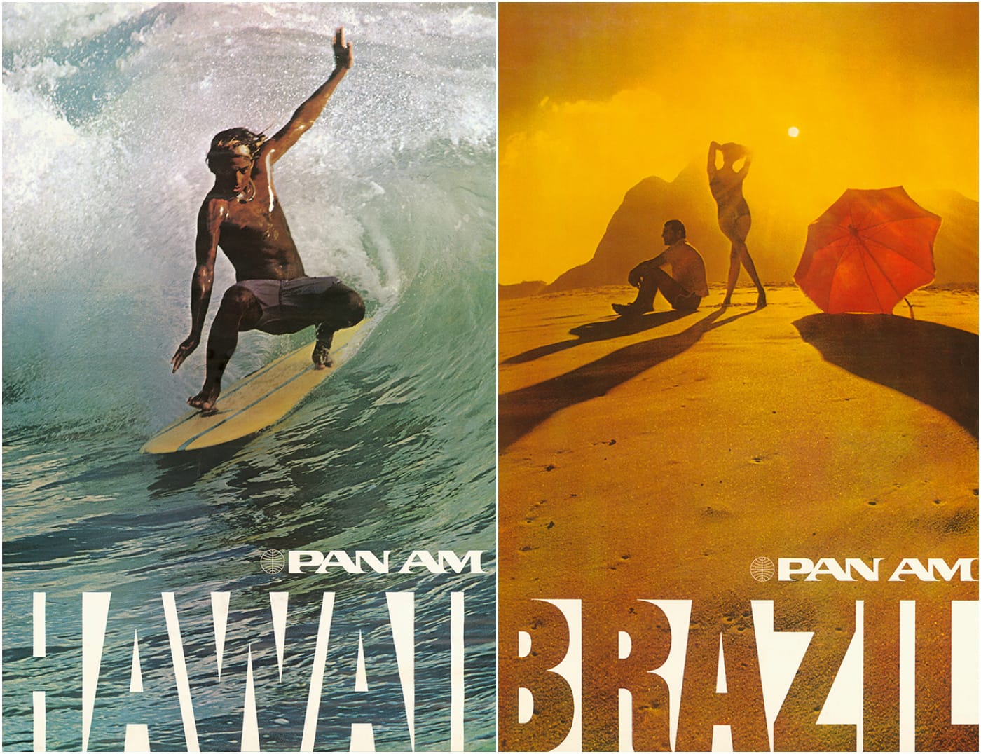
Later advertisements incorporated photography, such as those in the early 1970s by Ivan Chermayeff that visualized remote destinations. The Museum of Modern Art acquired the series in 1972, citing how the “cultural fantasies and ideals are projected through monumental imagery, presenting people and environments as distant objects of beauty. Rather than engaging with each country’s everyday realities, the viewers of these images, potential travelers, remain aesthetic observers.” Air travel in this American Dream was about becoming a journeying witness, and that little planetary logo branded how to get there.
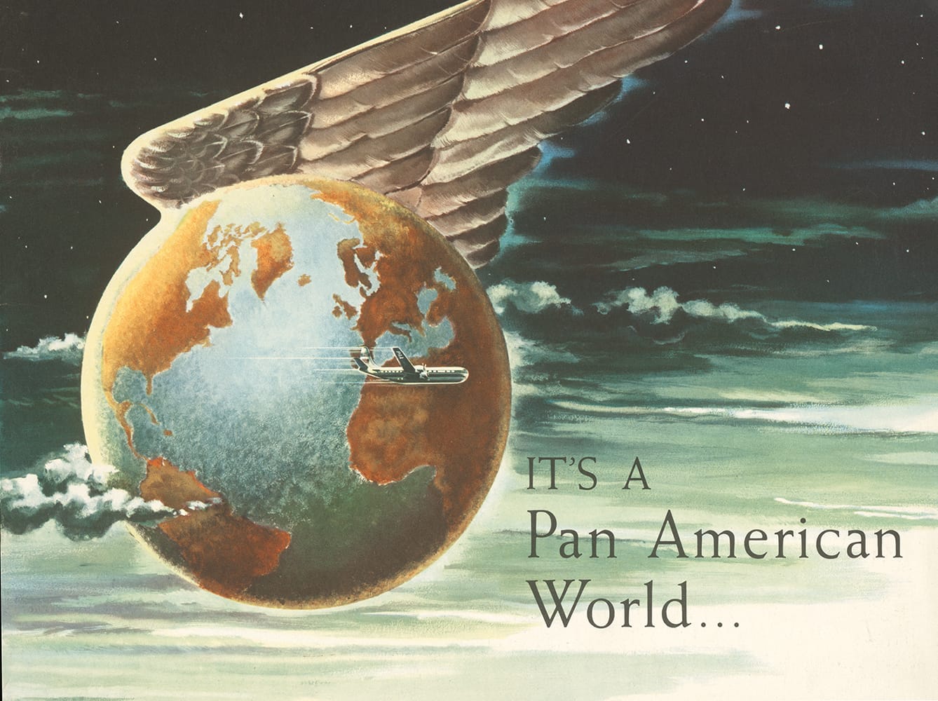
“Today, the blue globe Pan Am assumed as its corporate insignia at the beginning of the jet age continues to represent the airline’s history and achievements and its perceived status as unofficial flag carrier of the United States,” Hühne writes. “This iconic symbol has taken on a life of its own, inseparable from the airline’s history but now representing an abstraction of what the airline once stood for.”

Pan Am: History, Design & Identity by Matthias C. Hühne is out now from Callisto Publishers.