An Eye for Words: Concrete Poets at the Getty
Concrete Poetry focuses on the purists of the movement, particularly the Brazilian Augusto de Campos, the Scottish poet Ian Hamilton Finlay, and the Austrian poet Ernst Jandl.

Concrete Poetry: Words and Sounds in Graphic Space at the Getty Research Institute, reveals the wealth of the GRI’s holdings. Curated by Nancy Perloff, assisted by Christina Aube, this small but intensely focused show does not address the wide range of the poetic Concretists who began their experiments in the 1960s and 1970s in visual, verbal, and sonic combinations of words. Reaching across the globe through Brazil, Austria, Switzerland, England, Mozambique, Japan and elsewhere, the phenomenon did not take deep root in the United States; however it certainly found adherents here in Henri Chopin, Mary Ellen Solt, and Emmett Williams (all of whom are represented in this show). One might argue that it influenced works by John Cage and the more page-bound Projectivists (Charles Olson, Larry Eigner, and others) who moved their words from regularized line units into spatial arrangements across the page. The influence of the Concretists can even be seen in digital and graphic art works being made today.
Concrete Poetry, instead, focuses on the purists of the movement, particularly the Brazilian Augusto de Campos, the Scottish poet Ian Hamilton Finlay (who also worked in stone and other sculptural mediums), and the Austrian poet Ernst Jandl, while representing figures such as Eugene Grominger, Kurt Schwitters, Hans Arp, F.T. Marinetti, and Hugo Ball, as forerunners. Yet despite the somewhat limited list of artists, the range of their work is quite remarkable, as Concrete Poetry concentrates not only on words printed upon the page (often in beautiful colored inks) but in cubes, sculptural paper constructions, winding fold-outs, and the voice (the exhibition features recorded performances of several of the works, a remarkable exception to similar shows).
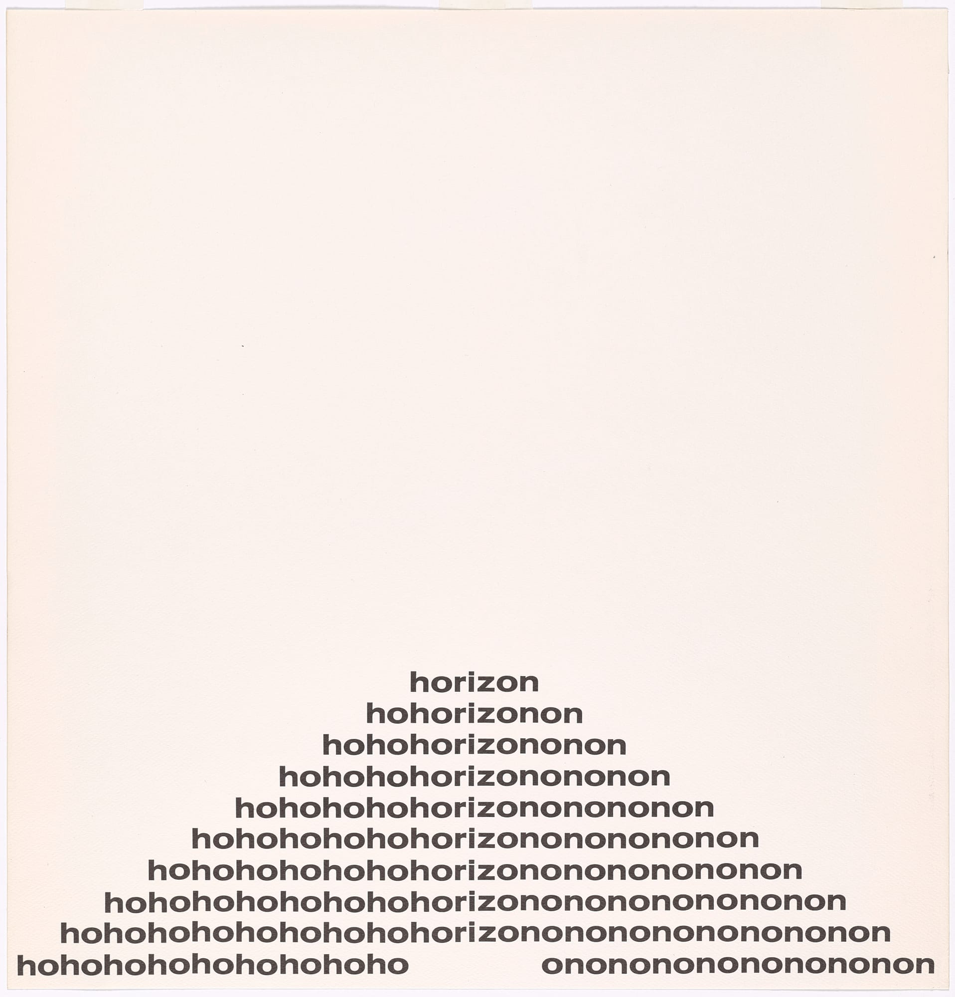
If many of these works, such as Finlay’s “Ho/Horizon/On” and “Broken/Heartbroken” (both 1968) may seem somewhat simplistic at first view, a closer observation reveals significant vocal and visual complexity. The first poem, beginning with the word “horizon,” for example, seems to be just that, a pyramidal statement of the low horizon upon which the words are placed on the paper. Yet reading this Finlay work, one hears a kind of Beckettian phrase “hohorizon,” (Worstword Ho) a movement forward, intensified by the very next line, with the gathering cry of “hoho.” This quickly becomes an almost comic laugh about trudging through that endless onward movement, before ending, finally, in a re-acceptance of the notion of onward movement with 10 “onononononononononon’s” which, in their hidden no-no-no’s can also be perceived, as against their assertive resignation at life’s onward movement, as a kind of denial.
Similarly, the “broken heart” of “Broken/Heartbroken” sputters off into a complete break-down of language in the downward trajectory of the words upon the page represented through a spatial gap between the linguistic fragments, until the phrase is inverted at the conclusion as “heartbroken.”
The simple repetition of the word “Luxo” in Augusto de Campos’ ironic work conveys its message by the ornate elaboration of typestyle, following an equally luxurious path of winding foldouts as it reveals the pointlessness of the inordinately decorated word.
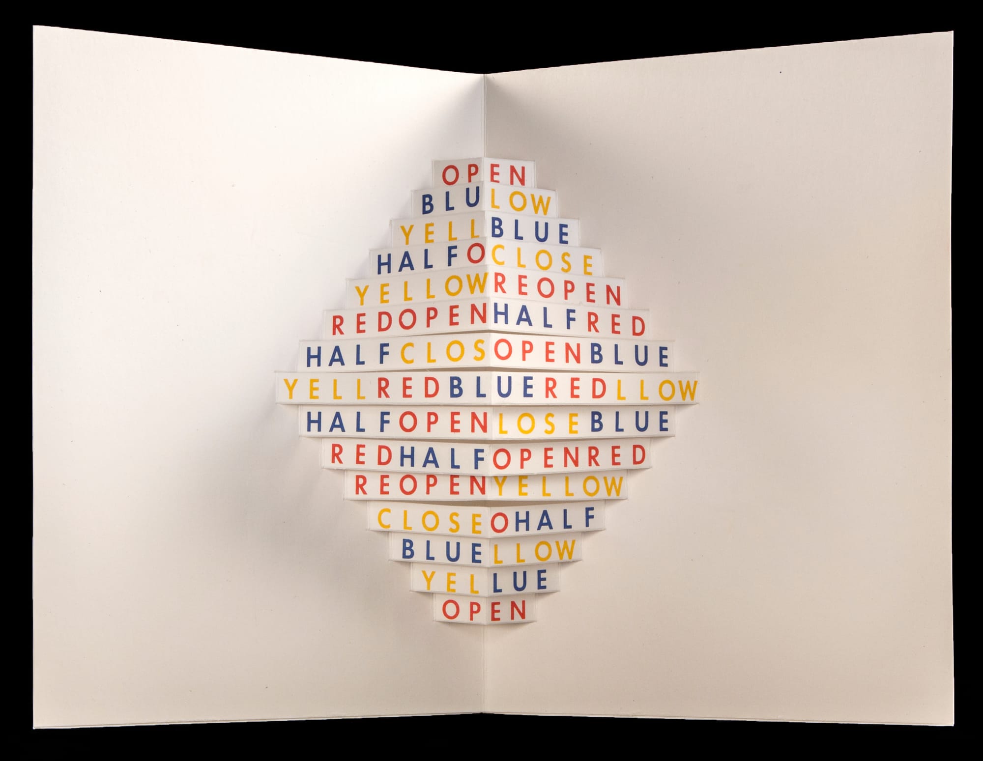
Often in de Campos’ concrete creations, words literally jump off the page. In the beautifully installed section of the show titled “Poems in Three Dimensions” stunning collaborations between de Campos and the Spanish artist Julio Plaza pop out at the viewer with three-dimensional statements. One such work, “Open (Abre)” (1969) announces its colors and dimension in space (i.e. open,” “half-open”) as it enacts them. The eye is forced to read down and across space, and to follow the text through corresponding colors.
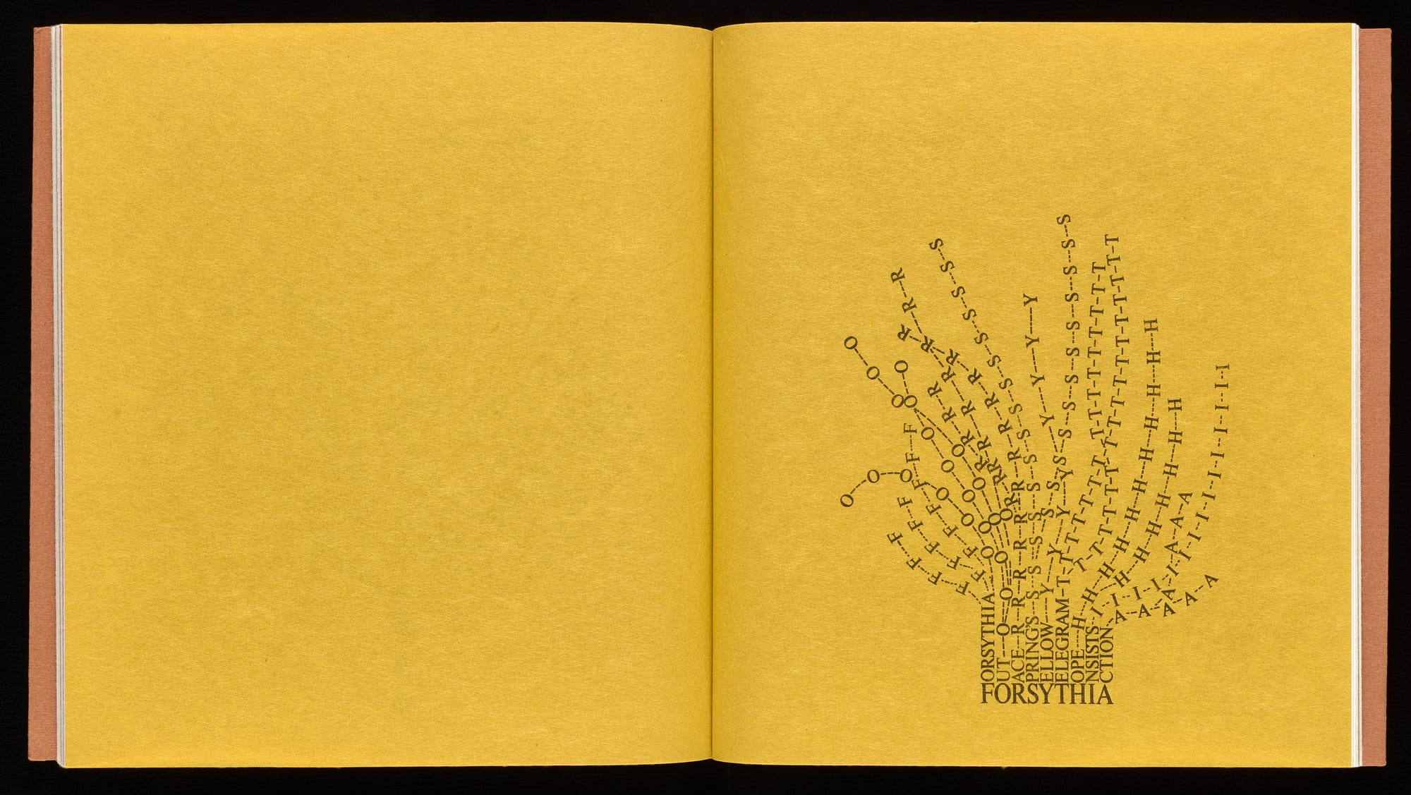
Solt — who is the author of one of the most comprehensive anthologies of Concrete poetry — is represented in the exhibition by two works of her well-known Flowers in Concrete series, my favorite being “Forsythia,” a gold-backed expression of the roots of the poem, “Forysthia Out Race Springs Telegram Hope Insists Action,” whose linguistic tendrils wind out into the growth of the consonants and vowels expressed by that seemingly “potted” statement. Enlarged into a large panel visible as one enters this wonderful show, one gets an immediate sense of the visual wit and intellectual concerns to be encountered within.
Given the outstanding examples assembled by Perloff and Aube, one hopes that the GRI continues to collect this important genre of visual art generally neglected by most major art museums. Concrete Poetry expresses the delights of poetry made for the eye, as well as for the intellect.
Concrete Poetry: Words and Sounds in Graphic Space continues at The Getty Research Institute (1200 Getty Center Drive, Los Angeles, California) through July 30.


