Helen Frankenthaler’s Panoramas of Paint
Dual retrospectives of paintings and woodcuts underscore Frankenthaler’s restless experimentation in image and materials.

WILLIAMSTOWN, Massachusetts — The dual exhibitions of Helen Frankenthaler’s paintings and woodcuts at the Sterling and Francine Clark Art Institute offer a compact, revelatory, and frequently stunning look at an artist whose reputation has been all too often yoked to a single, if singular, technique.
As the story goes, and it is well known enough not to bear repeating, in 1952, when Frankenthaler was all of 23 years old, she painted “Mountains and Sea,” an epic-scaled abstraction (86 5/8 by 117 1/4 inches) now in the National Gallery of Art, Washington, DC. “Mountains and Sea,” a masterpiece in anyone’s book, was executed in her pioneering “soak-stain” method, which was quickly heralded — in the words of the Washington Color School painter Morris Louis — as “a bridge between Pollock and what was possible.”
Louis’s invocation of “what was possible” is as succinct an encapsulation of formalism’s diminishing returns as you are likely to get — the kind of blinkered nonsense that postmodernism, at its outset, gleefully kicked aside. Not that “Mountains and Sea,” in which Frankenthaler suffused the canvas’s fibers with oil paint thinned to the consistency of watercolor, would be any less of a personal breakthrough if it weren’t hijacked by a predetermined reductionist narrative — but it is useful to keep in mind the paradox that, in the context of the time, the “possible” was envisioned as a narrowing of one’s sights (towards an ideal of flatness) rather than a cracking-open of the pictorial imagination.
It is a paradox because the cracking-open of the pictorial imagination is exactly what Frankenthaler’s post-stain career was about, and these two exhibitions, As in Nature: Helen Frankenthaler Paintings and No Rules: Helen Frankenthaler Woodcuts, move deftly across the decades, offering a potent overview of the artist’s ever-shifting concerns.
In her lucidly written catalogue essay for As in Nature, guest curator Alexandra Schwartz, in an attempt to tread the slippery line between form and content in Frankenthaler’s work, wades deliberately into a now-forgotten tempest-in-a-teapot, namely the degree with which an abstract painting should be seen as referencing the world outside its edges.
Revisiting the survey exhibition Nature in Abstraction: The Relation of Abstract Painting and Sculpture to Nature in Twentieth-Century Art, organized in 1958 by John I. H. Bauer at New York’s Whitney Museum of American Art, Schwartz writes that Bauer’s “qualified, even tentative, claims” regarding nature’s “indirect” and “subconscious” influence on the artists in the show — claims that barely deviated “from the standard lines on Abstract Expressionism” — did not immunize the premise from “utter vitriol in the art press.”
And yet Frankenthaler, despite her professional and personal alliance with Clement Greenberg, seems to steer clear of the doctrinaire approach wielded by supporters of Greenberg’s formalism on one side of the aesthetic divide, and of Harold Rosenberg’s arena of psychic struggle on the other. In a passage that Schwartz quotes from the catalogue for Nature in Abstraction, Frankenthaler states:
I could say that nature has very little to do with my pictures. And yet I’m puzzled: obviously it creeps in! […] I don’t have a fixed idea about this, and I seem to find myself in something new in terms of nature. I think that, instead of nature or image, it has to do with spirit or sensation that can be related by a kind of abstract projection.
The idea of “abstract projection” rather than “nature or image,” in its precision and humility, couldn’t be farther from the nebulously teleological “bridge between Pollock and what was possible,” but it proved to be the key to Frankenthaler’s explorations as an artist — never locked into a particular path, but always probing, scrabbling, and sometimes stumbling in search of a particular pictorial truth.
I use the term “particular pictorial truth” because, of the dozen, mostly large-scale paintings on display — other than a pair of deliberately coupled (on the part of the curator) canvases from the 1990s — no two are alike.
From the earliest painting in the show, the pre-stain “Abstract Landscape” (1951), in which green, yellow, red, blue, and tawny shapes resemble floral Matisse cutouts, Frankenthaler’s allegiance to High Modernism and her penchant for a referential perspective toward nature are undeniable.
Next along the timeline is “Giralda” (1956), a bona fide “soak-stain” oil painting whose explosive, earth-toned composition includes a sketchy depiction of the Giralda bell tower of the Seville Cathedral in Seville, Spain (here rendered as atilt as its Pisan counterpart, though it doesn’t lean in real life). Frankenthaler curiously tops the tower with an onion dome rather than the Renaissance lantern it now flaunts, evoking its original incarnation as a minaret. (A nod, perhaps, to Matisse’s Tunisian period?)
But unlike “Abstract Landscape” and even “Mountains and Sea,” there is a noticeable degree of grit and awkwardness in this work, an indication that the artist is working against a natural tendency toward elegance and has become more willing to flirt with unresolvable conflicts of texture, color, and shape.
That said, there is one painting in the show that matches the ecstatic — that is to say, unconflicted — content of “Mountains and Sea,” and that is “Milkwood Arcade” from 1963, one year after Frankenthaler abandoned oil paint for acrylics. Cloaked in milky green, raw sienna, ultramarine blue, and a patch of salmon against a bright yellow field, the work is a shock wave of paint poured across the raw canvas with the infatuation of a new love.
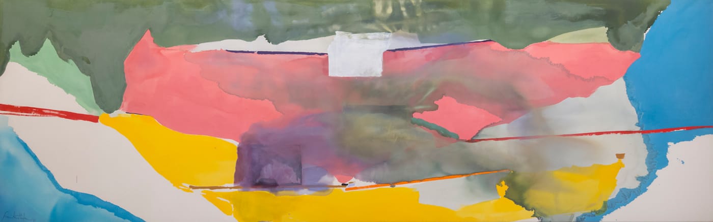
The chronology then skips 10 years to 1973, which is represented by two paintings, “Summer Harp” and “Off White Square.” “Summer Harp” is a tall (108 by 75 1/2 inches) canvas that manages to fuse Matisse’s bright color and linear grace with the schismatic composition of Clyfford Still. But as arresting as it is, the drop-everything, must-see painting in the show is “Off White Square,” an astoundingly beautiful work that, at 79 3/4 inches tall and 255 1/2 inches wide, commands an entire wall and everything else around it.
Awash in pink, yellow, green, and blue, the painting is a monumental self-contradiction, in which the liquidity of the poured paint feels conceptually at odds with the exactitude of the red, orange, and violet streaks breaking up the picture plane like a stepped mountain range. The titular off-white square is scumbled onto the surface in the upper central portion of the canvas, lending an additional abrasiveness in opposition to the cloud-like forms, while a ghost-square, below it and to the left, dissolves into a purple haze. The tensions generated on the surface get under your skin even as you’re irrevocably seduced by the color and scale — a sensation that can only be described as exquisite irritation.
This painting, along with seven others, are from the Louis-Dreyfus Family Collection, while the other four are from the Helen Frankenthaler Foundation, which means that many of the works on display have rarely, if ever, been seen by the public, and the sense of discovery is rewarding even where the stresses piled onto the work become too much for its sometimes fragile scaffolding, as with the nasty slashes of fluorescent green that chop up the poured passages of “Jockey” (1978), or in the paired canvases from the 1990s that the curator associates with Frankenthaler’s admiration of the paint handling in the work of J.M.W. Turner and Gustave Courbet.
Those two paintings — the all-alizarin “Red Shift” (1990) and the grisaille “Barometer” (1992) — to my eye, tip the balance too much in the direction of representation (in their case, bottom-heavy Turner-esque seascapes), so that the “abstract projection” that characterizes Frankenthaler’s work at its best is diminished, losing a good deal of its metaphorical ambiguity and modernist bite.
The exhibition No Rules: Helen Frankenthaler Woodcuts is installed in a separate wing of the Clark’s dazzling Tadao Ando redesign, a distance that allows the artist’s accomplishments in one medium to sink in before plunging into another. Organized by Jay Clarke, the museum’s curator of prints, drawings, and photographs, the show covers a range of work starting with “East and Beyond” (1973), the artist’s first woodcut, which she made at Universal Limited Art Editions (ULAE), run by the legendary Tatyana Grosman in West Islip, Long Island, and ending with her last, “Weeping Crabapple” (2009).
Frankenthaler’s first prints were made by jigsawing a single block of wood into various shapes, inking the separate parts, and then running the carefully registered pieces separately through the press. The inking of these pieces was often executed in a painterly way, which resulted in an individualized character for each print. She did not attempt a run of perfect matches.
You might think that Frankenthaler’s unmitigated love of paint and lifelong practice of spontaneous innovation would leave little patience for a procedure as exacting and collaborative as the woodcut, but it turns out that her audacity and vision were more significant forces in the shaping of this remarkable body of work than any medium-specific skill set.
This is particularly evident in the later works in the show, which were made after she traveled to Japan and worked with the master woodcarver Reizo Monjyu and the printer Tadashi Toda, who were peerless in traditional Ukiyo-e methods.
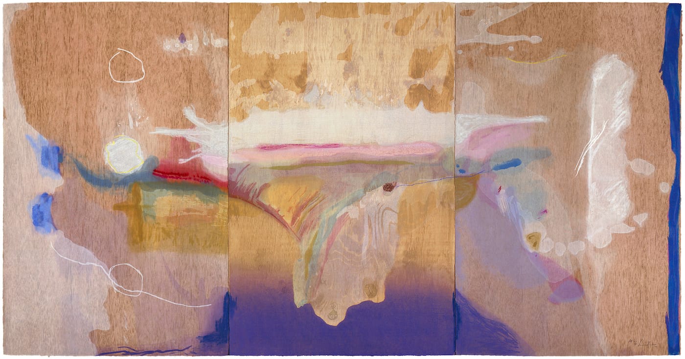
After this transition, the process becomes confounding in its complexity: Frankenthaler would complete a painting on wood to be used as the design for the work, just as Hiroshige or Hokusai would create a black-and-white drawing. As many as 46 woodblocks would be carved and 102 colors deployed (as in the spectacular triptych, “Madame Butterfly,” 2000) to make the print. Every scrawl, splash and drip would be represented by the wood carver, who, according to curator Clarke, would at times sand down the block edges to simulate a stain effect, while the artist’s characteristic paint layers were recreated through the use of opaque and translucent inks.
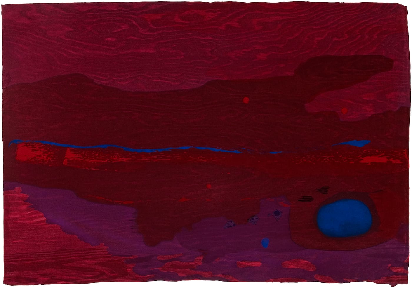
And yet Frankenthaler did not intend these prints to be mistaken for paintings, making a point to emphasize the wood grain in the base layer of a number of works, including the series, “Tales of Genji” (1998), “Madame Butterfly,” and the intensely red, blue, and purple “Japanese Maple” (2005) — going so far as to create trompe l’oeil wood grain where the natural impressions weren’t visible enough.
That Frankenthaler would go so far as to employ trompe l’oeil — creating the illusion of a natural artifact as the ground for the “abstract projection” of nature — is brain-teasing in the implications it holds for reality and its double. But it is also consequential as a marker in the life work of an artist who was once the poster child for pictorial flatness and self-referential aesthetics, but refused to be limited or defined.
As in Nature: Helen Frankenthaler Paintings continues at the Clark Institute (225 South Street, Williamstown, Massachusetts) through October 9, and No Rules: Helen Frankenthaler Woodcuts continues through September 24.
Travel to Williamstown and hotel accommodations were provided by the Clark Institute in connection to the opening of the exhibitions.


