You Are in Good Hands with Matt Connors
Connors has arrived at a synthesis of what, up until now, has been a stylistically identifiable but rather diverse output.
During an online search for Lawrence Durrell’s writing I found this passage in a review, “Durrell’s ideal of the novel is one of haute cuisine with great quantities of pepper and garlic” (Patrick Parrinder, London Review of Books, June 1985) and thought it was a good description of a lot of painting right now.
Forever Now, the Museum of Modern Art’s canonical-like 2014 survey of contemporary painting, left me with the impression of much flailing against an unforgiving surface. Beneath the churning painterly marks lay hopes of fulfilling the voracious eye, an impossible task. The current art audience equates dazzle and busyness with aesthetic experience.
The exception was Laura Owens. Despite the complex production techniques demanded by her large canvases — the digital and photographic manipulation, the screen printing combined with hand-painted areas — the work was visual and direct. She was the one artist of the 17 in the show, many of whom I know, respect, and have even written about, that I felt I was in good hands with, who wasn’t trying to sell me something I didn’t want to buy.
Peter Schjeldahl’s essay on Owens in the October 30 issue of The New Yorker quotes the artist on her own painting: “I think about what is required of me.” This is not unduly modest. She understands painting as a form that comes with conditions that must be accommodated. I am curious about the upcoming retrospective.
Matt Connors was another Forever Now participant, an artist whom I had been wary of for years. A smart guy, he wrote three beautiful, perceptive paragraphs, at my request, for the catalog that accompanied the Serge Poliakoff exhibition I curated last year at Cheim & Read. I have followed him since his professional beginnings. I thought his work was glib, but noticing his interview with Bernard Piffaretti in a catalog for a 2013 Piffaretti exhibition at Cherry and Martin in Los Angeles, 10 years after my own interview with this mercurial French painter, made me sit up.
To back up again for a minute, the problem I have with so much contemporary painting is that it’s dancing as fast as it can: most theorist/art historians have abandoned it, and most working critics have decided that it’s where to go for entertainment. Weighty concepts are addressed elsewhere. Worst of all, it’s taken at face value. When paintings are written about, the painting support is taken for granted as an inert rectangular location upon which a performance takes place. For Laura Hoptman, the curator of Forever Now, it is a platform that can host re-animators, where painters appropriate styles, remix, mashup, or sample.
This is a generalized notion of the painting that does not engage the painting object as a form and abandons its history. By history I mean attention to what paintings do, how they operate pictorially, how they communicate. Currently it is presupposed that because painting is dead it has no rules. But if there are no rules there is nothing to improvise with, no conventions to overturn, no arbitrariness to confound.
Rosalind Krauss writes about the idea of a technical support in her book Under Blue Cup, which she applies to the new hybrid forms found in the work of William Kentridge and Sophie Calle, not so much in painting. “Technical supports” are “mostly borrowed”, she writes, “from mass-cultural forms such as animated films, automobiles, investigative journalism […]”
In her book Krauss proposes that Edward Ruscha’s support is the automobile, and describes his photographs of the oil stains of absent cars as if “they [had] back[ed] down the history of recent painting to the 1960’s and the advent of stain painting, also called color field […] In doing so, they function as the ‘memory’ of the medium that he is both abandoning and reinventing.”
Before I saw Hocket, Connors’s new exhibition at CANADA, I might have agreed with Hoptman’s assessment of the Forever Now artists as samplers of past styles in an ahistorical present. It turns out that he has not been sampling at all but rather, like Ruscha, reconfiguring Color Field painting. He has returned to, or perhaps never left, his undergrad alma mater, Bennington, the last stand of Greenbergian formalism: Helen Frankenthaler, Kenneth Noland, Paul Feeley, Jules Olitski, et al. But Connors has taken nothing for granted. Paying attention to what he is doing, he has arrived at a synthesis of what, up until now, has been a stylistically identifiable but rather diverse output. It is also a very clear demonstration, in the form of an exhibition, of how a painting, at this time, might be constructed.
The exhibition takes up the larger of the gallery’s two spaces, where Connors has installed his paintings on a series of dividing walls that break up what is normally a single open space. There is an auxiliary show curated by Connors in the adjoining room, which I will get to.
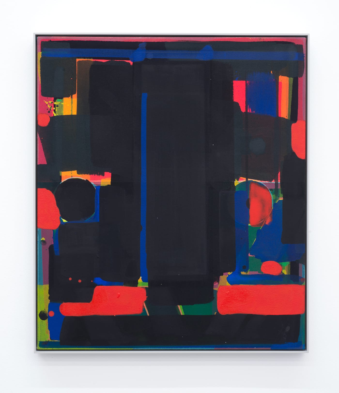
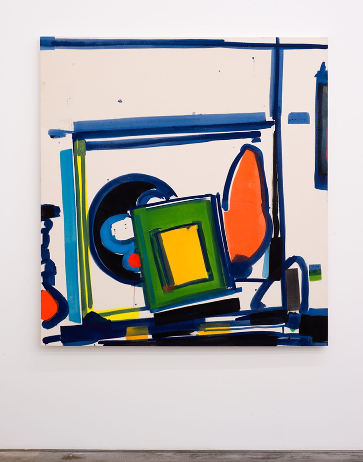
“Yet to be titled” (2017) is Connors’s largest painting here, at 75 by 59 1/8 inches; many others are half this size or less. Like most of the work in the show, it is done in oil, acrylic, and colored pencil; the color is rich and vibrant, there are lots of saturated reds, blacks and yellows, and the blues and greens are all complex mixes — Prussians and viridians, etc.
In “Yet to be titled,” a colored pencil line between two fields of dark gray and black echoes the tri-toned, red/washy off-pink border, akin to the edge of a drawing tablet, along the bottom of the canvas, but functions more as a brushstroke than a delineation.
Four blotchy red discs are aligned near the top, with a yellow wedge below three of them, and a blue band and a light violet diagonal chevron affixed below the yellow. Short strokes of black, pink, red, and viridian interrupt vertical and horizontal continuities.
Like all the paintings here, this one doesn’t coalesce into a single image, nor does it quite break up into parts. It holds itself at a distance from the viewer — due, in part, to the soaking in of the paint. Very little of it sits on top of the surface; consequently, it lacks the in-frontness found in most paintings, creating ambiguity.
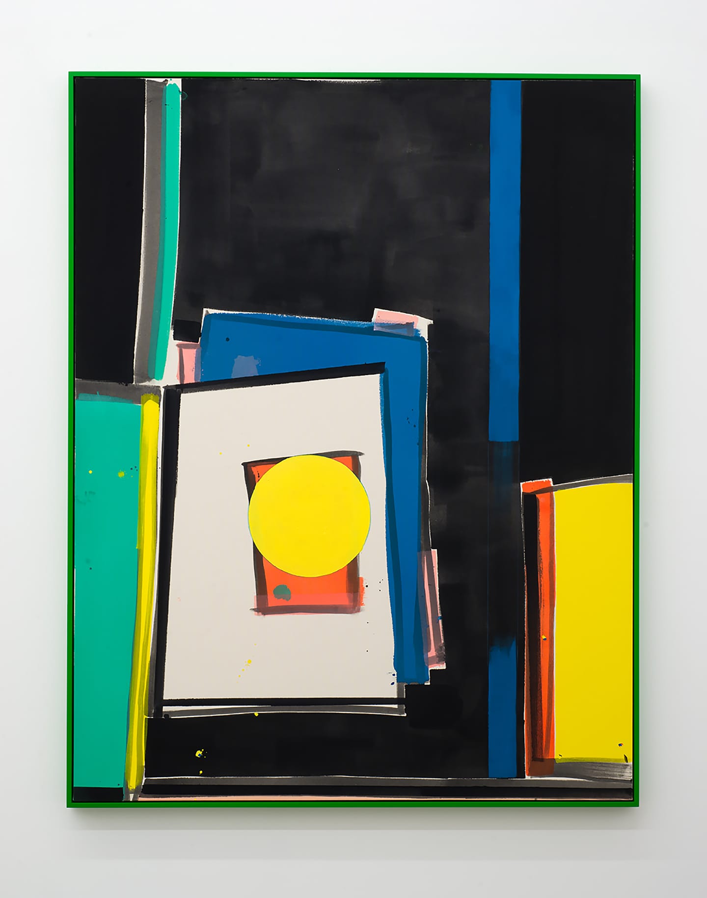
Connors also draws on such painters as Ellsworth Kelly, Mary Heilmann, Blinky Palermo, Imi Knoebel and Gunter Forg, depending in particular on Jules Olitski’s Constructivist-inspired soaked-canvas paintings, circa 1963-65. As he progressed, Connors developed a way of working with wet paint similar to the Frankenthaler watercolor-to-painting method; the paint soaks into the canvas during execution and leaves small spatters dotting the surface, as in “First Stack” (2016). One notices, here and elsewhere, additions of little dabs of opaquely painted “tacks” sitting on the surface, which approximate the look of small colored stains, in counterpoint to the more dominant color areas. These opaque accents are often multicolored, like a tiny index, and signal an awareness of the frontal plane, in that the majority of the surface seems to lie “inside” of it.
There is a more widely distributed opacity in the tray-sized “I Saw My Head Laughing, Rolling On The Ground” (2017), which is approximately 23 by 19 inches with the frame around it, and looks like a kind of deracinated Howard Hodgkin painting, that is to say, an electric spectrum of reds and blues mostly painted over with rich blacks but minus the fatty oil swipes à la Turner, not to mention the ‘charm’ of the found wood frames.
Contemporary painting has been under pressure since the advent of digital imaging, which has moved into the visual province that formerly belonged to photography. Roles have been reversed. You could once work a long time on revising a painting; now you can spend just as much time with a photograph, while painting has become the territory of the decisive moment. Connors’s very loose but indifferent execution preserves the entire work as one gesture and unites it in its moment of investigation.
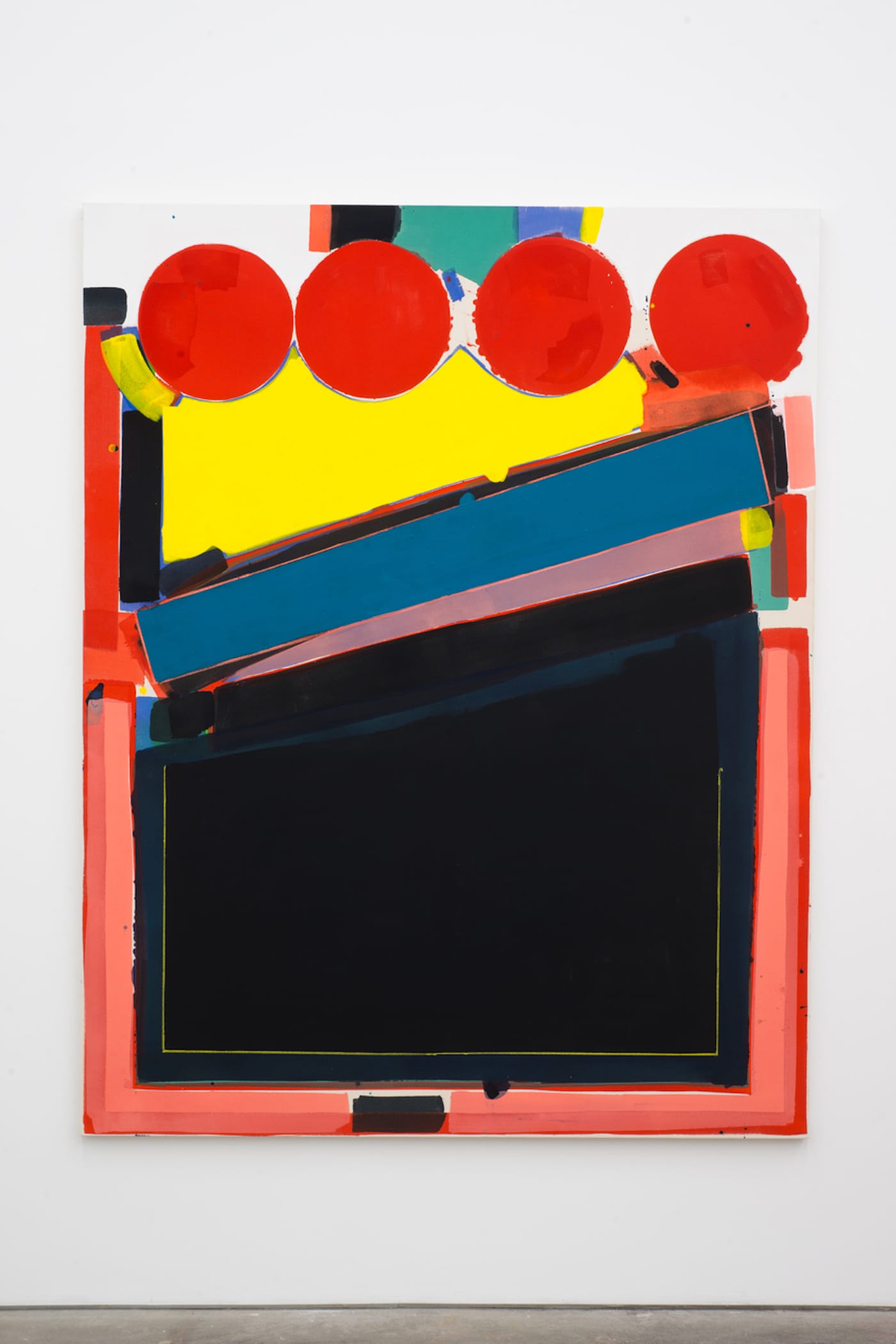
The element of performance is most apparent in two paintings entitled “Hocket” (2017) and “After Hocket (Gold)” (2017), both born from a small “Hocket Study” (2017), also in the exhibition. All share a motif that could be called an Albers square as approximated by a tagger: both paintings are more gestural than the others, and expose more bare canvas. I was informed incorrectly that Connors painted with disposable foam brushes. All the wide, softly blunt marks in these two paintings are bristle-brushed, disarming and equally unsentimental, looking like over-sized felt-tipped pens marking up a blotter pad, but more importantly they occupy a territory between line and shape.
It occurred to me that Connors may have set himself the task of retranslating the doubling of Piffaretti’s abstractions back into a single field, by attempting to invent a genre of generic, quasi-decorative abstraction that would have an intricate internal structure. This is what I perceive he is doing.
In 1967, Donald Judd wrote in Arts Magazine that Jackson Pollock had “a different idea of generality, of how a painting is unified […] that everything is fairly independent and specific.” In Connors’s new paintings there are always a good number of pivot points, areas between the larger shapes where smaller dots and short shapes of color collect, providing the overall picture with a number of auxiliary compositions that demonstrate a remarkable complexity in such seemingly simple and direct work.
What is most striking is the transparency of execution, which provides an explicit narrative of the work creating itself. One of his technical supports may derive from an interest in the picture as a text, most likely a poem. Every element stands out as an individual thing. Connors might agree with Susan Howe, who has written of “the formal rigors of poetry as light and impulse” (Debths, New Directions, 2017). Connors named his first exhibition after James Schuyler’s first book of poems, Freely Espousing; another show was called Enjambment, a term used to describe a line of poetry that continues beyond its end without punctuation. Another exhibition, entitled Dromedary Resting, refers to a passage in Proust about a mistitled catalog entry for a painting.
Perhaps in this spirit of the littérateur, Connors devised in CANADA’s adjacent space an auxiliary group exhibition, Working/Not Working, that provides a kind of exegesis of his recent work.
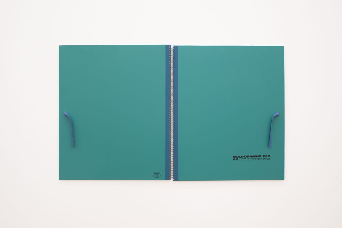
It is striking how little color there is, but this indicates that Connors’s primary interest is in structure. There are five Nick Relph found postcards, each with a disc shape cut out of it that is replaced with a small mirror, which corresponds to the filled-in rounds in Connors paintings. A Fairfield Porter watercolor of a distant sun over a misty sea is a demonstration of washy gray with tinted overlays. The colored wash as a tone corrector operates in most of the paintings, just as another Porter painting illustrates the way small dabs of paint can bring the frontal plane forward. Steve Wolfe’s “Untitled (Sketchbook 8F)” (1990), a facsimile fixed on the wall, uses one of the beautiful blue-greens that Connors appears fond of, and is an example of the book as painting.
A video by Richard Serra, Boomerang (1974), records Nancy Holt, wearing earphones, describing the sensation of hearing herself speaking as her words return a moment later via a voice-delay recording. “The words coming back do not have the same forcefulness” she observes. A comment on Connors entire project, and no less compelling.
Matt Connors: Hocket and Working/Not Working will continue at CANADA (33 Broome Street, Lower East Side, Manhattan) through December 10.


