A Typeface Transforms the Alphabet in the Style of Famous Artworks
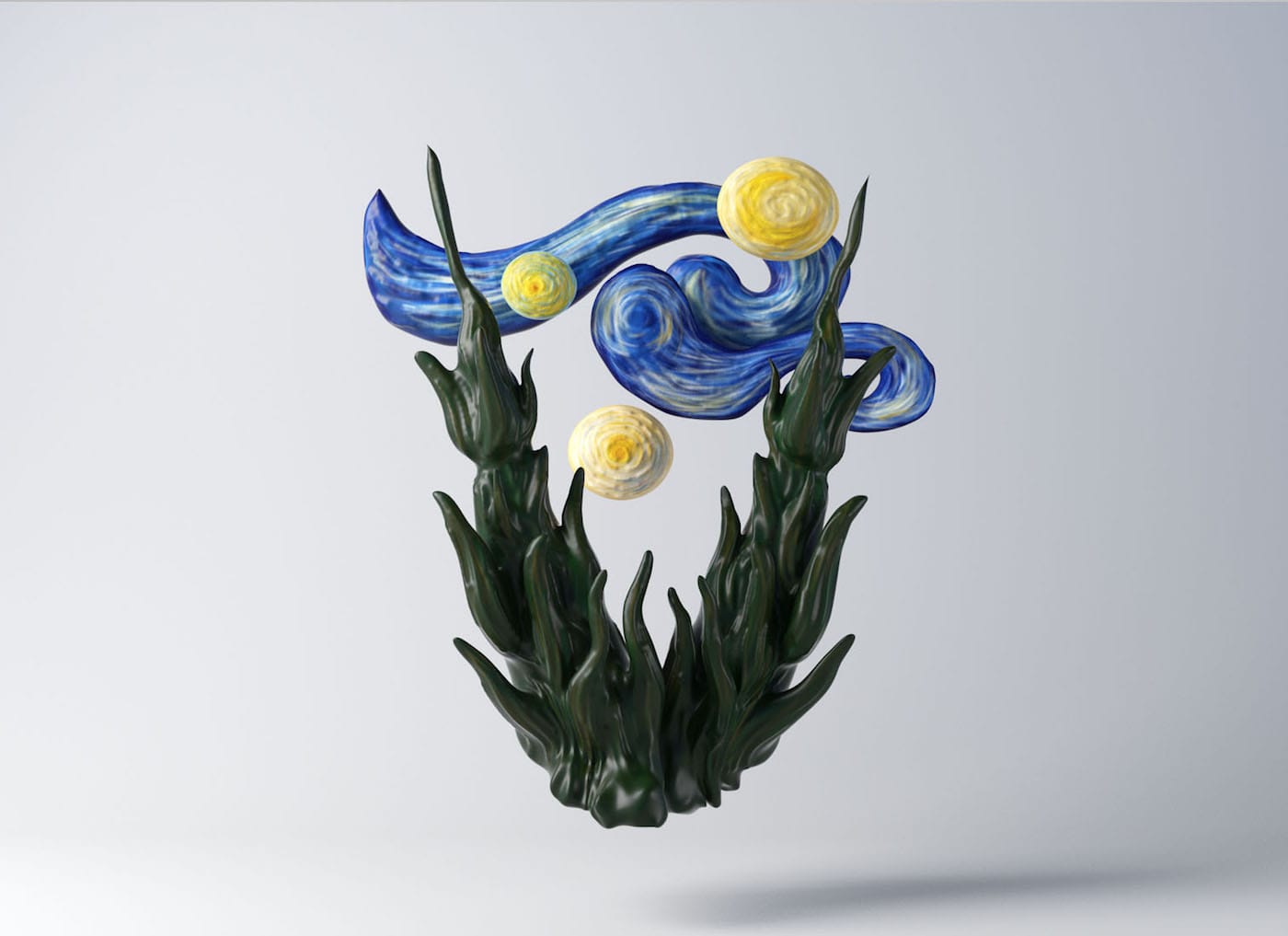
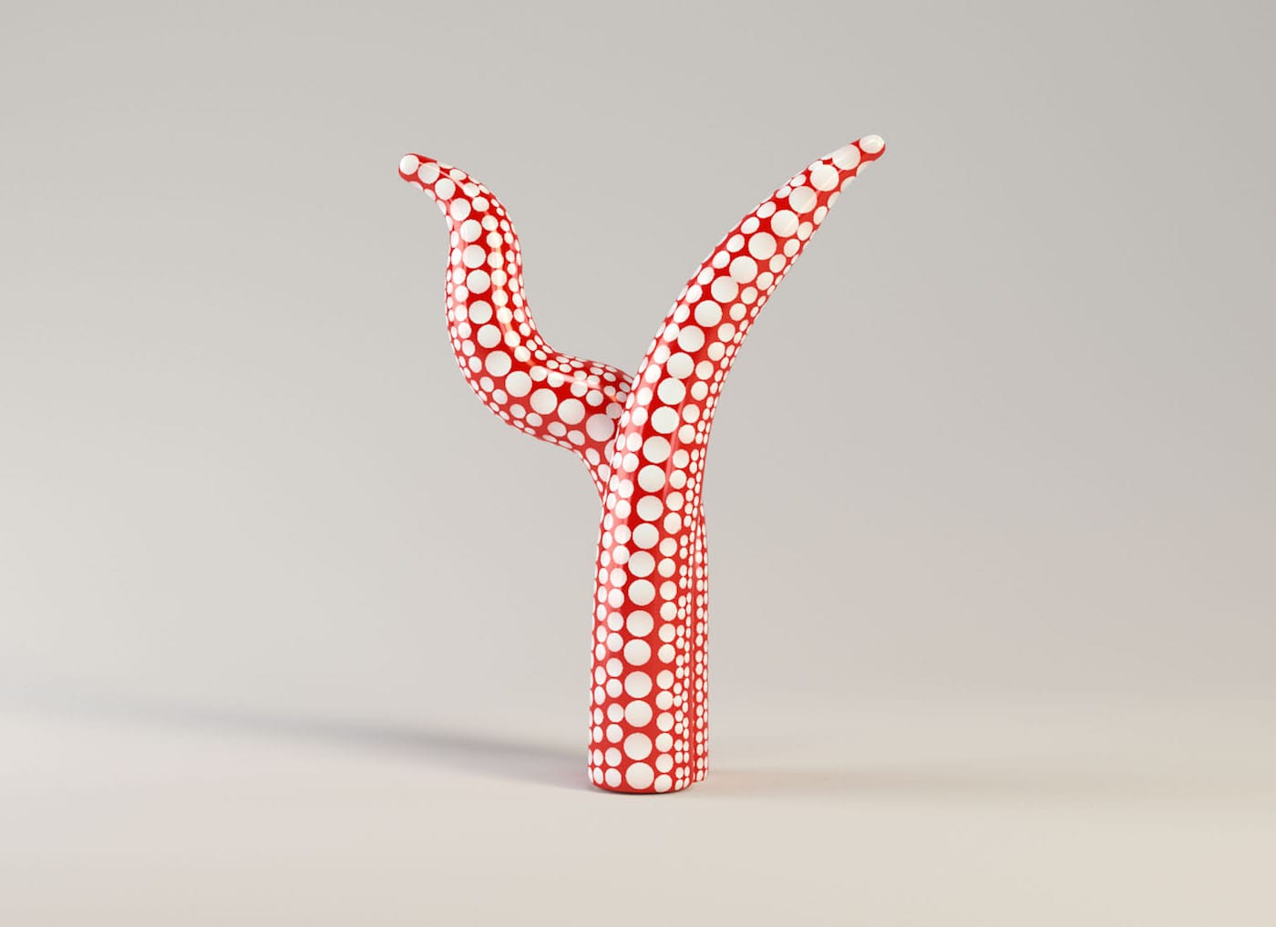
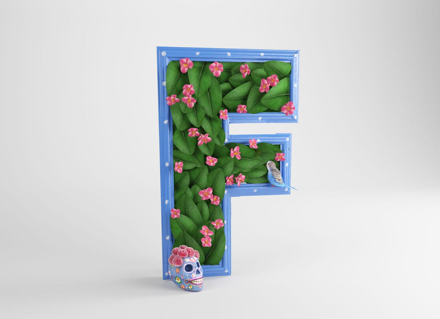
In this artful alphabet by the Madrid-based design studio CESS, "V" is for van Gogh and "F" is for Frida.

Even if some of us pay little attention to it, typography — whether deliberately unnoticeable or at its most beautiful — is an art. And for the 36 Days of Type project, which invited graphic artists and designers to design one letter or number each day, the Madrid-based design studio CESS created a typeface inspired by modern art itself: the adorably named Artphabet, a striking, mostly hand-designed project that also serves as a lesson in 20th- and 21st-century art.
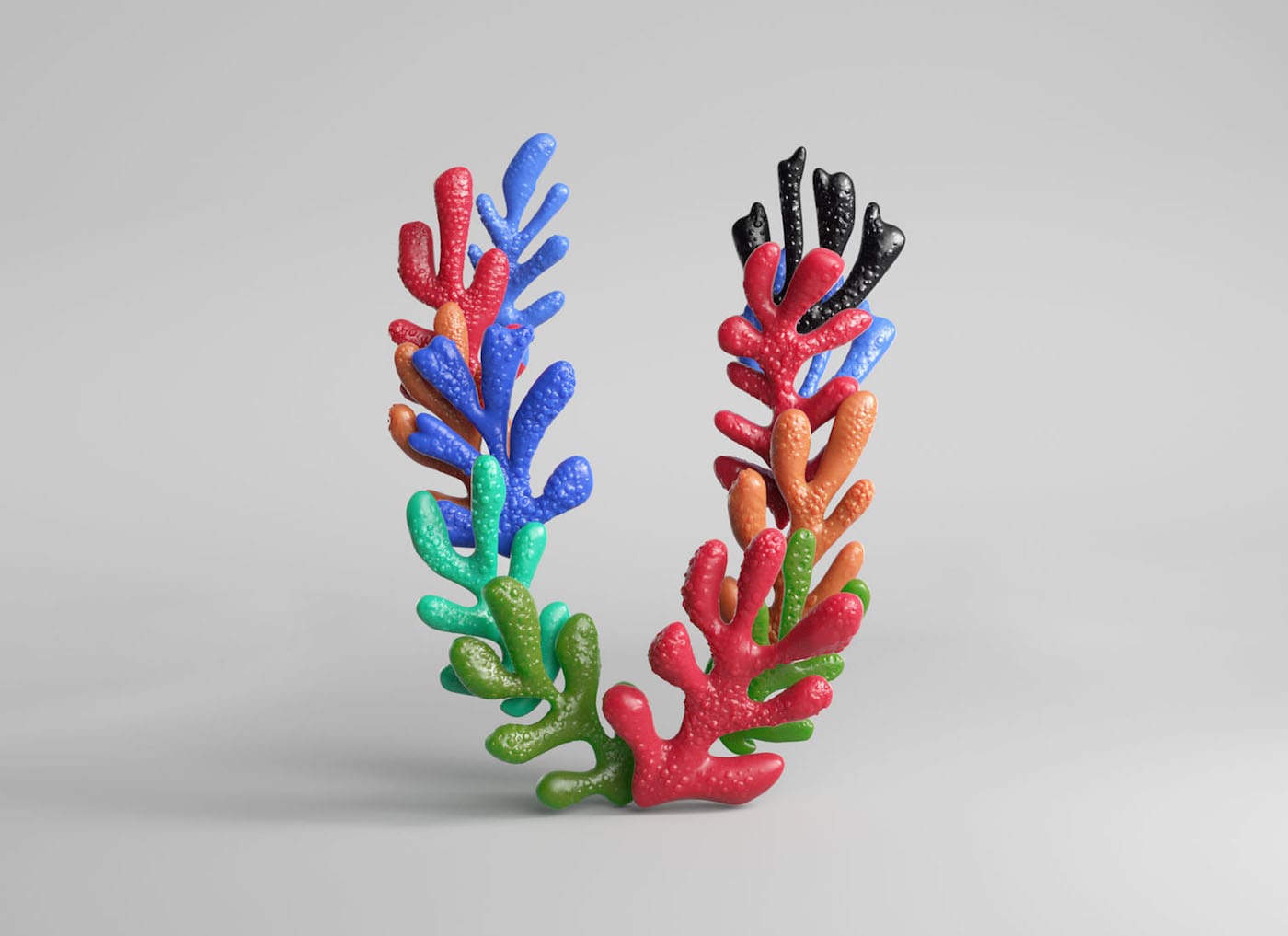
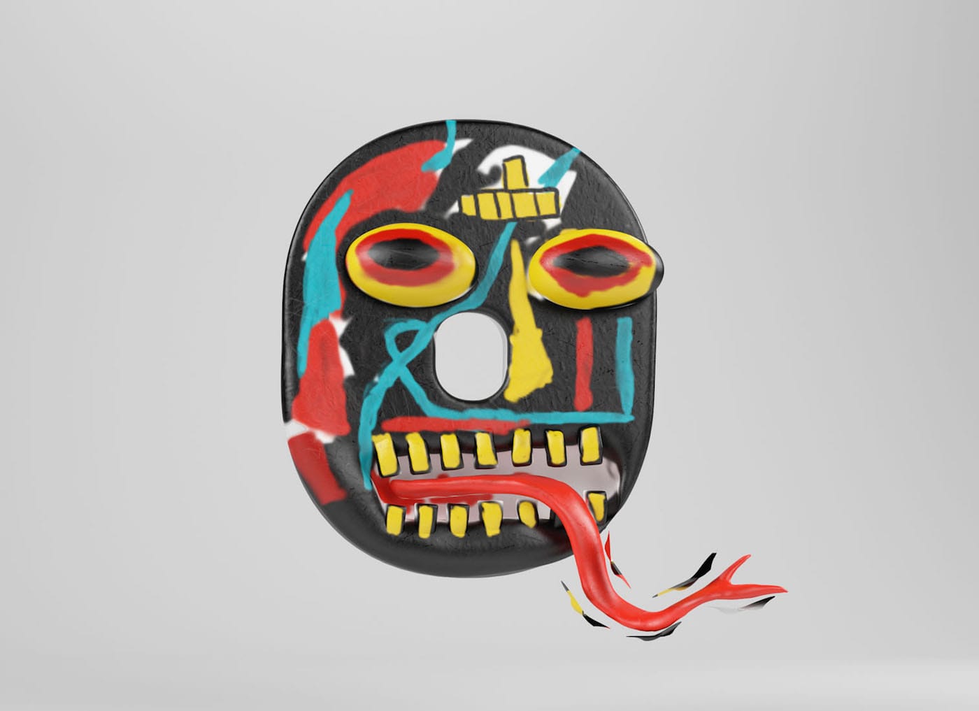
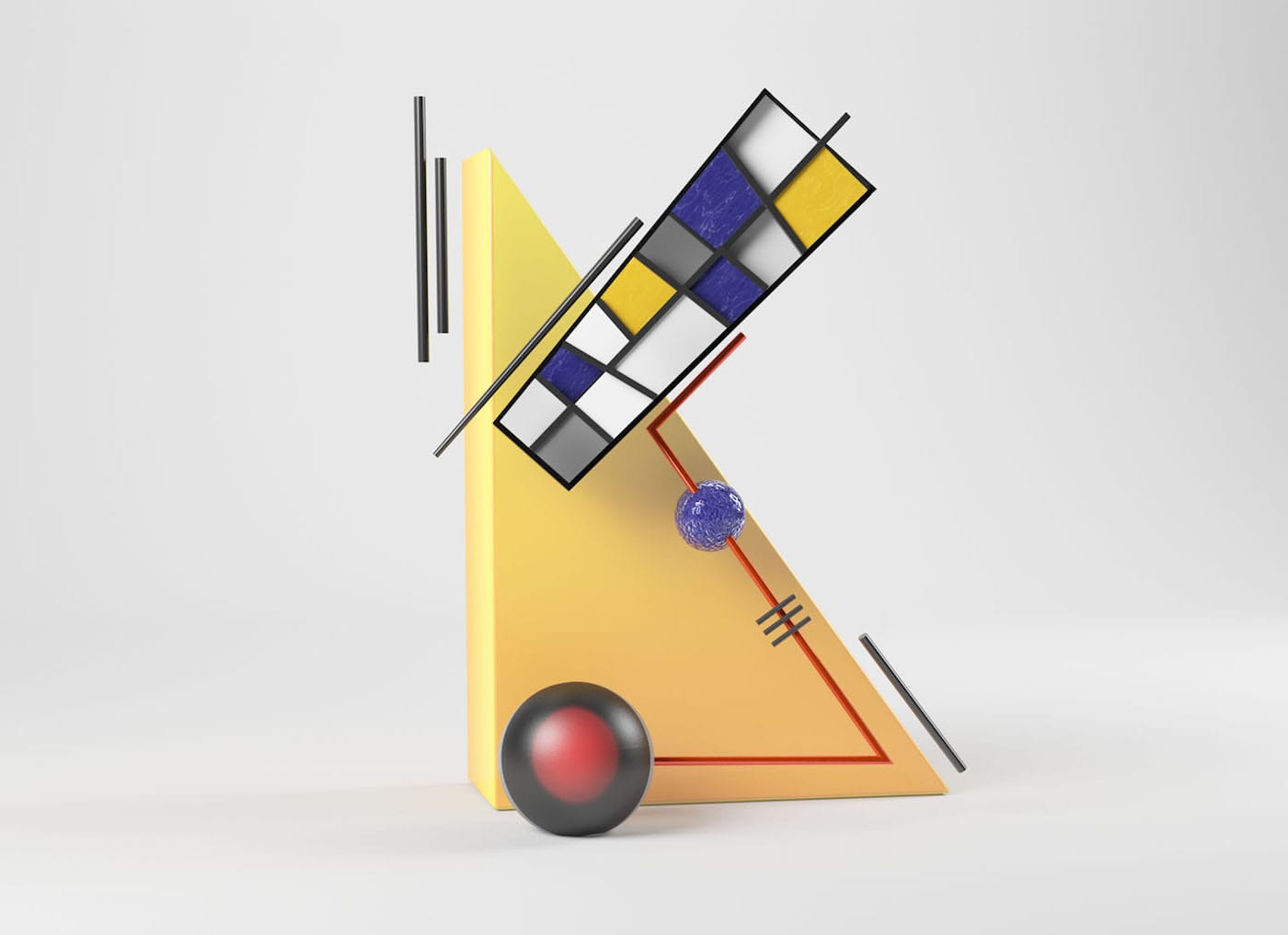
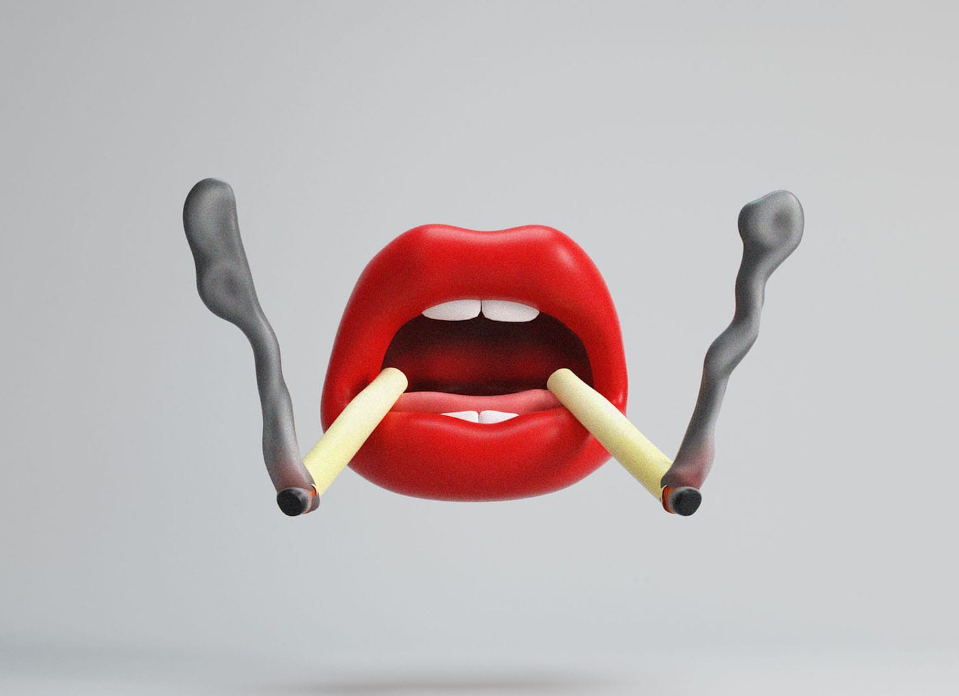
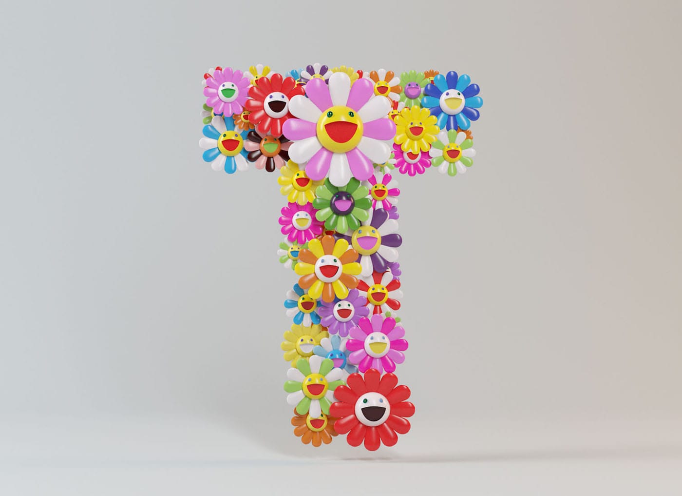
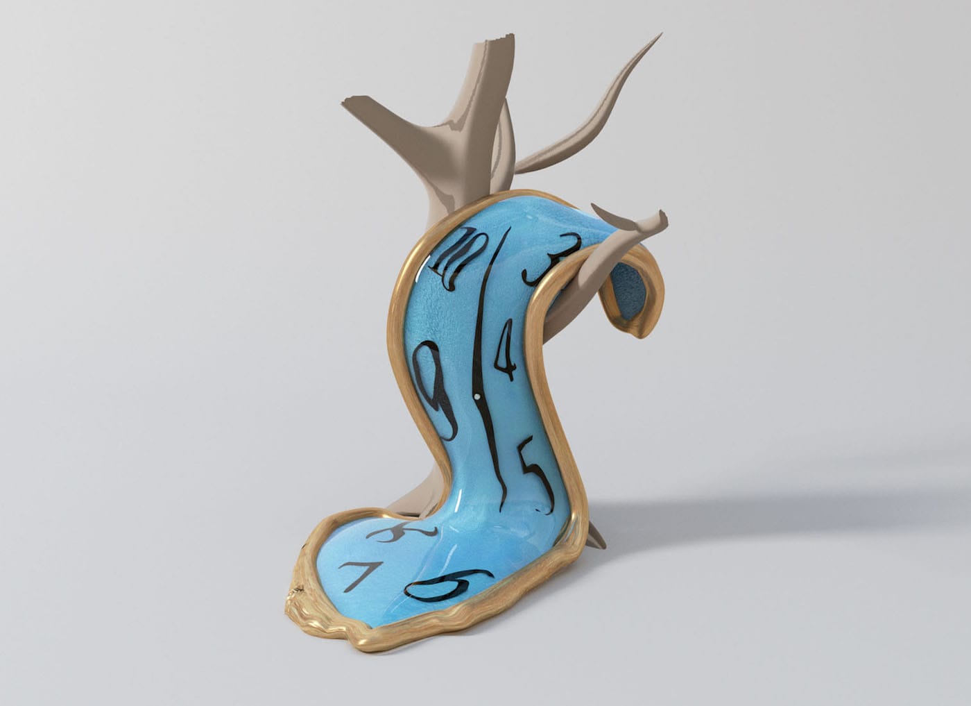
The featured pop and modern artists lend themselves well to alphabet letters. Sometimes they get captioned as in a children’s book: “A is for Andy Warhol” (a soup can dented enough for the apex of an A); “D is for Damien Hirst” (a shark in a vitrine, swimming from one half of the D to the next, à la “The Physical Impossibility of Death in the Mind of Someone Living”); a shiny, “J for Jeff Koons” balloon animal. Not every letter corresponds with the given artist’s name — there’s a “Q” inspired by Jean-Michel Basquiat and a “U” inspired by Henri Matisse, and those are uniquely lovely, too.
César Cid, creative director at CESS, told Hyperallergic over email that while much of his work “focuses on lettering and 3D typography,” this typeface “has been a very experimental work, since the variety of the compositions was considerable to cover so many different styles.” Indeed, the form of the project mimics its content. “With this project,” he explained, “I have dared to ‘imitate’ some artists painting textures by hand, as if it were a brush, but digitally.”
But did Cid know the project would be appealing enough to prompt the interest of any art-lover, even veritable design dummies (like arts writers), or make for a wonderful, say, children’s book? “When I started working on the project, I hardly thought of a tool beyond visual enjoyment,” he said, “but when I was working on it, I realized the great didactic potential that the alphabet could have.” CESS is currently approaching other options “or platforms to export them, such as impressions, collectibles, and even a great adventure to make a small book.” No guarantees, though — for now, just marvel at the contortion of some of the world’s most recognizable work into gorgeous lettering.