Jim Dine Breaks Out
Although Dine is considered a blue-chip artist (a rather ugly term, if you ask me), the New York art world has not been kind to him.

Jim Dine has had at least five careers since he and Claes Oldenburg started Judson Gallery in 1959, helping move the art world away from Abstract Expressionism as well as initiating a new era. He was instrumental in authoring, staging, and performing in Happenings, the precursor to Performance Art. He is a poet who writes many of his poems on long sheets of paper tacked to the wall, which is to say he is poet-performer; a painter best known for his images of hearts and robes, motifs he began using in the mid-1960s; a draftsman and printmaker whose graphic mastery is beyond dispute; and, more recently, a sculptor.
In addition to the hearts and robes, Dine’s motifs include Pinocchio and Venus de Milo. In his use of common objects and his unabashed love of Classical Art, Dine is an unacknowledged influence on Jeff Koons — unacknowledged, most likely, because Dine’s hand is visible in everything he does, and we are supposed to have moved on from that, into the domain of flawless entrepreneurial production celebrating the triumph of Capitalism.
Although Dine is referred to as a blue-chip artist (a rather ugly term, if you ask me), the New York art world has not been kind to him, perhaps because of his commitment to the hand, as well as his refusal to develop an overtly Pop style (as did Roy Lichtenstein) or rely on mechanical means (as did Andy Warhol). His work is too emotional.
What distinguishes Dine from the Pop Artists with whom he has often been associated is his relationship to materiality: he loves what paint and other matter can be made to do. The other criticism that seems to be held against him is his love of drawing, which many consider old-fashioned or obsolete. Finally, what I think really bugs the cognoscenti is his stance as a fundamentally traditional artist intent on foregrounding the expressive capabilities of paint and graphite, just as the poets who have been his lifelong friends (Ron Padgett, Robert Creeley, David Shapiro, Vincent Katz, and many others) are intent on plumbing the expressive potential of words.
There can be something humbling about embracing that legacy, especially when you recognize that you are a blip in time, and that whatever the future holds will likely be beyond your comprehension. I think the embrace of this legacy is something to be pondered when you visit the exhibition, Jim Dine: The Black Paintings, at Richard Gray Gallery.
In 2015, just as Dine was about to turn 80, he began The Black Paintings. This is what he had to say about them in a statement for the catalog accompanying the exhibition:
I had found a 3-inch square piece of paper that my printers had been testing black litho ink on. The small forms that were laid down evoked a figurative image that was (and is) human, yet visually concrete so that the black forms can be interpreted unconsciously as many things “non-verbal.” I built these paintings during the remainder of the year with sand and acrylic mixed together til they evoked for me a predominantly black colored poetry. I used my dictionary of non-objective shapes and various colors to evoke the passion that was just waiting to erupt from my hand. This passion speaks of my use of color in a tender way and also can evoke loss and tell you about a new kind of happiness, living with a history of screams. As I painted, I related more than ever to the imagined savageness of a mad dog as I saw in my brain the deep red blood moon.
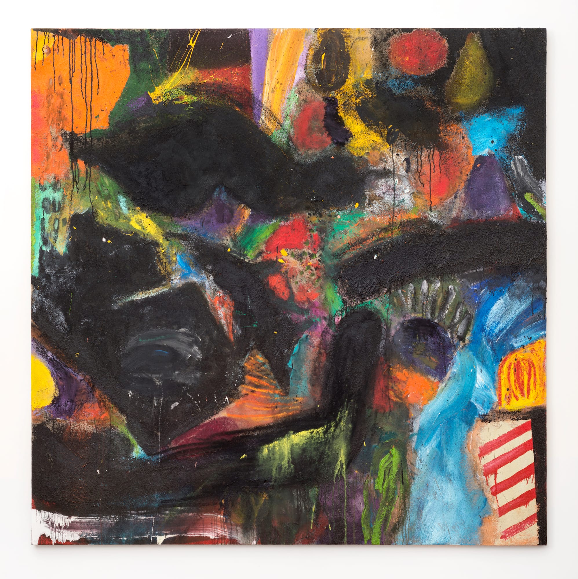
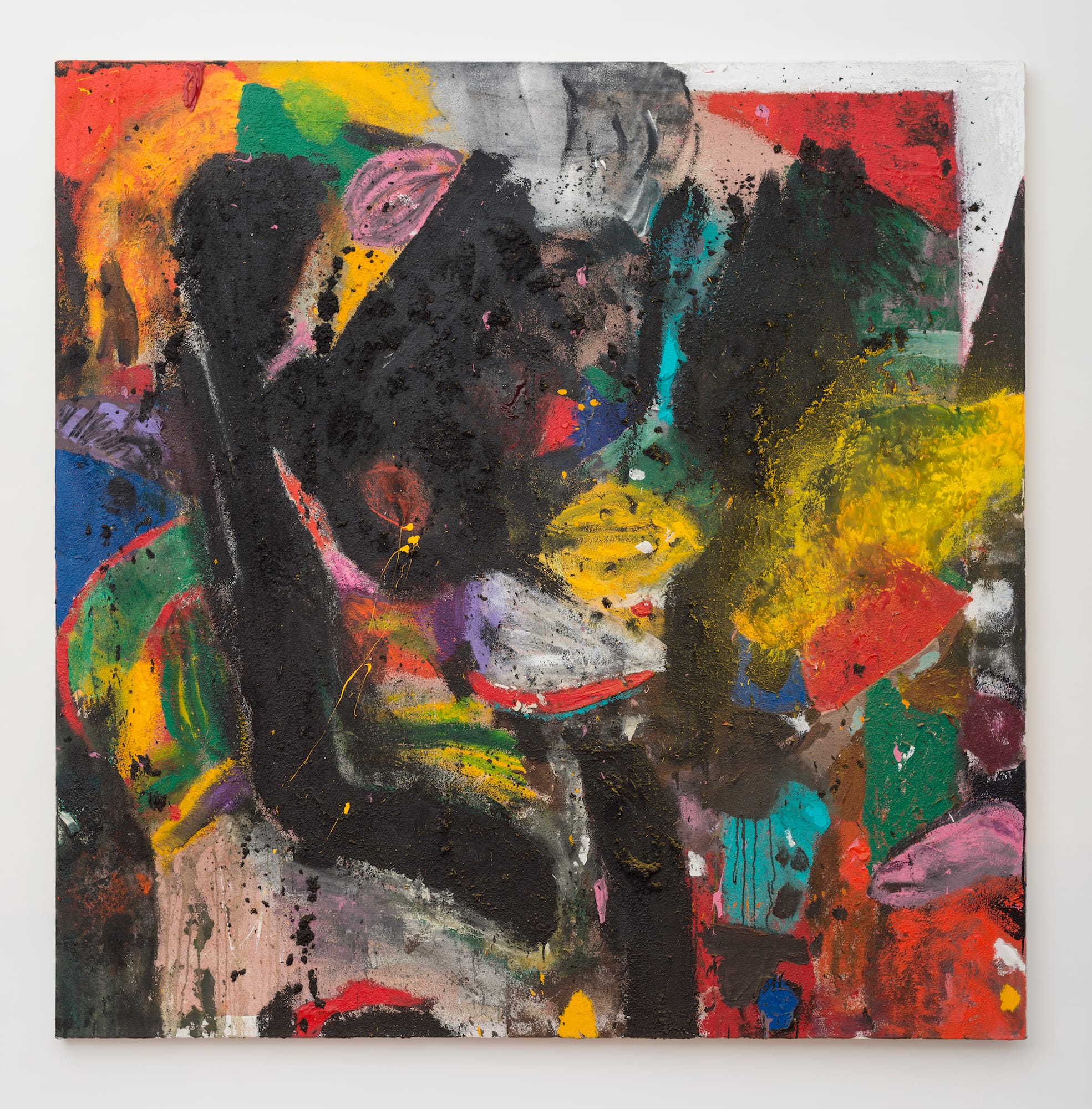
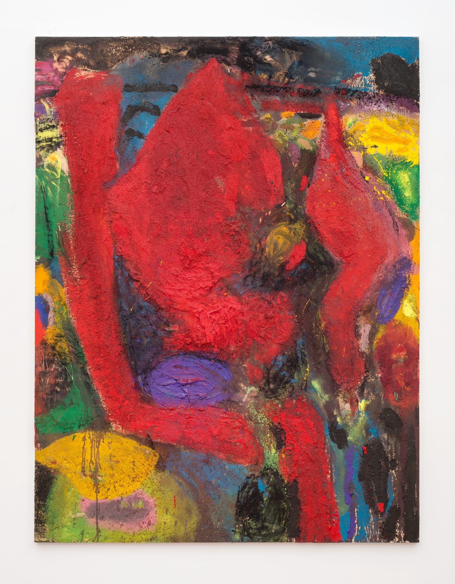
As an artist who has explored immediately accessible motifs throughout his career, the forms he saw on the small sheet of paper were abstract and, in that regard, very different from his “hearts” and “robes.” They were not translatable into nouns. In these works, which are done in acrylic, sand, and charcoal, Dine keeps redeploying the “black forms” he first saw on a “3 inch square piece of paper.” The results are — to use a popular descriptor — gnarly. The rough surfaces of the black forms reminded me of unsmoothed asphalt or something that had been burned beyond recognition. The bright, jaunty colors surrounding the black forms take the grief out, but not completely. The tension between the two further animate the paintings.
Dine uses a variety of instruments to apply the paint, as well as squeezes it out of the tube. He also uses an auto body grinder to go back into the built-up surfaces, which might not even be dry.
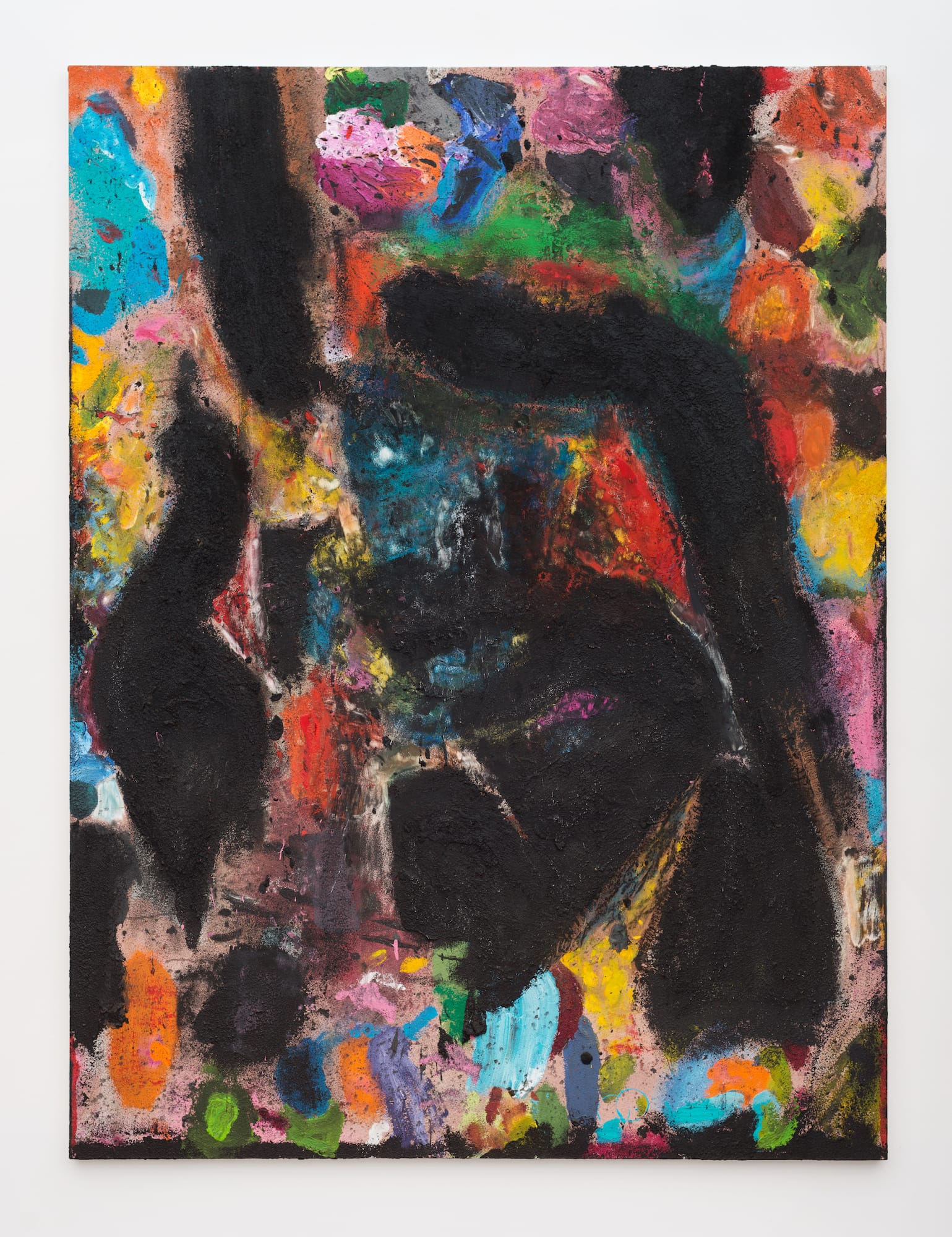
Despite all the different ways he applies the paint and reworks the surface, the paintings do not come across as overworked or collage-like. They are made of different kinds of material states and passages that magically hold together. The black forms sit within and on top of the clouds and variously colored shapes. Specks of black dust and sediment cling to the uneven surface. There are patches where he has used the grinder to get back to the bare canvas. The colors exude a glow, particularly when they are abutting a visceral black form. We seem to be looking at the wall of a cave, a built-up layer of scar tissue.
One black form that recurs in all the paintings reminded me of a severed arm, while another reminded me of a dead bird. The juxtaposition of body-like forms against bright yellows, deep reds, and luminous blues is jarring, and one is not sure what to make of it. The edges between one form and another are not crisp. It seems to me that Dine wanted to build a painting that could not be turned into discursive language, that resisted explanation. He wanted to be in touch with his unsettling, inchoate feelings. In order to attain this possibility, he had to use unnamable forms. For Dine, this is radical.
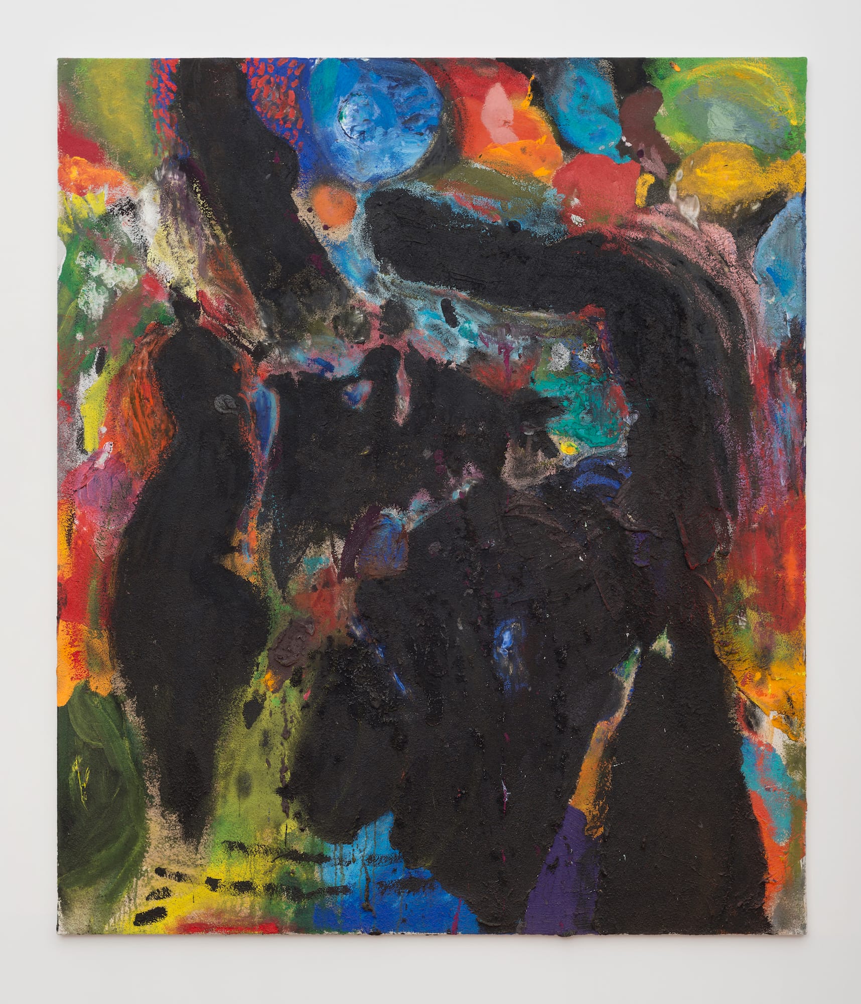
The juxtaposition of black figural forms and a layered ground of brightly colored shapes conveys an irresolvable tension between gloomy figures and cheerful colors. I kept thinking of the paintings as the aftermath of an unspecified cataclysm.
Dine’s abstract paintings don’t owe anything to Abstract Expressionism or to Minimalism. Despite their drips, grittiness, and abundance of paint, they are not defined by sweeping, gestural brushstrokes meant to evoke a heroic moment in the history of art. The black forms don’t show overt signs of how they are made. Dine was not looking over his shoulder when he made these paintings. He was looking forward. Remember, he was about to turn 80. The result is a body of work that is tough, tender, layered with the history of earlier marks and forms, and deeply scarred. They are autobiographical without being anecdotal or image-ridden. There is nothing cool or aloof about them. They establish and define their own province.
Jim Dine: The Black Paintings continues at Richard Gray Gallery (1018 Madison Avenue, Fourth Floor, Upper East Side, Manhattan) through December 21.


