Mark Grotjahn Checks All the Boxes
One or two of the paintings in Grotjahn's latest show might be interesting to look at, but a giant gallery space full of them becomes overbearing and tedious.

Mark Grotjahn seems to want to exist under a microscope: he has positioned himself to be the beneficiary of close attention paid to his every move in the studio, as the scrutiny devoted to the shifts and changes in his work are widely recognized as signs of his seriousness.
You can learn, for example, that he stopped working on his Butterfly series in 2008, after tearing a rotator cuff and breaking his shoulder in a skiing accident. Unable to paint for long hours, as he once did, he had to find a new way to paint over shorter periods of time. Perhaps he believes such dramatic analysis is necessary because he lives in Los Angeles, home of Hollywood stars who thrive on admiration for their daily exercise regimen.
Grotjahn, who began exhibiting in Los Angeles in 1998, first made a splash in New York a little more than a decade ago, when a group of his Butterfly paintings was included in the 2006 Whitney Biennial. Since then, he has regularly shown his paintings, drawings, and sculptures, with each group dominated by a motif.
In his sculptures — which have been described as starting out as “a studio exercise” — he began making “masks” in 2000, beginning with cardboard boxes, which he ripped, tore, and gouged, and enhanced with various cardboard appendages. In 2010, he began casting his “studio exercises” in bronze, maybe because he felt that this would make them into “Art.” The artist appears to have applied the paint to these bronzes with his fingers, no doubt out of a desire to have direct contact with the object’s metal surface.
Along with the Masks, Grotjahn began work on his Face series of paintings. In these works, he applied stuttered rows of paint with a palette knife. Elementary eyes, orifices indicating nostrils, and mouths are manifested in the looping whorls of paint.
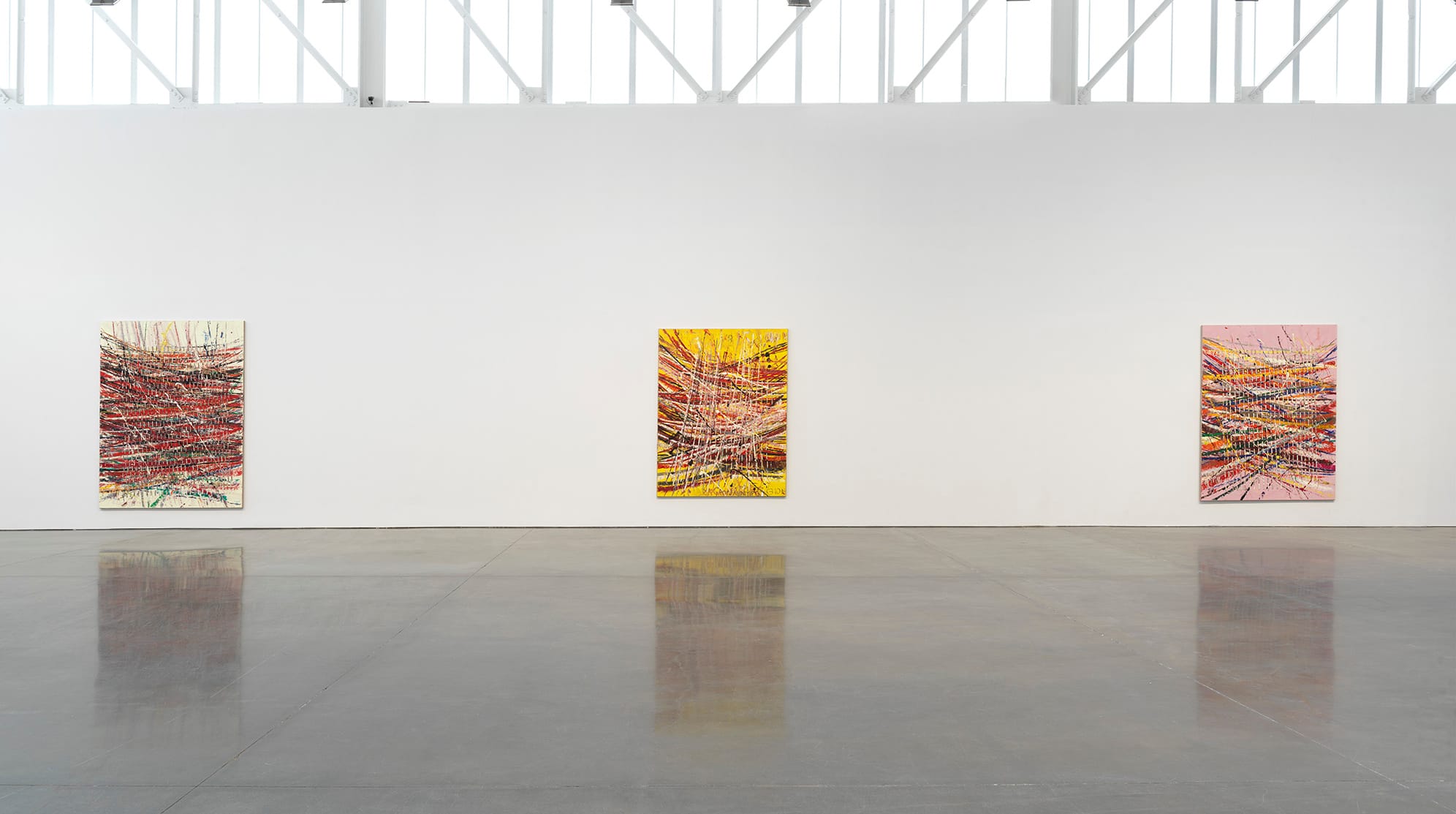
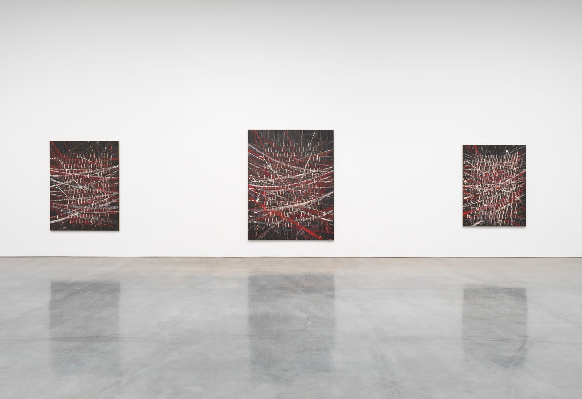
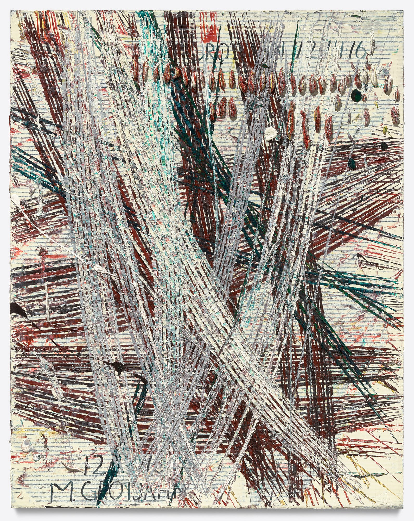
According to the gallery website, “Grotjahn began the Capri works (2016– ), seeking to break away from the Face paintings in favor of a more experimental, spontaneous working process.” Within the context that Grojahn has set up — his unremarkable reiterations of a motif in paint — the words “experimental” and “spontaneous” have been drained of meaning. Over the past three years, he has worked on three related series, New Capri, Capri, and Free Capri. Examples of these three series can be found in his current exhibition, Mark Grotjahn: New Capri, Capri, Free Capri, at Gagosian.
What does it all add up to? In the Butterfly series, viewers saw the palette change, going from monochrome hues to multi-colored works. Each graphically clear painting was a smart example of branding. In his monochrome versions, Grotjahn often added his name, which could be seen as a sarcastic nod to Robert Ryman as well as a further way of trademarking his work. In this series, Grotjahn utilized Renaissance perspectival systems and vanishing points — often misaligned — to evoke the illusion of depth while depicting a radiating form on a flat surface. The results were handsome, mannered, and brittle.
The combination of old master devices and minimalist forms is not a new move, having been central to the work of Peter Schuyff in the 1980s. The problem that Schuyff encountered is one that Grotjahn has had to face: how do I get myself into a new body of work that employs a different — and therefore fresh — set of mannerisms?
The Face series is done on cardboard, which he primes and mounts on linen before applying layers of paint with brush and palette knife. The varying elliptical shapes in this series have their precedent in the radiating forms of the Butterfly series. What the two groups share to a large extent is that Grotjahn is not really interested in composition. The compressed lines and other shapes evoke peacock feathers. The palette knife’s stuttered lines are signs of the artist’s labor. The color choices seem arbitrary.
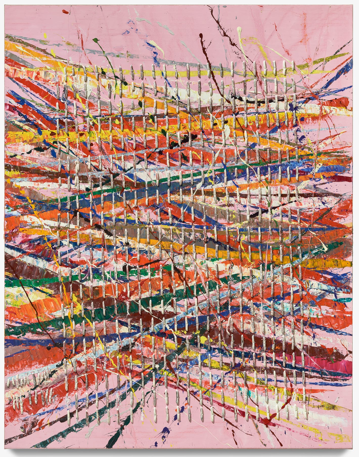
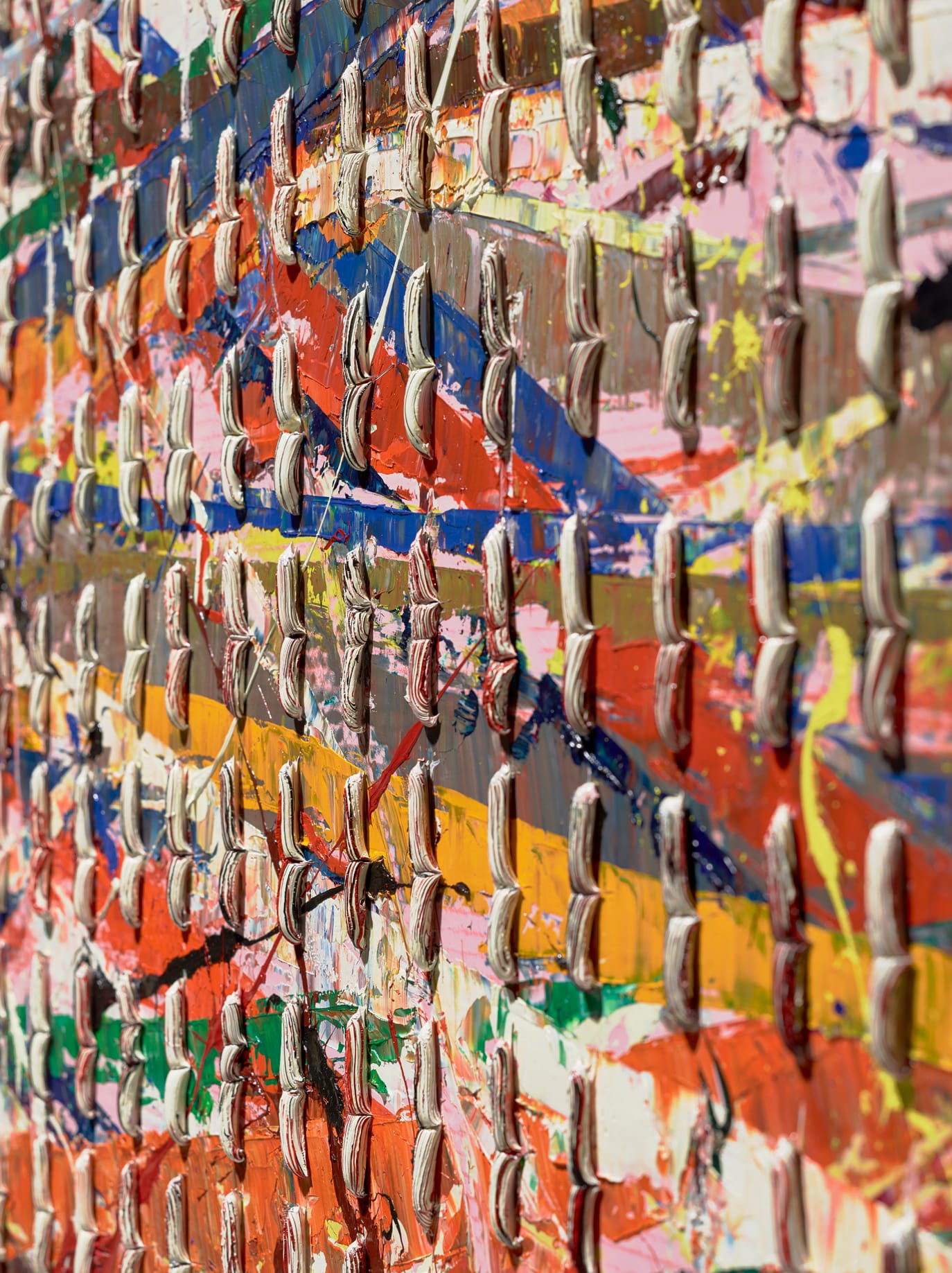
Having moved on from the Faces, the problem with the New Capris, Capris, Free Capris is that they come across as formulaic, even tepid. Nothing about the placement of the diagonal and vertical lines of paint seemed crucial. Each time I went through the different rooms of the gallery, I got the sense that Grotjahn is coolly checking off all the boxes of what to do in an abstract painting: apply paint with brush and palette knife, and squeeze from the tube. Use palette knife to make splatters. Be gestural and expressionist and also have a grid. Paint on cardboard (look gritty) but mount on linen (be Arty). (He does this is two of the series but not in New Capris.) Lay down a monochrome ground and then put one color next to another without much forethought (so that you might come across as tasteless), but limit the colors you use (so that what you attain isn’t too tasteless).
One thing I have to say about these works is that they are busy. They invite you to stand close and see the different strokes made with a palette knife. You might wonder how he got the striations of another color in his blurts of paint that look like they were squeezed from a tube. You might puzzle over how these perfect worm-like sections of cinched paint sit on the painting’s uneven surface, showing no evidence of gravity’s tug. You might be impressed at how evenly spaced these cinched worms are and that they form a grid extending slightly off the surface.
Grotjahn has essentially brought together different ways of applying paint to a surface. The recent works are a collage of dissimilar paint applications. In contrast to Terry Winters, who has pushed conventional compositional formats (all-over grid and centrally located form) into new territory, Grotjahn achieves a Frankenstein-like pastiche. The instances of marveling add up to being distracted.
One or two of the paintings might be interesting to look at, but a giant gallery space full of them becomes overbearing and tedious, like a bin full of hand-painted ties on sale after Christmas. The differences from one painting to another seem capricious and meaningless. The work comes across as a lot of labor expended in pursuit of a dependable product, but not much else. Grotjahn’s paintings are too labored to qualify as zombie abstraction — but since when did advertising your hard work and time spent make something into art. His works are a conglomeration of effects, something that has been present to varying degrees since the beginning of his career. This is art of calculation that adds up to far less than has been claimed.
Mark Grotjahn: New Capri, Capri, Free Capri continues at Gagosian (555 West 24th Street, Chelsea, Manhattan) through December 22.


