Moving House: Chuck Webster at ZieherSmith
Chuck Webster is in his early 40s. He has been showing regularly in New York for nearly a decade. This is his sixth show at ZieherSmith since 2003.

Chuck Webster is in his early 40s. He has been showing regularly in New York for nearly a decade. This is his sixth show at ZieherSmith since 2003.
In his first show, a single row of nearly three hundred works on paper snaked around the gallery. Done mostly in ink and watercolor, they consisted of emblematic forms more or less centered on the paper’s largely unmarked ground.
There was a lot going on in these drawings. Webster wasn’t programmatic and didn’t seem to be pursuing a style. He used different kinds of paper, from thick white rag to antique sheets slightly yellowed with age, and was conscious of the kinds of interactions happening between his medium and the surface.
He wasn’t interested in being an artist of the moment — that is to say, being ironic, cute (or “cutist” as Peter Schjeldahl once said in another context) or showing piles of doodles, as if drawing were some desperate, mindless activity (a way of filling up time).
Webster not only made drawings but he wasn’t precious about them. He also wasn’t afraid of influence or of riffing off other artists, from Louise Bourgeois and Martîn Ramirez to Paul Klee and Anna Zemånkovå. It was exciting to see the work of a young artist who was so voracious and disciplined, wild and direct. It suggested that he was unguarded, that he wasn’t looking over his shoulder for approval.
* * *
Since that first show, Webster has gained deserved attention for his work. In contrast to his seeming unlabored drawings, his paintings, which are done on wooden boards, are often worked on for up to a year.
The board is necessary because Webster likes to put the paint on and sand it off. Eventually he arrives at a distinct form, which, as with the drawings, is centrally located. He tends to work with a handful of tonally related colors in each painting. They help establish the mood and the light.
Many of Webster’s paintings are relatively modest in scale, which connects him to Forrest Bess, Bill Jensen and Thomas Nozkowski. Some might put Arthur Dove in this mix, but I am not one of them because I don’t think Webster is nostalgic or claiming to be spiritually enlightened, which also separates him from Jensen.
The fact that Webster entered this territory and has more than held his own is a testament to his determination. For one thing, his images tend to be spikier, and have more repetition, than the older artists he was looking at. There is something faintly dangerous about them.
* * *
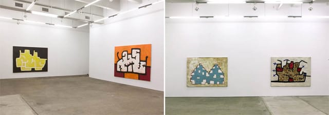
Until this exhibition Webster titled his paintings. In addition to leaving his paintings untitled, he decided in advance to work on a consistently larger scale than he previously had, and to develop and explore a form as it moved it from painting to painting. There are seven painting in the exhibition, but I also saw three in the gallery office and consider them part of my experience.
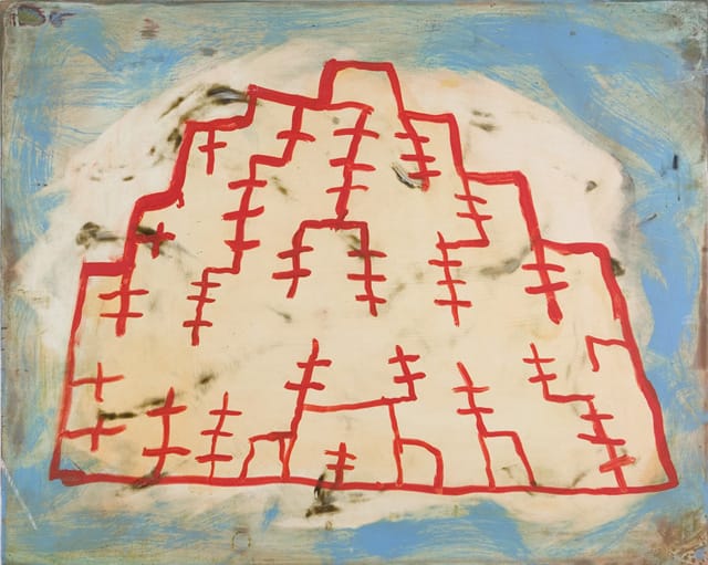
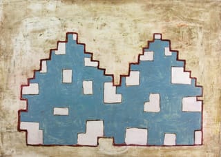
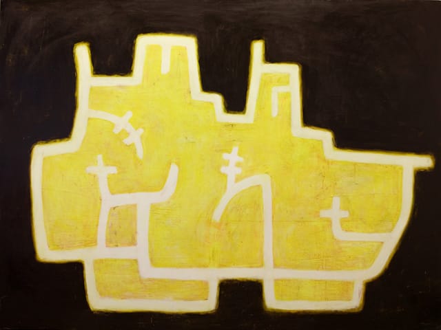
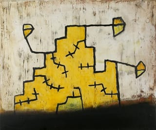
The structure that Webster is here exploring is a stepped form that owes something to Navaho blankets. He uses a thick line to make the form’s border, appendages and interior lines. The thickness of the line confers gravity, as well as a sense of slow forcefulness.
The linear form, whose interior is usually painted a different color than the surrounding ground, evokes a two-story pueblo with TV antennas sticking willy-nilly out of it, as well as a caveman’s version of the fortress in Hayao Miyazaki’s film Howl’s Moving Castle (2004). For all of its weight, the forms seem animated, as if they might pick up and move elsewhere.
By focusing on one form, which he never repeats exactly, I got the sense that the artist is trying to consolidate what he knows and attempting to learn something else at the same time. Webster certainly knows how to make an interesting and often mysterious form, but he has seldom put it somewhere believable. Now it seems that he wants to expand the premise of his work, to go beyond the realm of mysterious things and make places where such things might exist.
The one pitfall he faces is making that place too schematic and based on visual shorthand, something that Carroll Dunham has never quite overcome. This show doesn’t tell us enough to surmise how successful Webster will be.
* * *
In these paintings Webster is able to make things that seem simultaneously brute and comical, which is not an easy combination. They definitely represent a move away from his earlier work.
It seems to me that there are two things he should consider — one is opening up the color in his work. In the painting with a red linear structure overlaying a larger whitish ground, which is surrounded by watery turquoise-blue brushstrokes, I had the sense that this was on his mind, that he wanted to see what he could do when he moved beyond a palette of related colors and tonalities.
The second thing that occurred to me while looking at this exhibition is that he ought to consider how to complicate the figure-ground relationship — something that Nicholas Krushenick, Nozkowski and Helmut Federle have all dealt with. (I am suggesting that he think of the whole sheet when drawing). I think there is a lot more that Webster wants to fold into his paintings, and these might be ways that for him to do so.
* * *
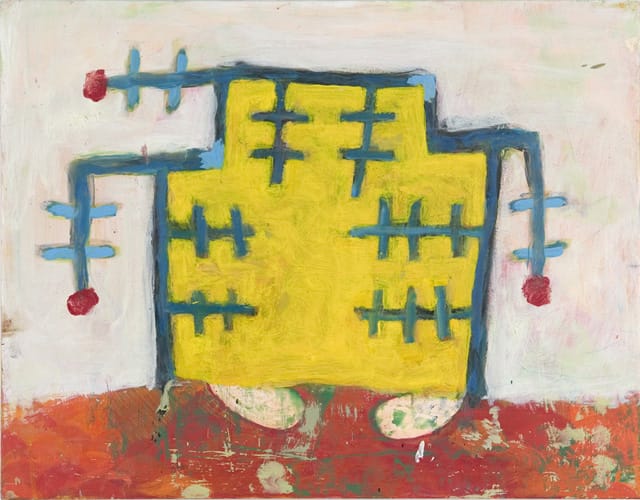
In the back room there is a rather modest-sized painting with a simple stepped yellow form outlined in mostly dark blue. It looks like a 1950s robot with its antennae (or were they arms?) hanging down, each topped by a red circular shape (or thinly applied blob). The form is resting on a red ledge streaked with green, the remains of an earlier, painted-over effort. Two pink forms (feet or tongues?) pointing inward, slip out from beneath the flat yellow robot.
There is something funny, irrational, tender, and unexpected about this painting. The weathered surface, the pink-and-green streaked ground — elements that sometimes seemed like a backdrop in the other works — finally all came together.
Chuck Webster Paintings continues at ZieherSmith gallery (516 West 20th Street, Chelsea, Manhattan) until May 25.


