Picture This: Sunandini Banerjee and the Book Illustrator’s Art
How do adjacent drawings or photos affect our reading experience as readers? What happens in the mind as we process both words and images? How do both tell a story together?

How do adjacent drawings or photos affect our reading experience as readers? What happens in the mind as we process both words and images? How do both tell a story together?
As a reviewer, I’ve wondered about these questions as I consider novels and short story collections, often in translation, that include impressive artwork created in response to the text, or vice versa, texts born from visual art.
Last year, there was Animalinside, a comic-book-length collaborative exchange with existential-themed text by Hungarian writer László Krasznahorkai and paintings by Max Neumann, focused on an enigmatic dog-being with two legs. I ended up liking the pictures more than the words, but Kraznahorakai’s prose proved to be funny in an over-the-top barbaric yawp sort of way.
I also read Paul Scheerbart’s mesmerizing “failure journal” called The Perpetual Motion Machine, published by Wakefield Press (reviewed at Hyperallergic here). Wakefield included 26 schematic drawings by Scheerbart, which added to the humor (he’s a comically bad engineer, though a skilled technical artist), and their meticulousness showed how dangerously lost he was in his utopian fantasy.

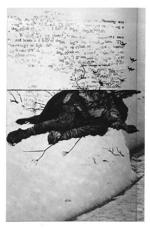
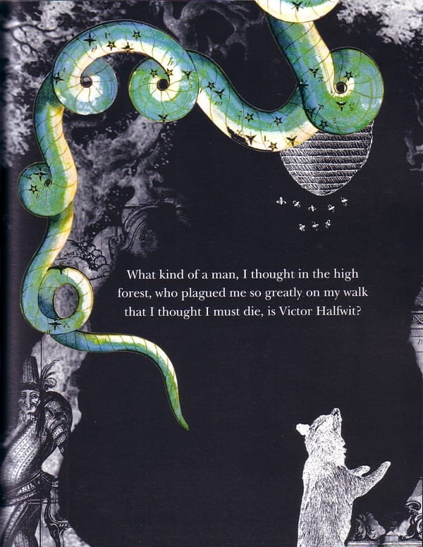
Seagull Books recently published some striking examples of art/text: The Loss Library, a collection of prose about failed stories by South African writer Ivan Vladislavic; and a children’s tale by Thomas Bernhard (yes, that Thomas Bernhard) called Victor Halfwit, in which a couple pages of text were transformed into a thick folio-fable of collage artwork, perfectly capturing the tone of Bernhard’s slightly gruesome and hilarious fairy tale.
Both books benefit from complex and hypnotic artwork by Sunandini Banerjee. After several years working on book covers for Seagull, Victor Halfwit became her first full-length, illustrated book project.
“Not having illustrated a book before — but knowing that I disliked children’s books which had pages full of text and a picture cowering in a box in the corner somewhere,” she says, “I began to read it word by word, sentence by sentence, phrase by phrase, and began to ‘draw’ on wherever the associations and images came to me naturally.”
Bernhard’s work is known for its intense seriousness, and Banerjee said when she first read Victor Halfwit she thought it was “simple and perhaps even a wee bit dull.” “But I found that when you take your time over it… when you pause to breathe between those words, whole worlds of pictures come cascading through the cracks and between the lines. So even though he uses the word ‘forest’ about 20 times, each forest is different. And that perhaps was the challenge.”
She said her goal was “to be true to Bernhard’s style and yet to bring in enough of myself to prompt the reader to read a little more, to bring in some of themselves and go, ‘Ah, that looks familiar,’ or ‘Hah! That’s really funny.’ Each page becomes a story in a much bigger story.”
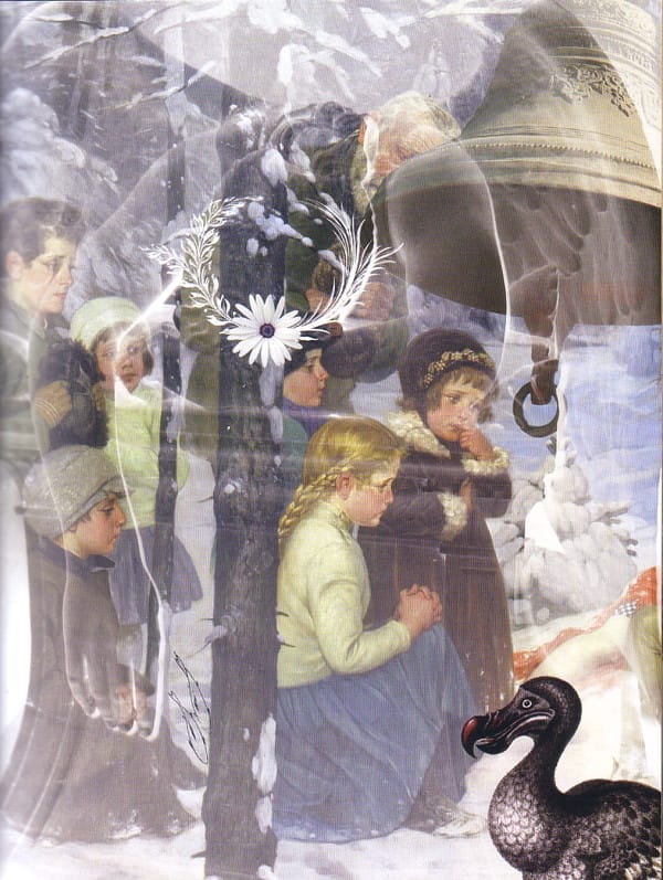
She created over 200 pages of artwork based on a few pages of text. “It was an immense undertaking,” she says, “and I feel that I have to generate a new lifetime of images and memories and associations, for I have vomited everything I possessed into those pages.”
As a collagist, Banerjee is staunchly independent and when I suggested Hannah Höch as one possible influence, she politely resisted the idea. “One of the things I simply do not do is to identify any form or person as ‘an influence’ or as ‘an inspiration.’ I don’t want to be ‘like’ anyone. I want to be me.”
“It is not just a question of assembling images. One is reading, remembering, recalling, reinventing, rediscovering, associating — all at once. One is picking up on certain words or motifs and then chasing them down the alleyways of representation to see what they finally look like when you stand face to face. … After it is over, I can never remember how it was that it came to be done.”
Picture-filled texts make the story feel like it’s drawing two reactions out of me: first comes the calm memory of children’s books I’ve loved; second, the feeling, decidedly more abstract, of knowing that these words triggered images in someone else’s mind, and these “other” conceptions are now alive in the book. The result is a palimpsest — an overlay of visual responses each competing for dominance.
When I asked Banerjee about this in relation to her intentions with the artwork she created for Vladislavic’s The Loss Library, she said, “I don’t think there can be a specific intended effect with any form of art. One can hope or wish for something to have a certain effect, but so much of it lies in the eye of the beholder. Our idea was to have a frontispiece for every story, a pictorial representation that could be its seed or its fruit. And we wanted to treat them like old-fashioned picture plates, which is why they were printed separately and then stuck in. Not to illustrate each story, in the strict sense of the word, but to perhaps walk alongside, to accompany, sometimes even to comment, to point out.”
One thing I hadn’t even considered was what the author might think about any of this tinkering. After all, a book cover is usually something authors just have to live with and hope the publisher can do their best. With The Loss Library, Banerjee said Seagull worked with Vladislavic:
[He] was remarkable in his generosity to allow me to ‘intervene’ if you will, or illuminate if you will, his words. And for that I am grateful. Every reader, every viewer, is welcome to make of it what they will. Once it is in their hands, it is their responses that will make them read or turn away.
Though I greatly admire the artwork in these so-called picture books, I find them a challenge to read and enjoy. Their subject matter lives a complex life, the writer, the artist, and my responses all contending. And I find myself struggling to preserve my ideas and images, to preserve relationship with the author. To preserve its intimacy. Maybe because I write fiction as well as criticism, I don’t want that third partner in my reading experience — no matter how fine or complex their contribution. Mere words on the page may not be very exciting things to look at; what’s exciting is what I make of them. I want to keep that work to myself.


