A Painter's Dissonant Geometry
Gary Petersen is a highly intelligent painter, which is to say he has absorbed a lot of art history and, more importantly, is at ease with it.

Thinking about the artist’s relationship to art history, Robert Motherwell put it like this:
Every intelligent painter carries the whole culture of modern painting in his head. It is his real subject, of which everything he paints is both an homage and a critique, and everything he says is a gloss.
By Motherwell’s definition, Gary Petersen is a highly intelligent painter, which is to say he has absorbed a lot of art history and, more importantly, is at ease with it. Exuberantly at ease, in fact, which is one reason why I was eager to follow-up and see his current exhibition, Gary Petersen: Just Hold On, at McKenzie Fine Art (September 3–October 20, 2019).
This is how I characterized Petersen’s debut solo exhibition three years ago:
Petersen is a hard-edge geometric painter whose groupings of color and stacked forms seem inspired by Ellsworth Kelly, Al Held, and Nicholas Krushenick — distilled shapes, impossible arrangements, and a welcome dose of vulgarity. His off-center, stacked shapes have a decidedly urban feel to them. Like the girders, granite slabs, and rebar piled up at a construction site, the piled shapes come across as simultaneously secure and unstable. And yet, in wonderful counterpoint to the drab and somber colors we associate with municipal construction, Petersen’s palette is a mixture of holiday cheerfulness and artificial tones.
Part of my curiosity was to see what Petersen would do with what he already had. I was not disappointed. With the addition of curvilinear lines as borders separating one area from another, wilder color, and other stylistic moves, Petersen has juiced up the “impish delight” that I saw in his first exhibition. As his exhibition title announces, we better be prepared to “hold on.”
Whereas earlier generations of postwar abstract artists often became reductive, jettisoning aspects of painting’s history, Petersen seems to feel that he can build upon the past literally and figuratively. He does not feel a pressing need to obliterate it, nor is he interested in parody or citation. If anything, he is moving in the opposite direction and seeing how much he can bring into a painting that is essentially layered and flat, without resorting to well-known moves such as ironic mimicry.
More importantly, Petersen has developed a lexicon of shapes and colors that still feels expansive and exploratory at this point. He is not stuck in a style, and all that it supposedly signifies, as a number of postmodern abstract artists did in the 1980s, when they hooked their work to a theorist, such as Jean Baudrillard, like a caboose.
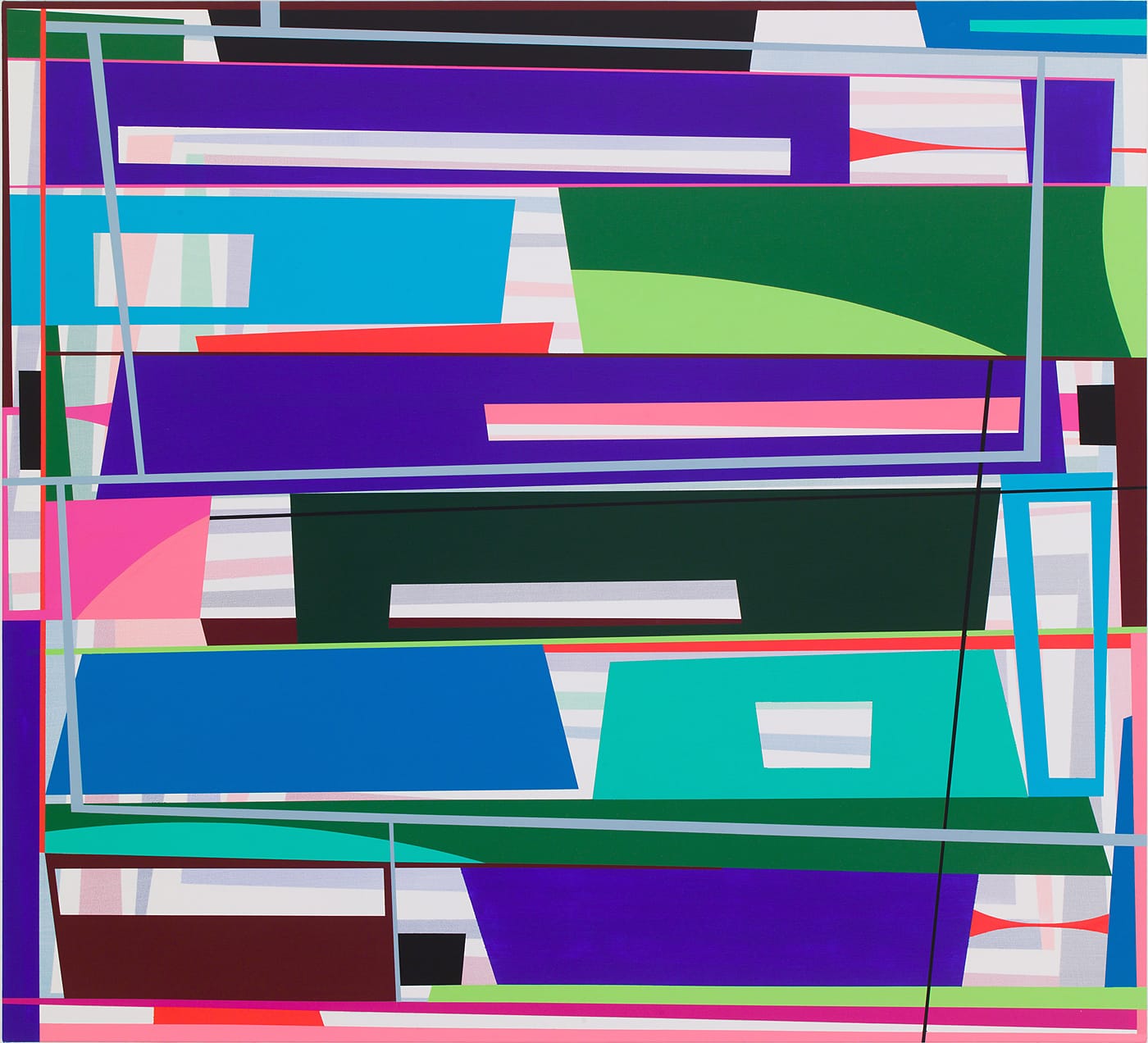
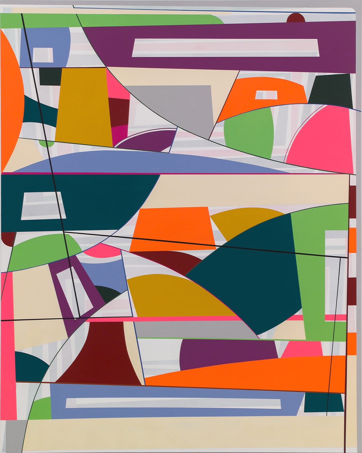
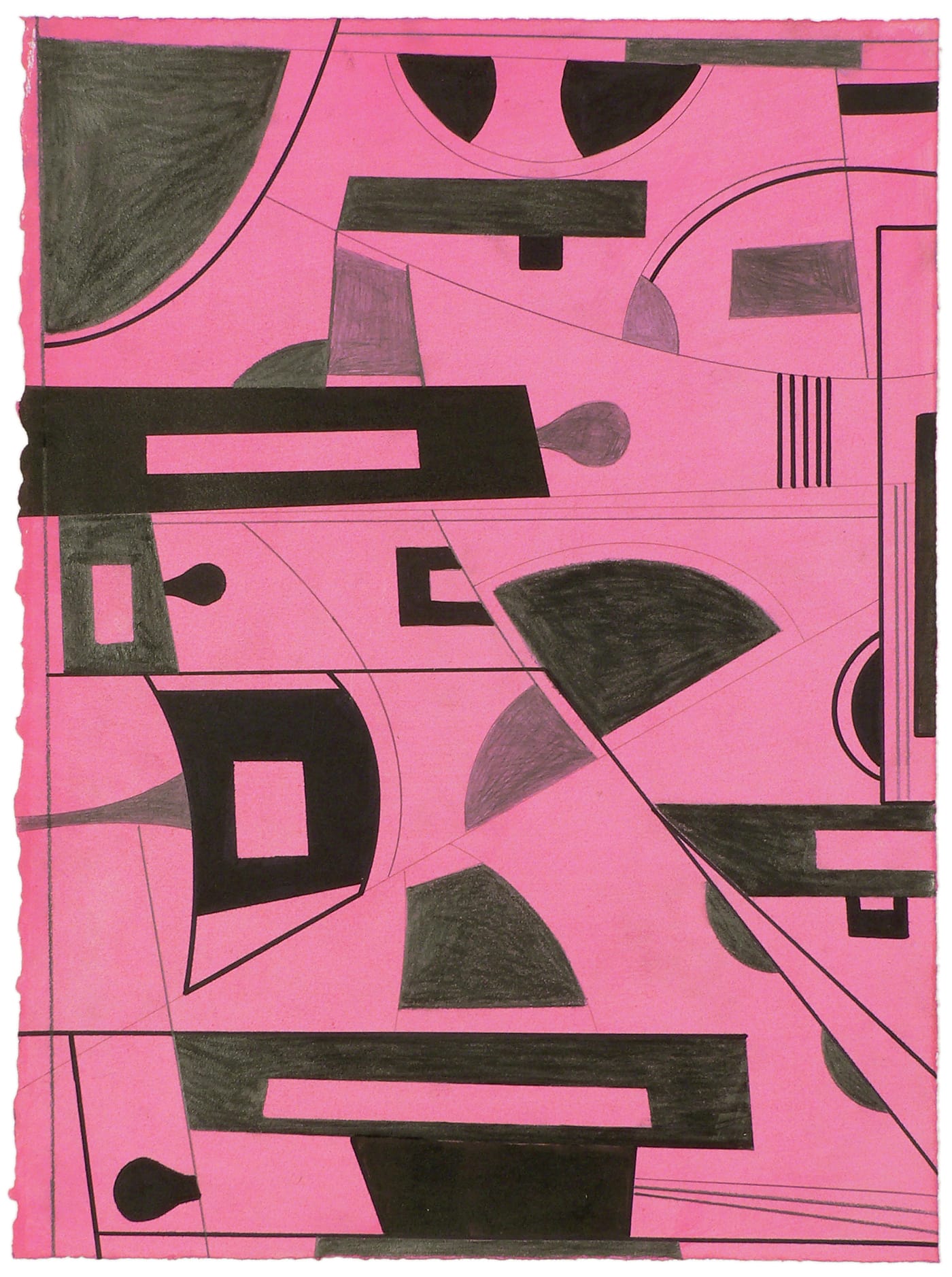
The exhibition contains 10 paintings and five drawings. The paintings range in size from 12 by 9 inches to 40 by 108 inches (“Hitch Hiker,” 2019) and 64 by 84 inches (“Split Screen,” 2018).
Petersen divides “Hitch Hiker” into three internal sections, the middle one roughly double the width of the flanking right and left sections. The composition echoes a car windshield with the front seat passenger windows flattened into a panoramic format. To continue this analogy, each section’s palette is distinct from the other two. As we drive from an urban landscape — as evoked by the stacked geometric shapes — the view out each window is different, yet connected. Other views can be seen between and through the edifices closest to us. It is a commonplace experience that Petersen has transformed into an abstract painting.
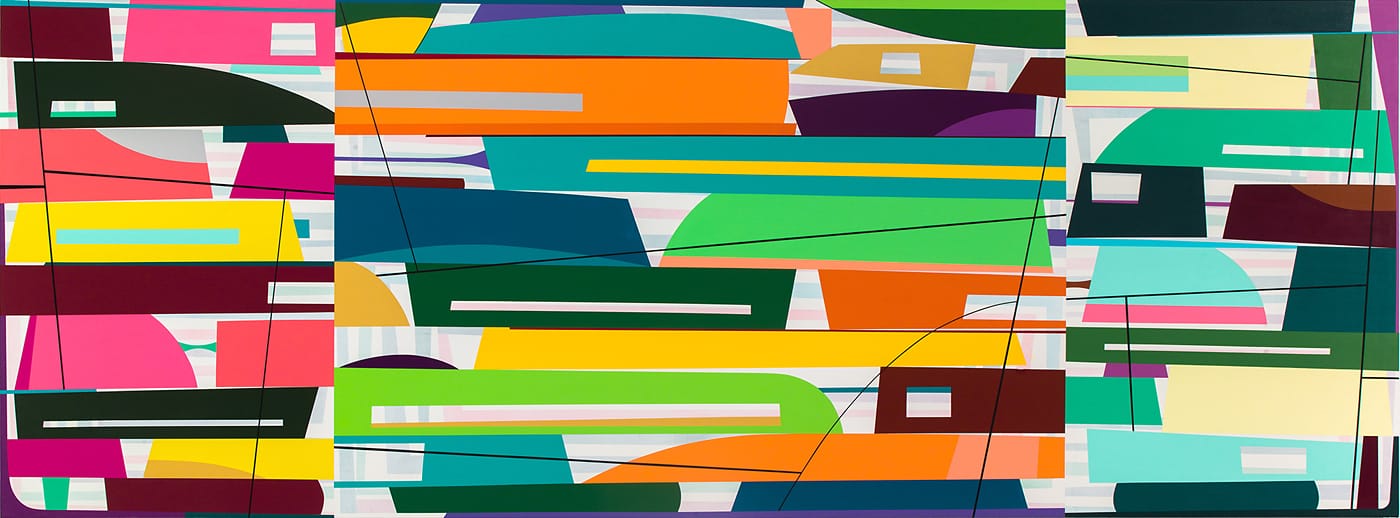
The bright lemon yellow in the far left section of “Hitch Hiker” is not found in the other sections. In contrast, a darker yellow is the middle, while two shapes in the right are pale yellow. There are black shapes in the outer sections but none in the central one. There is no obvious methodology to Petersen’s color selection for each section, but his process results in visible differences.
The stacked shapes in all three sections are set against a ground consisting of pale horizontal or vertical pastel bands on a white ground. The horizontal bands of muted pastel colors evoke Agnes Martin, Minimalism, and reductive geometric painting. Over these compressed layers, Petersen adds a linear element — in this case a black line that forms an open skeletal structure — halting either before or along the vertical seams suggested by the sections, where two different-colored, horizontally oriented shapes abut each other.
By overlaying the banded ground with different-colored geometric shapes stacked atop each other, it appears that Petersen is building a new edifice over a previous one — something that also happens in architecture. With the addition of the linear element, he seems to want to have it all in his paintings: composition, layered space, color, and line.
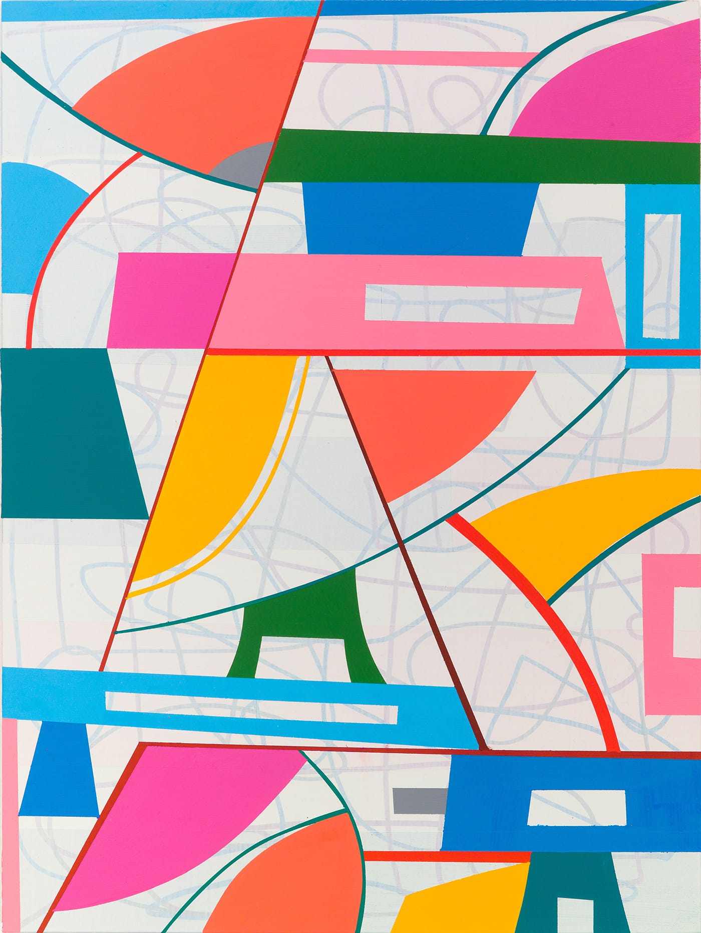
In addition to using internal divisions to make far more complicated paintings than those in his previous exhibition, Petersen has added a number of elements. In “Caught Between” (2019), which measures 12 by 12 inches, a looping line marks the ground overlaid by the geometric shapes, establishing a stronger contrast between figure and ground. The looping line reminded this viewer, at least, of Dan Christensen’s early spray paintings (ca. 1967-69).
Two other elements in “Caught Between” push the painting further into new territory for Petersen. One is a curved line, which extends in from both the right and left edge, with each rising up until another line or shape stops them. It is as if the curved line and its contents are invading the painting. The second element is that the linear structure that overlays the earlier layers is made up of parallel diagonal lines; this adds a dynamic quality into the composition, a feeling of vertigo.
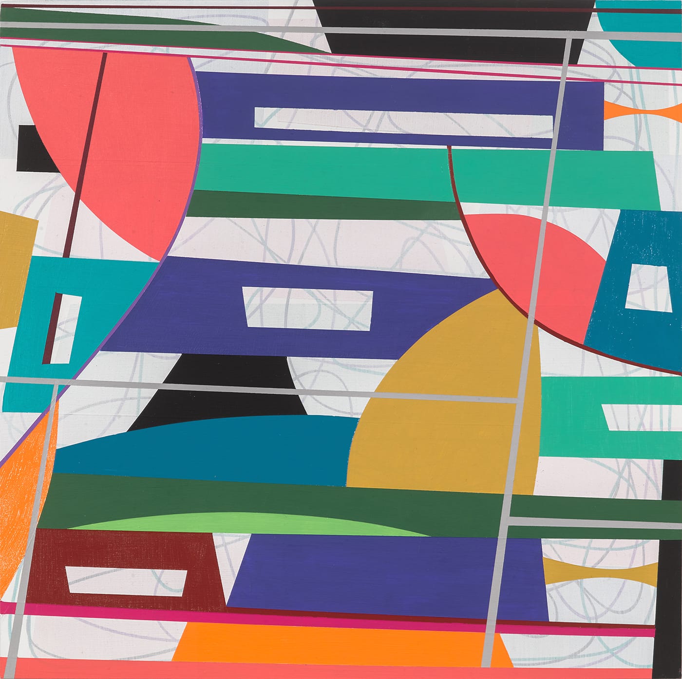
Having previously constructed a composition that was simultaneously tight and precarious, Petersen has nudged the implications of precarity further down the road. At times, I was reminded of a kaleidoscope that has fragmented further. The dissonance evoked associations with jazz and its shifts in chords and modality.
Oil paint in some of these works adds a light tan geometric shape, whose tactile surface reminded me of skim-coated walls. In contrast to the tight surface of the acrylic, the oil paint was noticeably thicker, tactile, and slightly uneven.
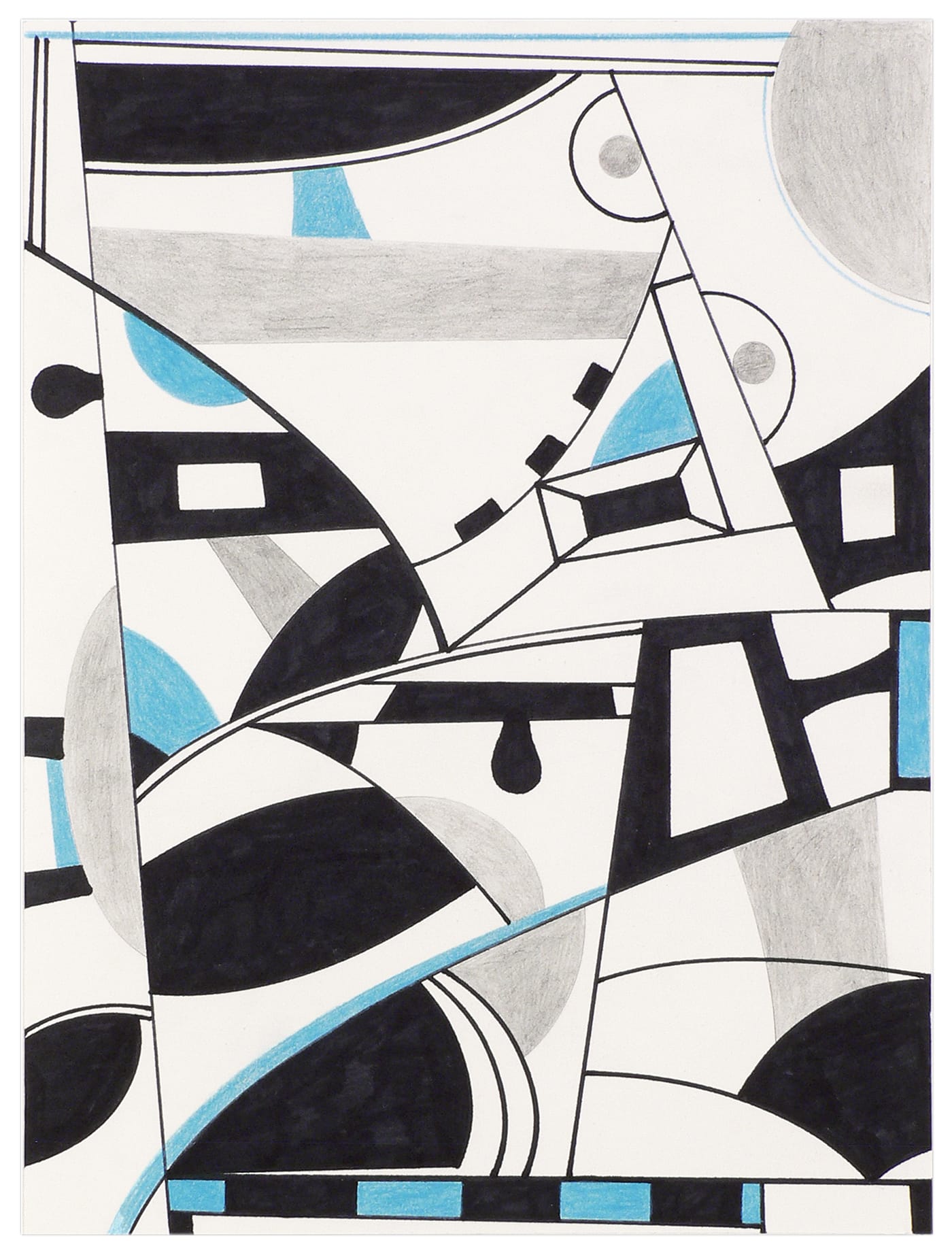
Petersen’s five exhibited drawings are divided into two groups: one in different densities of black and gray on colored paper, and one in three colors (gray, black, and violet or blue) on white paper.
By showing paintings in radically different sizes and including modestly scaled drawings, Petersen’s exhibition expresses something few painters are willing to own: it conveys vulnerability as well as a commitment to remaining open and adventuresome. This is why I have the feeling there is much more to come in what is already a strong body of work.
Gary Petersen: Just Hold On continues at McKenzie Fine Art (55 Orchard Street, Manhattan) through October 20.