COVID-19 Statistics in Instructive, Comforting Illustrations
Artist and data journalist Mona Chalabi creates engaging illustrations on Instagram about staying safe during the pandemic.

In the tumultuous times of the COVID-19 pandemic, public information about the disease and ways to protect ourselves and others from can have life-or-death consequences. This is a challenge facing artist and data journalist Mona Chalabi, whose instructive and reassuring illustrations about the pandemic have gone viral on social media.
Chalabi, who is a data editor for the Guardian US, is known for visualizing (or “translating”) complex and heard-to-read scientific data into lucid, colorful illustrations and videos. Her ongoing series, COVID-19 Translations, applies that technique to public service announcements provided by the Centers for Disease Control and Prevention (CDC) and other trusted sources.
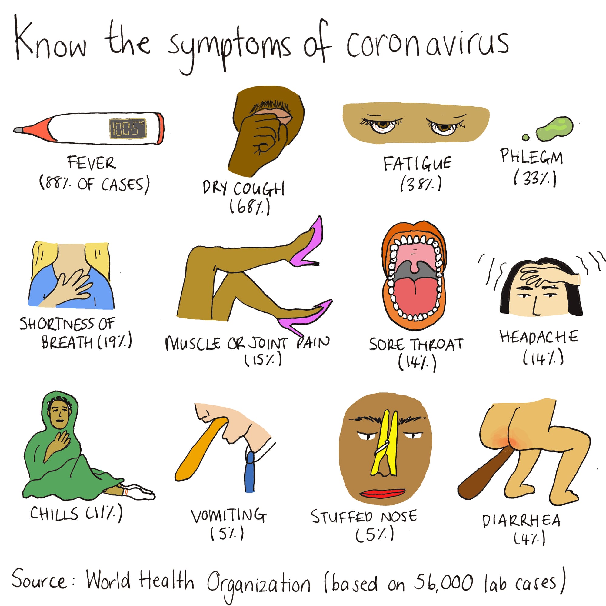
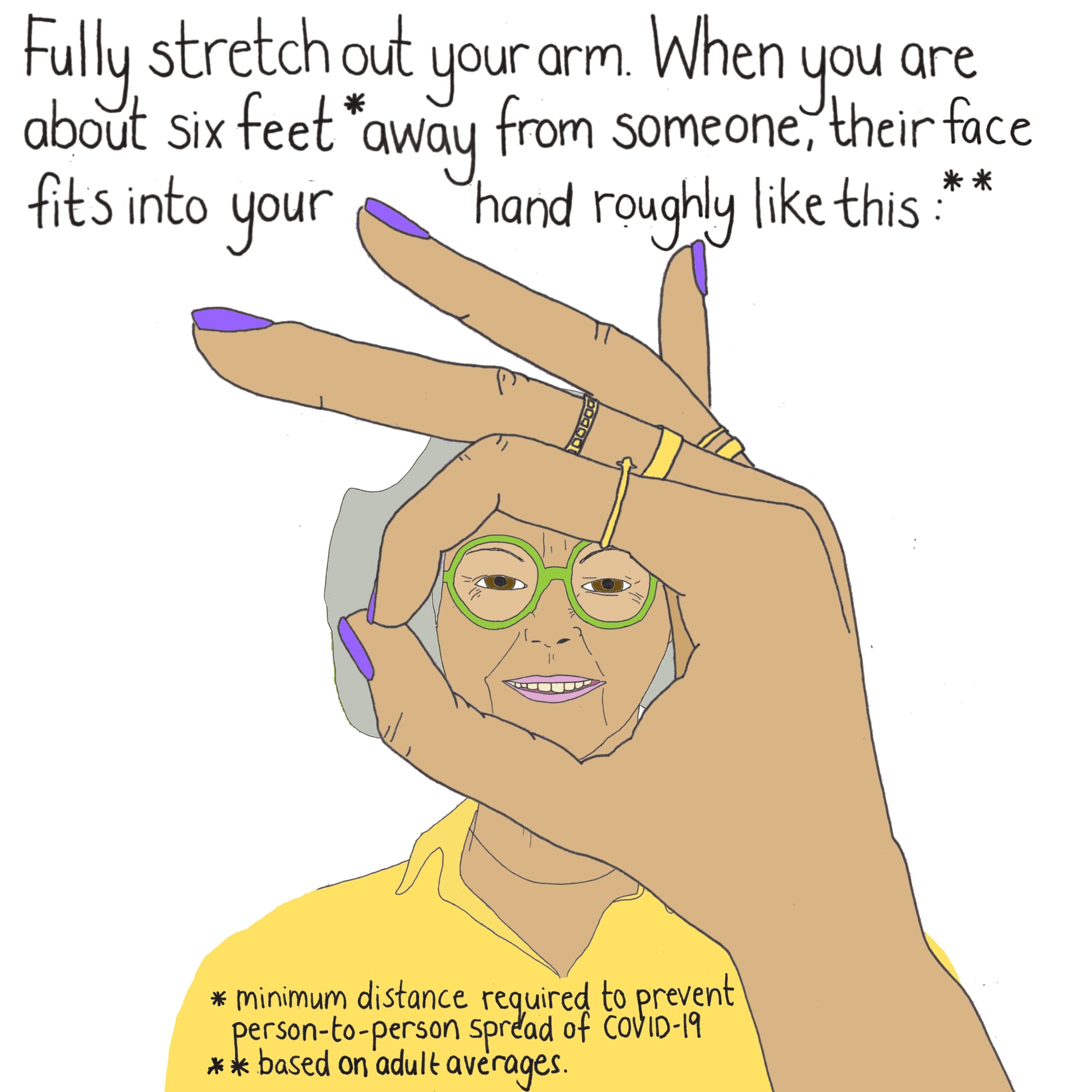
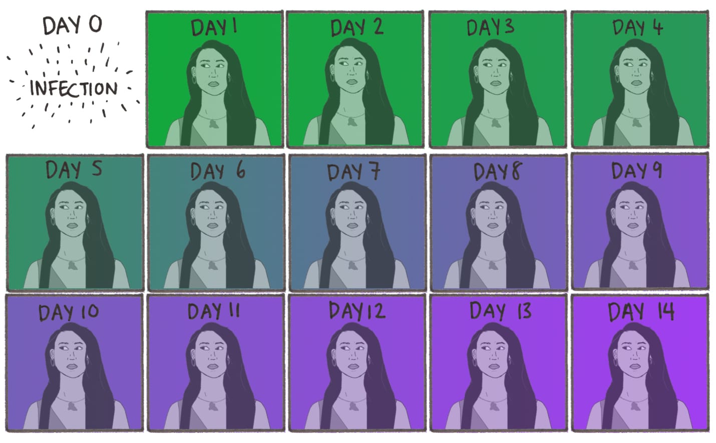
Gaining tens of thousands of likes and hundreds of comments on Instagram, Chalabi’s illustrations visualize data on a variety of questions pertaining to the pandemic — from the symptoms of the disease to how to properly practice social distancing — including a particularly illuminating post that explains the difference between social distancing, quarantine, and isolation. Each illustration cites the source of information with a caption.
“I don’t ever report on things when they’re unclear, but I feel that right now it’s really important to influence human behavior in order to protect our collective health,” Chalabi told Hyperallergic.
Yet, the insufficient research on the novel COVID-19 and science’s incomplete understanding of its behavior have confronted Chalabi with difficult moral dilemmas in her work, leading her to veer towards more “conservative findings.”
For instance, when she researched the question of how long the virus remains alive on different surfaces, she found that neither the CDC nor the World Health Organization (WHO) had any specific guidance on the issue. As a result, she had to make a choice between two academic studies — one that claimed that the virus can survive up to nine days on some surfaces, and another that suggested a lifespan of just three days.
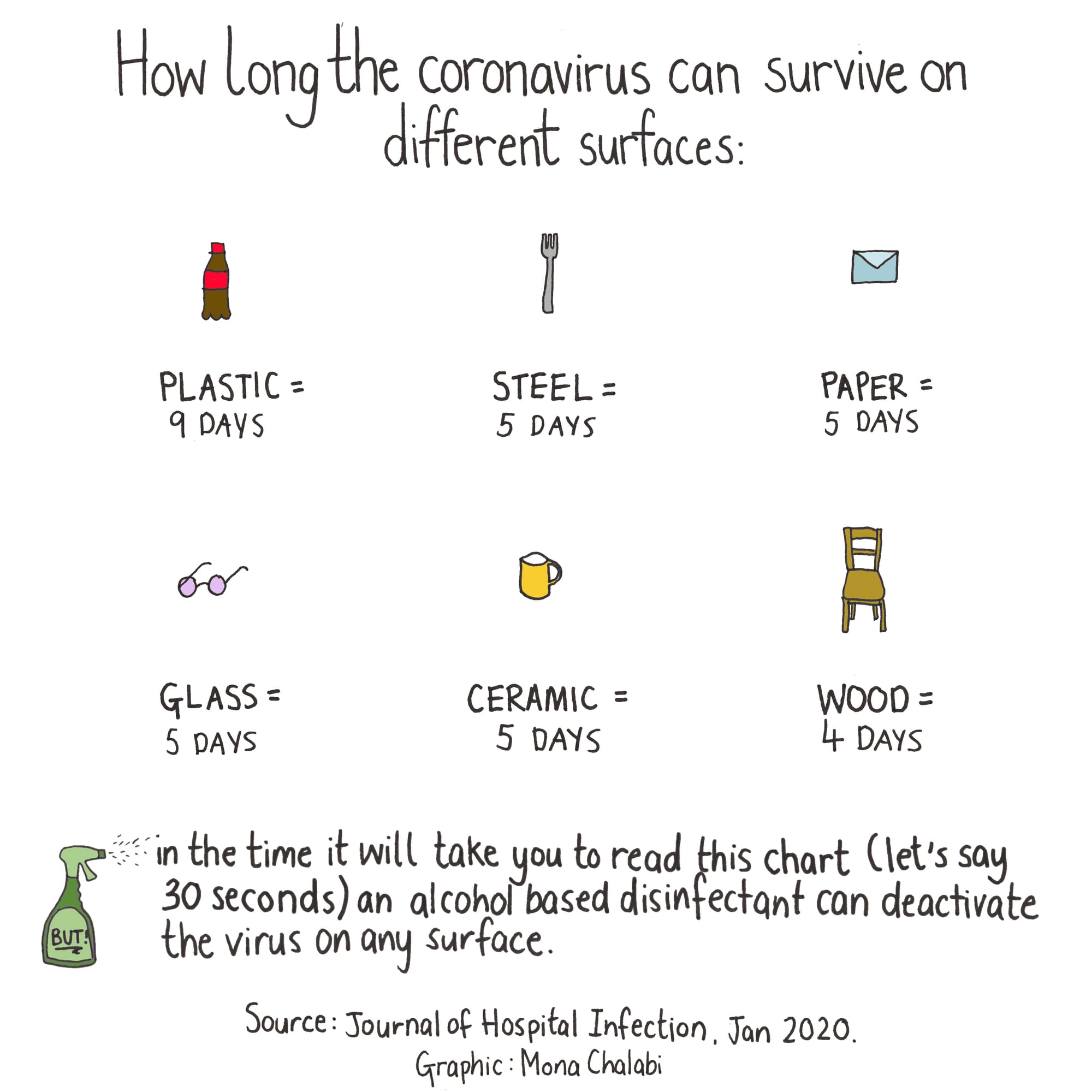
“While trying to choose between the two, I thought: should I just go with the one that suggests that virus lives longer? Because the worst-case scenario is publicizing the study that suggests a shorter term and possibly making people sick if it turns out that the virus lives longer.” She ultimately chose the study that suggested a longer lifespan for the virus.
But these choice don’t come without self-doubt, as Chalabi confessed: “I want to avoid causing harm, but you could say that I’m causing harm by freaking people out or by getting them not to touch things […] I’m worried for example about people with OCD [Obsessive-Compulsive Disorder] who might find it triggering.”
Misinformation about the virus is rampant online, which only adds to Chalabi’s anxieties. “Every journalist should be so scared these days,” she said. “Misinformation is killing people. It’s a matter of life and death to clarify the public understanding of this outbreak.” Her next step, she added, is to assemble a team of experts that would vet her illustrations before they are published (she’s currently seeking grants to facilitate this process).
Chalabi, who’s based in Brooklyn, said that she works 12 hours every day on her illustrations while worrying for her family in London, who are under national lockdown as of today.
“I’m so conflicted about everything I do these days,” said Chalabi. “But all I can do is be as transparent as humanly possible about the decisions I’ve made as a researcher and why I’ve made them. Inaction is not an option.”


