A Rebel in The High Modernist Camp
Suzan Frecon insists that art is a wordless experience, that paintings invites us to a plane beyond understanding.

This summer has seen a spate of exhibitions by women working in in the field of geometric abstraction. The list includes Beverly Fishman at Miles McEnery, Torkwase Dyson at Pace’s East Hampton space, and Carmen Herrara at Lisson Gallery. Suzan Frecon’s new show, now on view at David Zwirner through October 17, joins them.
Frecon, who has been painting since the 1970s, the heyday of Minimalism, has developed into one of its more unorthodox practitioners. In contrast to Robert Mangold’s rejection of the rectangle and Brice Marden’s reinforcement of it, Frecon has reinstated elegant form into otherwise severe parameters. In the artists’ seventh solo show at the gallery, she continues to explore soft, geometric abstraction at a near-architectural scale, with paintings that are both reductive and expressive.
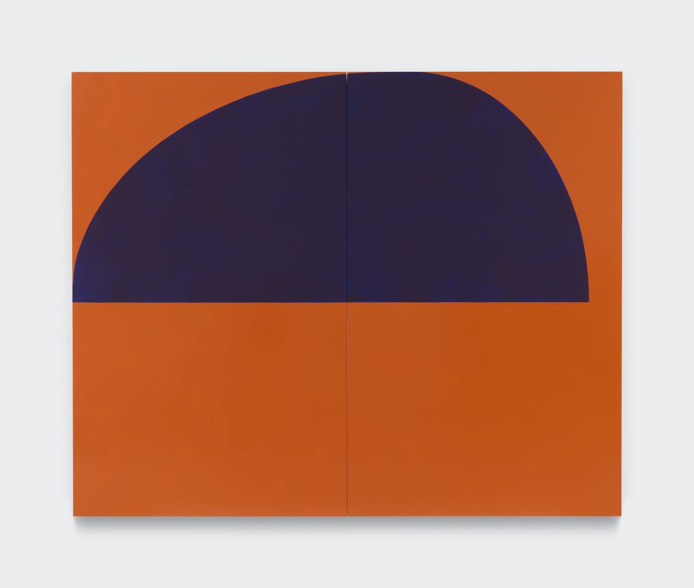
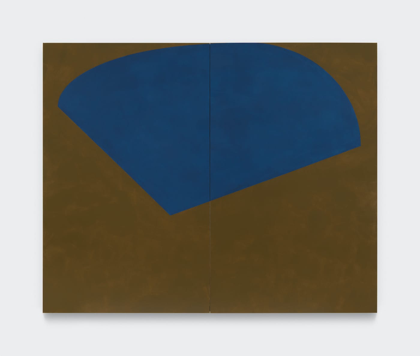
The nine paintings in the show are exhibited in only natural light, without artificial enhancements. There’s a logical explanation for this. The show is largely comprised of diptychs using raw pigment mixed with linseed oil, relying on a palette of deep earth tones the occasional vivid orange, applied thinly and subtly, exploring transparency and opacity in surfaces alternately glossy and matte.
These paintings are both material and transcendent. Their compositions are asymmetrical, positioning arcs and ovals in the upper half of the canvas. Frecon’s reductive formal vocabulary permits uncanny figure/ground relationships, with the two often appearing interchangeable, suggesting a transient quality despite their scale and physicality.
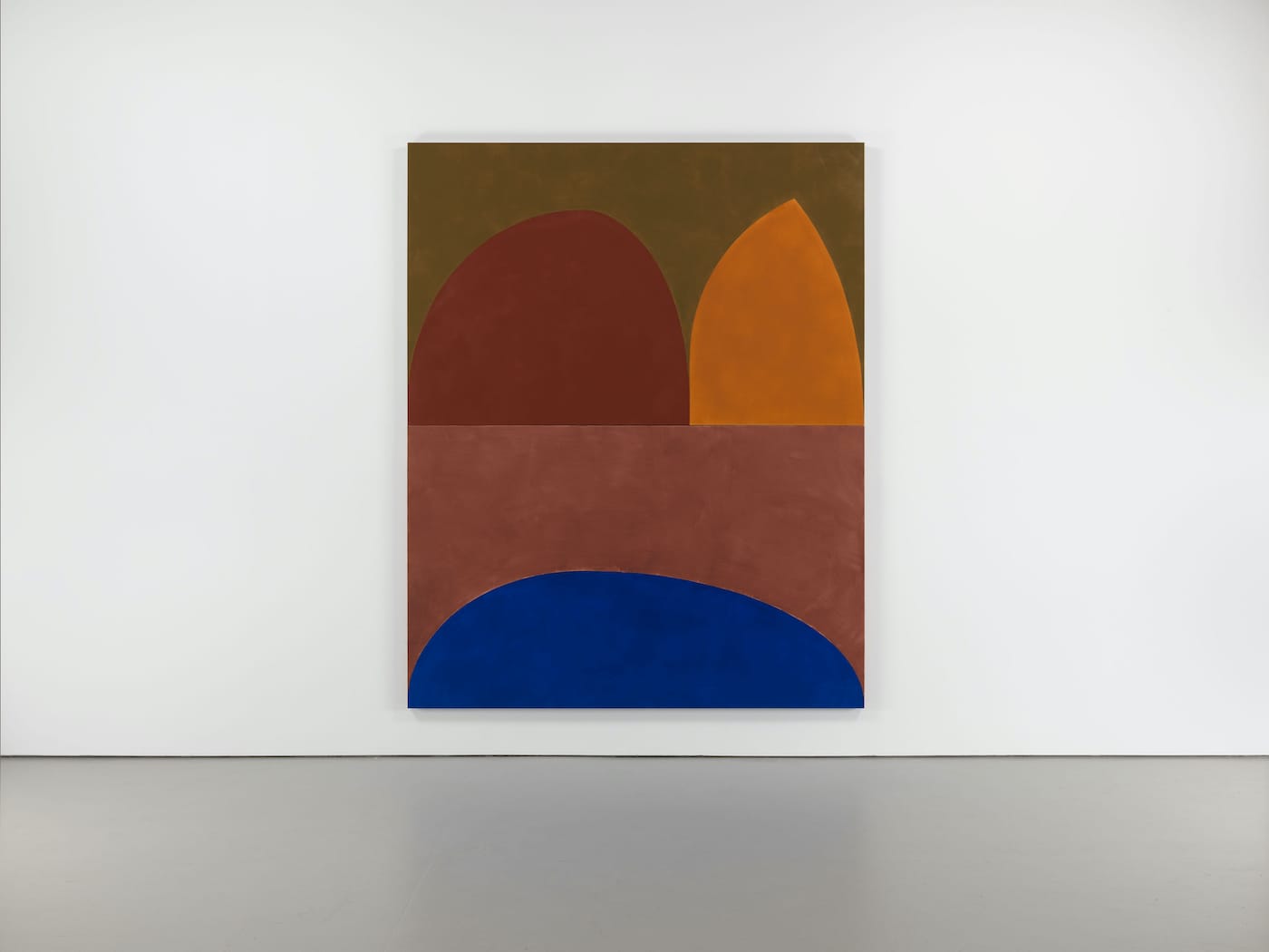
The artist draws small sketches continually, often repeating certain motifs. A work like “stone cathedral” (2019) is one painting that contains such a motif; it is also the only one in the show that suggests a foreground, middle ground, and background. At the top, the artist paints a swamp-green field, against which two arches—sandy brown Romanesque and ochre Gothic— sit atop the composition’s midline. Below, a rotund, deep ultramarine blue expanse intrudes from the bottom of the painting onto a dusty rose field, like the surf on the shore. Each form rotates relative weight and density to the next, situating form and color to create convex and concave space, resulting in a kind of flattened sculpture. This painting necessitates embodied looking, creating an experience that is as physical as it is meditative.
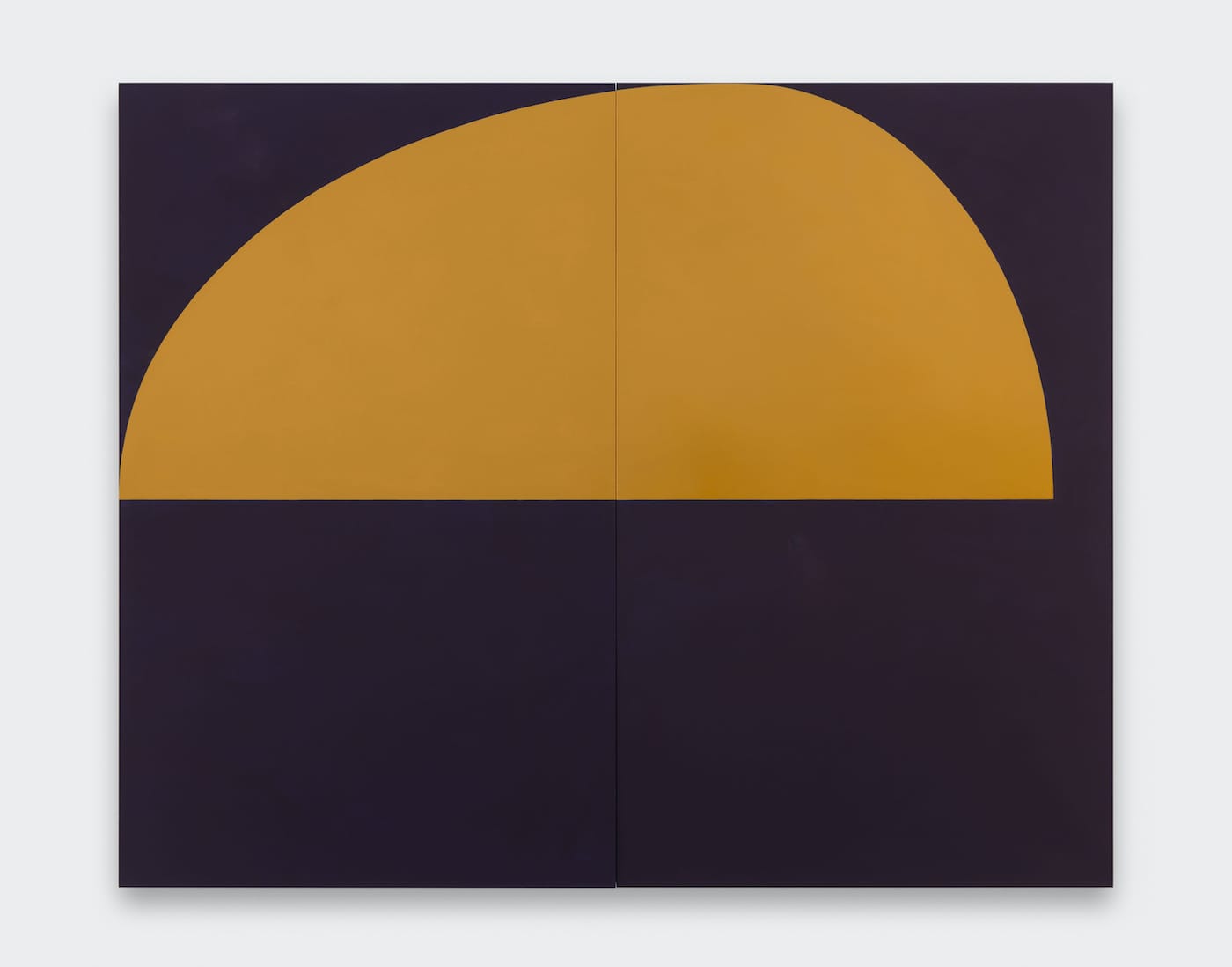
These paintings are rife with formal contradictions that produce a myriad of optical affects. The diptych “yellow lantern” (2018) is composed of a matte, ultramarine-black field. For all of its darkness, it bears the softness of velvet absorbing light, appearing visually weightless. A large, rotund, glossy, golden ochre form rests at the top, its edge reaching the left corner, while leaving a couple inches on the right to create negative space. The ochre form hovers and emanates light, yet the opposing color density provides it with a sense of formless form, just beyond reach.
If Frecon feels like a rebel, an outlier in the high modernist camp, it may be because her relationship to art history isn’t framed by an appeal to the High Renaissance. Her paintings have more in common with another 20th-century metaphysical painter, Giorgio Morandi, while an even more likely antecedent comes in the form of Cimabue, whose painting “Madonna di Castelfiorentino” (1283 – 1284) depicts a solemn Mary and the infant Christ surrounded by a gold-leaf aura bordered by an opaque, black archway. Mary, cloaked in a deep, black robe, looks outward toward the viewer as Christ touches her cheek yet seems to be peering beyond her. The alternating color contrasts creates a massive recess behind the figures that advances and recedes into near-sculptural depth, suggesting material presence and divinity all at once.
Frecon insists that art is a wordless experience, that paintings invites us to a plane beyond understanding. It is likely that language has a limited capacity to explain perceptual phenomena, and these paintings appear to revel in mystery.
But rather than remain in some murky ambiguity as over what these paintings might mean, we would do well to remember the power of color to influence the feeling and atmosphere of narrative content—hardly a negligible quality.
The artist’s content, like the ever-changing nature of her forms, remains elusive, even as their color conveys something profound about our state of being and its inverse, non-being; these are paintings that are as much about being here now as they are about our eventual absence.
Suzan Frecon: oil paintings continues at David Zwirner (537 West 20th Street, Chelsea, Manhattan) through October 17.