Artists Quarantine With Their Art Collections
“If I have to be discarded, let it be in the beautiful green space of this painting.”

Author’s Note: As the global death toll from Covid-19 surpasses 1,000,000 with no sign of slowing, the ubiquity of trauma continues to alter the most familiar features of daily life: eating, getting around, meeting people, even looking at images and objects we’ve been living with for years. In this series, I’ve been asking artists: In the context of the Covid-19 pandemic, do you look at your personal collection differently now, and which works in particular? Is there one that especially resonates with you in this weird, frightening time? And does it take on new meaning?
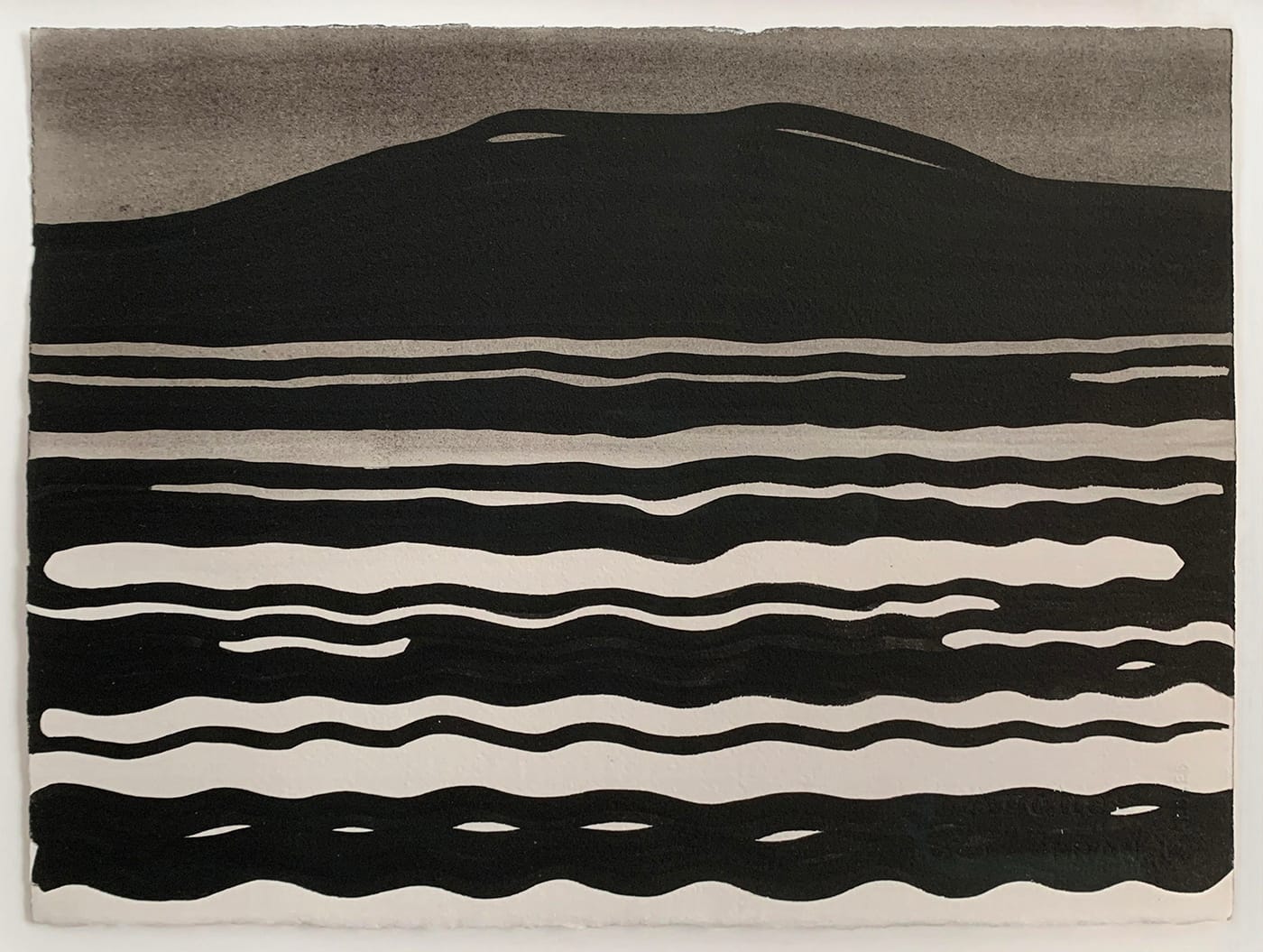
Chie Fueki (Beacon, New York): During the lockdown in March, I shifted the location of my studio routine away from a multi-use building to our apartment, where two ink paintings by Eric Wolf bracket either side of a window.
In the painting on the left, “Observatory Mountain,” a rippling lake foregrounds the silhouette of a summit that Eric has painted repeatedly on visits to Maine. When we hung this painting after moving to Beacon, we discovered the uncanny coincidence that Mount Beacon, visible from town, shares the same angles and undulations as Eric’s “Observatory Mountain.” In its sister painting, “Fog,” the lake is present but the mountain has vanished, exchanged for a gradation of gray wash that bleeds upwards towards raw paper. The air has been stilled, the mountain obscured, and the ripples flatten toward straight lines.
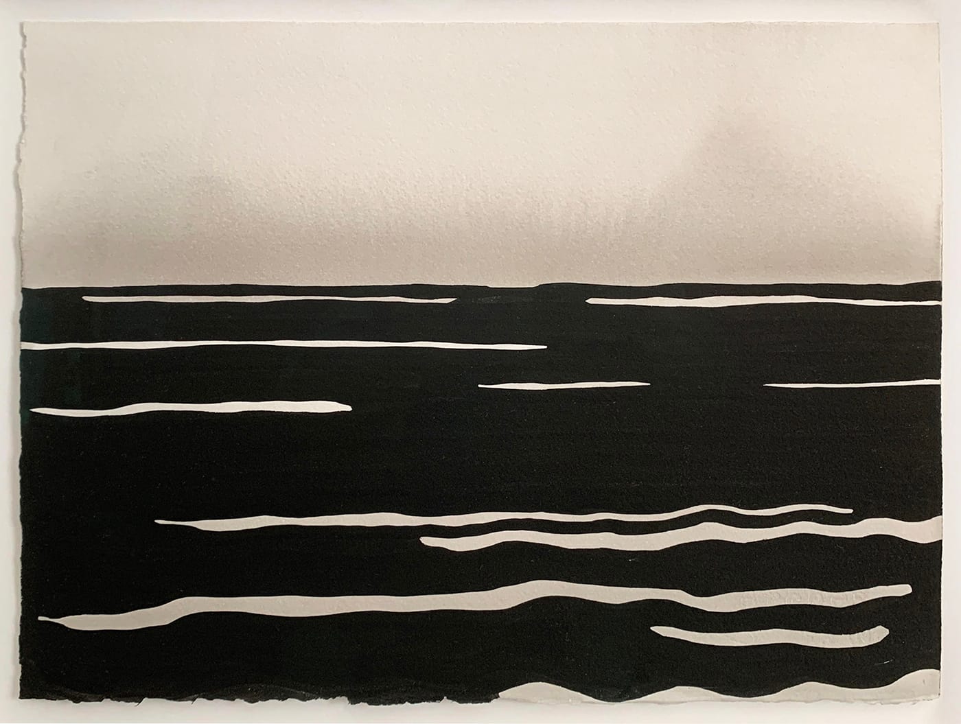
When the season shifted to spring, Mount Beacon would occasionally disappear behind fog or low clouds, and Eric’s two paintings would take turns quoting the world. Friends and family were veiled from us too, gradations of themselves communicating from afar. In-person encounters became almost too saturated to be real. We were routinely humbled by the value of things we took for granted, and the truth of our local and global interdependence was made undeniably plain. It was, and is, a time of rethinking.
Eric’s solitude when he painted these works, his tent and table set up in a Maine preserve, reaches out to me in these times. His past seclusions, captured in the decisive fluidity of his paintings, are both companion and guide. Working next to his inks, I painted two large paper ribbons that evolved into Mother Altar — an installation of offerings and works by artists, friends, and the public, contributed during the summer months of the pandemic.
There’s a heavy tactility to Eric’s paintings, an insistent materiality. The ink is so densely saturated, the thick paper bordered with ragged edge. How are they at once so full of air, light, space, and motion? Can we embrace their alchemical optimism, grounded and yet transforming?
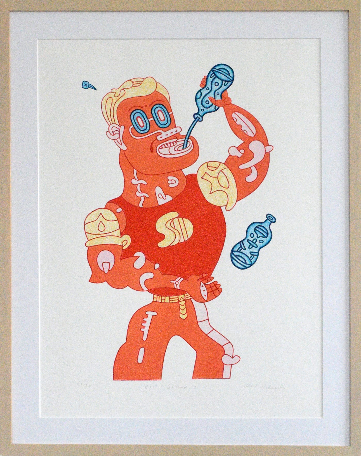
JoAnne Carson (Shoreham, Vermont): The piece that has changed the most radically for me in the COVID era — in fact it feels like it has completely transformed its meaning — is this Karl Wirsum lithograph from 2009, titled “Exit Brand X.” Pre-pandemic, I viewed Wirsum’s image of a muscled man dressed in a Superman costume and guzzling from a blue bottle as comic shenanigans. He seemed to be the guy at the bar pumped up on booze, mansplaining and swaggering around as a superhero wannabe. Now I see that he is Donald Trump. I don’t know why I didn’t see this before. The print is in our living room and when I am watching the PBS Newshour and Trump is on, I quickly look over to check “Exit Brand X” and, yup, it is Trump.
What once seemed like an image poking gentle fun at a delusional no-nothing bully now has a more malignant feel. It points a finger at our greedy leader and by extension at us. He is red but he is drinking blue. He will do anything to survive, like his solo expedition to find a vaccine to save himself. When he perspires, he sweats nails. Could it be that Wirsum’s creation is not an imposter after all, but a real pandemic-era Superman fueled by narcissistic greed and a willingness to go it alone? I hope that after the election I will return to viewing this Wirsum with upbeat mirth. Right now it seems to be a cautionary tale.
Tom McGlynn (Jersey City, New Jersey): This is “Tattoo” by Nancy Spero. During the lockdown, I had the chance to become freshly intimate with the work and with the circumstances of its addition to our collection.
My wife, artist Tenesh Webber, and I bought it in 1996 at a benefit exhibition held at a no-longer-extant venue on East 5th Street called The New York Kunsthalle, which was administered by Martin Kuntz. Kuntz had organized the benefit to raise funds for the beleaguered city of Sarajevo, then under military siege. He published “Tattoo” for the occasion. Nancy’s husband Leon Golub also contributed a work, I believe. I had met and become friendly with Nancy and Leon years earlier (1982-83), working on an interview with Leon and spending time with them in their studios on La Guardia Place. They also hosted meetings there at that time for “Artists Call” (a gathering of artists protesting the US military intervention in Central America) in which I took part. Their mutual commitment to social issues made a big impression on me as a young artist and their participation in the Sarajevo benefit was a typical example of the many social and political causes they supported.
The imagery in “Tattoo” is characteristic of Nancy’s more ludic, collaged celebrations of women’s imagery throughout art history. Its giddy, liberating joi de vivre in relation to the tragic immediacy of the Sarajevo siege has taken on new significance during the social emergency and constraints on freedom of movement while locked down in the Covid pandemic. Its animated figures unapologetically suggest: “In the face of all of this, why not dance?”
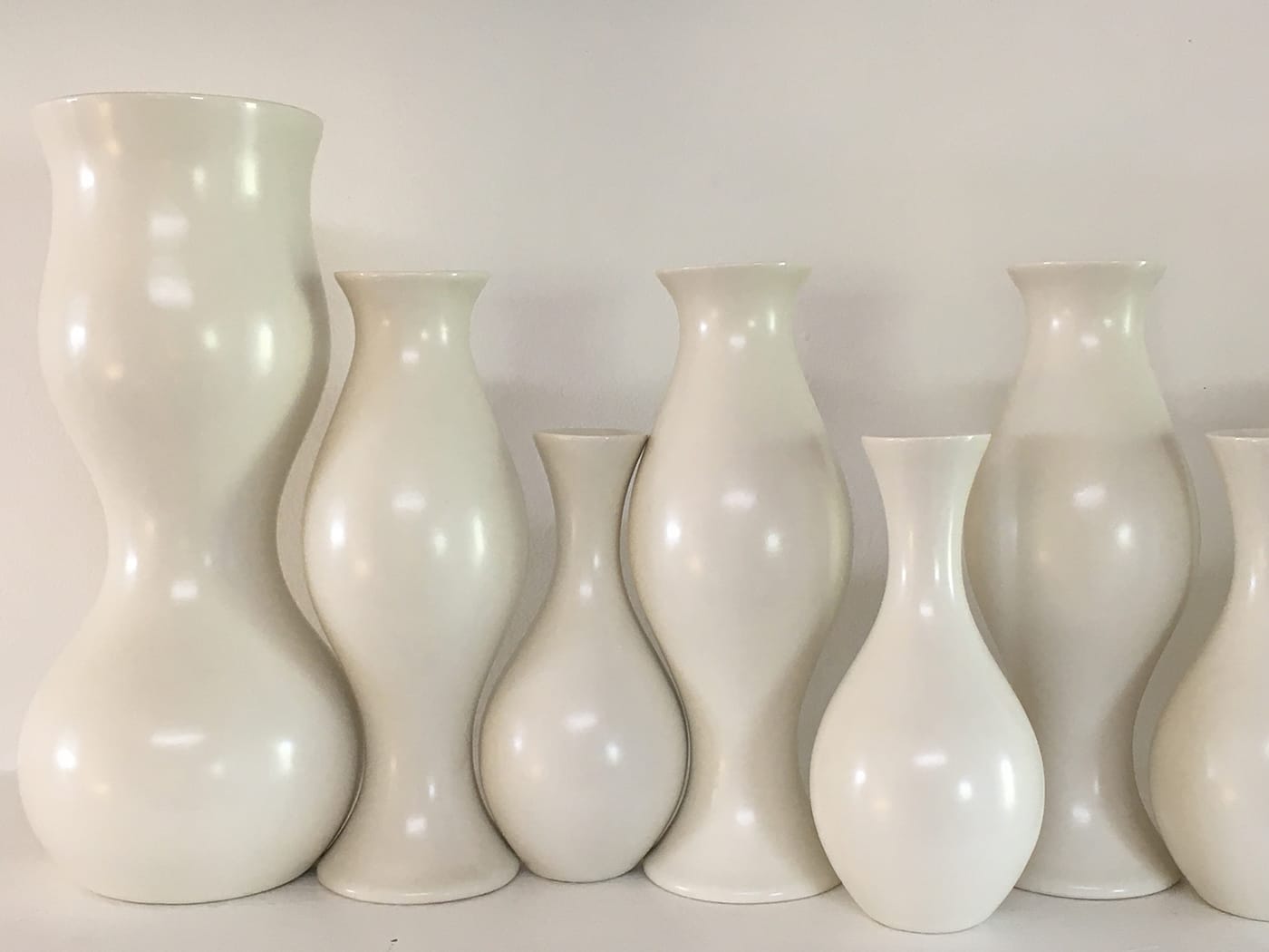
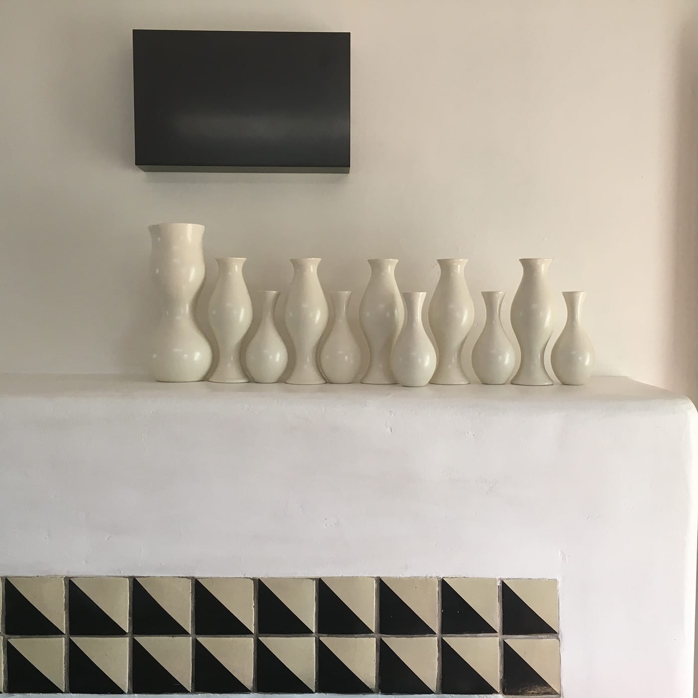
Susan York (Santa Fe, New Mexico): I am looking at Eva Zeisel’s 11 white vases on our mantle, the ones I’ve been shifting around a little every day since March. I’ve come to understand more about them in the past seven months than in the previous six years that I’ve had them. I’m transfixed by these multiple forms because in my earlier life as a potter I learned the beauty of pure form, the importance of craftsmanship, and the power of repetition.
Like looking at Kazimir Malevich’s “Eight Red Rectangles” (1915), it takes time to see the profoundly subtle geometry of the forms. Initially, I had assumed that Zeisel’s nearly interlocking vases fit symmetrically against each other like puzzle pieces. But when I push two of them against each other and their curves nearly touch, it all changes. When I put the largest form next to its smaller companion, I see that the negative space between the curves is slightly off, like two of Malevich’s rectangles that barely tilt.
Ziesel designed “Eva’s Centerpiece” in 1999 at age 93 with David Klein and James Reid, who cast the porcelain Eva series at their studio, KleinReid in Brooklyn. Together, the three drew and cut out vase forms that would interact with each other, then Zeisel refined the curves for the final designs.
These curves remind me of when Agnes Martin told me that a tea bowl is the most abstract form of all. At that time, I was making hundreds of tea bowls and each one was its own world, as are each curve, every opening, and the spaces in between “Eva’s Centerpiece.”
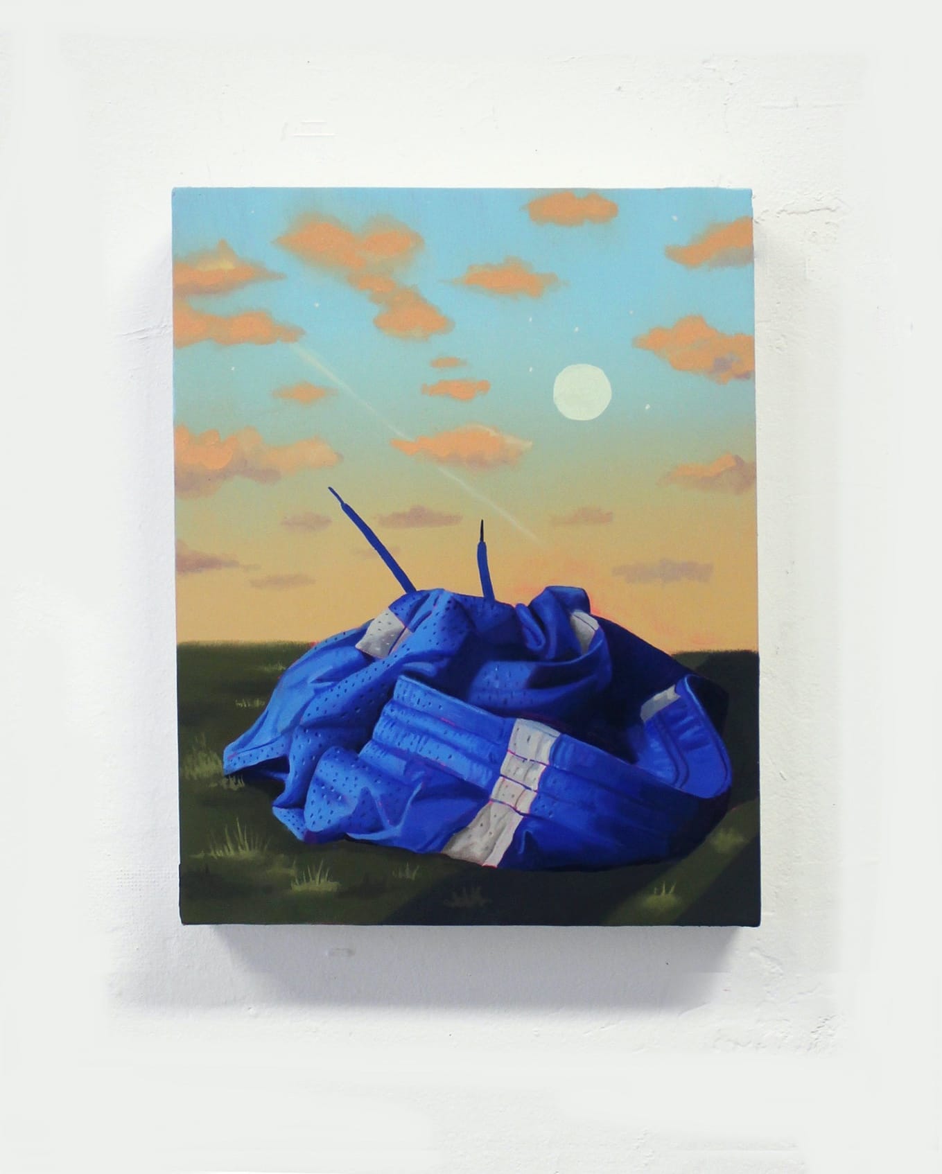
Mark Joshua Epstein (Ann Arbor, Michigan): Danny Ferrell’s painting “After the Game” was the first piece I bought after moving into our place in Michigan, in the fall of 2017. The apartment was new to us and I was wildly homesick for people, for art, for everything. I had never met Danny but had followed his work closely and I found the combination of the forlorn and the erotic in this piece to be irresistible. This painting is so many feelings wrapped up in one lusciously painted pair of gym shorts, left — or flung, or dropped — either on purpose or by accident in a field at sunset. Where is the owner of these rumpled mesh shorts? Are they with someone else who is also shorts-less, rolling around in the grass? Being a rapturously unsporty kid, it felt good to own this image, and to hang it in the bedroom I share with my husband.
I see Danny’s painting when I wake up each morning. It hangs directly in my line of sight when I open my eyes, but maybe now it feels different. Now the shorts have become a stand-in for me, or for us — alone, discarded, exposed — but it remains such a beautiful scene. If I have to be discarded, let it be in the beautiful green space of this painting. I notice the sky more now than I used to — that last light fading, the slippage of time caught for a moment and forever.
David Kramer (New York City): In 1994 I got a job painting Jack Pierson’s apartment just south of Houston Street. It took a week, and at the end of the job I told him I would be willing to take a piece of artwork instead of cash. Jack agreed and the next week I met him at his studio.
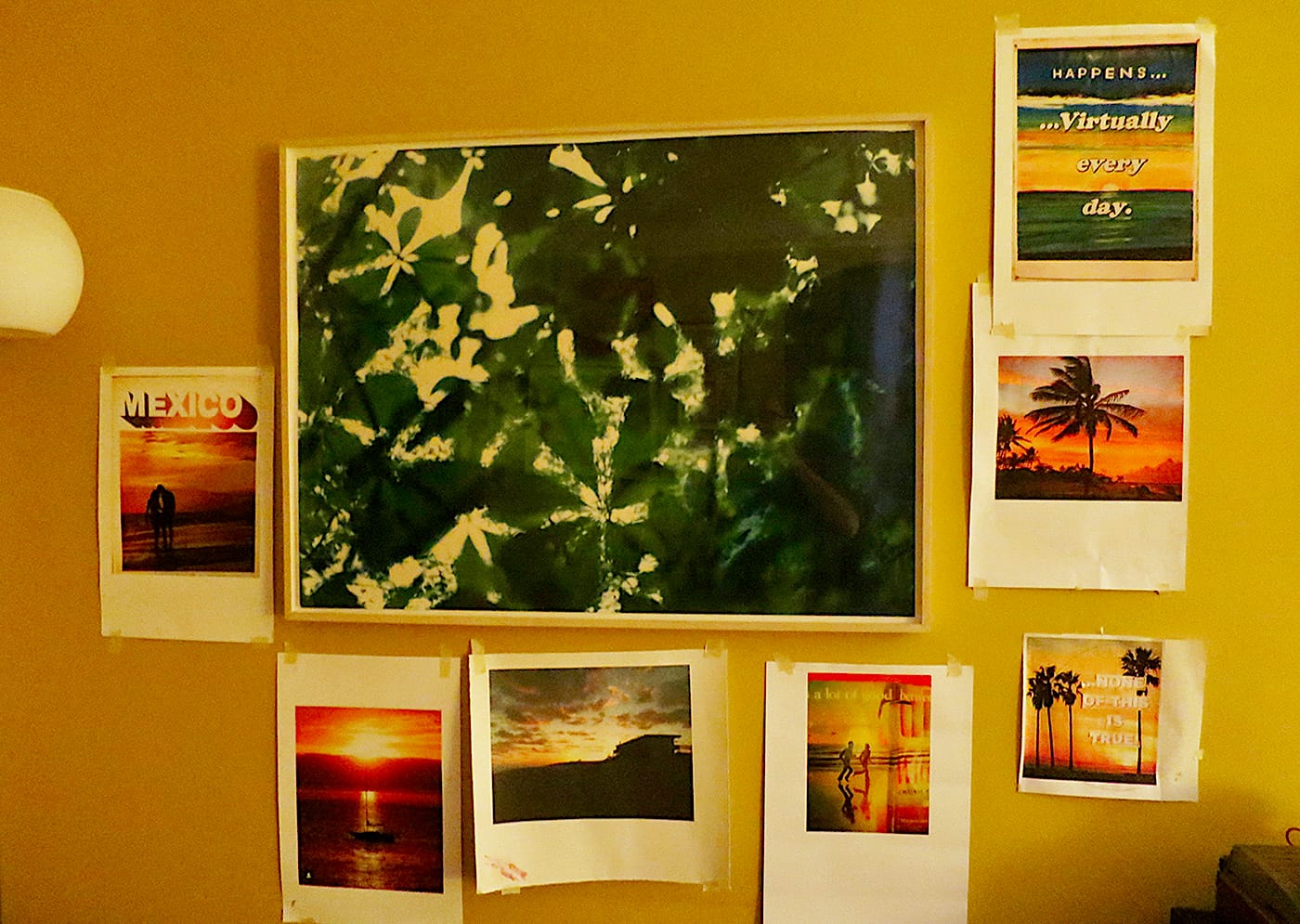
Jack’s studio was on the corner of 42nd Street and 8th Avenue. He was catty-corner to the Port Authority, upstairs, during the days when Times Square was still a pretty rough neighborhood and workspace was cheap. Anyway, I looked through a bunch of large photographs and I saw one that really jumped out at me. It was shot straight up at the sun, looking through some lush green magnolia leaves. It was beautiful and gave me the feeling of want, of desire. You couldn’t see the sun but you could feel the warmth. A warm summer day… I took “Magnolias” home and had it framed, and it has been on the wall above my kitchen table ever since.
My kitchen table has basically been my studio since March. I get up every morning and eat breakfast. And then I clear off the table and start my project for the day. Mostly, I have been making hook rugs. I decided to take the images from my iPhone of sunsets. Going outdoors to observe something as simple as a sunset has seemed like taking your life in your hands. So I thought instead to make my own sunsets, and to include phrases like “NONE OF THIS IS TRUE” or “VIRTUALLY EVERY DAY” or “IT IS WHAT IT IS.” One rug led to another and soon I had a series and I decided to call it Mar-A-Lago Sunsets.
While I worked over the months of the lockdown, I put my inkjet prints on the wall, all around the Jack Pierson photo. It was as if the sun that you couldn’t see in his photograph had become even more impossible to ever see again. In some ways it seemed like we were both trying to get to something that was unavailable.
Later, in June, when my neighborhood in Chelsea was covered in a skin of plywood, as the city braced for the George Floyd/BLM protests, I thought about New York City from my past. It looked again like it did when I was a kid, back in the 1970s, ‘80s, and into the ‘90s, with plywood-covered storefronts and furtive people walking around, crossing streets to stay away from strangers. Now that getting around town safely, which is ordinarily never a question, has become a priority, I am reminded of that trip to Times Square in 1994, to Jack Pierson’s studio, coming down the stairs with my prize, thinking, “…How am I going to make it back to Chelsea with this thing under my arm?”
James Hyde (Brooklyn, New York): When I was younger, I didn’t desire possessing a collection of art — even apart from having no means to gain one. I believed loving a work was more substantial than possessing it, and so I assembled my “museum without walls.” I’ve evolved to appreciate owning actual works, but this collection of my imagination remains.
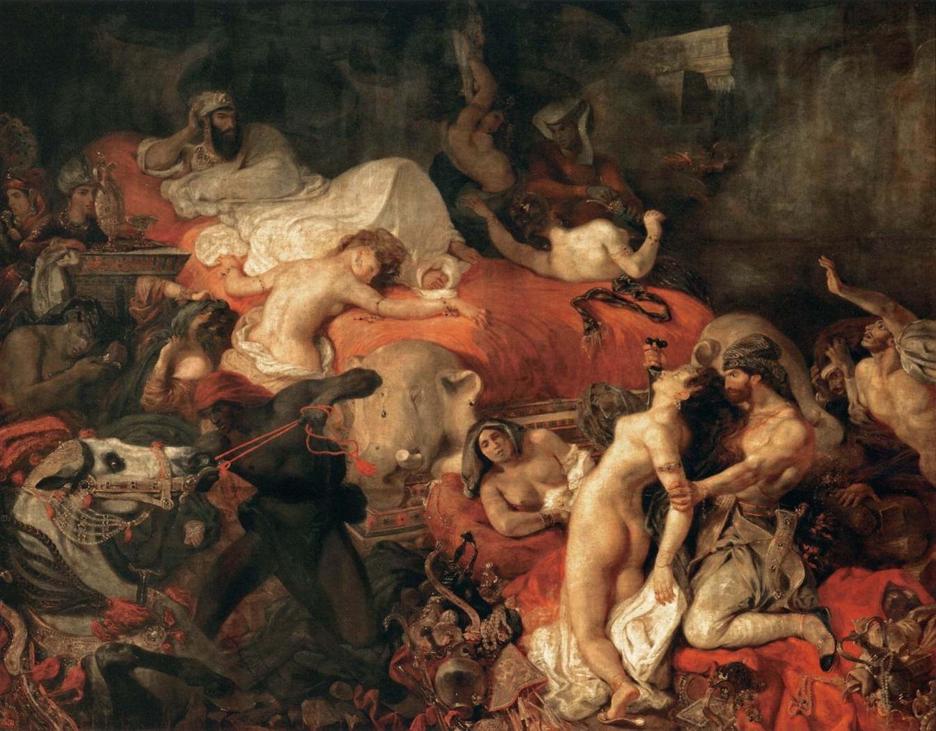
Initially, I disliked Delacroix’s “Death of Sardanapalus” (1827). It required multiple viewings at its commanding size in the Louvre before I could muster affection, let alone enthusiasm for this painting. What brought me around was Delacroix’s paint: his dark, jewel-like glazes, his highlights and chromatic surprises. The imagery of paint fluctuates between liquid and smoke in sinewy compositional swirls. The painting is in the key of red — the color of the counterpane of King Sardanapalus’s enormous bed and of the wantonly spilled blood; it suffuses the painting with the flavor of red wine. Its painterly quality is strange, both opulent and dissolute. The composition is energetic, but hardly cohesive — all jumble and fragment, its contents seem about to spill out the bottom of the canvas. The many figures are tangled and cropped, and the illumination is uneven and barely coherent. What holds the picture together is Delacroix’s line, connecting actors and action and, with its glistening colors, giving the picture its hallucinogenic musicality.
In spirit and subject the painting channels and portrays chaos. King of the Assyrians, Sardanapalus, with an insurgency poised to capture him, oversees the slaughter of his wives, servants, and slaves; amplifying the terror, a bejeweled and wild-eyed horse is impaled in the lower left of the canvas. Perched on the bed above a murdered woman, the king, secure in his narcissism, surveys the massacre with grim satisfaction. The story is shameful and outrage lodges it in the psyche with its potion of power and waste, luxury and violence.
Delacroix derived the story from a play by Lord Byron, though it’s startling how far he deviates from Byron’s narrative. Rather than an unspeakably loathsome monarch, Byron’s Sardanapalus is not unsympathetic. Overcome by love for his concubine, he is blind to a revolt against him. Even as the king grasps the situation, he wavers, as he dislikes bloodshed. By the time the conflict escalates, his dithering has cost him the battle. Rather than surrender, Sardanapalus builds a pyre and his lover willingly follows him to self-immolation.
What explains the difference? In Paris, fever dreams were in the air — Hector Berlioz’s Symphonie Fantastique (1830) premiered three years after Delacroix presented his painting. Conceivably Delacroix’s revision of Sardanapalus was politically motivated. In 1815, France had returned to monarchy. In 1824, three years before Delacroix unveiled his Sardanapalus, Charles X ascended the throne, set on increasing his authority. Whether or not Delacroix’s picture was a deliberation on contemporary abuses of power, its portrait of wealth, indifference, and cruelty mark it as a painting for the present.


