Wayne Thiebaud and the Limits of Gluttony
I was lucky enough to see Wayne Thiebaud: 70 Years of Painting at the San Jose Museum of Art (February 27–July 4, 2010) and write about it for The Brooklyn Rail (July–August 2010). As with that exhibition, many of the works now on view at the Aquavella Galleries’ posh, mirrored townhouse on Manhatta

I was lucky enough to see Wayne Thiebaud: 70 Years of Painting at the San Jose Museum of Art (February 27–July 4, 2010) and write about it for The Brooklyn Rail (July–August 2010). As with that exhibition, many of the works now on view at the Aquavella Galleries’ posh, mirrored townhouse on Manhattan’s 79th Street (the artist’s first show there), a few blocks north of the Whitney Museum of American Art, came from the Thiebaud Family Collection, the artist’s studio, museums and private collections. Evidently, only a handful of the more than eighty works are for sale. On the day that I went to the gallery a man came in and asked the woman at the front desk for a price list because his wife had told him to “buy her something for Christmas.” This might bother some people, but some of those same people probably don’t see any problem with how much money reality stars spend on their underwear.
Wayne Thiebaud is ninety-one years old. The art historian, John Wilmerding, organized the Acquavella exhibition, which is being billed as a “Retrospective.” There is a lavish catalogue with an essay by Pepe Karmel, who was the co-curator, with Kirk Varnedoe, of the Jackson Pollock retrospective at the Museum of Modern Art, New York, in 1998. Thiebaud has never been a favorite of MoMA, certainly not since the days when William Rubin was the Director of the Department of Painting and Sculpture, and his successor, Varnedoe, didn’t do much to challenge that viewpoint. I can’t remember the last time I saw a Thiebaud hanging in the hallowed rooms of the permanent collection.
Thiebaud has had better luck at the Whitney Museum of American Art, where he had a retrospective in 2000. And there is something very American about the paintings that first gained him attention in the 1960s — the rows of cakes, pies, lollipops, and yo-yos lined up like soldiers, their brightly colored slices and discs resting on a thickly painted white ground. By applying the paint as thickly as we expect frosting to be on cakes, Thiebaud played with the American trompe l’oeil tradition, and with artists such as John F. Peto and John Haberle. Joining sweet frosting and poisonous impasto made for an interesting conversation between the visual and the visceral, eye and body. One could say that Thiebaud made dangerous eye candy.
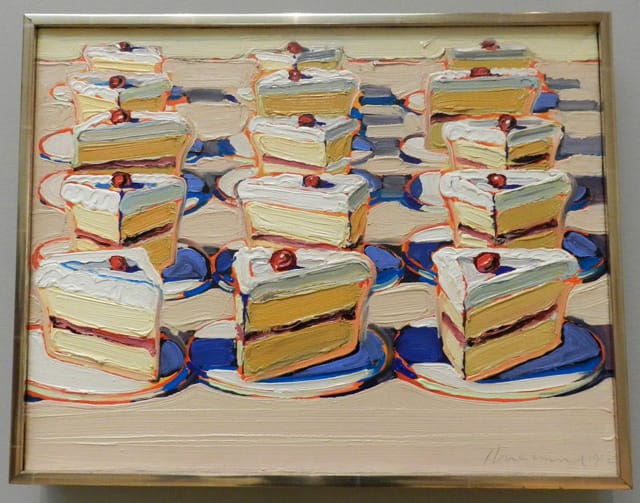
Ostensibly topped by a thick layer of gooey white frosting, the triangular wedges in “Boston Cremes” (1962) are edged in red and blue. The white oval dishes the slices are sitting on are edged with pastel greens, sharp reds and different shades of blue. The dishes rest on a beige plane (counter) — made of creamy, unbroken and broken horizontal brushstrokes — that is synonymous with the painting’s ground. The beige ground connects the yellow and turmeric-colored pies, which are made of double-stacked parallelograms divided by a creamy brown line. The painting constantly shifts along tonal and optical trajectories with neither of them taking precedence. The other shift is between the representational (cherry topped slices of pie on dishes) and the abstract (circles, triangles, parallelograms, and ovals).
As closely packed as the pies are, the thick, visible brushstrokes are even more densely crammed together, like bricks and boards, making a network of brushstrokes and shifting color spanning the painting from side to side and top to bottom. And this, I think, is what art historians don’t want to acknowledge. Thiebaud’s repetitions and patterns define a space, while the paint’s materiality denies it. “Boston Cremes” comes close to being an all-over painting, but deliberately stops short of achieving that orthodoxy.
At a point when everybody was squeezing space out of paintings, Thiebaud was putting it back in, while establishing a tension between surface and depth. The reason is that Thiebaud wants the viewer to be aware of his or her own body, and he recognizes that this is something that Pollock lost when he made his groundbreaking paintings. For all their materiality, Pollock’s allover paintings make it difficult for the viewer to orient his or her body to the painting — they take the ground we are standing on away. I suspect this is one reason why Thiebaud has never gained the favor of MoMA. He challenges their narrative, which claims this was the goal of painting.
* * *
One of things about Thiebaud that I think should be pointed out is how much his ambition changes from work to work. He has made big easel paintings and small ones. His works on paper come in all sizes. In this exhibition some are as small as 5 inches x 4 1/4 inches, and he hasn’t even covered the entire sheet with paint. In terms of materials, he is a hardcore traditionalist who uses oil paint, pastel and charcoal. He makes prints in nearly every medium, including etching, lithography, linocut and silkscreen. He paints on cigar boxes and gives them to his wife, Betty-Jean. He lives to paint and his enthusiasm is unrivaled. He doesn’t seem to worry about the seriousness of his statements, which doesn’t mean he is modest. And yet, on the day that I went, three of the more modest works in the exhibition were what I looked at the longest: two pastels, “Pastel Scatter” (1972) and “Cupcake and Shadow” (1995–2012), and a painting on paper, “Black Shoes” (1983).
In these three works, none of which is larger than 15 ¾ inches x 20 inches, I found myself marveling at Thiebaud’s intelligence, humor, and love of ordinary things. I was reminded once more that he doesn’t fit into any art historical narrative — he is not a Pop artist, even though he was briefly included in group shows devoted to Pop Art because of his subject matter. And, in the end, he really stands apart from the Bay Area Figurative painters with whom he has long been associated. Thiebaud is a maverick who didn’t begin exhibiting regularly until 1962, when he was in his early forties, at the Alan Stone Gallery, New York. Even though he didn’t hit his stride until that rather late age, he has had a career that has spanned more than half-a-century and, if the recent works are any indication, he neither shows signs of slowing down nor making attempts to recapitulate his career.
In “Cupcake and Shadow,” the cherry topped cupcake and its bluish shadow, which extends straight down, are the descendants of Claude Monet’s motif of a haystack. But Thiebaud is more Fauvist than Impressionist. His colors are jarring and not necessarily pleasing. His use of sweet pastels bumping up against acidy colors elevates his work into another realm. Think Matisse meets Kirchner in the hothouse of California pastels and “neon in daylight.”
At the same time, it seems to me that Thiebaud is criticizing both Monet and himself for making paintings that people consider sweet and joyous, that the haystack, like the over-rich cupcake, might be too sugary. In terms of scale, the cupcake presides over the paper’s rectangle like a tombstone-cum-hut. Pointing straight down from the cake is a bluish shadow tapering down to a point, a platform that cannot support the weighty object resting on it. The horizon line divides the cherry topped mound of chocolate frosting from the cupcake. The background is zinc yellow, acidy. One sees faint traces of green and orange submerged in the changing yellow. Sweetness borders on sickly but, and this is Thiebaud’s genius, doesn’t cross the line.
* * *
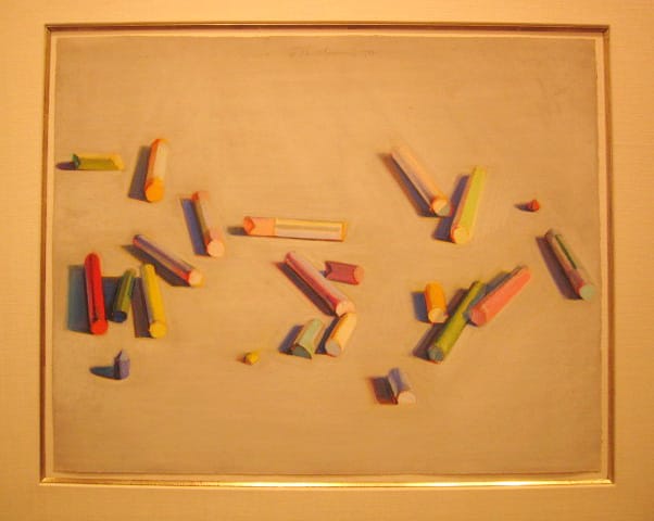
In “Pastel Scatter” (1972), Thiebaud uses sticks of colored dust to draw sticks of colored dust. I couldn’t help but think of the line, “dust to dust.” And this I think is an underlying aspect of Thiebaud that is too often overlooked. I don’t deny that there is joy in his work, but I hardly think that is all that is there. The foodstuffs in his paintings have a limited shelf life. Might that not be an admission of doubt about the lasting quality of his work? By making his subject matter synonymous with his paintings, might he not also be acknowledging that nature’s indifference will triumph over everything, including human civilization?
The pastels lie scattered across the whitish ground, like the aftermath of a drawing session. Some are clustered together; others are isolated. They lie diagonally for the most part, in the area between the bottom sixth and top quarter, which are empty, except for the artist’s signature, date, and the outline of a heart along the top of the pastel, in the middle. The vantage point suggests that we are bent over, scrutinizing the colored sticks, perhaps deciding which one to pick and use next. Or perhaps they need to be put away, in some kind of order. Whatever the case, they lie in disarray, with shadows as substantial as the objects themselves. It is as if the underlying grid of his cakes and pies has been upset, leaving behind evidence of a quiet but unstated turmoil. Once again, the artist approaches abstraction, but stops short. There is a reason for this, and it is something we ought to think about.
* * *
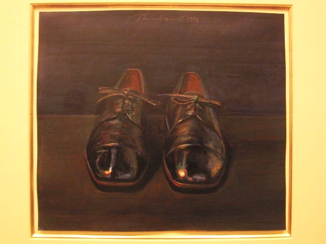
The last work I am going to write about in this essay — one that I returned to a number of times — is “Black Shoes,” a small oil on paper. For anyone who knows Thiebaud’s work, the fact that the painting is largely shades of black and dark brown comes as a surprise. The artist’s signature palette is white with a variety of pastels and bright colors.

Pointing directly at the viewer, the shoes emerge from the darkness like boats or coffins. Interestingly, their laces are neatly tied, turning them into empty packages decorated with bows. The sense of order that this conveys is disquieting, infusing the painting with silence and absence. Traces of red and blue are visible in the shoes’ shiny leather surface, endowing them with a crepuscular glow.
By the time I left Acquavella Galleries, I was wondering if Thiebaud had made this painting in response to his friend Gordon Cook, a printmaker and painter who died in 1985, not yet sixty. Later, I learned that Cook had had his first heart attack in 1983, the year that Thiebaud completed “Black Shoes.” Best known for his complex etchings, Cook painted modestly scaled still-lifes of a single object, such as a black hat, an unlabeled jar of mayonnaise or horseradish, a large rectangular section of olive loaf, a one-pound bag of garbanzo beans. Cook’s tonal palette consisted of different shades of brown, gray, and black.
There is “An Appreciation” by Thiebaud in the posthumous monograph, Gordon Cook: A Retrospective by Christina Orr-Cahall (The Oakland Museum and Chronicle Books, 1987). Towards the end of it, he wrote:
Looking at Gordon Cook’s works allows us to experience a stubborn belief in responsibility towards lucidity, authenticity, and veracity, and reminds us that art has its own morality.
These words seem to describe Thiebaud’s work as well as Cook’s. We may believe it is our right to till and irrigate every inch of land, but Thiebaud’s vertiginous views — in which the space seems as if it could simultaneously split open and collapse — tells us otherwise.
Wayne Thiebaud: A Retrospective continues at Acquavella Galleries (18 East 79th Street, Upper East Side, Manhattan) until November 30.


