DIS Magazine’s Website of “Subversive” Stock Photography Is Like Shutterstock on Ketamine
Convention-flouting DIS magazine is launching a new stock photography website called DISimages.com next week, and they’re really hoping their images pop up everywhere — from the Huffington Post’s front page to a weed dispensary’s brochures.

Convention-flouting DIS magazine is launching a new stock photography website called DISimages.com next week, and they’re really hoping their images pop up everywhere — from the Huffington Post’s front page to a weed dispensary’s brochures.
Of course, given that this is the same DIS that published an overblown review of Axe body washes and commentary on Art Basel by Miami’s Real Housewives, DISimages.com will contain none of the bland, corporate-minded pictures of awkward-looking models eating apples that are found on Shutterstock or Getty Images.
Instead, the images — all available for purchase, and shot by a variety of buzzy collaborators like Ryan Trecartin, Jogging. and Takeshi Murata — will borrow the themes and conventions of stock photography, in order to slyly subvert them in a variety of creative ways.
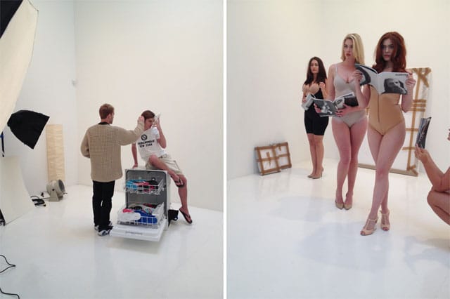
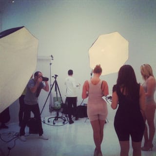
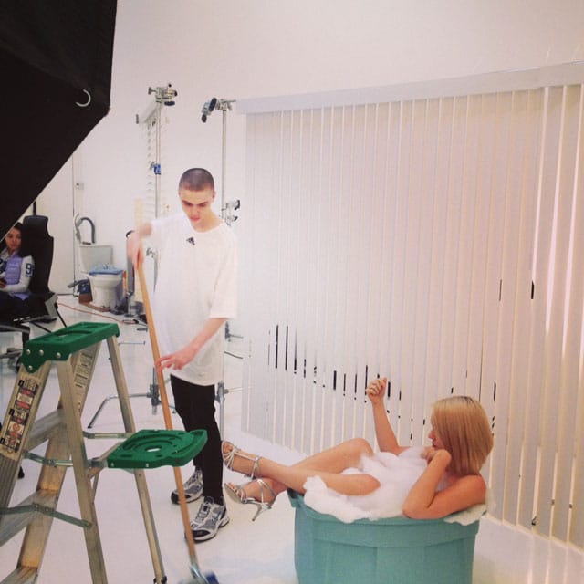
On the Saturday that I spent lurking behind-the-scenes at the small Soho gallery hosting DIS’ photo shoots, editor Solomon Chase got behind the camera to capture blank-faced models posing in stereotypical settings that were injected with out-of-place elements (like a toilet bowl, or piles of cash) — thereby invoking the clichés of commercial photography, but twisting its banality into surrealism-tinged ambiguity.
“A lot of stock photography is comprised of empty images that avoid explicitly saying anything so that can be slotted into any context. Our images will be less clear about what the message is supposed to be,” Chase explained, adding that he’s aiming to “flood” Google Images with these off-kilter photographs.
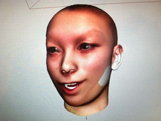
Meanwhile, artist Ian Cheng was surrounded by a coterie of teenage models upstairs. Using a non-photographic motion capture software called Faceshift, Cheng captured 3D renderings of each girl saying stock lines like “Hey,” “I love seafood,” “Debit or credit?” and “I’m pregnant” (one of the girls flushed and begged him not to send the clip to her father).
Like its competitors, DISimages.com will be tagged with meta-data so that users can search for photographs using keywords, which range from the obvious to the way out of left field.
But Marco Roso, another DIS editor, is quick to shut down my suggestion that the project is a kind of sly joke — or a satirical jab at the conventions of commercial photography. “We take humor seriously, and are not trying to be ironic — because that’s associated with highbrow superiority,” he explained. Rather, Roso insisted that the project’s aim is to broaden the genre by adding fresh, new options.
While stock photography is often regarded as a form of digital detritus, this is not the first time DIS has earnestly embraced its conventions. In 2011, they photographed the New Museum’s Free exhibition in the same, flattened style.
This collapse between the hierarchies of art and commerce is a continuing preoccupation of the editors’. “We don’t want to distinguish between fields,” Chase said, while Lauren Boyle — a DIS editor as well — added that the magazine has always been interested in experimental economic models and mass propagation.
In an extension of their democratic approach to art, all of DIS’ photo shoots for the rest of the month are open to the public. The trickle of visitors on opening weekend was slow — some amateur photography enthusiasts burst in and took photos of themselves on set. A group of bored-looking CUNY students rolled in during a gallery-hopping tour. “I’m just trying to understand what’s going on,” one of them told me, before she was herded to their next stop.
As I gathered my coats on the way out, I ran into Jessie Wender, a photo editor from The New Yorker. “I like how they’re concept-ing things they want to shoot. A lot of the time I look at stock photography puzzling over what idea they’re supposed to serve,” she remarked. Would she use these photos in The New Yorker, I asked. “Probably not,” she admitted, laughing.
DIS Image Studio at The Suzanne Geiss Company is open Feb 2–Feb 24. Find the schedule here.


