Jasper Johns: Hiding in Plain Sight
Johns has repeatedly used one motif whose source has never been identified.

For years, an observation that Frank O’Hara made about Jasper Johns’s art has stuck in my head:
Jasper Johns is […] a very misunderstood artist, whose art presents to many something easily assimilable and understood, but Johns is one of the most mysterious artists of our time, an artist whose work is not formal, in the sense that it is understood or expounded. He has the experience, which may or may not be unfortunate for him, of seeing his paintings greeted with delight because the images are recognizable when they are filled with pain (“Art Chronicle,” Kulchur, Summer 1962)
I have always linked O’Hara’s observation with a statement that Johns made to Roberta Bernstein about his use of use of plaster fragments in early works, such as “Target with Plaster Casts” and “Target with Four Faces” (both 1955):
Any broken representation of the human physique is touching in some way; it’s upsetting or provokes reactions that one can’t quite account for. Maybe because one’s image of one’s own body is disturbed by it.
From his first exhibition at Leo Castelli (January 1958) to his most recent exhibition at Matthew Marks (February 9–April 6, 2019), one of Johns’s recurring themes has been the damaged human body. For more than six decades, he has used a variety of materials and processes to fashion and record shattered body parts, traces of skin, broken anatomies, grief that viewers can only glimpse, and grinning, jaunty skeletons standing in doorways, wearing dapper hats and sporting canes, as if they are waiting to greet us.
One of Johns’s processes is to trace an image and then alter it, while maintaining its exact contours. The changes that he makes to his source material are in keeping with a well-known note that he made in his sketchbook: “Take an object / Do something to it / Do something else to it. [Repeat].”
An early example of this is the encaustic painting “White Flag” (1955), in which he covered a collaged ground of paper and fabric with white encaustic, attaining a colorless, cadaverous presence. What caused the flag to lose its color, to become funereal, to become a sign of surrender?
Johns’s repeated examinations of pre-existing subjects, or what are commonly called “readymades,” is very different from the approach taken by Andy Warhol and his followers, which is to appropriate an object and do one thing to it. Johns’s transformation of readymades does not lend itself to mass production or to production by a studio assistant. His works are not variations.
Johns’s restating of motifs derived from modern artists including Edvard Munch, Pablo Picasso, and Marcel Duchamp, along with Northern Renaissance artists such as Hans Holbein and Matthias Grünewald, has routinely led to him being accused of being obscure or hermetic. Within this context, Warhol is commonly described as a democratic artist, while Johns is characterized as elitist — terms that seem wrong in both cases.
At the same time, obscure as he supposedly is, viewers are often delighted by his “mysterious” and puzzling works as long as we don’t have to recognize their embodiment of “pain,” particularly since it seems to have no obvious source, and there is no one and nothing to blame for it.
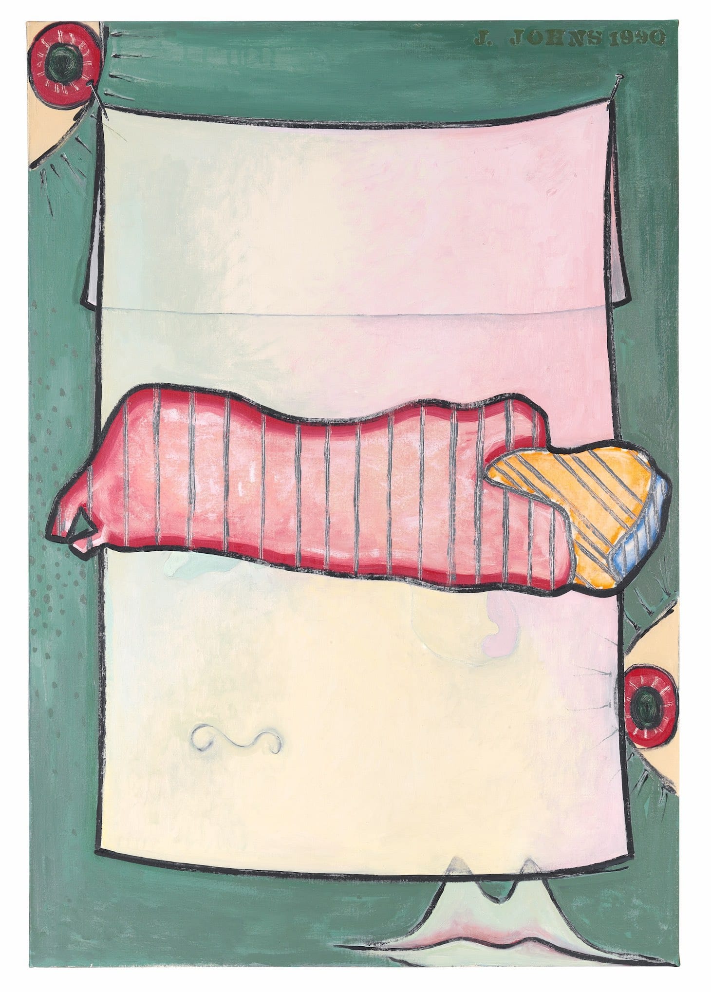
One motif of Johns’s has never had its source identified. He introduced it in the painting “Green Angel” (encaustic and sand on canvas, 73 1/8 by 50 ¼ inches, 1990), which was first included in the exhibition Jasper Johns, at Leo Castelli Gallery (February 16–March 9, 1991). The gallery poster announcing the exhibition pictured “Green Angel” (1990), which was the first time he used this motif.
The motif resembles two joined figures, one vertical and one horizontal, neither of which the viewer can identify with any certainty. The vertical figure rises up from the painting’s bottom edge on a support that seems too narrow for the rest of the body. It is made of flat, interlocking areas of blue, orange, red, yellow, and violet. The horizontal figure is beige stucco and featureless, as if shrouded. Its dark gray outline distinguishes it from the vertical figure, which is not outlined. A thin, lighter line forms an irregular V that runs from the top of the figure, near what we are apt to read as a shoulder, to the bottom edge. The division suggests a head and body. A short appendage protrudes from the lower left side of the prone figure, seemingly squeezing a cropped, rounded red form we read as belonging to the vertical figure.
In “Green Angel,” John combined this new motif with one he first used in “Untitled” (oil on canvas, 22 5/8 by 16 1/2 inches, 1985): two cropped eyeballs with long lashes, one nestled tightly in the painting’s upper left corner, peering down, the other peering in from the painting’s right edge, more than halfway down. Along the painting’s bottom right edge, he has depicted what could be read as a pair of lips or two mountain peaks. On the lower left is a curved horizontal line that we could read as nostrils.
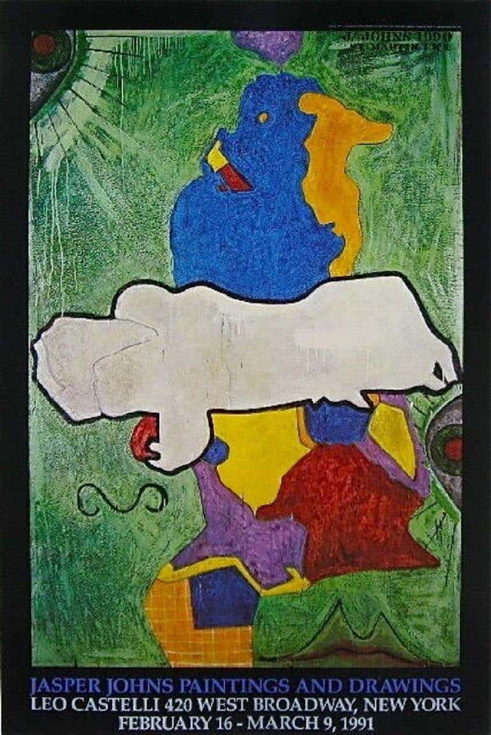
Johns sets this combination of a schematic face and abstracted figures against a green ground. The schematic face suggests that we are looking at someone staring inward at a figural combination that is both familiar and elusive. The most obvious association is with a mother holding a child, but everything about this reading is off, starting with the anatomy. The vertical form does not invite associations with a woman, particularly a Madonna or mother, while the horizontal forms seems too large to be an infant. Is the prone figure alive or dead?
Ever since I first saw "Green Angel” and related works, I’ve been reminded of Johns’s statement to Bernstein about people being “touched” and “upset” by “a broken representation of the human physique.” To me, Johns’s empathetic response hardly seems that of an artist who is aloof, ironic, or overly intellectual and emotionally distanced. Rather, I think Johns is refusing to claim that he is especially sensitive or tormented, which is a cliché mainstream view of artists.
At the same time, I remained curious about the source, and grew even more so because Johns used it, or part of it, in 13 more paintings he completed between 1990 and ’97.
This is what the Museum of Modern Art’s website says of the etching and aquatint “Green Angel 2” (1997), in the museum's collection:
Johns has looked to other artists for motifs and patterns to serve as compositional elements in his own work. While many of his references have been identified — from work of the modern master Pablo Picasso to that of Matthias Grünewald of the Renaissance — here Johns presents a shape traced from an unnamed work. He decided not to make the source known because it might hamper spontaneous responses. To date, the Green Angel motif has appeared in over forty paintings, drawings, and prints.
Would we think differently about the motif if we learned its source? Would it reinforce the belief that Johns is hiding something because of what it might reveal about him (a view I have never put much stock in)? Did he choose the “Green Angel” motif because of its relationship to the familiar, almost stock, trope of mother and child? If the figure is not the “Green Angel,” is the angel the schematic face? What is our capacity for compassion, particularly in a world that is beset daily with horrific, institutionally sanctioned violence and unreported instances of human abuse? Can we stay open and respond? What moves us?
I returned to these questions today because I got an email from Cristobal Lehyt, an artist whom I did not previously know, which read:
Hello
I hope this email finds you well.
I am just writing because I saw this image and thought that you might be interested.
Maybe you have seen it already — I might be late in sharing this find — but if you haven't maybe this will be of interest to you.
The black and white image is of an assemblage by Auguste Rodin titled “Torso of the Woman Centaur and Minotaur” (13 by 13 by 8 inches, c. 1910), which is in the Musée Rodin, Meudon, France. Ironically, 10 years after Johns first used this motif in his work, which he flipped in “Green Angel,” the black and white image of Rodin’s assemblage was reproduced in a book, Iconoclash: Beyond the Image Wars in Science, Religion and Art, edited by Bruno Latour and Peter Weibel (ZKM and MIT PRESS, 2002). Both the Rodin and Johns’s “Painting Bitten by a Man” (1961) were included in the chapter “Why Are Images so Ambiguous” by Dario Gamboni, 41 pages apart.
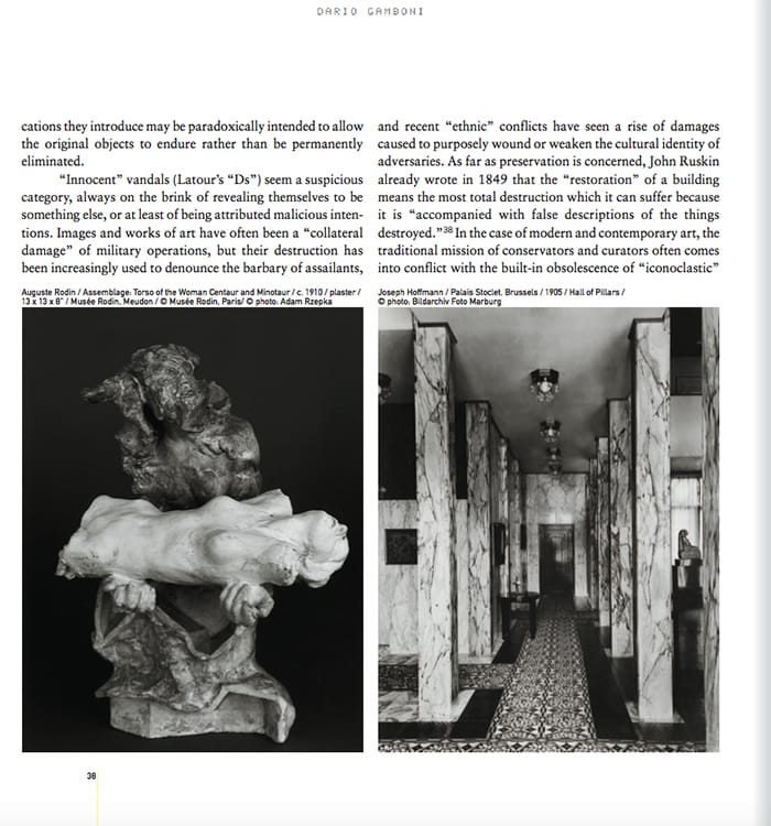
I sent the Rodin image to Jasper in an email with this statement: “I thought of you when I looked at this piece.” His answer was even shorter: “I should think that you would!”
Found in Greek mythology, Minotaurs and centaurs are opposites. A Minotaur is a beast with the head of a bull and the body of a man, while a centaur has the head and torso of a human and lower body and legs of a horse.
In Rodin’s assemblage, the dark Minotaur supports the prone white torso of the woman centaur, which has been severed from her lower animal body, on his forearms. His white hands are visible beyond her body, the fingers closed.
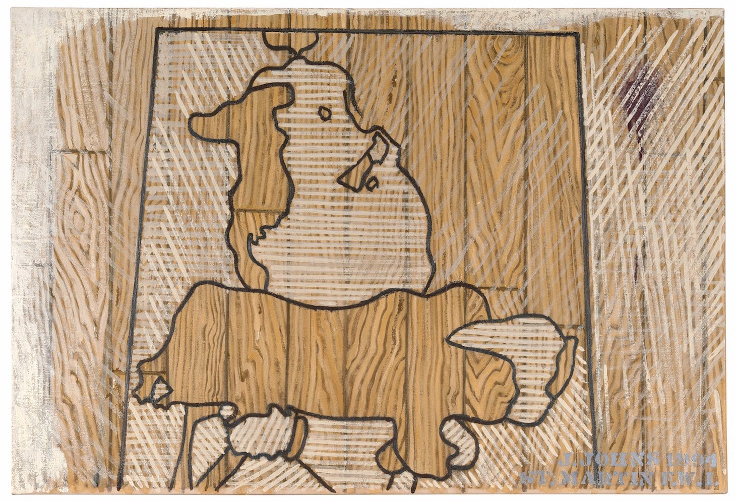
What are we to make of the severed torso of the woman centaur, her head thrown back? Is Rodin’s combination of incommensurable creatures erotic, violent, tragic, or sad? How did this scenario come to pass? Both the centaur and Minotaur seem to be victims of unnamed cataclysms.
Did Johns suppress the source because he wanted to restate the torment of their impossible relationship in a way that is more accessible to the viewer? Or because it enabled him to focus on two opaque figures that, while seemingly joined, don’t fit together?
Is the face in “Green Angel” looking at himself as a creature made up of parts that are bonded but don’t fit together? Or is it looking at the dependent figure that is both joined to and separate from the towering one? Why is the prone figure monochromatic and the vertical one in multiple colors? The painting suggests that we are observing someone in a state of reflection, which would explain why we might not be able to identify what we are looking at. How and why did the image disturb him? Might not the state of disturbed looking be an inescapable condition? Does there need to be a key to all these questions? Might not Johns want us to keep looking without “reaching,” as John Keats warned against, “after fact & reason”?


