Standing on the Edge of Space: Painting as Noun and Verb
Oil on canvas. Evolving motifs. Line embedded in color. Compositions suspended between chaos and stability.

Oil on canvas. Evolving motifs. Line embedded in color. Compositions suspended between chaos and stability.
Free-associate these elements and the great postwar painters inevitably come to mind, Generations One and Two of the Abstract Expressionists, the keepers of the Modernist flame after WWII reduced Europe to ashes.
The dominant trends of postmodernism in painting and post-painting in biennial art have done their best to marginalize painting-as-painting, abstraction woven out of experience and observation. It is difficult to encounter it these days without speculating about its place at the table.
Jennifer Riley has been making abstract and semi-abstract paintings for years, but in the past half-decade her work has made a marked shift from what could be considered a Pop-inflected, postmodernist tilt toward a purer form of classical abstraction, reversing the historical sequence.
Riley is also active as a teacher and guest critic (Harvard Graduate School of Design, Indiana University, Pratt Institute, MICA, Columbia and Yale, among others), a curator and a writer for Artcritical, the New York Sun and the Brooklyn Rail, where our paths first crossed six or seven years ago.
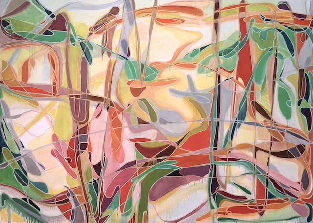
Her current show of paintings and drawings, Memory from Sight, at Allegra LaViola is inspired by nature but, unlike her two previous exhibitions, its bloodlines are distinctly abstract. The means she employs, however, are almost identical to the earlier, more illusionistic work. I wanted to ask her about getting from there to here.
* * *
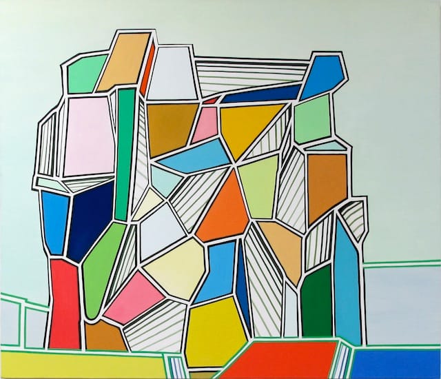
Thomas Micchelli: I want to go back four years, to your solo at Allegra LaViola in 2009, which was titled To Be A Thing In This World. The paintings in that show, which were abstracted images rather than pure abstraction, were composed of flat colors sectioned off by double lines, reminiscent of cloisonné or stained glass. There were paintings that evoked faceted seascapes or desert canyons; others seemed devoid of a referent, but their solidity and sense of space, their thingness, in other words, was very apparent.
Jennifer Riley: I had been working strictly non-objectively for several years but I began to feel the tug towards engaging with more specific forms, places, narratives, objects, painterly possibilities and different philosophical concepts. I made an abstracted image of a starburst (the birth of the cosmos), one of the earth, a dark watery sea, a sea with volcanoes.
There were also canyons, landscapes with built forms, a bunch of glyphs, etc. I wanted to recapture images of things that are seen but not so often examined. In this work, their tessellated pattern suggested, at least to my mind, the subtle shifts and vibrations that underlie all matter.
In retrospect, it was an overview of what was possible for me to address in paint, which turned out to be anything.
Ah, I adore stained glass, though it was far from my conscious mind. The doubling of the lines solved purely formal problems. They left a white channel that exposed the pristine support surface and they allowed the many flat colors and striped areas to have air-breathing space.
These lines developed from my work of the late ’90s, which had thick bands of gradient color spread across prepared grounds. Eventually the bands became thin, then thinner and more saturated — finally they were lines that I could use to articulate more complex spatial concerns — layered forms, edge limits and other things — as well as atmosphere.
TM: Two years later, you had another solo called Fire-Fangled Feathers. In this set of paintings, flat colors and double lines persist but illusionistic depth is abandoned. The imagery is now purely abstract, comprised of intersecting loops and interstitial color against a neutral field.
JR: In December 2010, I was working on an image of the galaxy but I kept failing and failing. I was in a crisis because I knew I needed to abandon the body of work I had developed for that exhibition — three months away — but I realized I was unable to articulate what I wanted to in the language of straight line and flat plane.
In the middle of all this, I was invited to spend ten days in St. Petersburg, Russia. Every morning in St. Petersburg we walked two miles to the Hermitage in dim snowy light. I wanted to see everything in the collection — and I nearly did — which resulted in an epiphany.
After seeing so much great, great, great art, I decided it wasn’t worth limiting myself in any way. Technically I didn’t know how to make the shift I saw clearly in my mind, so I returned to the drawing board — quite literally — and looked at what my drawings were telling me. Most obviously it was something like “let go of the rules!”
When I would look at the photographs of the galaxy made by the Hubble telescope, they would strike me as a tangled web of lines that described the vast intersecting celestial bodies, unchartable space, unreal colors and the notion of limitless expanse. They garnered in me feelings of complete awe and absolute wonder, thrill and hesitation. A feeling I felt more than once looking at things in the Hermitage. I remember asking myself what it meant for me to want so badly to paint a galaxy… Why is art so enthralling? What does this mean?
I know this sounds corny. It’s not the first time we’ve seen a lens turned on outer space — in fact it’s older than the hills, but each (abstract) journey is individual. I’ve researched, studied, experienced many, many physical wonders of this world —masterpieces of architecture, art, urbanism, as well as humbly built but astounding things.
There are so many routes in, so many “issues” being addressed in art. I simply wanted to get closer to the things I feel and experience, with more direct, tangible evidence and less filtering through purely geometric language.
The metaphor of translation works here for me — as if I were translating emotions to numbers rather than emotions to words…
TM: The title of the 2011 show refers to one of Wallace Stevens’ best-known poems, “Of Mere Being,” which begins with the line, “The palm at the end of the mind,” and ends with:
The palm stands on the edge of space.
The wind moves slowly in the branches.
The bird’s fire-fangled feathers dangle down.
There is both an upward drift and a dangling-down of the lines and colors, with balletic whirls and crossings. Were you also thinking of Stravinsky’s Firebird?
JR: I am so glad you brought this up — I see why you would think of Stravinsky’s ballet, which is based on a Russian fairy tale. The only link, however, is that Diaghilev gave Stravinsky a few month’s deadline, and that’s all I had to complete the work!
I chose the Wallace Stevens poem because I responded to its layered meaning, evoking both the imagination and mortality, and suggesting a simultaneous space contained in the mind and one that lies beyond the range of the mind or reason. The elasticity of space described and the collapse of metaphor to what is — “as” and “is” are equal. In painting, I like to think this happens or can happen. Painting — I should say my painting — relies on metaphor and it is bound to its material properties.
TM: The pastel drawings included in that show were rough and explosive, while the paintings seemed intent on reining in their energy and somehow compacting it.
JR: That body of work was really the first phase of this current show. I just needed three years to figure out how to do it. The pastels were massive attacks to get to a form and an understanding of the image. Then, I took them apart to understand how to build the paintings out of arrested gestures — I had to take a geometric route towards gestural abstraction. Compared to the previous work, these paintings did feel explosive and I was excited about the move, but they were not yet expansive enough…
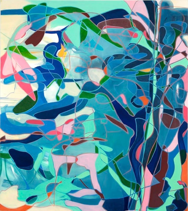
TM: In your new show at LaViola, Memory from Sight, that energy seems to have escaped its containers and spread across and behind the linear elements. The color spills into the lines, and the lines lead colors into one another instead of dividing them. The planes are no longer flatly painted, but are broken up into washy brushstrokes, drips and dissolves.
JR: Yes, all true! I needed/wanted the painting and my making of the painting to be more evidential of things felt, seen, remembered. Working large, improvisationally and with color demands a faster, more fluid approach. It was difficult to open up my method/process to re-engage with the unpredictability of washes and fluid paint, but that started to happen —
TM: I was especially pulled in by “Wolfcreek Howl” (2013), in which the linear elements seem splayed across the surface while the fields of color hover a palpable distance away, creating an almost intolerable tension.
JR: This was one huge struggle and it was the first of the really big ones in the show. I could imagine it but couldn’t see it for the longest time and finally with some distance I saw it coming into being. The tension you mention is the chance by-product of earlier concerns with an expanding painterly vocabulary. I kept a lot of the language in play even as I stretched it.
TM: In her essay for the show’s catalogue, Stephanie Buhmann cites your distinction between “painting as a noun” and “painting as a verb.” She explains the latter in terms of the “energizing speed, lucidity and fluidity” of paint, while the earlier work — the “noun” paintings — suggests “embodiments of statements.”
JR: She got that absolutely right. I understand painting as a language. I’ve drawn a metaphor more than once to language, having studied languages before and while studying painting.
TM: If the work in 2009 and 2011 felt distanced and, in a sense, framed and polished, there is now a sense of experiential saturation that indicates much more than a formal shift. The paint comes in from all sides, evoking a bottomlessness that can be terrifying in an Arshile Gorky, but here comes across as a kind of transcendence or pantheism.
JR: Yes, the presence of the Stevens poem in my 2011 show suggests I might lean towards a pantheistic view of the world. The lessons of Color Field Painting and Abstract Expressionism, of not reporting on the visible but revealing the unknown, could also be brought into the discussion. I think, however, that wanting to depict/relate images of hard facts needs to be balanced by an awareness of what lies beyond the boundaries.
I literally said to myself that ‘painting’ is also verb — it is an action — as well as a noun. I’d been too long in the noun; it felt natural to shift from ‘sign’ to ‘record.’ From something that indicates sets of information, so to speak, to showing tangible evidence of experiences.
No doubt that nature has influenced my recent work. I find my self staring with my mouth wide open at birds, at the edge of the forest — I sometimes feel guilty for looking — like I should get back to work — but looking is working for a painter.
TM: Stephanie writes that your motivation “is not a change of aesthetics but of outlook”:
This outlook could be described as the summation of the artist’s different experiences and fields of interest. Riley’s new paintings in particular reflect her current re-engagement with work by de Kooning, Pollock and Mitchell, her immersion in the natural environment as well as the art and architecture of Rome.
It makes sense that the “verb” paintings come out of Action Painting, though your surfaces and touch are vastly different. Which is why I turn back to Gorky, in particular his large drawing “Summation” (not to draw a facile allusion to Stephanie’s use of the word, but there it is) or an oil painting like “Agony” (both dated 1947 and both in the collection of the Museum of Modern Art, New York).
JR: We are fortunate to have these works in New York City.
Gorky and the Action Painters are each their own universe to me — so vast, so complex — and I’ve long admired their work, which I’ve learned from. I hoped that in my own way I could bring some aspects of their work forward, using my own sensibilities and sources. When I was in school Action Painting was ‘dead’; going there was like going over Niagara Falls in a canoe — unstated but definitely “NOT” advised.
TM: In the Gorkys, the graphic elements interact with the colors between and behind them to create an illusion of limitless space, while the Action Painters tended to choke off space or to compress it into a very narrow Cubist bandwidth.
While the lines and shapes in your new works crowd the surface, they don’t dominate it. Like a slick of gasoline shimmering on a lake, the painting’s surface is a membrane manipulated by the depths and pressures it masks.
JR: Wow, Tom, I love how you see this work. There’s no greater pleasure than hearing someone articulate their experience of it.
A few years ago I saw again a very large early Rothko painting of his studio on view at Pace — it was one he did just before he made his signature series. There was also a Pousette-Dart show in Chelsea and a show of enormous late Matta’s… I was shocked by this trifecta of earlier works. Some of my peers thought they were irrelevant; some were thrilled like me. I saw a lot of information in the works that felt surprisingly fresh, if overlooked. It’s never a direct cause and effect but something definitely got into my mind.
I look to the sweep of painting culture as much and as often as possible — and when I’m working on a problem or concern I recognize that it can often be a portal into a new understanding of an artist’s work. I look again at Gorky, at Mitchell, deKooning, Matta, Smith, Rothko as well as my contemporaries, but also at Fra Filippo Lippi and countless Renaissance, Baroque and Mannerist artists. Even if aspects of other work relates to a current concern only obliquely, I can still find information, inspiration, hints, and partial solutions there from time to time.
I have recently begun a renewed relationship to nature after decades of living and working in dense urban environments. My husband and I live both in DUMBO and in a log cabin in the hills of southern Indiana. These are polar opposite conditions. My physical engagement with NYC, Rome and the woods — an overabundance of stimulation — seeps into the pores of my work.
Yours is an apt metaphor. I activated the grounds and made their locations interchangeable with the shapes lassoed by my thin double lines. I wanted omni-directional space largely defined by linearity — and for the space to feel atmospheric in some places, flat and still in others — suggesting varying conditions and temporal modes. I didn’t want a hierarchy of the elements. It’s important to me that the image comes across all at once — line, plane, ground, wash and color — to elicit the broadest range of visceral response.
Jennifer Riley: Memory from Sight continues at the Allegra LaViola gallery (179 East Broadway, Lower East Side, Manhattan) until April 27.