Kingston Locals Can't Stand City's “Soulless” New Signage
New site markers installed in the Hudson River Valley city last month have been decried as “bland,” “ugly,” and “sterile slop.”

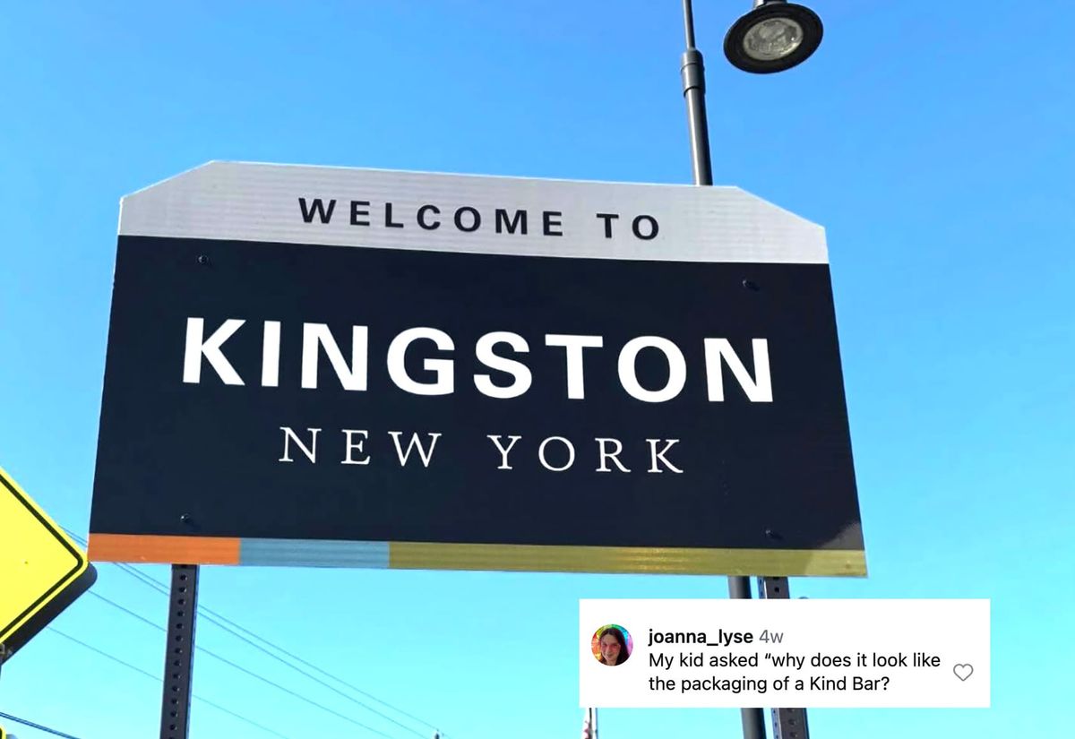
One would think that with nearly 400 years of history since the initial Dutch settlement in 1652, the former capital city of New York would want its new signage to reflect centuries of cultural and commercial growth. Instead, Kingston got dozens of new site markers last month that many are calling “bland,” “ugly,” “soulless,” and “sterile slop.”
The signs, which were designed by the Pennsylvania-based environmental and urban design firm MERJE, sparked additional fury when local news outlets reported that the project cost about $425,000 in funding so far, provided by federal distributions from the American Rescue Plan Act (ARPA) for economic recovery after the COVID-19 pandemic. The initiative began with a 2018 study conducted by the Ulster County Transportation Council, which found that people, especially visitors, had difficulties in wayfinding across Kingston's Uptown, Midtown, and Downtown/Waterfront districts.
So, how did Kingston end up with a design that some residents have aptly compared to the branding aesthetics of a KIND bar wrapper?
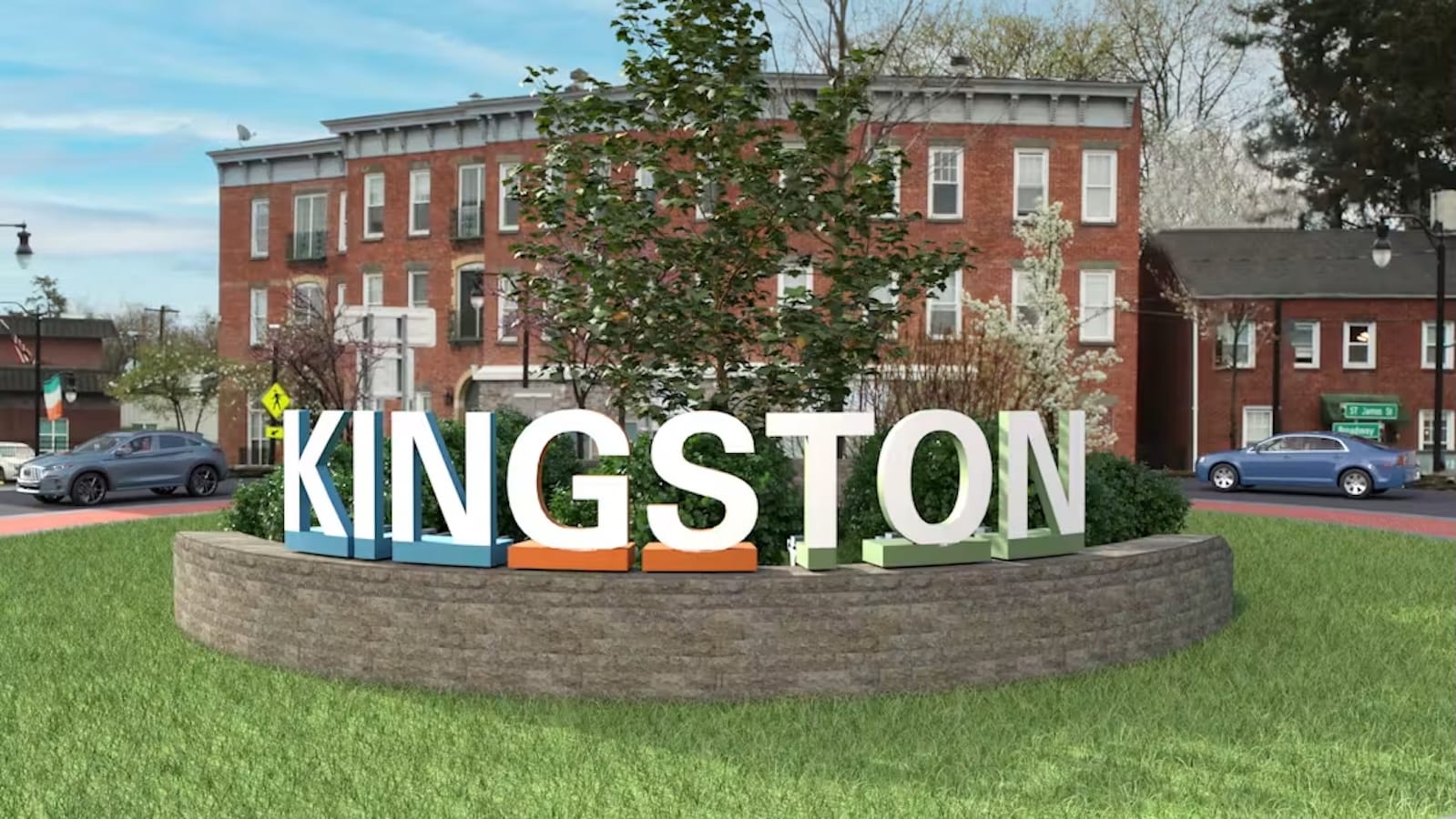
Summer Smith, Kingston's director of communications and community development, told the Daily Freeman that the intent was to give the city a cohesive look while recognizing its three districts with color markers and symbolic motifs: orange and gears for Midtown, green and window panes for Uptown, and blue and bridges for the Waterfront. (Cue Miranda Priestly's “groundbreaking ...”) Brickwork is set to embellish the signposts for a more historic Kingston feel as well.

It turns out that the project achieved its aim of city cohesion through a shared distaste for the aesthetic choices. Locals quickly dogpiled the signs on Reddit, Instagram, and Facebook, saying that they look like a pre-made PowerPoint template, have a corporate feel that doesn't engage with the city's history or natural landscape at all, and appear AI-generated. Noting that Kingston has a robust arts community, they also criticized the project's outsourcing, as the signs were not only designed by a Pennsylvania firm, but also fabricated and installed by a New Jersey-based company called Forge Signworks.
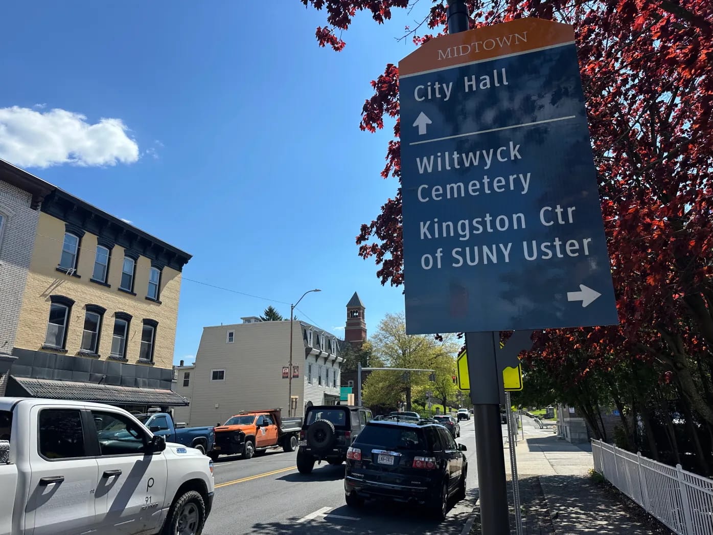
Adding insult to injury for the locals, several of the directional signs were printed with a typo of the county's name — reading “SUNY Uster” instead of “Ulster.” The Daily Freeman reported that Forge Signworks has replaced the signs with the corrected versions on their own dime ...
Other residents complained that this initiative was prioritized, citing the high lead concentration in the Kingston water system, potholes in the roads, and the Hudson River Valley's housing crisis as more pressing problems affecting the city's livability.
One local woman, 76-year-old Sharon Boyd, was so aghast with the new branding — especially for the sign that replaced the painted and debossed wooden post denoting Kingston's historic Waterfront — that she chained herself to the original in protest. Kingston Mayor Steve Noble was patently not happy with that, and called the city's mobile mental health team onsite.
Noble, who grew up in the city, also told Radio Kingston that “change can be scary, change can be hard sometimes,” but that he hopes the signs can become a part of Kingston's culture. He clarified that the initiative was not taxpayer-funded, utilized a minuscule percentage of the $17.3 million in ARPA funding for the city, and added that all the local design and fabrication firms fielded had passed on the opportunity.
“We do think that once the signage project is finished, and once the historic brick elements are added to all the wayfinding signage, that people may feel that this is more historic looking,” Noble told the radio station, reiterating that this was only the first phase of the project.


