Twitter Transforms Its Logo Into Sleeker, Balder Birdie
Today the micro-blogging service has unveiled its sleeker and more feather-less — not to mention slightly darker — blue logo.
Like any growing business, Twitter has taken a step forward in terms of branding. Today the micro-blogging service has unveiled its sleeker and more feather-less — not to mention slightly darker — blue logo.
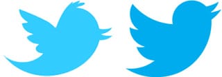
The new Twitter logo has a noticeably more optimistic stance (perhaps like its economic model, TechCrunch notes), looking upwards but that’s not the only thing that has changed. The new design, as the video demonstrates, is based on circles and less quirky than its older cousin. One of the wing feathers has disappeared and the tuff of hair … sorry, I mean, feathers … on its head is plucked away and the curves of its tail, beak and wing are more uniform.
Twitter’s Creative Director Doug Bowman explains the thinking behind the new birdie:
Our new bird grows out of love for ornithology, design within creative constraints, and simple geometry. This bird is crafted purely from three sets of overlapping circles — similar to how your networks, interests and ideas connect and intersect with peers and friends. Whether soaring high above the earth to take in a broad view, or flocking with other birds to achieve a common purpose, a bird in flight is the ultimate representation of freedom, hope and limitless possibility.
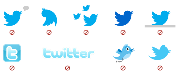
Love of ornithology (study of birds)? Really? But along the roll out of the new branding is also a list of brand dos and don’ts, including [with our commentary]:
Do:
- Use our official, unmodified Twitter bird to represent our brand. [god forbid you mash it up]
- Make sure the bird faces right. [no leftie birdies]
- Allow for at least 150% buffer space around the bird. [huh?]
Don’t:
- Use speech bubbles or words around the bird. [birdie is a mime]
- Rotate or change the direction of the bird. [but how will we represent if it’s a drunk tweet?]
- Animate the bird. [hear that! it.can’t.fly.]
- Duplicate the bird. [you mean like a pattern?]
- Change the color of the bird. [diversity is shunned in the branding departments of the twitterverse]
- Use any other marks or logos to represent our brand. [what if I want to go retro?]
Is the new logo more successful than the former one? I vote yes. The image is clean, more iconic but also slightly more generic, which is probably to be expected from a brand that continues to grow into an international communications powerhouse. Last week, Pew Internet announced their findings that 15% of online Americans (80% of Americans are online) use Twitter, while 8% use it daily. These numbers should tell us why Twitter feels its little birdie needs to continue to evolve or else it may go the way of the dodo.


