Two New Data-Mapping Tools Help Us Better Understand the Planet
Two recently launched applications for mapping datasets examine our planet and humanity's impact on it.

Two recently launched applications for mapping datasets examine our planet and humanity’s impact on it. The incredibly advanced Science on a Sphere (SOS) Explorer from the National Oceanic and Atmospheric Administration (NOAA) is a 3D desktop Earth, over which night lights, carbon tracks, ocean temperatures, and even satellites and space debris floating far above the surface are visualized, while Many Cities, from MIT’s SENSEable City Lab, tracks mobile phone usage and concentration in major cities.
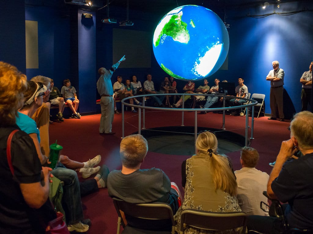
The two initiatives have distinct focuses but are worth highlighting together, since both are user-friendly tools that demonstrate the increasingly accessible ways in which data is being made available. SOS Explorer is an established presence in museums around the world, where it’s projected onto a physical suspended orb, giving the striking impression of a planet in motion (it’s on permanent view at the Museum of Science and Industry in Chicago, the National Zoo in Washington, DC, and the London Science Museum, to name a few).
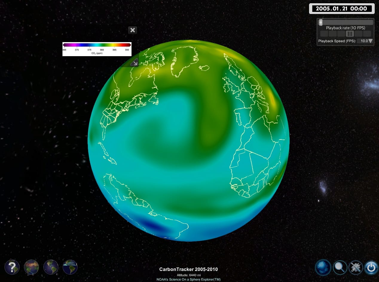
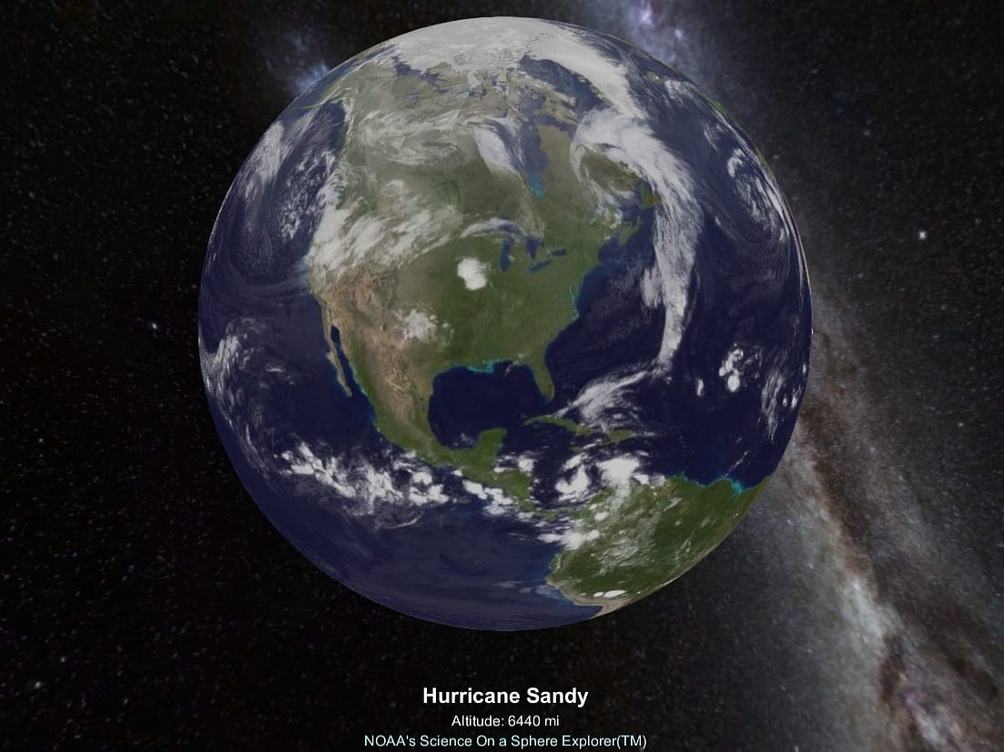
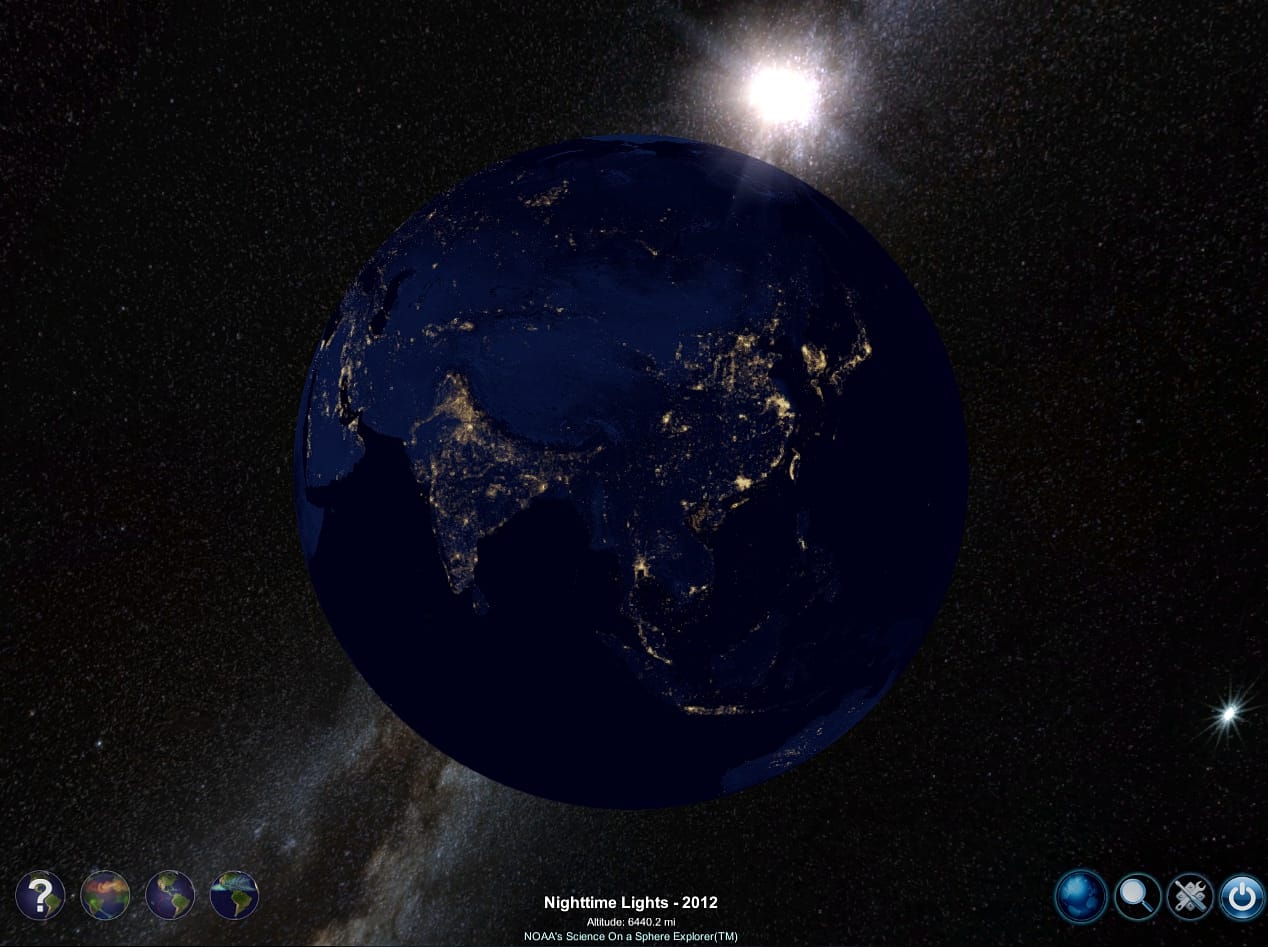
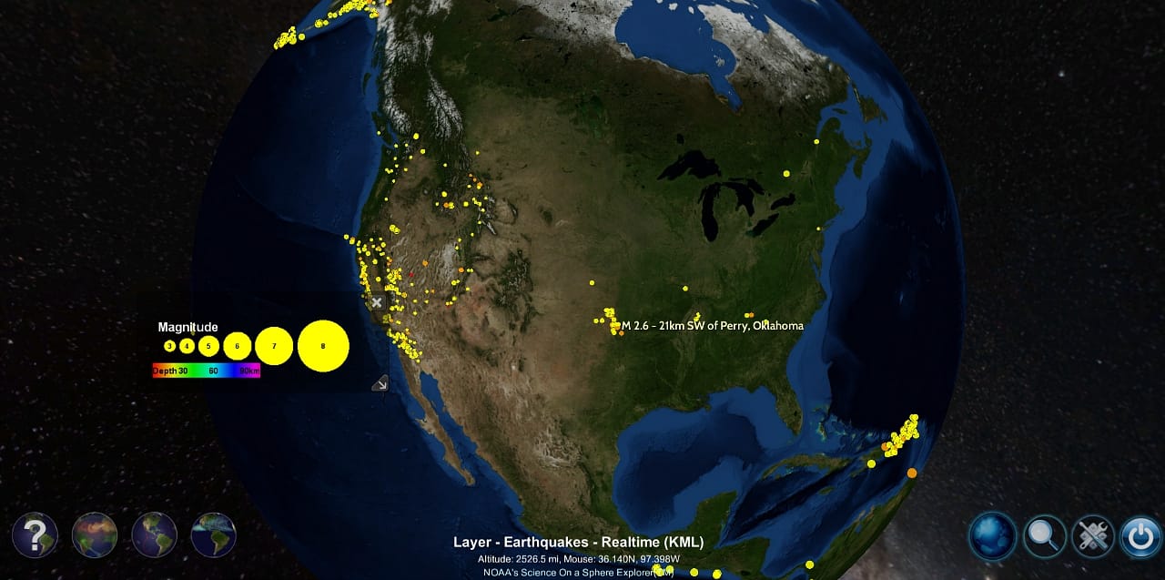
The version for Mac and PC announced last month offers the visualization for desktop for the first time. One goal is to make it easy for teachers to use in the classroom, but anyone with an interest in the dynamics of the planet can find a lot to explore. The application (which is a bit large, just over 10 GB when loaded on a Mac) starts with a current view of the Earth, with the clouds shown in real time, and offers loadable datasets based on information from NOAA, NASA, KML, and other agencies dating from 1950 to present. They show current information related to phenomena like earthquakes alongside historical statistics on the changing shape of Arctic ice, cropland density, and even specific moments, like the formation of Hurricane Sandy. NOAA’s announcement notes that future versions will have the whole SOS library of data — like a more in-depth, data-oriented Google Earth.
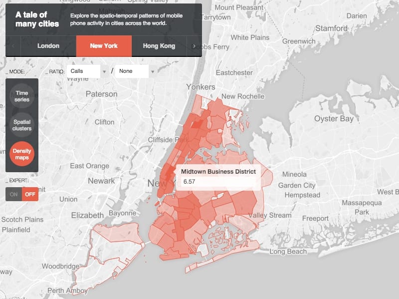
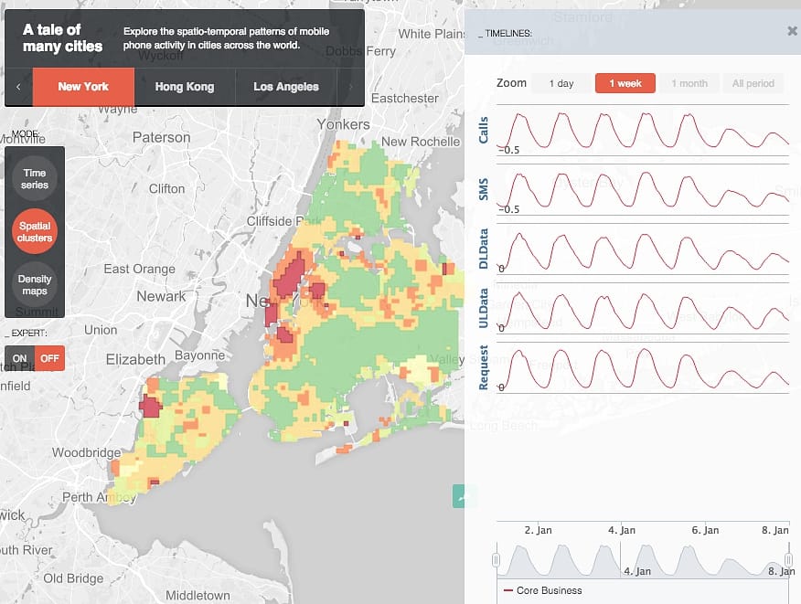
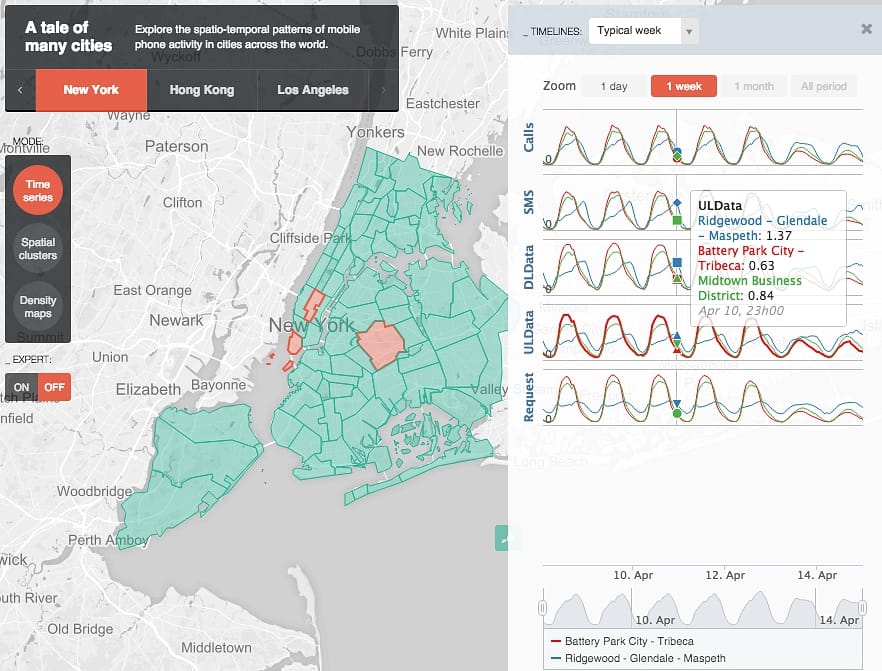
Meanwhile, MIT’s SENSEable City Lab created Many Cities with Ericsson, which builds telecommunications infrastructure, in an effort to provide “spatio-temporal patterns” of mobile phone activity in New York, London, Hong Kong, and Los Angeles. The application was released last year but featured last month in the MIT Technoloy Review. Through a map and charts, it shows the frequency of SMS usage, density of calls, traffic patterns, and usage comparisons between neighborhoods. All of the data is anonymous, but it is a reminder of just how much information is collected from our mobile phones and a consideration of how it can be used.
The SOS Explorer is definitely the more involved tool, but both it and Many Cities use available data to help up understand our planet and human interaction with it, whether that means the physical alterations of climate change or the more invisible rise of phone traffic.
NOAA’s SOS Explorer and MIT SENSEable Lab’s Many Cities are both available for free online.