Morris, _December 2013 (Rio)_ 2013

Sarah Morris, “December 2013 [Rio]” (2013), household gloss paint on canvas (via: Petzel Gallery)

What does it mean when you hook up your work to that of a late modernist giant working in a reductive vein — Ad Reinhardt, Agnes Martin, Robert Ryman, Ellsworth Kelly, Frank Stella, or Donald Judd, for example — like a caboose? I am not talking about engaging directly with another artist’s work or ideas, but of perpetuating a look or, in the case of Wade Guyton, the various monochromatic, striped and geometric surfaces we associate with Minimalism. Guyton’s mid-career survey at the Whitney Museum of American Art (Wade Guyton OS, October 4, 2012–January 13, 2013) suggested that if you know how to efficiently package and produce that look, success may well come your way, that you too can be a caboose that makes a difference. In other words, you become a high-end art director in the guise of a forward-thinking conceptual artist.

For all the praise circling like an irremovable halo above Guyton and his use of an Epson inkjet printer to make his paintings (further complemented by the self-satisfaction of institutional apparatchiks relishing the seamless fit between his lack of creativity and their academic narrative — the one that concludes with the death of painting and all the other attendant deaths — the elephant still in the middle of the room is the way the paintings look.

What they look like are large facsimiles of Minimalism but without the expenditure of labor that went into the real thing. Efficient artistic production with just the right conceptual twist, it seems, is nothing to sneeze at. Guyton and his studio assistants might tug the folded canvas through the printer, but that is hardly the same as an individual making a painting or, for that matter, a drawing.

Their labor is proficient manufacture under the sign of art, which is not the same as Jorge Luis Borges’ fictional author, Pierre Menard, “recreating” Don Quixote word-for-word. Guyton’s paintings are the aesthetic equivalent of the nearly perfect copies of Louis Vuitton bags that you can buy on Manhattan street corners. They don’t cost as much as the original, and they look pretty good.

One reason I am thinking of Guyton and his myriad examples of well-produced scruffiness is because, in the eyes of tastemakers, the creation of  imperfect and, in some cases, ironic variations of the artistic canon is a sanctioned way of dealing with what Harold Bloom called the “anxiety of influence.” The post-Bloom mantra seems to be this: Don’t take on, address or engage, but appropriate, copy and lampoon. If wielded with the right amount of panache, this strategy can significantly cut down the wait time between  a young artist and art world success.

We are well past Arshile Gorky and Willem de Kooning and their years of struggle, with no intention of looking back. This is not necessarily a bad thing, because the model of the suffering artist is hackneyed and tiresome, a B-movie version of bohemian life. It is the academically approved replacement model that I have a serious problem with, which smugly dismisses anything that seeks to delve beyond the surface. Appearance, it seems, has now become the art world’s highest goal, a shift in aesthetics more in keeping with the aesthetics of Hollywood and fashion designers. Stonewashed, artily torn jeans bought off the right shiny rack are infinitely preferable to ones that have gotten that way through actual use.

Kassay, _He Is Now With His Parents_ 2013

Jacob Kassay, “He is Now With His Parents” (2013), acrylic on muslin (via 303 Gallery)

Along with the efficiency, and institutional legitimacy, of acting in the proper Warholian manner, another reason why Guyton and others have chosen to appropriate Minimalism’s look is because it is the apotheosis of art-about-art, the period when subjectivity, content, meaning and all the other messy contingencies were emptied out of painting, along with space. As Stella famously said, “What you see is what you see.” And Warhol concurred when he stated, “just look at the surface of my paintings and films and me, and there I am. There’s nothing behind it.”

There is something liberating about not having to deal with problematic and chaotic issues such as the personal. For those appropriating Minimalism’s appearance, the goal is to make a good-looking product that reaffirms the death of painting, the death of the author and the death of originality without coming right out and saying it. If you are well bred enough, it seems that you can have your cake and eat it too. After all, we have not yet reached the point in the narrative that proclaims the death of the art director.

Of course, it helps that Minimalism is the ubiquitous postwar look, found in architecture and design. It is easier for Guyton and others to engage with a reproducible look associated with the timelessness of the present era than to grapple with a particular thing, an object with a history, which speaks too much of the material world and time’s incursions. If the imperfect copy or ironic shout-out helps verify the academic view dismissing the author and originality, it also reinforces the belief that art is all about style, the look of the thing. And, if style is the culmination of an artist’s work, then Guyton’s work is certainly accomplished. It looks serious. The colors might even be considered somber, neutral and non-expressive. Can we ask for more? Apparently not.

I was reminded of the success of Guyton’s postmodern strategy when I saw Jacob Kassay’s exhibition, IJK at 303 Gallery (November 1–December 20, 2013) Sarah Morris’s solo, titled Academia Militar, at Petzel (November 14–December 21, 2013). Kassay and Morris, like Guyton, are caboose artists who have hitched their fussy, smart-looking work to pre-ordained giants of art history. What all three artists share is good taste; they embrace what they have interpreted as brand-name formulas (or signature gestures) developed by major artists.

Kassay, _Then by Necessity_ 2013

Jacob Kassay, “Then by Necessity” (2013), acrylic on canvas (via 303 Gallery)

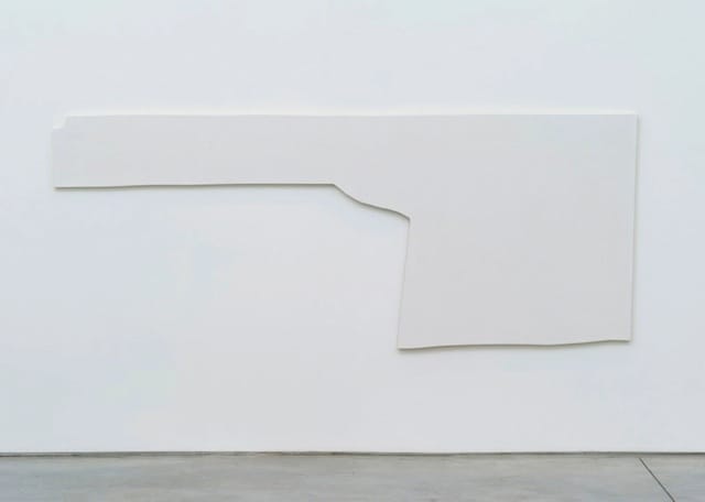
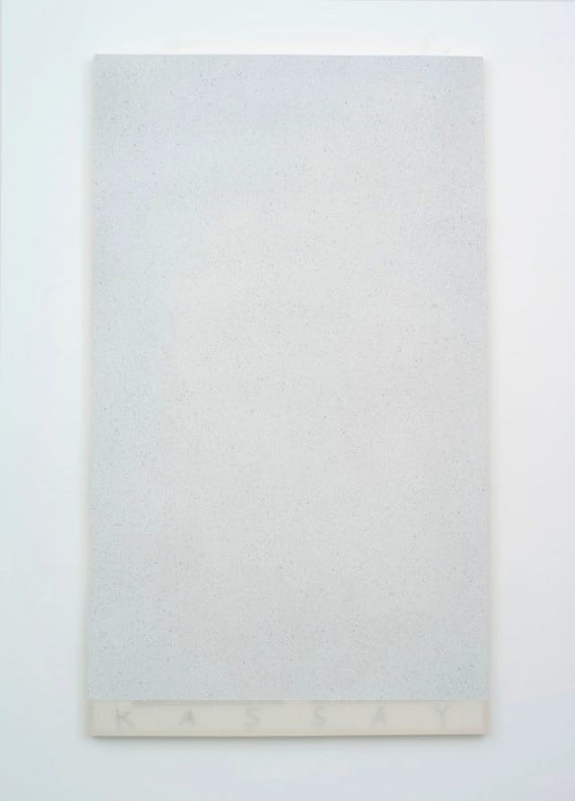
Kassay’s exhibition consisted of white and pale gray acrylic paintings on oddly shaped canvases and wall sculptures made from solid wedges of glass “to be inserted into library books,” as I learned from the press release. The sculptures make no impression whatsoever, while the paintings, in their retrofitting of the work of Ryman and Richard Tuttle for ironic purposes, suggest the impossibility of being serious about anything.

In her exhibition, which includes paintings on canvas, ink and gouache on movie posters and a film, Morris has co-opted Stella, Kelly and Victor Vasarely by adding just the right touch of graphic design to her brightly colored, large-sized, McMansion-friendly, geometric paintings. In contrast to Kassay’s sophomoric ironies, Morris claims to make work about power relationships, which suggests a passing familiarity with the writings of Michel Foucault.

For Kassay and Morris, the goal is to adapt and repurpose a particular 1960s-70s brand-name look in a way that demonstrates the conceptual brilliance (or light bulb moment) of their ideas, as well as ensure that the making of the piece, however flawless and uptight, smoothly illustrates the deep thinking that went into it.

Kassay, _Nails Nails Nails Nails_ 2013_

Jacob Kassay, “Nails Nails Nails Nails” (2013), acrylic on canvas (via 303 Gallery)

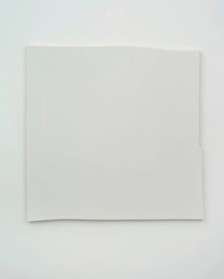
Kassay’s punctiliously engineered canvases owe everything to the seemingly casual, eccentrically shaped painted wood reliefs that Richard Tuttle began making in the mid-1960s. However, nothing Kassay does is casual. Rather, the slightly curved and irregular stretchers are calculated to appear casual, which conveys either a lack of imagination or a fear of it. According to the press release, Kassay used “residual textiles from paintings long lost, sold or otherwise disappeared.” While the last word is meant, I suppose, to add poignancy to the work, there is something obscenely smug about the allusion to the forced disappearance of thousands of people during Argentina’s Dirty War.

Kassay’s employment of atomized white and gray paint sprayed onto the shaped surface, with the artist’s name in large letters along the bottom and stenciled titles running along the side — which are all appropriated from Ryman — emphasizes the painting as an object, while titles such as “Inner Vendor” and “Bogus Torrent” (both 2013) are diluted versions of Ed Ruscha’s deadpan wordplays. Instead of coming across as ironic, which was most likely the artist’s intention, the combination is as dull and deadly as the 2011 children’s film Mars Needs Moms.

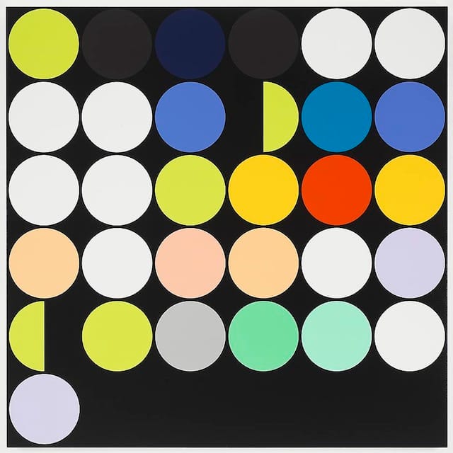
The painter and filmmaker Sarah Morris has long anchored her work in urban megalopolises, or what the writer William Gibson would designate as “The Sprawl”: Beijing, Los Angeles, Las Vegas and, in her current exhibition, Rio de Janierio. According to the gallery’s press release, the exhibition’s title, Academia Militar, is the name of the military academy “located at the base of the infamous and cinematic Sugarloaf.” The press release goes on to state, “the title encapsulates the contradictory political history of Brazil and its system of power which is currently going through a moment of rapid development and change.” The viewer, therefore, had better get wise to being in the presence of paintings with political and social implications. The real kicker, however, is the last line before the list of Morris’s numerous “international solo exhibitions”: “Her paintings streamline and create a new language of place and politics.”

If I take the press release as representative of Morris’s thinking, then this is the generic language I hear speaking in her big, bright, graphic abstractions,  would look tailor-made for corporate lobbies and spacious museum galleries. The hard, high-contrast palette of violets, reds, greens, blacks and grays are meant to evoke urban cacophony, while the circles and petal shapes convey Rio’s erotic character and tropical climate. We are intended, it would seem, to decode these rather obvious signs, as if somehow we will become enlightened in the process. If there is something at all monstrous about Rio, it didn’t make it into Morris’s paintings.

Morris, _Cosan (Rio)_ 2013

Sarah Morris, “Cosan [Rio]” (2013), household gloss paint on canvas (via Petzel Gallery)

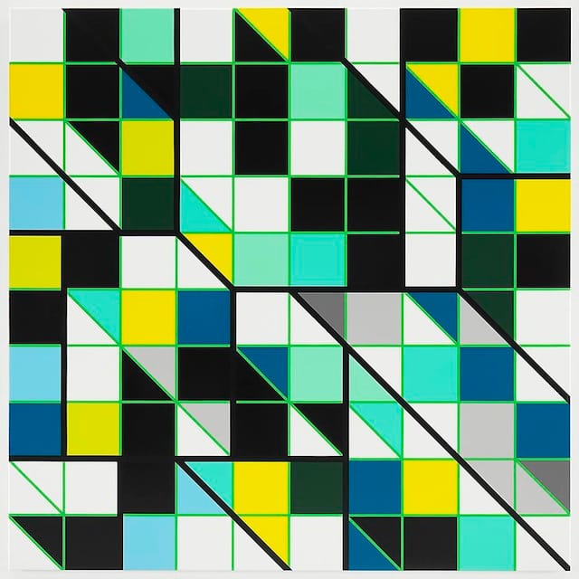
The closest Morris comes to complexity is in “Cosan (Rio)” (2013), which takes its title from Brazil’s biggest producer of ethanol and sugar. It is a large square painting divided into a grid of colored squares (turquoise greens, whites, grays, blues, blacks, and yellows), some of which have been divided diagonally into triangles. Thick diagonal black lines descend from the upper left to the lower right, dividing the composition into slated sections, and cause the composition to flip between a flat surface and a three-dimensional space, a corporate building façade and the rows of cubicles crammed inside it. As a comment on sameness and repression it seems a tad pat.

Like Kassay, Morris seems to be taking her cues from the well-known Hollywood Formula of making sequels to stories the audience already knows and loves — in this case, Minimalism. As a twist, she mixes in a couple of disparate genres: Op art, commercial design, including Bossa Nova album covers, and Univision’s corporate logo. If her most recent line of large, glossy products were a movie, it would be the 2011’s Cowboys versus Aliens — body snatching ones, of course.

Morris, _Casa das Canoas (Rio)_ 2013

Sarah Morris, “Casa das Canoas [Rio]” (2013), household gloss paint on canvas (via Petzel Gallery)

While a number of writers have advanced the view that Morris’s paintings are a critique of late capitalism, I think this claim must be meant ironically, since only a successful late capitalist would have rooms big enough to hold her paintings, one of which measures 84.25 x 169.49 inches. If anything, Morris’s grids of brightly colored circles, with their allusions to lunar cycles, commercial packaging, corporate logos and Op Art, resemble a digitally processed fusion of high modernist vocabulary and graphic design, resulting in a clearly defined diagrammatic image that studio assistants can handily fill in with high-gloss household paint.

With their precisely measured colored lines separating distinct areas of glossy, unmodulated color, Morris’ paintings follow the coloring book aesthetic: be sure the color stays between the lines. There are unexpected color shifts that briefly hold your attention, but little else to engage your thinking. Once again, we are delivered to the land where appearances are all. The grit of Rio de Janierio is nowhere to be found. Instead, Morris has translated the pomp and circumstance we might associate with military academies and their penchant for parades and bright medals into large, beautiful, empty paintings with just enough variation to save them from monotony — just what the interior decorator ordered.

Jacob Kassay: IJK continues at 303 Gallery (507 West 24th Street, Chelsea, Manhattan) through December 20.

Sarah Morris: Academia Militar continues at Petzel Gallery (456 West 18th Street, Chelsea, Manhattan) through December 21.

John Yau has published books of poetry, fiction, and criticism. His latest poetry publications include a book of poems, Further Adventures in Monochrome (Copper Canyon Press, 2012), and the chapbook, Egyptian...

37 replies on “What Happens When We Run Out Of Styles?”

  1. I appreciate your voice John, as a welcome rejoinder to the usual discussions about art and specifically painting, but I have to say your articles can become a little tiresome when you go on and on about the kind of painting you DON’T like. Even when you write about an artist you admire, the whole article seems to be propelled more by your disaffection for what their art stands against. I think sometimes it’s best to leave certain things in silence and begin a new discourse when the old one seems tired. When a critic devotes time and energy to repeating names, it does nothing to fell those giants, it only repeats their names. If we really don’t care, then let us not care.

    Every time I read an article about art, I’m hoping to find some inspiration. Something beautiful. Something thoughtful. Something personal. I think that is where your heart is, so I suggest not bothering with crap art…

      1. Yes…though I would say to much cheer-leading, not too many cheerleaders. Most critics, including John, praise when praise is due. That’s easy. Its a joy to write about what we like. The real challenge for a critic is to assess fairly when we feel the work falls short. I’m comfortable with the general assessment of the work discussed in “What do we do…” but I’m less comfortable with the accusation that the artists are cynically motivated. I’m not at all sure how it can be avoided, considering the argument, but I get a bit queasy when writers judge motivation. Half the time when I’m painting I don’t know what the hell I’m doing.

    1. yeah it would totally grab your attention while you silently wait outside your bosses boardroom.
      in corporate hell

      1. Why don’t you ride on the coattails of a poet, instead of champion an accomplished female painter with a 20 year established career -with full dedication to painting, minimalism, pop art and post- neo Geo! I don’t like this bashing of Sarah Morris. Her
        painting was one of the hottest paintings , in my opinion, at Basel.
        It’s so easy to attack female painters aint it? Everyone loves that!
        This fucking writer trivializes Morris claiming she co-opted
        Stella and Kelly.. attempting to smother her 18 year or so career as a
        reputable artist reducing her work to interior decor and graphic design.
        This is another attempt at attacking a female painter.. We know that
        the art world LOVES to demolish females– and the men never want to see
        women succeed at painting. Sarah is a great painter! She handles paint
        amazing, the size is perfect, the colors are very considered… I don’t
        have time or the interest to write an art review but if I were still
        writing criticism I would write her a raving article. Her work stands
        up. I dont care about the other two dudes..I’m a huge supporter of Sarah
        and her dedication to painting. She always comes out with fresh looking
        work. It never looks like anyones work but hers. ! Wait, no I should look at the overly ego
        inflated Martin Creed slop paintings. I don’t know who you are Sam Wallace, but you are most notably a nobody and apparently a bitter misogynist..

      2. I don’t like this bashing of Sarah Morris..
        It’s so easy to attack female painters aint it? Everyone loves that!
        This fucking writer trivializes Morris claiming she co-opted
        Stella and Kelly.. attempting to smother her 18 year or so career as a
        reputable artist reducing her work to interior decor and graphic design.
        This is another attempt at attacking a female painter.. We know that
        the art world LOVES to demolish females– and the men never want to see
        women succeed at painting. Sarah is a great painter! She handles paint
        amazing, the size is perfect, the colors are very considered… I don’t
        have time or the interest to write an art review but if I were still
        writing criticism I would write her a raving article. Her work stands
        up. I dont care about the other two dudes..I’m a huge supporter of Sarah
        and her dedication to painting. She always comes out with fresh looking
        work. It never looks like anyones work but hers.PERSONALLY IM FUCKING
        PISSED__ SARAH MORRIS PAINTING AT ART BASEL , PETZEL WAS ONE OF THE
        HOTTEST PAINTINGS THERE!! Wait, no I should look at the overly ego
        inflated Martin Creed slop paintings and embrace that. Look at all the haters here — all men.

    2. you wrote a reply that accused me of sexism and wanting to destroy sarah morris’s career because she’s female.and something about martin creed!?
      but its been deleted.

      here are some facts about me..

      i think the best artist of the last 30 years is cady noland

      i hate martin creed,he is the worst artist of the last 10’000 thousand years.
      (i have no idea why you accused me of loving martin creed!!??)

      of my favorite artists of the last 20/30 years probably just over half are women.
      a few examples – rita ackermann,cady noland,iza genzken,ida ekblad,agathe snow,trudy benson,joyce pensato.

      i believe the best painter alive today is rita ackermann,or possibly bjarne melgaard.i can never quite decide,you see the point im making though?

      i hate martin creed,honestly i cannot say that enough!

      sarah morris,jacob kassey and the other guy,i’ve forgot his name,are boring reductive and just a bit crap.

      this is not some woman vs man thing,its simply a question of good art vs bad art(in my case anyway)

      and sarah morris makes BAD ART.

      with love sm

      1. Cady is amazing I love her work 🙂 Although not a painter ,in any traditional sense- Rita is also a great painter.

  2. Very well stated: “the creation of imperfect and, in some cases, ironic variations of the artistic canon is a sanctioned way of dealing with what Harold Bloom called the “anxiety of influence.” The post-Bloom mantra seems to be this: Don’t take on, address or engage, but appropriate, copy and lampoon. If wielded with the right amount of panache, this strategy can significantly cut down the wait time between a young artist and art world success.”

    1. The key word in Bloom’s premise is “anxiety”.Where is the anxiety in this rehash of deconstructive rehash of minimalism by Sherrie Levine.

      1. Stella expressed his anxiety about the glibness of flatness in “Working Space”.Flatness as something achieved,as an act of the will upon the disparate should haunt these hipsters as the road less travelled.

  3. Great to read these ideas plainly stated by a critic. Shit is getting so monotonous, the game of self-referring art is tedious and formulaic. Alot of things have happened in art and culture in the last few decades, why is everyone so stuck in the 60s and 70s. It is too easy and apparently, as your write, a good strategy towards success for the newcomers. I don’t want to disrespect the former canons, I just want to meet the new ones!

    1. For what it’s worth, Kenneth Noland was making altered, large format digital prints of his own stripe painting at least 10 years ago. With or without irony, not even Guyton’s process seems very original and the resulting “paintings” even less so.

    2. a friend of mine said “if your going to
      make a painting about boredom don’t make a boring painting”.
      I say, if your going to make a painting about

      ‘the immediate access of iconography in a cyber age’ don’t make a painting that
      is immediately accessed and over with.
      Good art isn’t about message it’s about a
      satiability of understanding – something that settles in with some weight and
      longevity. Any subject should be treated this way. Any one, if it’s
      important. This is a huge historical value that isn’t
      understood by the new generation of art students (and apparently teachers too).
      Honestly, it’s an embarrassing time to be an artist.

  4. thanks for thoughtful writing and basic clarity. would enjoy reading of your positive choices but do look forward to your ideas either way.

  5. Yeah! Someone gets it! If art mirrors the world around it, then this art is fabulous because that’s exactly what it does. Thanks to John for explaining it. Sad we have become a world where the guy who has the most (expensive) toys wins.

  6. looking at these artists helps me imagine how it must have felt to standing in front of a painting of a cow in a field in 1910.

    ornamental.

  7. Enjoyable article. The lack of the personal associated with abstraction’s culmination in minimalist art is I think a detachment appealing to the ambitious and profession-seeking young artists emerging today. Such detachment is the result of the ironic and “meta” strategies that come with a belief in the arc of art history and one’s desire for a career and even legacy in such a history. After all, abstraction and reductionism does give an air of sophistication and maturity to a young artist like Kassay. The problem as I see it is that despite the appeal of the objects they make it is not clear whether the artists Kassay and Morris are being ironic or tongue-in-cheek about their associations and references as a way to subtly distinguish themselves from their forebearers or whether they are sincerely and clumsily trying to find a way to inject the aesthetics of abstraction and minimalism with some content revealing a somewhat amateurish take on abstraction. It makes me wonder if we are given a critique of a tradition or a trite sequel to squeeze one more penny from a successful franchise.

  8. maybe i’m being too generous, but to me, the work the of guyton et al. lies in its questioning of how a work of art “means” anything. minimalism is a useful reference point for younger artists because it represents the last gasp of formalism and the transition into the semiotic free-for-all of postmodernism. also, i don’t really care how much “work” it took to make a given piece … didn’t we get past that w/ duchamp?

  9. The one quality which seems to bond these 3 artists is lack of risk-taking or, to put it more bluntly, downright cowardice which has been tarted up. Were they tyres they would be re-treads.

  10. What I am always struck by in work like this is its inherent cynicism and near-criminal lack of generosity. Obviously (if sales are an indicator) “successful” as PRODUCT. Useless, however, as ART…..in my book.

  11. The correct spelling is RIO DE JANEIRO.
    There’s always google y’know. Or an atlas if you’re a hardcore hipster.

    While I wish my beautiful home’s name had been spelled correctly 😛 it’s still good reading.
    Oh yeah and Sarah Morris obviously has never been to Rio.
    If she had, her paintings would have more critical content FOR SURE.
    But Brazil is hype right now, I understand her useless intention to promote herself through my culture. No worries she’s not fooling anyone… 🙂

  12. This is the kind of criticism Hyperallergic could do much more of- articulate, interrogative, and well reasoned with a cognizance of where the reviewed object falls within larger swathes of time. Regardless of whether or not we agree with John, his willingness to hold the artist responsible for their product is a welcome respite from constantly nebulous and anemic art writing. More of this in the future.

  13. “adapt and repurpose a particular 1960s-70s brand-name look ”

    Referencing and repurposing the past—especially the past of one’s formative years—seems to be ubiquitous in all areas of the arts. Probably always a part of art, but in our world emphasized and accelerated by modern communication. When something new has to happen RIGHT NOW, then it becomes expedient to comment on the recent past rather than take the time to figure out how to move past it.

  14. Very nice article. Not a lack of imagination, but rather a “fear of imagination,” seems a correct assessment of the situation. But, what if you put all your imagination into a work and it still looks like something that a critic can casually mark as having been seen before? You mentioned a lot of deaths, but not too much about the death (or unsustainable nature) of style itself. Who creates this dependence on style, the artist or the critic? It seems to me that the artist creates work and the critic recognizes and creates and exercises the references to style. Isn’t it up to the critic to abandon or kill the use of style as a critical devise?

    1. Isn’t it up to the critic to abandon or kill the use of style as a critical devise? Yes this is true and in this I can imagine John Yau’s frustration and anger , how else can he describe this work without reference to Minimalism in which the most dominant element in this work is it’s references to Minimalism. How would you discuss this work ?

      1. If for no other reason than novelty it might be interesting to begin with the supposition that art criticism is dead. If not yet stone-cold it is certainly on something much like a death bed. This topic alone should give critics something to write about for a good long time. Perhaps the art critic could come out from the protective screen of academic and historical rehash and admit to a much more personal implication to the words they generate about the wordless. Of course, this could also be facilitated by artists who ignore styles in favor of personal expression. If nothing else this article shows the weakness of work created specifically to reference other work. I was encouraged by the title of this article, but let down by it when it fell into the recognizable pattern of what passes for art writing. Perhaps, if you can not discuss work without resorting to style-comparisons then the work should not be discussed. Move on. We have pictures that come with the words, why not let the reader process the style comparison thing visually themselves and have the words stand for what they are…a writer’s own act of creativity and personal revelation? Then, as such, writing which falls into the style of comparing styles begins to read like something we have read before and suffers from the same short-comings as art work which is stuck in the same sort of feedback loop.

  15. The first thing that comes to mind is that Richard Tuttle and Robert Ryman are not dead yet and are still very much alive and working. Perhaps the slick tentativeness of the work described in the article has to do with this, a perpetual waiting for cues or maybe the fear of copyright violation -aesthetic or actual , perhaps this is where the conceptual schtick comes in, to fend off claims of fraud. Direct appropriation was tried in the 80’s and after the fervor died down failed miserably because the originals were so much more substantial I think of the pseudo/neo/ersatz – Minimalist work that has been discussed as a decoy or dummy version of the work it is copying.I think caboose is too charitable a metaphor as it implies that it is made of the same stuff as the original and is able to do the same thing as with a train’s caboose which is wood and steel. This is far less substantial- balsa tissue and styrofoam ? (Tom Sachs without irony?) I think of this work as a decoy, or something that gives the appearance of being art but for what purpose I can’t tell other than ire and disbelief which is an old game. Yes it’s clever and facile and we’re supposed to be pissed off but it seems to have happened to many times like this for anyone to care.

  16. Take Guyton’s disinterest in drawing, or in having a direct physical engagement with the impulse to make something at ‘face value’, rather than as having a didactic purpose or endgame in mind. This allows the artist to pay more attention to fulfilling other aspects of the impulse to make something. I think the flame imagery in Guyton’s work is an example of a kind of evocative image that finds a completely different treatment because the artist wasn’t tied to trying to draw/paint flames. Maybe this is a bit simplistic, but I wanted to play devil’s advocate for a minute.

    John Yau also wrote about Guyton for Hyperallergic in October of 2012. He makes a humorous reference to typewriters and white-out in that piece.

  17. The ironic thing is….I am willing to bet no one spends more time thinking and writing about Wade Guyton than John Yau. In one of Yau’s previous essays, he compared Guyton to George W. Bush (funny). In another, Yau compared Guyton’s work, and perhaps Guyton himself, to that of a closeted homosexual (beyond the pale disgusting). The point is, I think there is something personal in Yau’s assessment of Guyton’s work. I wonder why that is?

    1. Funny and interesting, I’ll have to hold judgment as I have read the essays or seen the work. However closet homosexual is an apt metaphor in that i see the work in the article as closeted art, it’s trying to look like art but something is holding it back and it can’t come out of the closet and be art.

  18. When ‘everyone is an artist’ (Joseph Beuys 1970) then by default art becomes cliché. Hence: “Like Kassay, Morris seems to be taking her cues from the well-known Hollywood Formula of making sequels to stories the audience already knows and loves”
    In tribes everyone is an artist and therefore tribes have no art, only design and decoration. The art becomes an adornment that everyone recognizes, it can in no way question the status quo. Cliché becomes the archetype (Marshall McLuhan) and painting becomes “McMansion-friendly”.
    This art is neither ‘ironic’ or reverent of past attitudes, it is dead serious. It is the totem pole of the post-modern pod-people.

    1. Yes post modernism for Ikea. Would love to see how they write it up in their catalog, also curious if it is user assembled with options for minor adjustments as with their other products.

Comments are closed.