Novel Takes on a Blue-Chip Art Collection in Queens
Thematic exhibitions present a unique dilemma; if a curator follows a theme too rigidly, the exhibition can become stifling. If applied too loosely, the curator essentially undermines their own role.

Thematic exhibitions present a unique dilemma: if a curator follows a theme too rigidly, the exhibition can become stifling; if applied too loosely, the curator essentially undermines their own role. Literary Devices, currently on view at the Fisher Landau Center for Art, manages to find the middle ground, largely due to its intelligent, and at times, provocative arrangement of works.
Based in Long Island City, Queens, the Fisher Landau Center for Art was inaugurated as a nonprofit museum in 1991. The former parachute harness factory is one of the area’s most incongruous hallmarks, a beautifully restored pearl-white warehouse, neighbored by auto body shops, chain hotels, and abandoned row houses. The center’s chosen location was largely borne of convenience, since it’s about a ten minute drive from the Judson Art warehouse where the founder of the center, Emily Fisher Landau, stored much of her collection.
Now in her mid-nineties, the twice widowed collector began acquiring art during the 1960s. She is a trustee of the Whitney Museum, and in 2010, she bequeathed over 400 artworks to the institution, roughly a third of her entire collection. Fisher Landau clearly has a preference for striking, minimal work, and much of her collection has a 1980s–90s bent. Artworks by artists such as Jenny Holzer, Barbara Kruger, Richard Prince, and Ed Ruscha, appear regularly in exhibitions drawn from her collection.
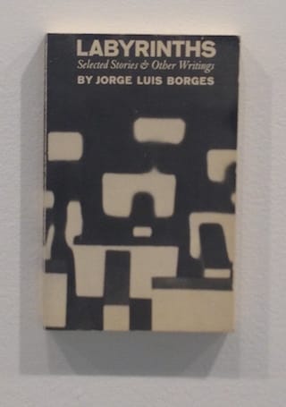
Curated by Nicholas Arbatsky, Literary Devices comprises of work incorporating text, literary themes, and representations of books themselves. The exhibition’s theme works surprisingly well. The most engaging pieces are those that actively explore the tensions between visual images and language. Such artworks beg the question of whether they are being viewed or read. A prime example is Steve Wolfe’s trompe l’oeil book sculptures, eight of which are displayed in a row. The artist has painted the jacket covers of literary works such as Jorge Luis Borges’s Labyrinths and J.D. Salinger’s The Catcher in the Rye on three-dimensional wood molds.
Wolfe’s painted facsimiles raise a number of theoretical dilemmas. Does it make sense to value the formal qualities of Wolfe’s work, or is such an appreciation negated by his use of trompe l’oeil? It would seem absurd to overanalyze Wolfe’s painting style, and yet the interpretation of his work hangs entirely on his skillfulness as a copyist. Perhaps the artist’s choice of literary work serves to tell us something about himself. Why these particular books and how are they connected? In re-producing the covers verbatim, Wolfe also foregrounds the formal choices made by their designers, thereby throwing the question of artistic authorship into disarray.
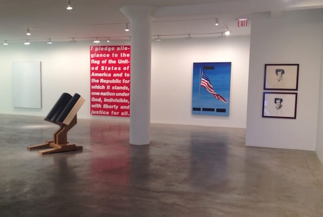
Hung together on the first floor of the exhibition are three large-scale works by Barbara Kruger, Ed Ruscha, and Tim Rollins & KOS. All three pieces scrutinize American culture with the use of austere, and seemingly simple visuals. They also complement one another, their combined color palettes recalling those of the US flag. Kruger’s “Untitled [Pledge]” (1988) is a red and white silkscreen reproduction of the Pledge of Allegiance. It takes a while to notice Kruger’s visual interventions in the form of subtle variances in text size and kerning. Two words, “allegiance” and “united” have been broken up by line breaks. In manipulating the text, Kruger dictates its cadence, emphasizing particular words for further contemplation.
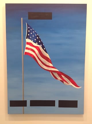
The Pledge of Allegiance has historically been a lightning rod for criticism. It was last amended in 1954 to include the words, “under God,” a contradiction for a republic that extolls the freedom of religion. Kruger’s minimal interventions encourage a deeper and more interrogative rumination of the pledge’s history. Ed Ruscha’s “Plenty Big Hotel Room (Painting for the American Indian)” (1985) depicts a U.S. flag cast against a blue sky. Four black rectangular blocks indicate the censorship of some words or a sentence. As with Kruger’s piece, the painting infers the absence of a contested history. Ruscha’s painting leaves the viewer with very little to go on, and so unlike Kruger’s work, we rely more heavily on the title in our interpretative efforts.
“Whiteness of the Whale II” (1991) is a stark white painting by Tim Rollins and KOS (Kids of Survival), a group of South Bronx teenagers with whom Rollins began to collaborate in 1984. The painting is part of a series produced during the group’s study of Herman Melville’s Moby Dick (1851). The imposing work is wide open to interpretation. Is it a comment on white hegemony? Perhaps the piece refers to the novel’s racial politics? Like Kruger’s “Untitled [Pledge],” the work functions in a wholly rhetorical manner.
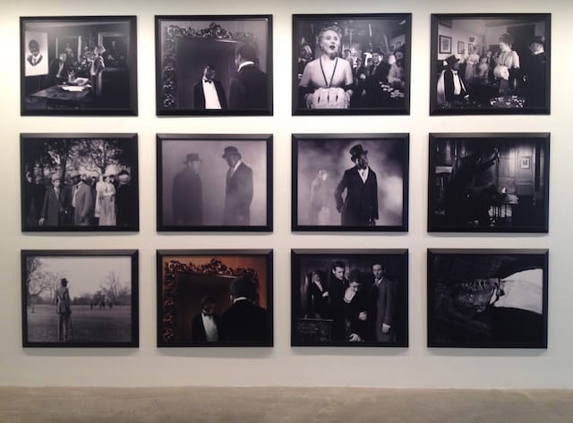
Two works inspired by Oscar Wilde’s The Picture of Dorian Gray (1890) are exhibited side by side. The most imposing is Yinka Shonibare’s “Dorian Gray” (1991), a series of twelve black and white photographs in which the British-Nigerian artist posits himself as the novel’s titular character. The work fits into a broader practice whereby Shonibare usurps the visual and cultural space dominated by the white elite. The monochrome format emphasizes the racial politics of the work while also explicitly referring to the 1945 film adaption of the novel, in which the American actor Hurd Hatfield portrayed Gray.
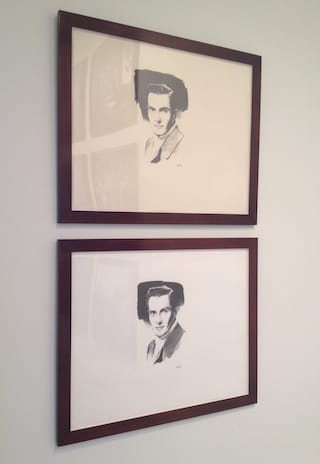
Displayed beside Shonibare’s work are two drawings of Hatfield by artist Allen Ruppersberg. Virtually indistinguishable, the drawings were executed seven years apart. It’s only upon closer inspection that the viewer is able to pick out minute differences, analyzing how Ruppersberg’s drawing technique has changed with age. The work cleverly underlines the themes of duplicity and transformation that lie at the heart of Wilde’s novel. The piece is entitled “Self Portrait (as Hurd Hatfield as Dorian Gray),” an acknowledgment that the subject is not only Hatfield, but the aging artist as well. It’s as if Ruppersberg is lobbying for Basil Hallward — the artist who paints Gray’s portrait in Wilde’s novel — reminding us that a painting doesn’t just capture the sitter’s soul, but the artist’s too.
It would be impossible to adequately review all the works in Literary Devices which spans three floors of gallery space and features over forty artists. If there is one figure who dominates, it’s Glenn Ligon, whose work is displayed on every level of the center. The second floor features two bodies of Ligon’s work, Narratives and Runaways. The Narratives, a series of chine-collé prints, resemble eighteenth-century frontispieces. The prints recall the language and cliches of slave narratives. The first work on display reads:
Black Rage; or How I Got Over; or Sketches of the Life and Labors of Glenn Ligon. Counting a full and faithful account of his commodification of the horrors of black life into art objects for the public’s enjoyment.
Ligon’s use of biography de-historicizes the horrors of slavery, collapsing the historical distance which blunts (and represses) trauma.
The Runaway series consists of physical descriptions of Ligon who assumes the role of a runaway slave. The accounts range from the blunt, to the elaborate: “Five feet eight … the Oliver North of downtown … Kind of stocky, tends to look down and turn in when he walks.”
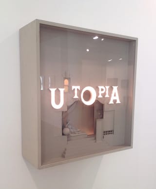
Like Shonibare, Ligon inserts himself into the past, except that he isn’t pointing to a cultural absence, but a specific literary history that many might prefer to forget. The Runaway and Narrative works are displayed in parallel along a long corridor. At the end of the room is Cletus Johnson’s “The Fifth Utopia (for Leo)” (1987), a mixed media diorama in which the word ‘UTOPIA’ is illuminated. Hung in such close proximity to Ligon’s work, the word reads more like a question.
A presentation of work by such iconic artists could easily be pedestrian. Thankfully, Arbatsky’s deft curation imbues the show with an orderly and fluid logic. The calibre of Emily Fisher Landau’s collection is so high, it would be virtually impossible not to find something of interest. Those who visit on a cold, blustery afternoon are more than likely to have the entire center to themselves, a surreal experience for any seasoned museum-goer. A number of the works include promised gifts to the Whitney, which will eventually be displayed in the museum’s new building. Experience them in Queens while you can.
Literary Devices continues at the Fisher Landau Center For Art (38-27 30th Street, Long Island City, Queens) through March 15.