The British Artist Who Painted Through War and Found Surrealism
A retrospective devoted to the British painter Paul Nash shifts the focus from his radical interpretations of war and Surrealism to his innovative use of color.

LONDON — In 1921, Paul Nash was in a dismal state. Having suffered from frequent bouts of fainting and depression following the death of his father and the emotional trauma of the Great War — in which he served, first in the Artists Rifles and then as one of Britain’s official war artists — Nash and his wife Margaret Odeh moved to Dymchurch on England’s south coast. The couple spent the next four years there while Nash recuperated and re-figured his relationship with painting. This brief reprieve would set the stage for Nash’s resurgence in the UK art scene as both an emblem of British sensibility and a lightning rod for international modernism.
Tate Britain’s retrospective of Nash’s career, the artist’s second (the first was at Tate Liverpool in 2003), fixates largely on the blurry distinction between Nash’s preoccupation with international surrealism and his penchant for patriotism. The latter is seen most evidently in the works from 1921 to 1925, which Nash made during his time in Dymchurch, the Berkshire Downs, and Whiteleaf. The work from this period is characterized by landscapes of rolling hills dotted with country houses, clumps of mushroom-like white trees that Nash depicts against crisp blue skies, and jagged waves — a stark contrast to the dynamic wartime works commissioned by the British military and Ministry of Information that propelled Nash to fame. Though he is widely commended for his application of surrealist principles to his paintings of the 1920s and ‘30s, his paintings are most compelling for the ability of his color palette to take on a fortitude that his composition lacks. The blended palettes that define his wartime paintings (both WWI and WWII) and the muted palettes of his late works soften the brutality and incomprehensibility of their subjects, thus positioning the role of the war artist as interpreter rather than interloper.
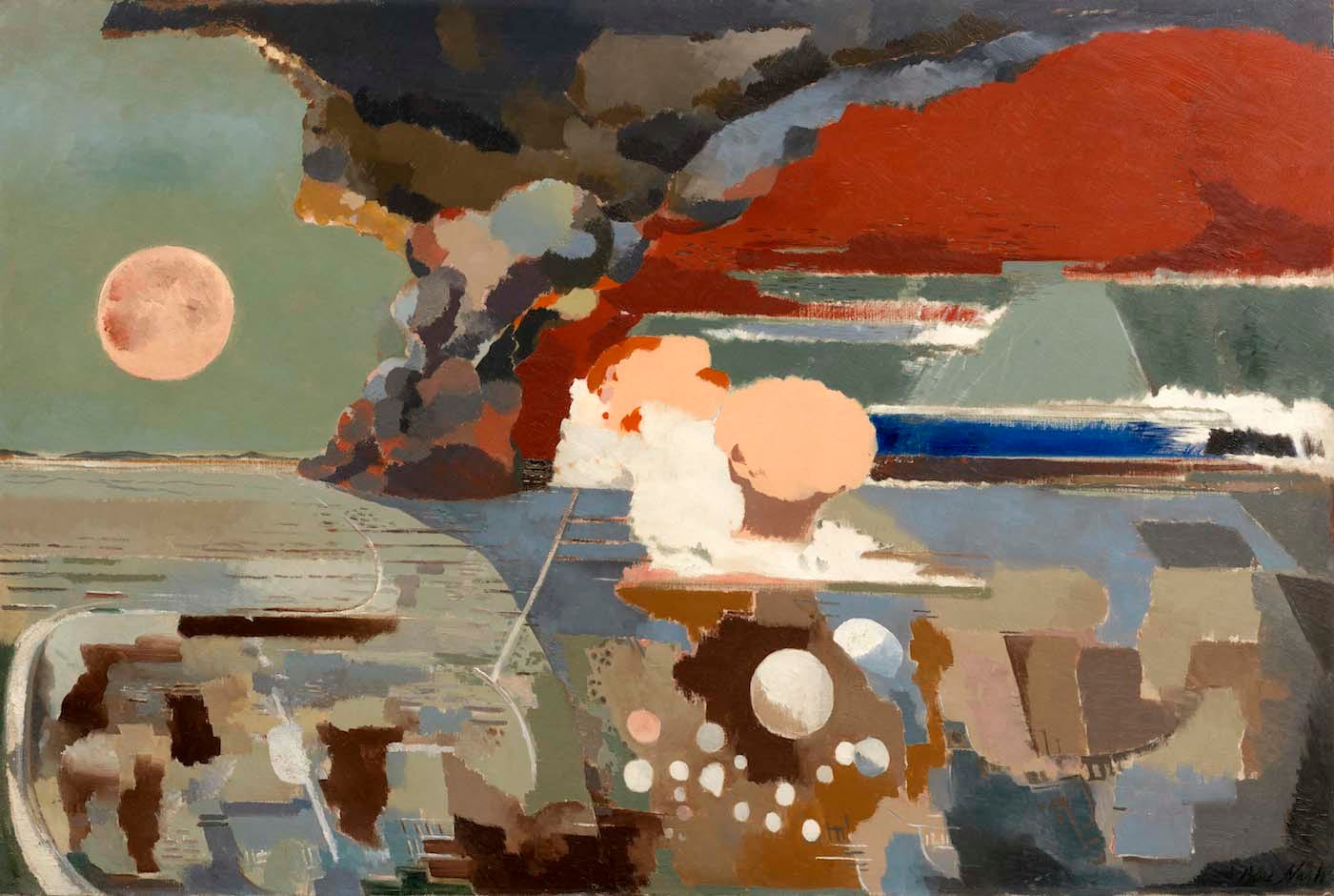
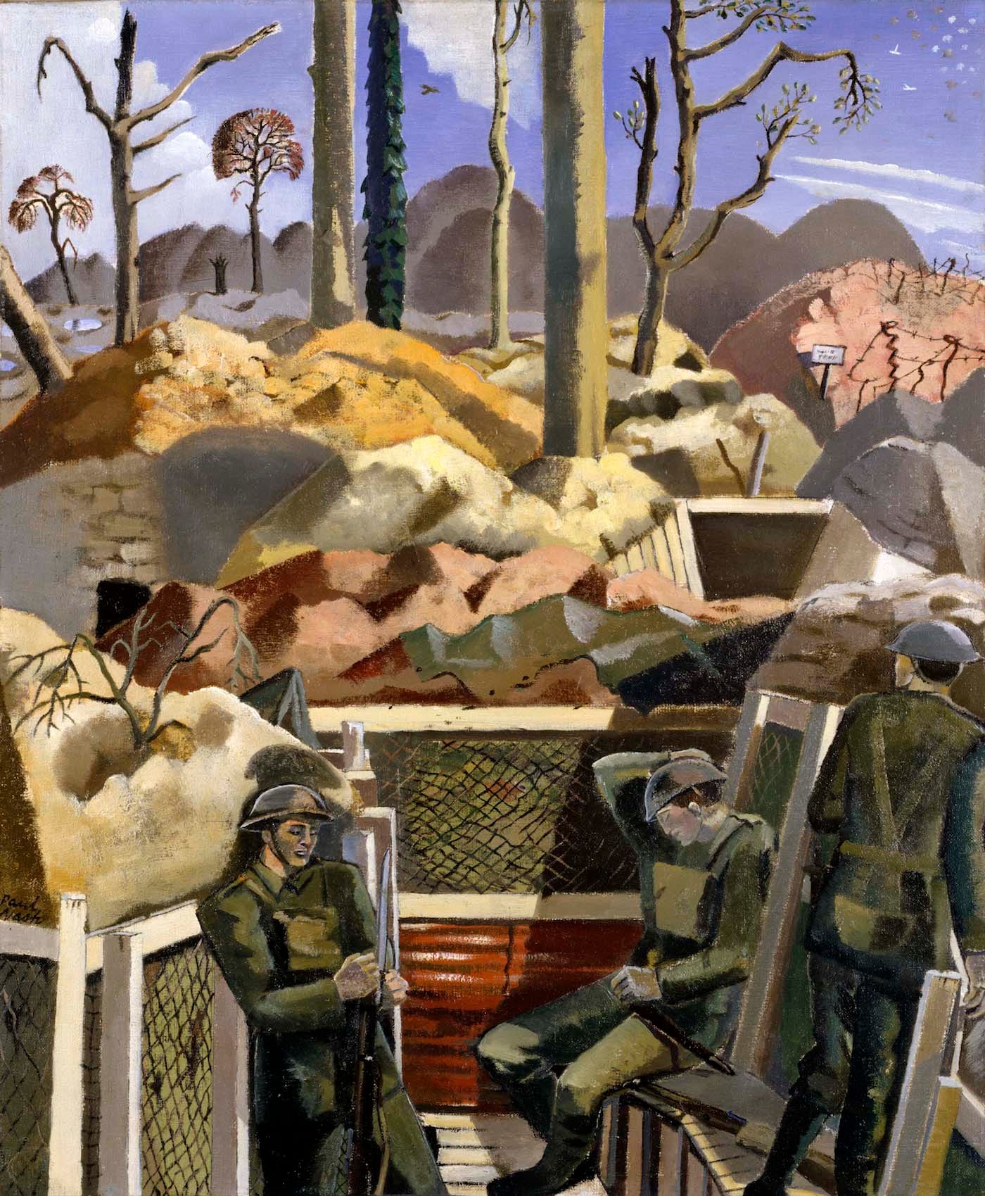
Staking out this interpretive position on the battleground was as much a result of Nash’s luck as of his talent. When serving on the Western Front in Ypres Salient, Nash encountered little major engagement, but was invalided back to London after breaking a rib. Shortly after his departure, his entire regiment was killed. While his injury healed, Nash recalled what he had seen: a landscape that was growing back in greens and yellows, despite the destruction of war, as depicted in the 1918 painting “Spring in the Trenches, Ridge Wood, 1917.” The painting is somewhat inconsistent in its attention to detail: the shadows of the soldiers’ bodies do not relate rationally to their forms, and their position in the foreground strikes an imprecise balance between the rocks and craggy trees positioned above them. It is the periwinkle blue of the sky, and the dark, ivy covered tree trunk that are most disorienting. Their pasty coolness seems at odds with the muddy olive and earth tones of the soldiers’ uniforms and suggests a sense of temporal displacement — is it night, day, or somewhere in between? Similarly, the 1944 painting “Battle of Germany” functions on a system of disjuncture: though the action of the battle is suggested by the muddied patches of brown, green, and gray, and the sea and horizon are defined by large planar strokes of paint, a pale pink orb on the top left side of the painting and the white and pink strokes directly in the center of the canvas function as the punctum relative to the surrounding, chaotic blur. In this way, Nash doesn’t make battle scenes any easier to conceptualize, nor does he undermine their material impacts. His slight intrusions of pale color offer instead a way to rationalize the totalizing effects of the brutality to which he was witness.
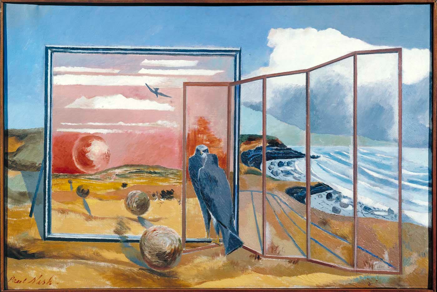
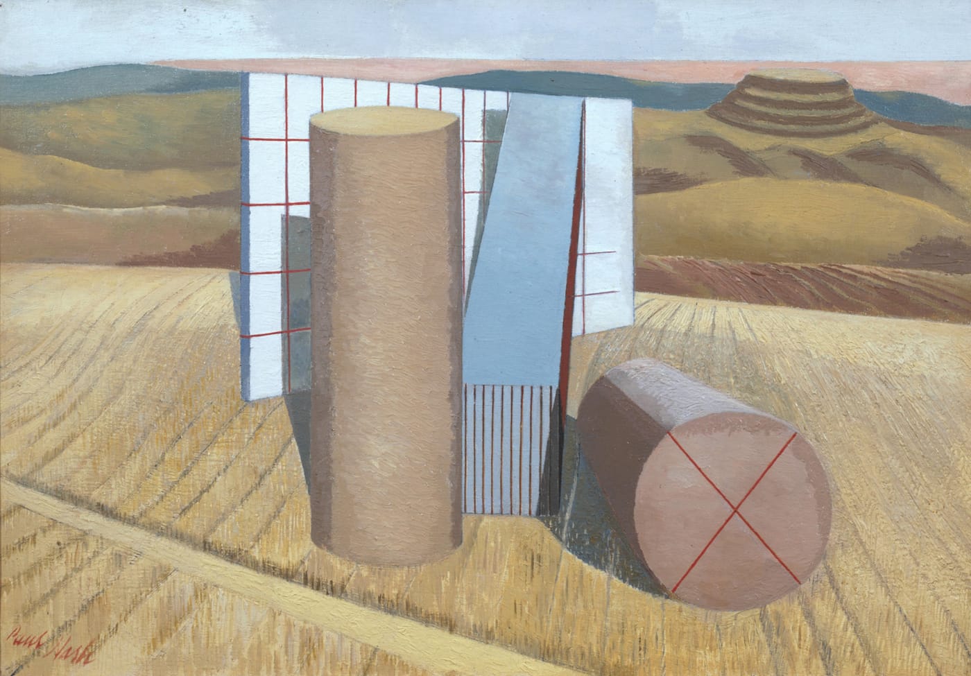
The war paintings are only one manner in which Nash exercised a more cerebral tack in his art. Several sections of the retrospective address — perhaps even belabor — Nash’s ties to Surrealism and his appreciation for artists such as Giorgio de Chirico, whose influence is visible in Nash’s conceptual and formal approach to paintings after Nash saw the Italian artist’s work in 1928. The works that comprise these sections are representative of Nash’s experimentation and trace his journey from an interest in the symbolism of William Blake’s poetry to a dogged dedication to investigating the ontological aspects of lifeless forms. However, they are nowhere near as conceptually challenging as the works of the artists Nash seeks to emulate, and they are formally much less engaging than the rest of Nash’s own oeuvre.
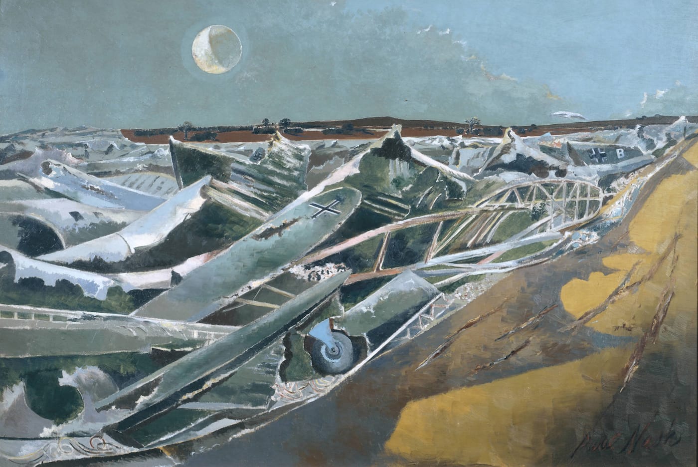
In the penultimate and final sections of the exhibition, Nash’s conceptual and formal freshness returns. The section titled Aerial Creatures catalogs his work made during the outbreak of World War II — when he was once again made an official war artist by the War Artists’ Advisory Committee — and places a special emphasis on a series of watercolors of crashed German planes. “Totes Meer (Dead Sea)” is similarly based on a mass of wrecked aircraft that Nash observed near Cowley in Oxfordshire; the jagged depiction of the wreckage among the waves is rendered in shades of blue that emphasize the sharp edges of the form, but the overall tonal composition, wherein the sky and the sea are formally distinct and yet meld together, renders an affected coolness. Likewise, the paintings that comprise the Equinox section are unified by their obsession with the sun, moon, and the hovering specter of death (represented symbolically by large, floating, flowers). In each of these paintings, a ghastly shade of pink establishes a grave atmosphere that originates not from the object-oriented symbolism of Nash’s surrealist paintings, nor from the muddy throes of battle in his war paintings, but is situated in an in-between space that retains the gravity of both.
Nash is lionized in British art history for his attentiveness to the world around him — for capturing and refracting war and transmuting international artistic movements to his native England. However, in Tate’s retrospective, what comes across most powerfully is his ingenuity in his careful use of color as a means to transmit affect.
Paul Nash continues at Tate Britain (Millbank, London, UK) through March 5, 2017.