A New Video Starkly Illustrates the Impact of Climate Change
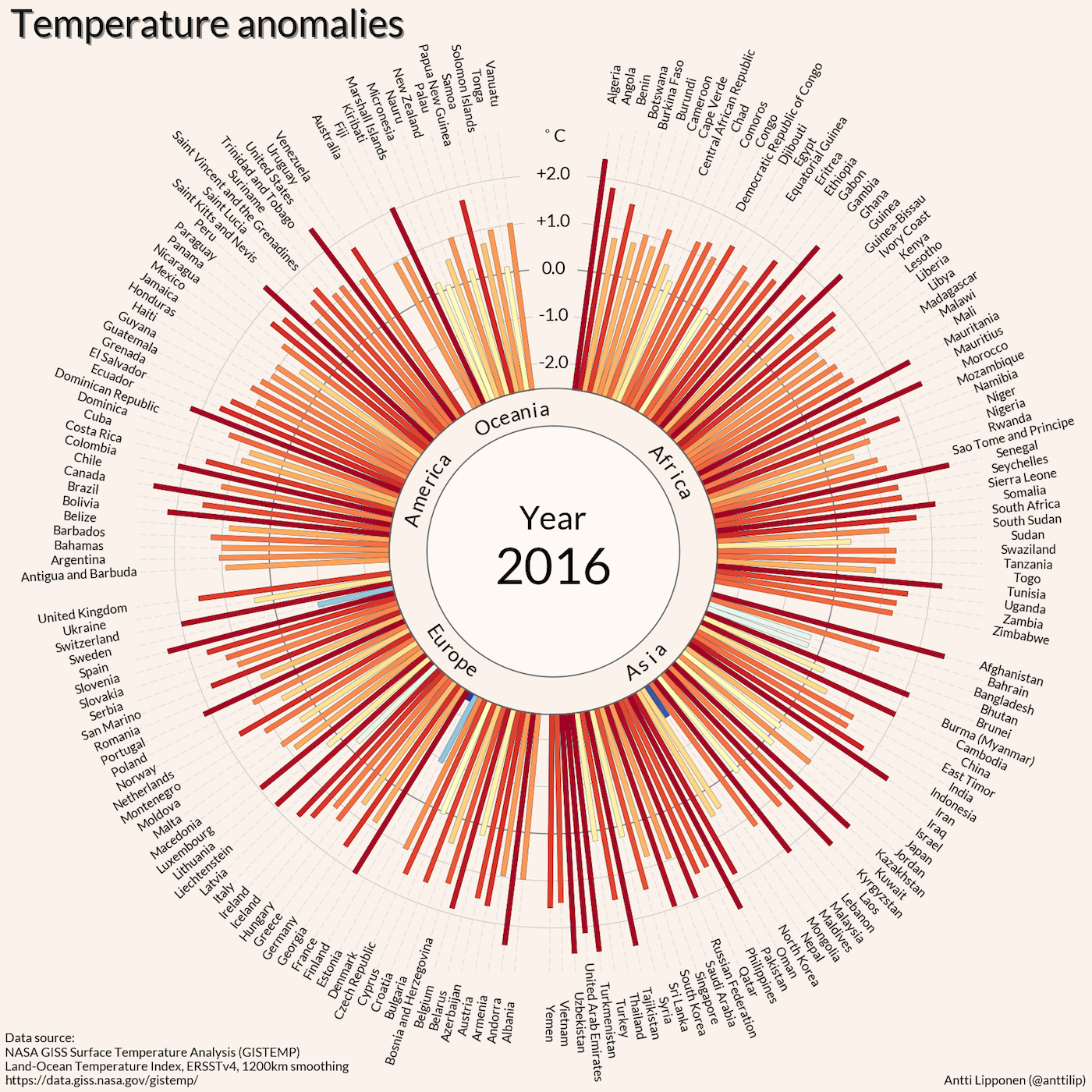
Finnish researcher Antti Lipponen’s recently released video presents a century's worth of data on global temperatures in just 30 seconds.

Earlier this year, the International Center for Photography held an exhibition called Perpetual Revolution: The Image and Social Change. It proposed that there is an ongoing revolution happening, from #Blacklivesmatter, gender fluidity, the refugee crisis, to climate change, and that digital images are simultaneously reporting and producing that change. In reviewing the show for the New York Times, Holland Cotter wrote, “Visual culture does more than reflect reality: For better and for worse, it creates it.” With climate-deniers, like those in the current administration, visual culture’s power to create reality is particularly crucial when it comes to its depiction of climate change, as it can make it feel concrete. But how do you make a digital image show climate change data in a way that can be felt and understood, even by someone who doesn’t know or believe the facts?
Finnish researcher Antti Lipponen’s recently released digital video makes the attempt to not only report on climate change, but make it a reality. In only 30 seconds, he presents a century of data through a series of stills marking the annual temperature anomalies across the globe. Bar graphs representing a country’s temperature are lined up in a circle shooting outwards in a radial pattern, conjuring the image of the sun and the roundness of the Earth. At first, the video transitions quickly between the slides of each year, but then as it approaches closer and closer to the current year, the lines go from cool blues to hot reds, and the pace of the transitions slows down to a rearing stop like a car ramming its breaks before running a red light. The data radials pulse out from the core, intensifying with every passing year like a ticking time bomb about to blow. It’s like watching the evolution of a star about to combust. Anomalies are the new normal.
If we are to take decisive action, it’s crucial that we comprehend the grim data. There have been many valiant attempts thus far in the form of line graphs, videos, and maps, that focus on a variety of ways that climate change is having an impact, including on migratory patterns, CO2 concentration, and our decreasing “carbon budget.” Last year, University of Reading climate scientist Ed Hawkins released a spiraling GIF tracking global temperature change. It went viral. Watching the wonky spirograph drawing is like watching a room grow increasingly crowded from above, or like tracking a game of darts moving further from the bull’s eye. The only issue with Hawkins’s image is that not everyone might immediately grasp the severe impact of a global temperature rise of one-point-five or two degrees Celsius. Without prior context, this illustration of climate change may remain abstract and incomprehensible.
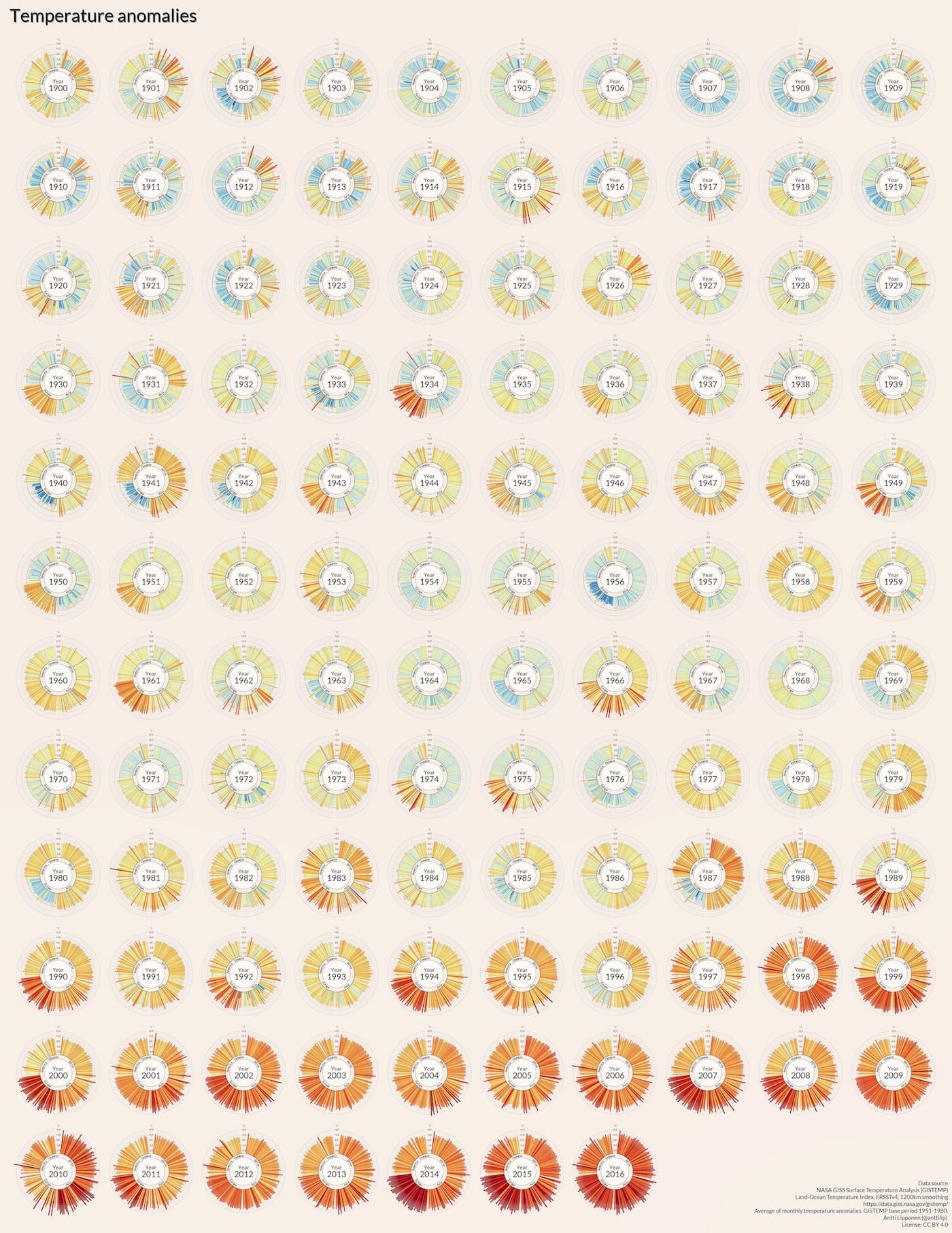
Lipponen’s image, on the other hand, makes starkly clear that these are the hottest temperatures we’ve ever experienced — and that there is no sign of the exponentially rising temperatures slowing or cooling down. The image’s pronounced and deepening red is a direct and urgent warning to stop the current course of action immediately. The image has resonated with many, as it has also gone viral. The only question left is, what action will we take?
Antti Lipponen’s video “Temperature anomalies arranged by country 1900–2016” is available to watch on Flickr.