A Database of Campaign Logos Is a Window into Our Politics
The intersection between design and political power, as far as these candidates go, is difficult to discern.

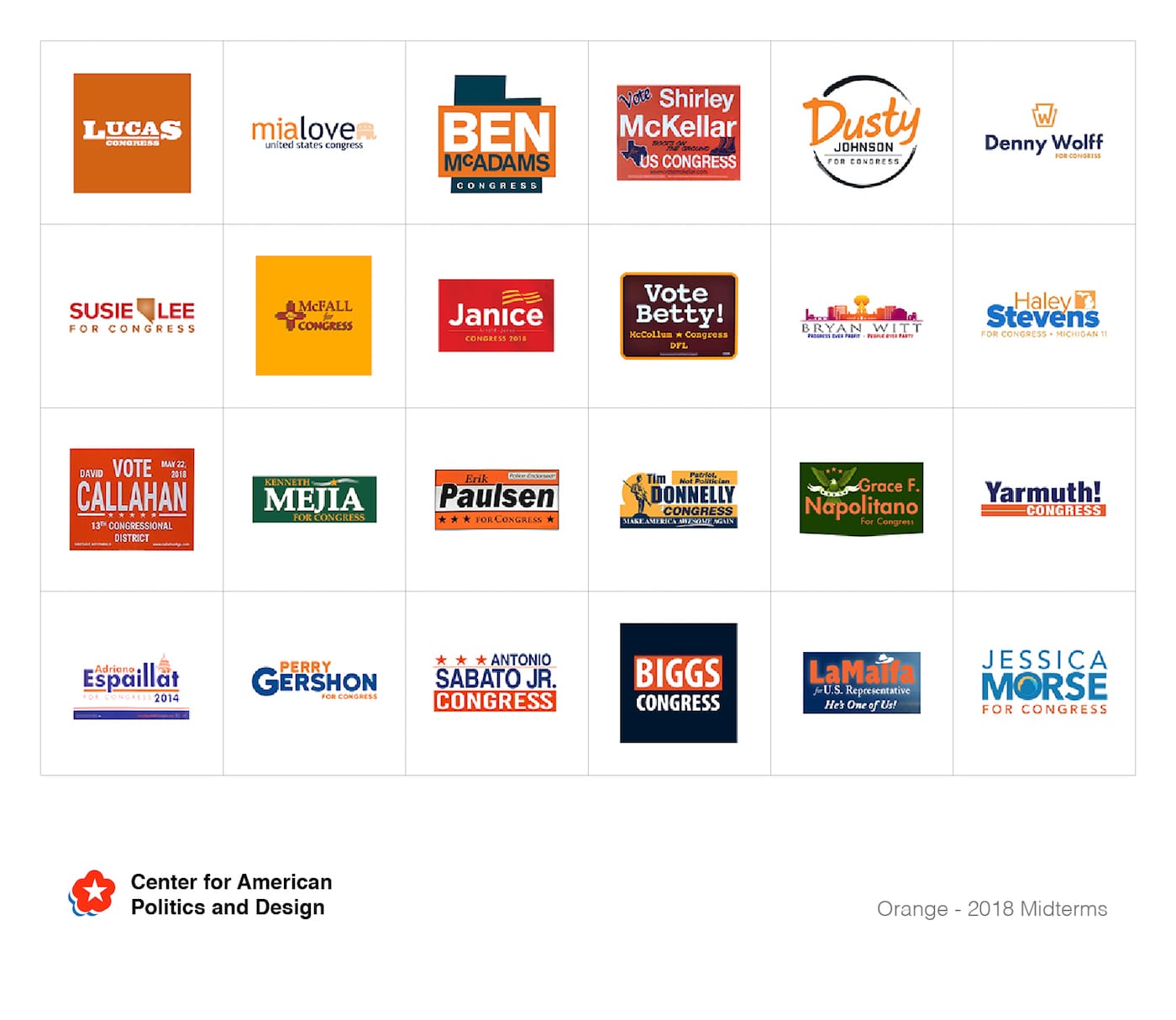
Stare at the logos of congressional candidates too long and it’s akin to sun-gazing. Everything goes blurry and homogenous. When I try to imagine them, I see blues, reds, an occasional #1EC635 green, a shooting star, a puffy Helvetica. Nothing more. Maybe the mercilessness of the last few months has got me despondent, or tired; maybe I’m not a particularly “visual person.” But the nuances of their imagery don’t register.
But they are nuanced, with patterns that repeat constantly or never at all, depending on the type of candidate using them. Hello Velocity, designers and creators of other playful and telling design projects (like Brand New Roman, a font comprised entirely of corporate logos, or Meatface, a hack for Tinder that overlays your face with a slab of steak), have archived the campaign logos of over 1,000 candidates into a single, searchable database entitled The Center for American Politics and Design (CAPD). The name sounds official, and unexpectedly so — under an administration that initially seemed to hate art — and the search is streamlined: filters allow you to select logos by color, iconography, and font type, and the gender, incumbency, office, and district lean of each candidate. It’s funny to source it, even here; the name renders even the caption below somehow official.
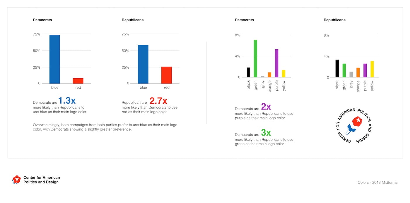
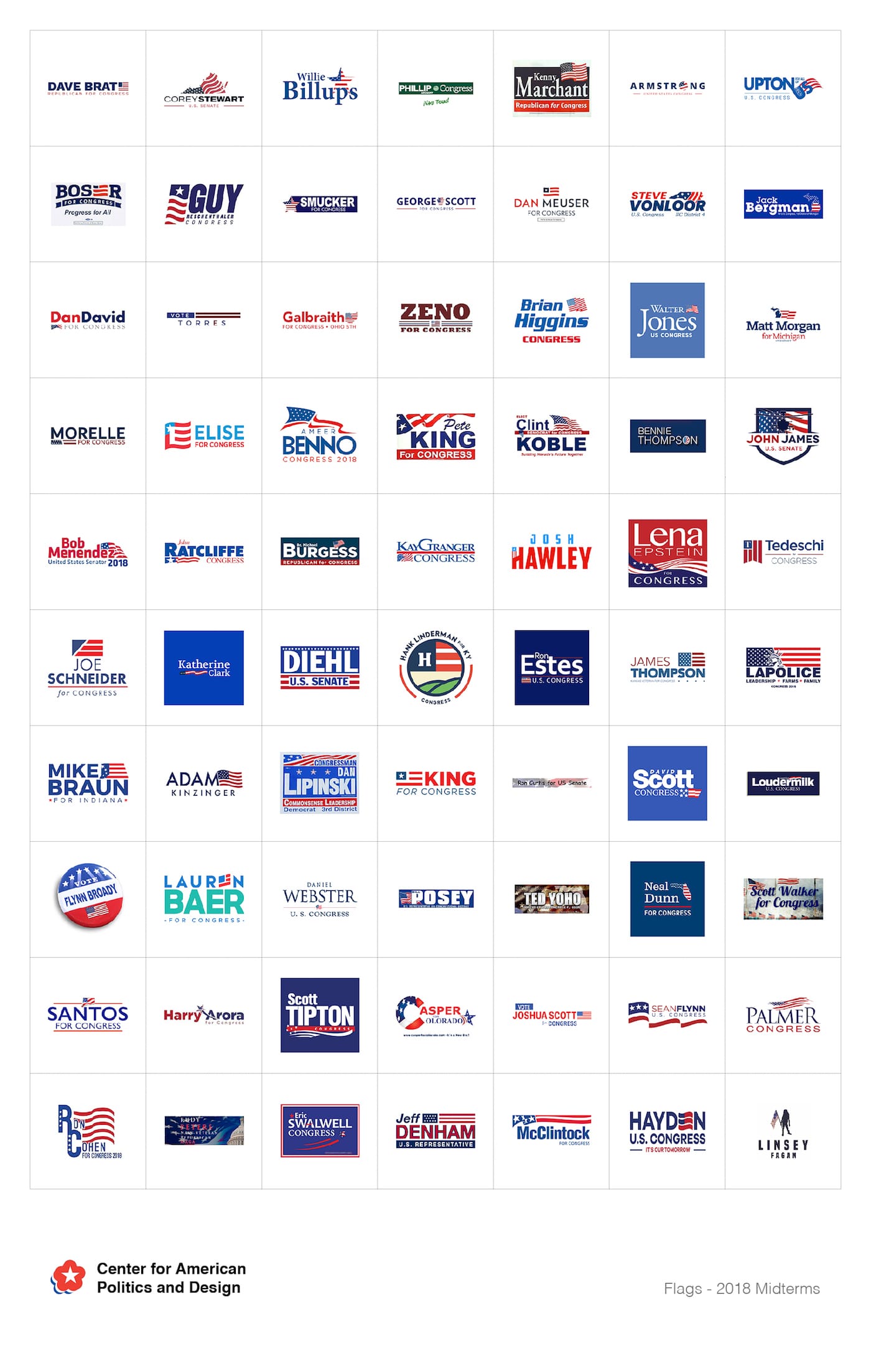
Then again, it sort of is. It’s certainly thorough. Select “letterform” and see how popular it is to replace a letter with a series of lines, or smooth, comforting waves, requiring just a little bit of pareidolia to complete the word. Nine candidates use birds in their logo, which is a category separate from “eagle” (that increases the number of winged-creature icons to 13). Compared to the simplicity of incumbents, the logos of non-incumbents seem more picturesque when you scroll through them quickly — like tiny landscapes. Republicans definitely prefer to use red over blue. Republicans also do not use more serif fonts than Democrats do (why did I think it’d be otherwise?). And only one candidate uses Comic Sans (Ron Curtis, of Hawaii).
When I read the pitch email for the project, it felt like a funny, somehow neutered, distant way of looking at the election, which I need right now. But, Susan Merriam, a designer at Hello Velocity, explains that it’s not.
In New York’s 12th district this year during the Democratic primaries, I witnessed a graphic design [challenge] between challenger Suraj Patel against incumbent Carolyn Maloney. Patel’s initial marketing materials could have been like Casper ads — clean graphics, colored gradients, and millennial pink. Maloney’s campaign was forced to send a second round of mailers that tried to out-hip Patel’s graphics, shaking up what we’d assume would be a pretty safe race for a 25-year incumbent.
Warm pinks and clean lines — Patel’s marketing campaign was not unlike an ad for a sexier version of a product you already have. Obviously optics are important in politics (because they’re important in everything). Another designer, Will Denton, adds:
We were interested in how little critical assessment there is of the graphic language of American politics. Historically, graphic design has had a peculiar and frequently unexamined role in the exercise of political power. In an era of hyper-sharing, when the President is tweeting out graphics mimicking the Game of Thrones logotype to announce that Iranian sanctions are coming, we thought this was an especially important time to try to get a fuller picture of the role of graphics in American politics.
The intersection between design and political power, as far as these congressional candidates go, is difficult to discern. (I write this, excitedly, nervously, confusedly, optimistically, pessimistically, laughing, crying, et. al from Florida, where we’re on the brink of senatorial and gubernatorial recount results.) The candidates’ wins and losses were a new set of data added Tuesday evening. Perhaps one can start clicking around, making connections between a win or loss and a color or font, playfulness or austerity. We won’t know for sure, of course, if it’s causation or correlation, or if a win or loss is even real (again, I’m in Florida). Hello Velocity’s Lukas Bentel sums it up: when the team contacted the campaign for Marc Herschfus, a Republican, non-incumbent candidate for Michigan’s 14th Congressional District, a representative told them that “it’s more of a front porch and cider campaign; if you’d like a sign you’re welcome to make one yourself.”
“We think of American politics as a massive, implacable machine, but it’s amazing how different that is from the lived experience across much of the country,” Bentel went on. “His campaign is not going to win, but it’s pretty incredible and maybe important that it can exist at all.”


