Curators Reveal Their Favorite Wall Colors for Showing Art
Nine curators share their favorite wall colors — a decision that constructs a sensibility for an exhibition, echoing around the artworks on view.

When looking at art, we’re often influenced by the intangible parts of our surroundings — the textures that surround art. Is the floor warm wood or cool concrete? Do the walls seem bright, lending a crisp backdrop to artworks, or are they a dark contrast, creating a void from which art emerges? Wall color is one curatorial decision that constructs a sensibility for an exhibition, echoing around the artworks on view. I wondered if curators had colors they particularly gravitated towards when planning exhibitions and if so, what they were.
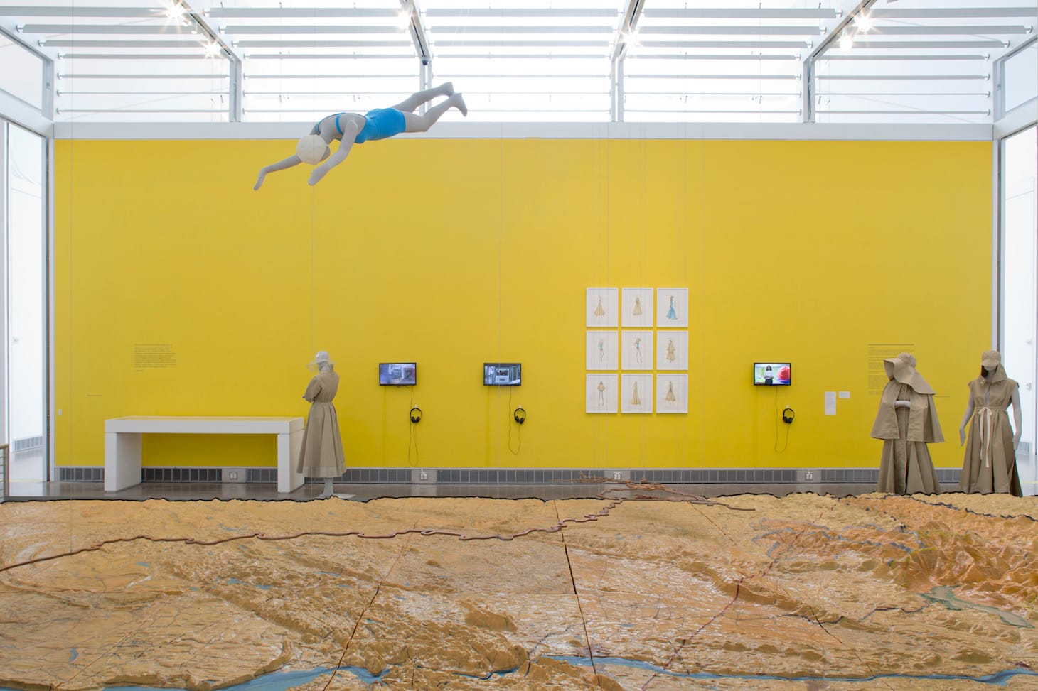
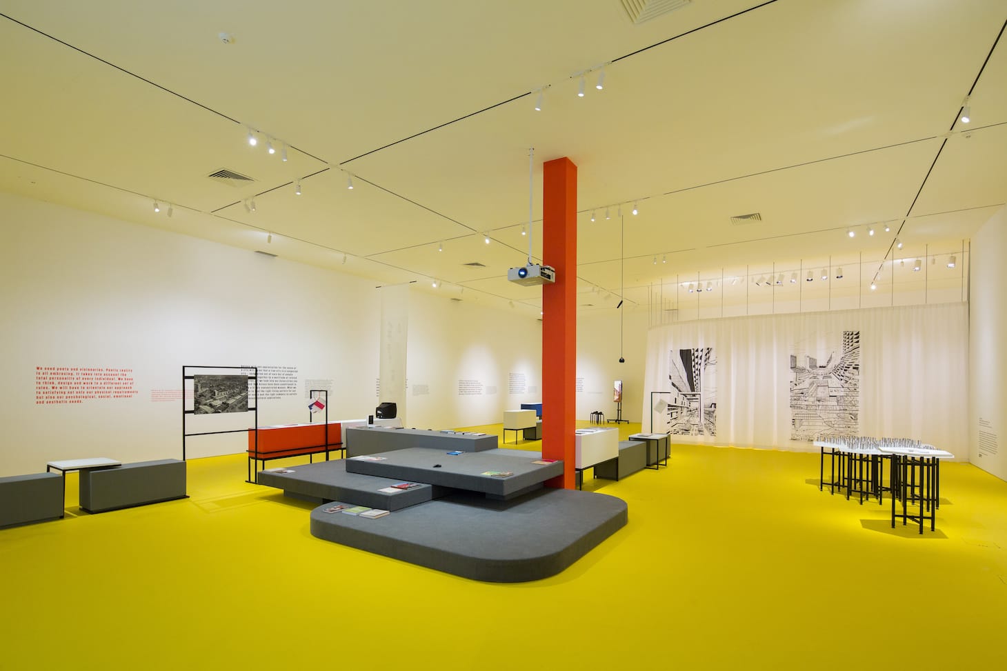
Often, exhibition designers are involved in the process and, of course, if the work is by a living artist, they usually have strong ideas as well. When Manon Slome and I curated Mel Chin’s show at the Queens Museum, LOT-EK designed the exhibition, which occupied every nook and cranny of the building. It was important to signal to audiences where the main galleries were, and also to provide a “trail of breadcrumbs” for people to find Mel’s works that were embedded in other collections on view, as well as the Panorama and the café. LOT-EK chose a bright, hi-vis yellow, which was used on one wall in each gallery, and they created a stripe of yellow color on the floor to indicate where Mel’s more “hidden” pieces might be installed. Choosing such a bright yellow was a major commitment, so we made the final decision after a number of tests in different shades, as well as multiple conversations and consultations.
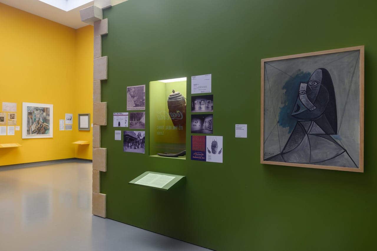
While white may be a default color for many, there are nearly an infinite number of whites to choose from (just check out the “white” paint chips at your neighborhood paint store), and curators definitely have opinions about which ones they like best. Plus, as with Mel’s show, sometimes a more intense color might be used to accentuate a segment of the show, or to signal a different category of objects as archival or as ephemera. And sometimes, we go crazy and embrace, in Ute Meta Bauer’s words, the full-on “rainbow spectrum.” But don’t take it from me …
* * *
Eugenie Tsai, John and Barbara Vogelstein Senior Curator, Contemporary Art, Brooklyn Museum
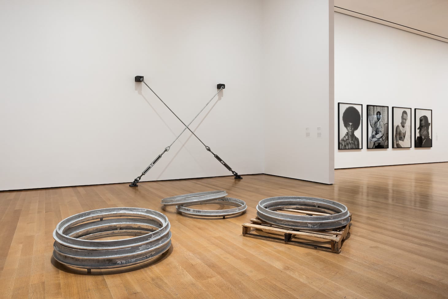
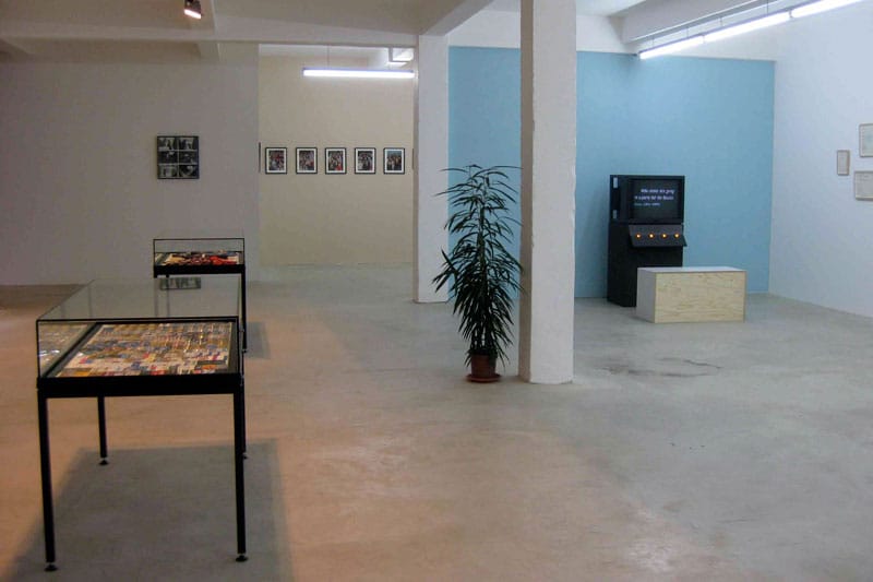
It really depends on the show. In general, the white cube seems to prevail. But as you know very well, white ranges from soft to clinical. And so, we spend time looking at options that will present the selected works in the best possible light. I like accent walls of color, though.
Franklin Sirmans, Director, Pérez Art Museum
Having grown up at Dia, can’t it only be white?
Unfortunately, I don’t have a favorite but had a wonderful work up recently by Penny Siopis that was on a beautiful light blue …

Charles Esche, Director, Van Abbe Museum
Green and Brook Andrew stripes ;)
Helen Molesworth, Curator
I’m so crazy that I often pick a new white for each show … and I started even started using (wait for it) COLOR. Farrow & Ball Paint really is worth it, their color saturation and hue are so much better!
Michelle Kuo, The Marlene Hess Curator of Painting and Sculpture, Museum of Modern Art
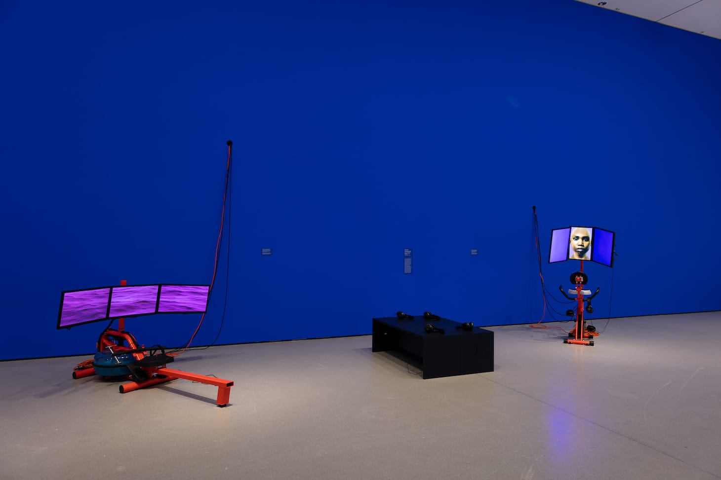
I just used Chroma Key Blue to go with Sondra Perry’s works and am loving it — does that count?
Larissa Harris, Curator, Queens Museum
When I did a show of Michael Smith’s work in Antwerp many years ago we picked colors from the disco pants he was wearing in one of his videos. I’m a fan of colors but wall paint is expensive and you have to plan in advance. Dove gray is another one I’ve used to set off archival material from “art-art.”
Ute Meta Bauer, Director, Center for Contemporary Art
I’ve used a wide range, from white and black to everything along the rainbow spectrum — including painting 6,000 square feet of floor surface an intense yellow for Incomplete Urbanism [at the Centre for Contemporary Art Singapore].
iLiana Fokianaki, Founder and Director, State of Concept, Athens
I usually pick a greenish gray to work with the terrazzo floor in the space.
Thomas Lax, Curator of Performance and Media Art, Museum of Modern Art
How about Drag Ball White? It’s a go-to.