George Miyasaki's Non-Western American Painting
In writing about artists of Asian descent I have repeatedly bumped up against codified prejudices in both the art and literary world.

The relationship between Asian art, Asian artists, gestural and calligraphic mark-making, Abstract Expressionism, and post-painterly abstraction is an entangled web marked by many nationalist and racial prejudices in the guise of objective criticism. In his well-known essay, “American Type Painting” (1955, revised 1958), Clement Greenberg made the extravagant claim that “not one of the original ‘abstract expressionists’ — least of all [Franz] Kline — has felt more than a cursory interest in Oriental art. The sources of their art lie entirely in the West.” If you believe that this narrow, racially charged viewpoint is no longer given any credence, you are dead wrong.
Reviewing the 2011 show Helen Frankenthaler: East and Beyond at Knoedler & Co., for which I wrote the catalog essay, Lance Esplund, the critic for the Wall Street Journal, wrote:
Coming on the eve of New York’s Asia Week, it is a fine show if you ignore its premise and dubious catalog essay, written by the Chinese-American art critic and poet John Yau. Mr. Yau, citing the Asian-themed titles of Ms. Frankenthaler’s works, surmises — with little or no substantiation — that she is steeped in “Asian art and philosophy” and has had “a long engagement with Asian art.” This is news, if not revisionist fantasy, to anyone who knows the artist and her European Modernist-influenced works, whose ambiguous titles were generally arrived at through free-association.
Put aside for moment Esplund’s xenophobic need to racially profile me and consider his claim that the essay was written with “little or no substantiation.” As Esplund well knows, any catalogue essay on Helen Frankenthaler published by a reputable gallery that presented her with a concept for the exhibition would require — as a minimum standard — that the artist and her studio approved of the show’s format, title, and catalogue essay.
Without going into the personal details of why Ms. Frankenthaler wanted me to write the essay, and that she was aware in advance of some of what I planned to state, she also invited me to Connecticut to view her collection of Asian art, which was prominently displayed throughout her home, alongside works by friends such as Kenneth Noland, David Smith, and Anthony Caro. At the very least, these facts suggest that the artist and her representatives tacitly approved of my “revisionist fantasy.” Also, as I poet, I know that the term “free association” is often used to disavow responsibility for one’s choices, but no association is actually “free.”
In writing about artists of Asian descent — from Wifredo Lam and Matsumi “Mike” Kanemitsu to Ruth Asawa and Leo Amino to Martin Wong, Barbara Takenaga, Chie Fueki, and Tammy Nguyen — I have repeatedly bumped up against codified prejudices in both the art and literary world, as exemplified by Esplund’s reductive characterization of me. It was thus inevitable that, as I went to the exhibition George Miyasaki: Abstract Expressionist California (Paintings and Lithographs, 1955-1961) at Ryan Lee Gallery, I would think about the many different ways racial prejudices regarding Asian artists and art have manifested themselves.
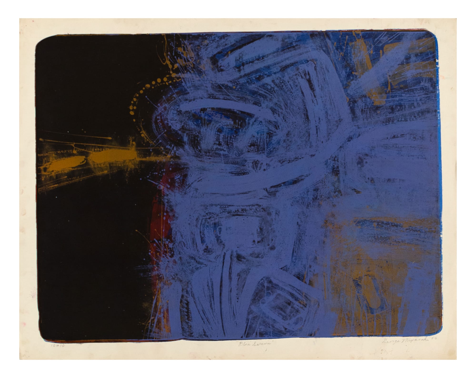
Miyasaki (1935–2013) was born in Kalopa, Hawaii, and spent part of his child in an internment camp. In 1953, he left Hawaii and moved to Bay Area to study commercial art at the California College of Arts and Crafts (now the San Francisco Art Institute), where his teachers, Richard Diebenkorn and Nathan Olivera, inspired him. By the time he self-published the colored lithograph “Night” (1955), a dark blue print measuring 15 3/4 by 23 1/4 inches, he had clearly abandoned commercial art in favor of fine art. It is also clear that he had become a masterful lithographer who, drawing on stone, connected himself to two traditions: Asian calligraphy and improvisational gestural marks. This is even more evident in the sublime lithograph “Blue Serene” (1956), measuring 20 ½ x 26 ½ inches. By 1958, he was showing his lithographs across the United States in juried exhibitions.
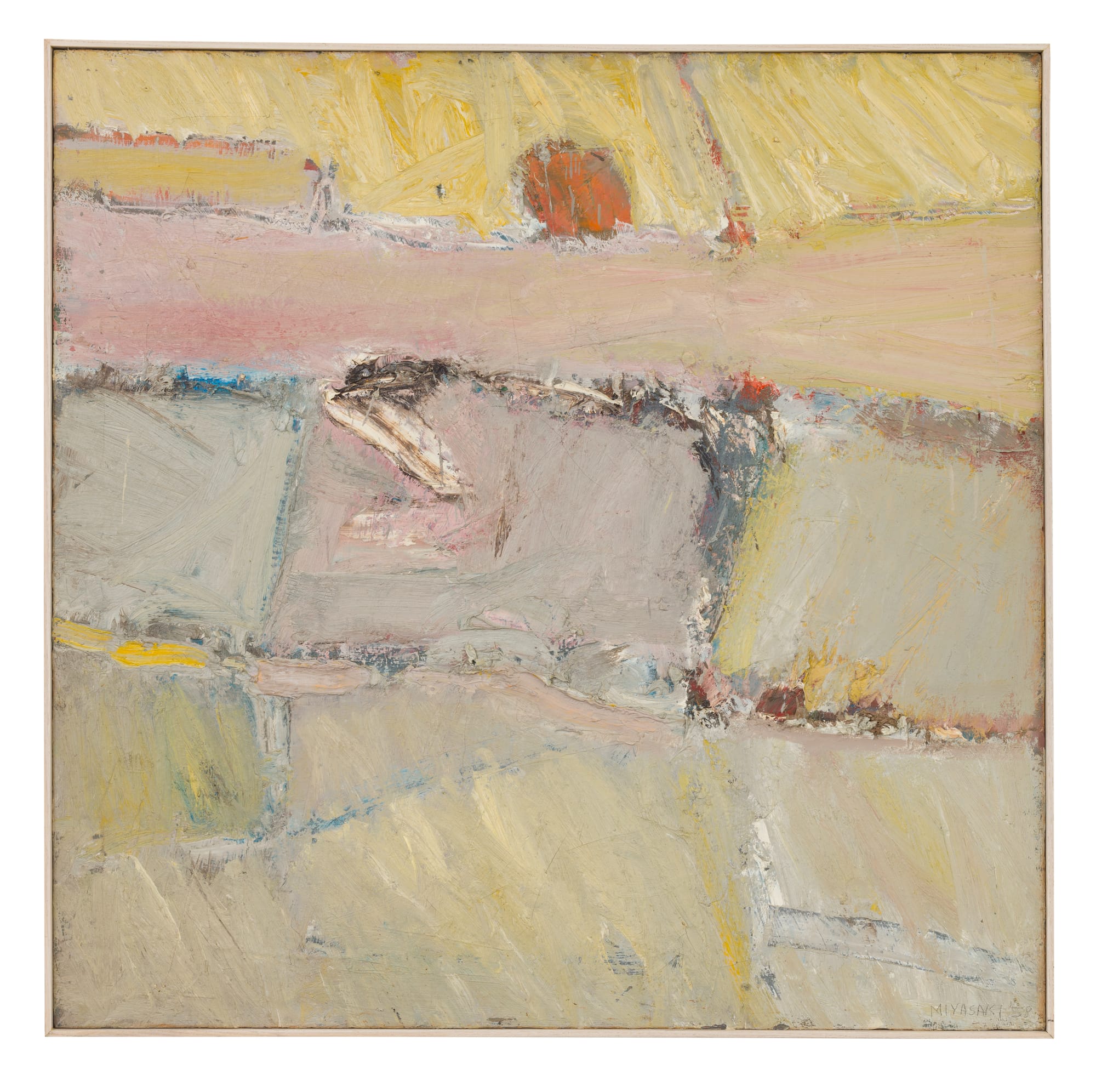
At the same time — and this is one of many complications Miyasaki brought into his work — his paintings from 1958 to ’61 are focused on built-up planes of pale colors rather than gestural marks or lines. While the inspiration of Diebenkorn’s Albuquerque and Berkeley painting series can be detected, it is equally apparent that Miyasaki is bringing something to the table, starting with color and the way the surface is built up. Whatever presence Diebenkorn had in these works, it had mostly disappeared by 1959–60, as evidenced by paintings such as “Horizon #2” (1959) and “Coastline” (1960). It also should be emphasized that the exhibition focuses on the beginnings of Miyasaki’s career, and that he made these works between the ages of 21 and 26.
In hindsight, it is apparent that Miyasaki, having absorbed the abstract landscapes of Diebenkorn and the figural presences of Olivera, had moved into a territory all his own by the late 1950s. Looking at these works in 2019, the question persists: why isn’t Miyasaki better known? And why aren’t these works and this period of his career better known? Artists respected him. In 1960, Willem de Kooning made his first lithograph, which was independently printed in a small edition by Miyasaki and Olivera at the University of California, Berkeley. De Kooning was inspired to do this after seeing what Miyasaki and Olivera were up to.
It is also unsurprising that he did not show regularly in New York in his lifetime. What artist of Asian descent making abstract works and living on the West Coast did have regular exhibitions in New York between 1955 and 2017 (when David Zwirner began representing the Estate of Ruth Asawa)? Part of Miyasaki’s neglect has to do with the art world’s fashions and changing tastes. But a deeper, more persistent part has to do with racial and cultural prejudices, as expressed by the first generation of American art critics — Clement Greenberg, Harold Rosenberg, and Irving Sandler — and carried on by Lance Esplund and many others in positions of power.
We have belatedly recognized Japanese abstract artists living and working in postwar Japan and Korean abstract artists living and working in postwar Korea, but we have not done the same for Asian artists who emigrated to postwar America or artists of Asian descent who grew up in America. This is particularly true of painters. It is almost as if the words “Asian” and “abstract art” are not allowed in the same sentence. Like oil and water, they do not mix.
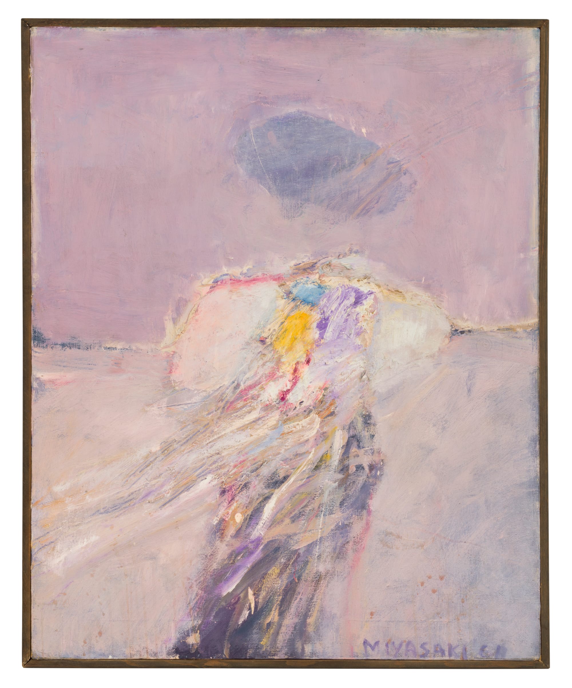
In such paintings as “Horizon #2” (1959), “Coastline (1960), “Shoreline #2” (1961), and “Untitled ‘The Path’” (1961), Miyasaki creates work that I would claim is as good as anything else by a West Coast abstract artist of his generation. In fact, I would say these works hold their own with those of older West Coast artists associated with Abstract Expressionism. I say this knowing I might be accused of fostering another “revisionist fantasy” within the art world. But, in these paintings, I believe that Miyasaki brought many different possibilities into close proximity. He expressed his strong interest in the relation between light and form, the ethereal and the solid, and in his use of closely related tones. He integrated this with his evocation of forms in a state of change; this is prominent in “Coastline” and “Horizon #2.” Am I wrong to suggest that Miyasaki might have been inspired by the Buddhist belief that “form is emptiness; emptiness is form” (from the Prajna Paramita Hrdaya or “Heart” sutra)? Or is Zen Buddhism only good for John Cage, Gary Snyder, and other white people?
While the titles suggest that standing at the ocean’s edge inspired the paintings, and becoming conscious of infinity’s presence (sky) and the inevitability of dissolution (ocean) are the subjects, what most holds my attention is Miyasaki’s ability to make a form appear to be in a state of slow but inescapable dissolution. He achieves this by varying the thickness of the painting and the use of close tonalities and subtle shifts in hues.
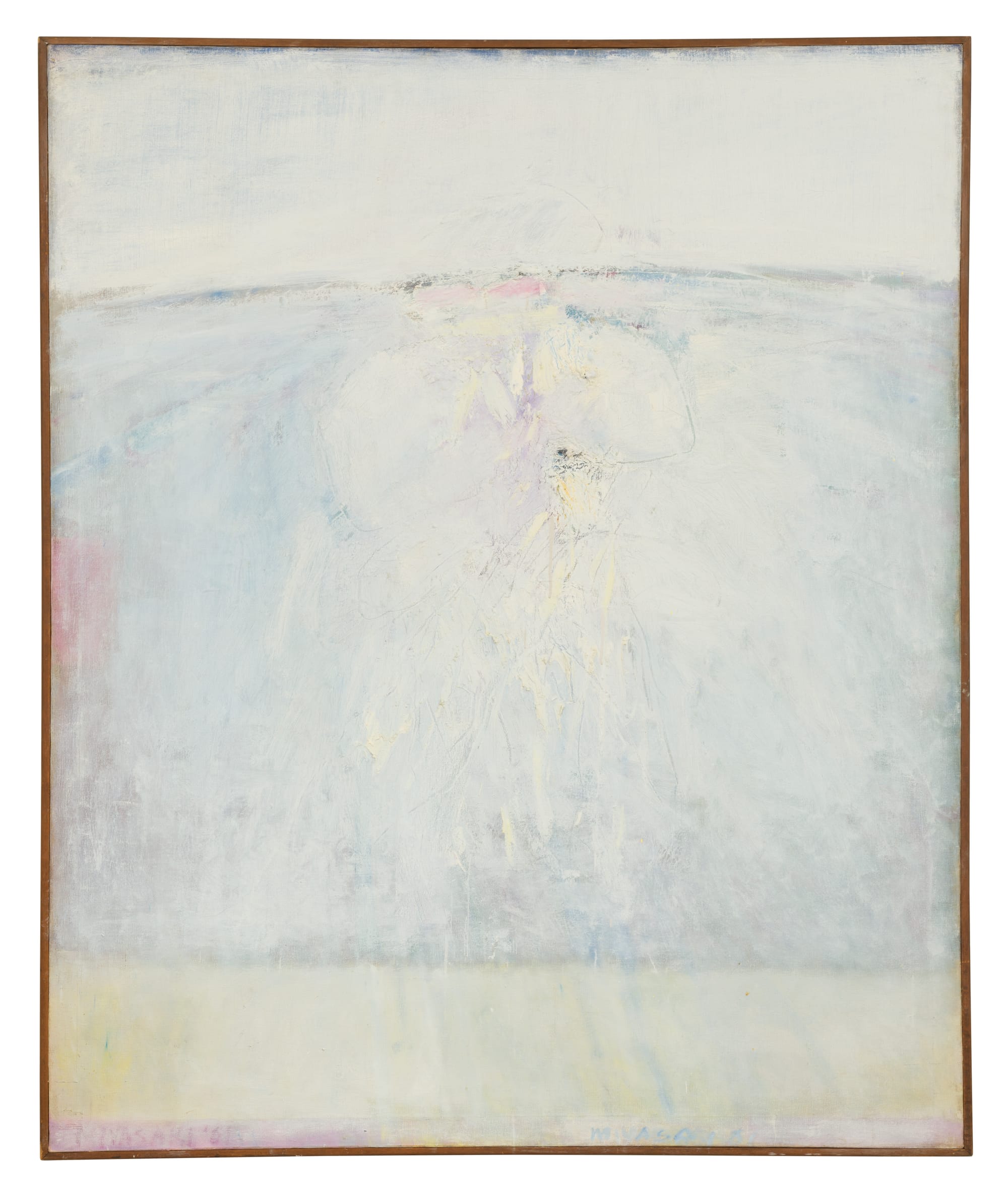
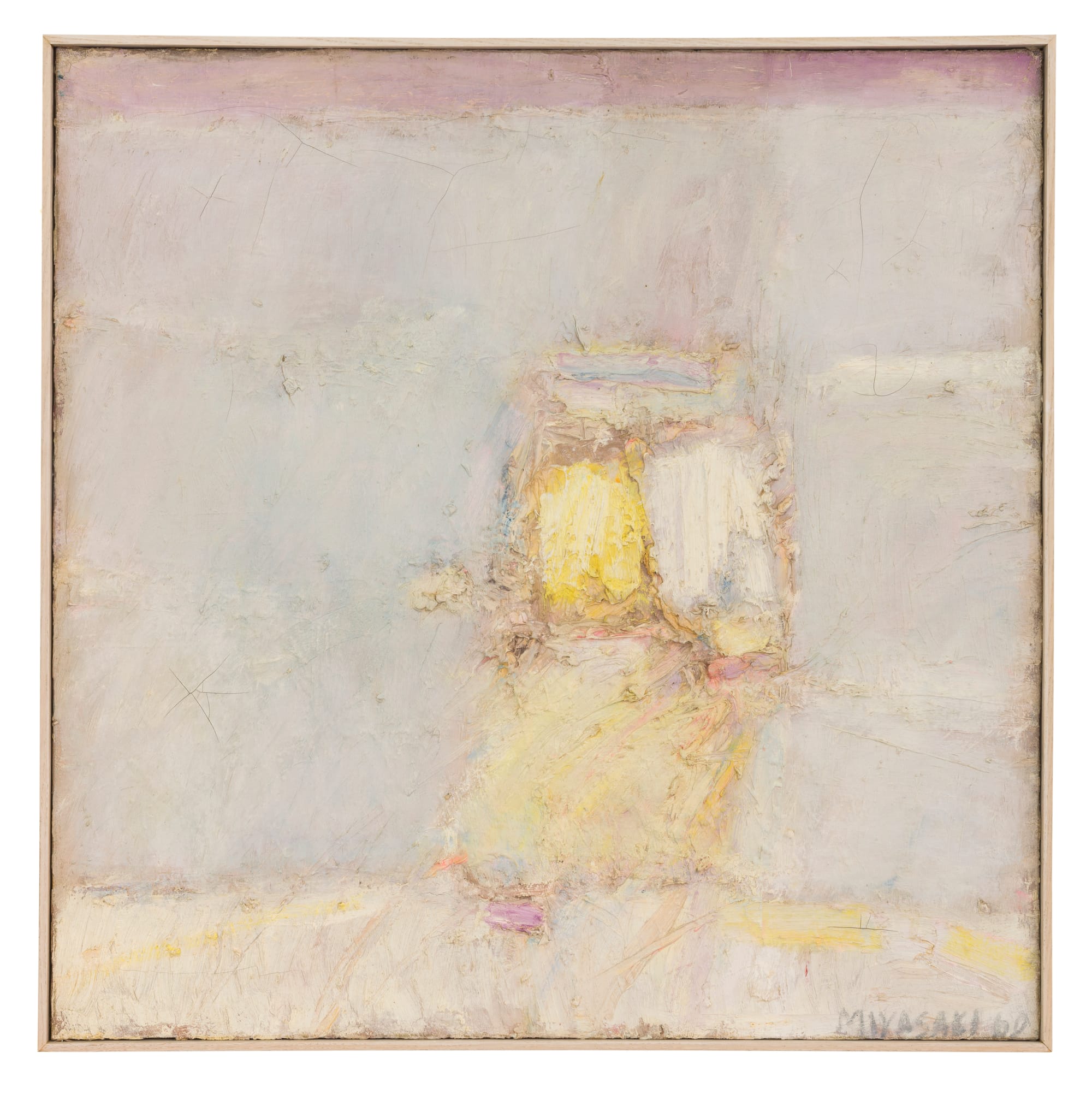
My favorite painting in the exhibition — the one that grabbed me immediately and to which I kept returning — was “Untitled ‘The Path.’” Measuring 58 by 48 inches, the vertical painting is divided into three horizontal areas, the widest being the middle area. Rendered in green, the bottom fifth of the painting evokes landscape and ground; we are presumably standing on something solid. The middle area is an uneven, scratched surface in which the viewer sees traces of pale violet, pale blue, rose, and milky yellow beneath a curved horizon line. The upper area is a bluish, milky white. This is a landscape that stretches back (as implied by the horizon line) while pushing off the picture plane with its built-up layers of paint.
Look at what Miyasaki does with thick brushstrokes of paint in “Shoreline # 2,” how he both mixes colors and keeps them intact. Notice how the direction of the brushstroke within a defined area directs our eyes, and how he gets the brushstrokes to quietly collide. Am I wrong in advancing that Miyasaki should get a second, longer look? Is it possible to see this Japanese American artist in the larger context of what was going on in West Coast abstraction between the mid-1950s and early ’60s? Or are all these questions to be filed under “revisionist fantasy?”
George Miyasaki: Abstract Expressionist California (Paintings and Lithographs, 1955-61) continues at Ryan Lee Gallery (515 West 26th Street, Chelsea, Manhattan) through June 15.
Correction: An earlier version of this article included a typo that mislabeled George Miyasaki’s lithograph “Blue Serene” (1956). We apologize for this error, which has been corrected.