Paintings with a Retinal Buzz
In Relative Brightness the canvas transforms into a rippling, luminous field of ever-shifting optical sensations.


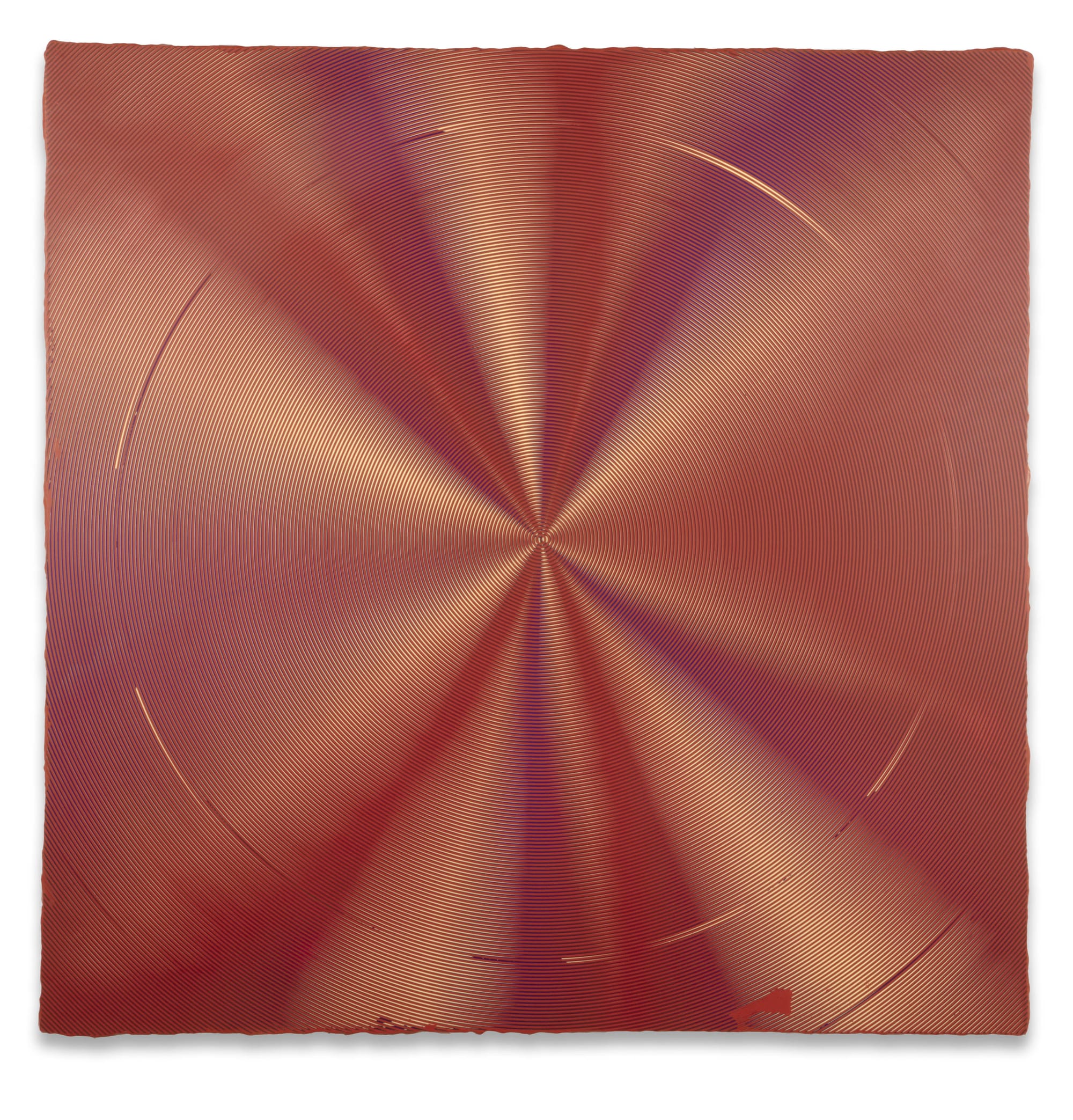
Straightforward in structure but visually confounding, the eight paintings in Relative Brightness, made collaboratively by Anoka Faruqee and David Driscoll, provide an understated retinal buzz with an undertow of genuine feeling. All dated 2019, the paintings are square in format — six measure 33 ¾ inches per side, the other two, 56 ¾ inches — and feature a primary motif of concentric circles, rendered as thin stripes about an eighth-inch wide, separated by intervals the same size. Each of a single, precisely mixed color, they orbit around a tiny dot of paint at or very near the center, extending outward to the edges and (by implication) beyond.
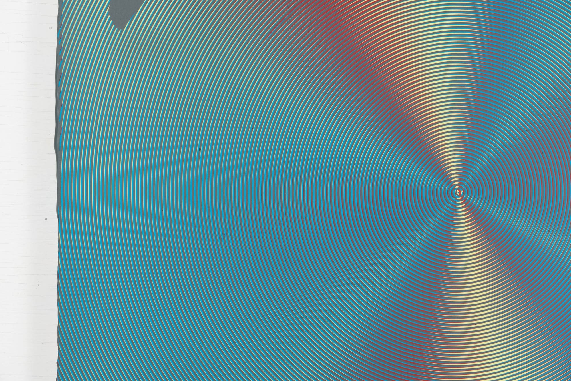
By overlaying two or more such circular fields slightly out of alignment with each other, the artists put in play an interference pattern that transforms the surface of the canvas into a rippling, luminous field of ever-shifting optical sensations. Similar to a moiré effect, this perceptual condition emerges from the combination of discrete sets of visual data. (The reader should be aware that, on a computer screen, pixel-based display frequently introduces an additional, misleading layer of pattern to the image.)

These dazzling data-rings are produced by pulling specialized, custom-made tools through wet acrylic paint. The binary of stripe/interval nets a mid-tone, allowing the artists to simulate the effect of blending or gradients without actually including any such paint handling; the precise admixture of hues striking the retina constantly changes as the viewer surveys the painted surface. Details of the procedure for applying color aren’t immediately clear looking at the works, though presumably the paint goes on in layers. The studio’s sandpaper budget must be considerable, as the surface of every painting is absolutely smooth.
It’s not polished like glass; the paint surface itself is matte. From just a few paces away, however, it gives the astonishing illusion of sheen. Offset stripe-circles of stop-sign red and forest green — both mid-range in tonal value — dovetail nicely on the horizontal axis of “2019-P 29 (Circle).” Elsewhere in the painting they pull apart to reveal slivers of light greenish blue (arcing through the top half) and magenta-pink (bowling around the bottom section). The red completely eclipses the green along the painting’s vertical axis; there the lighter colors are as conspicuous as the red and together form the illusion of a puckered bulge. The difference in the colors’ value is sharpest at the painting’s core and fans out, softening at the corners. This lends the whole color environment a metallic shimmer, like that of colored foil.
This describes the simplest painting in the show. The complexities of “2019-P 24 (Circle)” yield six distinct axes, each with its custom blend of desaturated primary hues and medium gray. A light mint green dominates “2019-P 28 (Circle),” functioning as a scrim through which the artists’ usual palette is glimpsed — and also like a Fresnel lens, amping up its brilliance. The magnificent trifecta of “2019-P 18 (Circle),” “2019-P 22 (Circle),” and “2019-P 23 (Circle),” amply spaced on a long wall, brings various subtle oranges and purples into the mix in combinations suggesting the luster of polished bronze, copper, and brass.
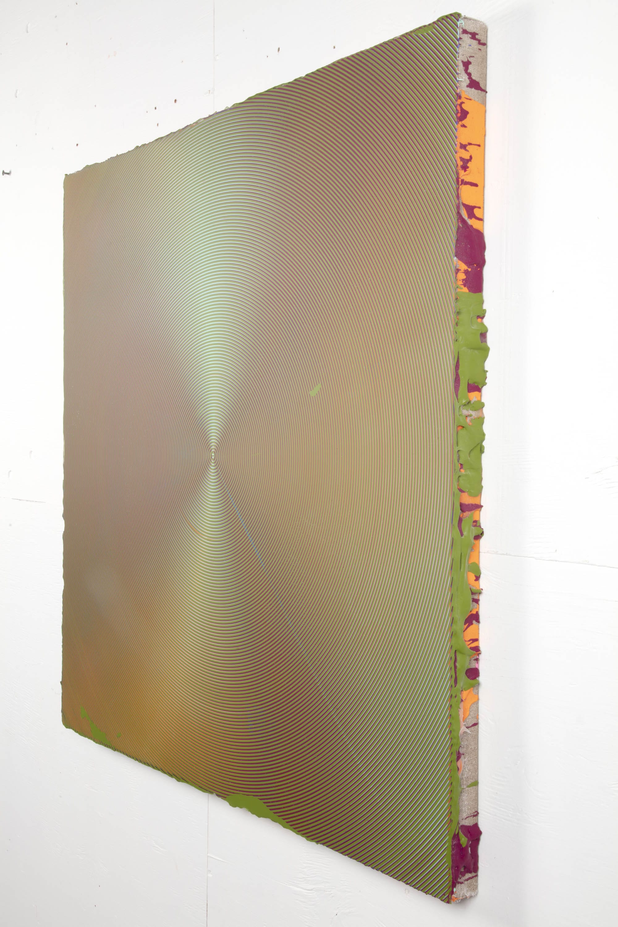
This precise palette is attentive to the visible spectrum of daylight, but its sympathies are more with sundown than high noon — twilight in particular, according to the press release. The sides of the paintings are splattered with drips and globs of paint, likely fallout from the artists’ flatbed process. These splatters form a sort of raw index of the individual hues which, on the painting’s face, are cooked — subordinated to the overall matrix of chromatic relationships where their interaction prevails.
Of course, Josef Albers is the artists’ lodestar. Faruqee and Driscoll carry on in the tradition of The Responsive Eye, MoMA’s 1965 exhibition of retina-centric art that included, in addition to Albers, works by Bridget Riley, Richard Anuszkiewicz, Gene Davis, and that under-recognized master of concentric circles, Tadasky. Of the contemporary Hunter College color painters, their work is most aligned, in formal terms anyway, with that of Sanford Wurmfeld, who, in works such as the immersive “Cyclorama” (2004), uses incremental gradations of hue to give light a seemingly corporeal presence.
More visually aggressive, Gilbert Hsiao’s paintings of overlaid stripes take moiré to baroque levels of intricacy by way of masking tape and spray guns. And in her screen-printed panel paintings, R H Quaytman has considered optical phenomena such as interference patterns, the “blind spot,” the Hermann grid, and the Fresnel lens in the broader context of the history of images and the possibilities and limitations of visual perception.
Faruqee and Driscoll are quite happy to allow imperfections to enter and occupy their paintings. The glitch factor in “2019P-30 (Circle)” is spectacular and includes a circular scrape or drag of the artists’ mark-making tool that sharks in and out of the painting’s wave-like undulations. Incongruous blobby shapes also appear in this painting and most others, sanded down with the rest of the surface and providing a crucial counterpoint, humanizing what looks like mechanical precision by drawing attention to the paintings’ manual origin.

The result is the undertow of genuine feeling I referred to at the beginning. These are pictorial compositions, after all; the resonating circles are the (preternaturally active) ground against which the glitches — though aberrations in the process — emerge as figures. Without these seemingly random flecks and scraps, the paintings would still be beautiful and masterful, but probably also slick and sterile. Perfection is deadly, as my friend Edith likes to say. Like blips on a radar screen, the alien blobs signal that the artists’ procedure is vital, animated by their decision-making, responsive. The products of Faruqee and Driscoll’s idiosyncratic technique demonstrate the indeterminacy inherent in a seemingly predetermined action. That uncertainty may be disconcerting in some contexts, but Relative Brightness proves that it can be exhilarating as well.
Anoka Faruqee and David Driscoll: Relative Brightness continues at Koenig & Clinton (1329 Willoughby Avenue, Brooklyn) through October 19.


