When Paintings Come Apart: Sharon Butler on the Inside Out
Wandering through the Museum of Modern Art, I came across the gallery partially devoted to the work of Robert Rauschenberg. It was the first time I had been there since the iconic “Canyon” (1959) — the one with the stuffed bald eagle — was donated to the museum by the Ileana Sonnabend estate.

Wandering through the Museum of Modern Art, I came across the gallery partially devoted to the work of Robert Rauschenberg. It was the first time I had been there since the iconic “Canyon” (1959) — the one with the stuffed bald eagle — was donated to the museum by the Ileana Sonnabend estate.
“Canyon” is essential to our understanding of Rauschenberg’s Combines, and, as the centerpiece of an arrangement that includes “Rebus” and “Bed” (both 1955), it makes a striking case for the sturdiness, both aesthetically and conceptually, of these extravagantly desolate hybrids.
The term “combine” is succinctly explained in the MoMA wall label for “Rebus”:
Rebus belongs to a body of work in which Rauschenberg integrated three-dimensional objects with two-dimensional paintings. His friend Jasper Johns coined the term Combine for such works, describing them as “painting playing the game of sculpture.” Made from layers of everyday materials found in the neighborhood of his Lower Manhattan studio (comic strips, political posters, fabric, and drawings), this work maintains a flatter, sparser surface than most of the artist’s Combines.
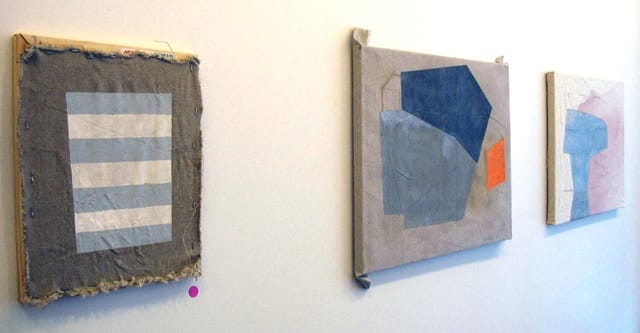
While I was looking at “Canyon,” the press photo for Sharon Butler’s new solo show at Pocket Utopia flashed across my mind. I hadn’t seen any of the work in person yet; in fact, the show had not yet opened, but I saw a kinship between Rauschenberg’s dissolution of the barriers between painting and sculpture and the way Butler’s painting’s looked in the photograph, stacked in front of one another, their painted canvas surfaces stapled almost willy-nilly to the front of the stretcher bars, which are visible along the edges of some of the works.
Perhaps it was the vast canvas expanse of “Rebus” in my peripheral vision that brought to mind Butler’s use of fabric as an independent element, or perhaps it was something deeper; like Rauschenberg’s Combines, there is something simultaneously serene and mad about these paintings. Butler’s title for the show is Precisionist Casual, which invokes the early American modernist movement, Precisionism, which was practiced by Charles Sheeler and Charles Demuth, as well as the New Casualists, a term she coined in an essay published in The Brooklyn Rail (June 2011):
There is a studied, passive-aggressive incompleteness to much of the most interesting abstract work that painters are making today. But the subversion of closure isn’t their only priority. They also harbor a broader concern with multiple forms of imperfection: not merely what is unfinished but also the off-kilter, the overtly offhand, the not-quite-right. The idea is to cast aside the neat but rigid fundamentals learned in art school and embrace everything that seems to lend itself to visual intrigue—including failure. The painters take a meta approach that refers not just to earlier art historical styles, but back to the process of painting itself.
The combination of the two concepts, Precisionist and Casual, becomes a perceptive descriptor for this show while allowing for wide swaths of ambiguity. I became acquainted with Butler about five years ago, not long after she started her influential blog, Two Coats of Paint, when she sent an unsolicited manuscript to the Rail, where I was managing editor of the ARTSEEN section (her essay, titled “Artist’s Retreat,” published in October 2007, one year before the crash, was a prescient analysis of the effects of a financial contraction on emerging and mid-career artists) and so I contacted her with the questions I had.
* * *
Thomas Micchelli: What about Rauschenberg?
Sharon Butler: Like Rauschenberg, my decision-making is spontaneous — I react to circumstances as they unfold — and the objects themselves are as important as the images painted on the surfaces. But Rauschenberg’s materiality is like the seasons in New England, with wild swings and radical contrast, and the decisions in my work are less dramatic. More like the seasons in Los Angeles
TM: Although you’ve spent much of your life in New England.
SB:Yes. I grew up along the coast in southeastern Connecticut, and then went to college in Boston, except for a semester studying film at UCLA. I still love visiting Los Angeles.
TM: Why are all 15 pieces in the show dated 2013? You hung the show on January 4th.
SB: In September 2012, I had an exhibition at Real Art Ways, a non-profit org in a big industrial space in Hartford, CT, that included much of my work from that year. For the Pocket Utopia show, I wanted to make all new paintings and I had the opening date in the back of my mind as I worked. When I signed the paintings on January 2, 2013, I was dating them the way a book publisher would — the year of publication, rather than the year in which they were composed. As I wrote “2013” I chuckled, realizing that people would assume I had dashed off all the paintings in the five days before the show, in my mind contributing to the Casualist conversation in an amusing way. Of course, no one will remember this small, somewhat arch gesture next year, but it’s not a bad illustration of how I work. I tease out ideas during the process that never would have occurred to me before making the object.
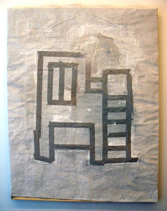
TM: The largest work in the exhibition is “Underpainted HVAC,” which is made out of gesso, metallic pigment and binder on a linen tarp, which is loosely attached to stretcher bars. This piece, for me, is as sculptural as it is painterly: the linen surface is heavily wrinkled and it bellies outward from the stretchers, while the color reminds me of a dusty, rough-hewn limestone slab.
SB: Yes. When you shine a light on the painting, the metallic pigment glitters, just like the minerals embedded in sidewalks. The painting celebrates both beginnings and endings at once.
TM: Tell me what you mean by “beginnings and endings.”
SB:Well, gesso is typically used at the very beginning of the painting process as a primer for the canvas. Signing, dating and hanging the object in a gallery traditionally signal that the artist considers the piece finished. The piece references both the beginning and end of the process.
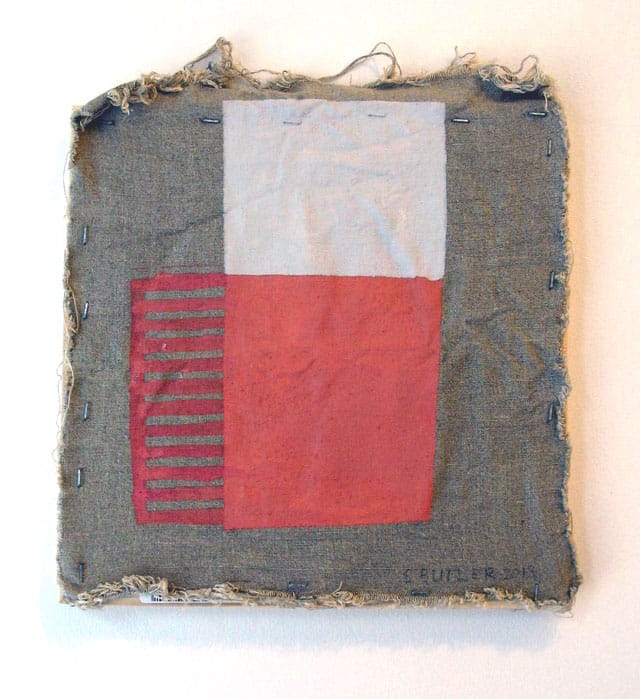
TM: The definition of Combine supplied by Jasper Johns can be construed as somewhat dismissive: painting playing the game of sculpture, as if painting were unable to rise to the challenge of three dimensions, or that its attempts at dealing with real space were frivolous. The works in this show come off as sculptural without seeming to want to be sculpture. And, to be sure, they aren’t Combines — they don’t incorporate objects in the way that the works of Rauschenberg and Johns do. Yet they as paintings they emphasize the materials with which they were made (the frayed edges of the canvas, the staples on the face of the painting, the glimpses of stretchers underneath) and assert themselves as objects in space. They seem to be merging painting and sculpture while negating both, and their construction, especially the nasty use of staples, gives them an anti-art feel. Is the kinship that I’m sensing with Rauschenberg derived from a common ancestry in Marcel Duchamp?
SB: As paintings they’re contrary, aren’t they? I would say, yes, there is a kinship with Duchamp. But I don’t mean to be revolutionary or even obtuse about art writ large – just expansive.
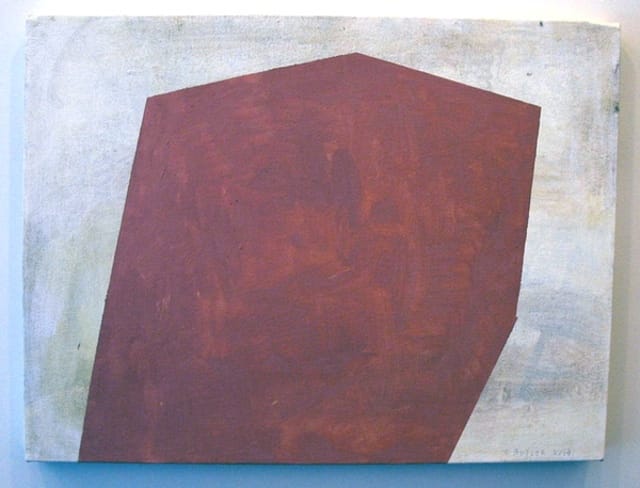
TM: It’s intriguing to note the changes in my response the longer I looked at the show, from a sense of alienation over the work’s apparent arbitrariness to a sudden recognition of its intuitive sense. The perfect example of this is “Vent,” one of the smaller paintings in the exhibition, which features a horizontally striped trapezoid in the center of a raw canvas rectangle, which is stapled to the front of the stretcher bar support.
The curious thing about the piece is that, along with the edge of the stretcher at its uppermost border, we can also glimpse a portion of the stretcher’s store label, including the red logo of Utrecht Art Supplies and the bar code. However, what seemed like a willfully negligent act of “studied, passive-aggressive incompleteness,” as you put it in “The New Casualists,” suddenly seemed thoroughly worked out: the punctuation of red enlivens the gray, white and taupe surface just so, and the vertical barcode provides a subtle, stabilizing counterpoint to the trapezoid’s broad, horizontal stripes.
SB: To be honest, I’m a little apprehensive that some viewers will have your first reaction, as well as a sense of condescension or even indignation towards the seeming lack of skill and effort involved. As the Met points out in the excellent Matisse show that’s now up, making something look effortless isn’t always easy. But it’s worth trying to do well, if that’s not too much of a paradox. I guess what interests me are the metaphorical possibilities of lethargy, bad decisions, mistake-making, and turning things inside out as reflected in a painting. From these things, I reckon there is quite a bit to infer about not merely how we perceive the world but how we live in it.
TM: I saw some installation shots of the Real Art Ways exhibition, and the paintings were hung unstretched on the walls, and at times they overlapped each other. In another photo, there was a painting in a heap on the floor, dropped like a discarded bed sheet. When I was at Pocket Utopia, I wondered why you stretched the canvases at all. To do so is to add an “art material” to the painting that was superfluous to its making, while any support – a panel of plywood, for example, or a sheet of metal, could have been used for the same purpose. The use of the stretchers takes us away from the world and back into art, toward a deconstruction of the art object, but in a way that is the inverse of what Rauschenberg did with his plethora of non-art materials. Using stretchers leaves us with the uneasy feeling that the painting is coming apart.
SB: I’m not particularly interested in straining to do unusual things with the materials or to incorporate industrial objects the way Rauschenberg did. I like the humility associated with cheap stretchers, pre-stretched canvases, canvas board, and linen tarps from the hardware store — the materials amateurs and hobbyists use. I see the pieces as cobbled together — but I like that you read them as coming apart. Either way, there’s a dynamism and open-endedness, which is one of the virtues of Casualist painting.
Sharon Butler: Precisionist Casual continues at Pocket Utopia (191 Henry Street, Lower East Side, Manhattan) through February 17.


